On GCash’s rebrand and the challenges of catering to an apprehensive market.
Article originally published in The Serious Review
In February 2019, Rappler published a case on why Filipinos are slow in transitioning to adopt e-wallets. Comparing data from across the region, the Philippines fell behind Indonesia and Thailand as having the least percentage of people having e-wallet accounts at 31%. In 2018, the Bangko Sentral ng Pilipinas tallied that 99% of all transactions were still conducted in cash, and a separate data poll showed that more than half of the survey still preferred cash as its method of payment.
For a country that boasts spending the most time online, and in an age when there’s an app for anything and everything, why is the allure—not to mention the concept—of e-wallets still alien to most Filipinos? When developing countries all over the world are steadily adapting to newer, more efficient ways of financial responsibility, why then does it seem like the Philippines is lagging behind or worse, going backwards?
A lot of it can be attributed to two things: fear and a lack of information, which in most cases, often go together. Afraid of personal data theft, not seeing the need, and no knowledge of how it all works, is a kind of unknown that leads to fear that eventually leads to distrust. If anything fintech should succeed in the Philippines, the main goal is to gain the trust of a growing, more discerning, and younger market. But how does one do that through design? What will it take for consumers and users to take the leap and trust in a fintech lifestyle app?
This was what Serious Studio needed to solve with GCash.

We believe that a rebrand is not a cure-all, magic solution to fix a multi-layered brand. Proper rebrands are also not mere facelifts of a brand.
According to Franz Weber of GCash, since its inception, the product “has had a single goal of providing secure, convenient, and accessible services to the financially underserved.” And yet, data has shown that a majority of the market is still either uninformed or wary of apps like GCash.
Despite being around since 2004, GCash as a brand still had not reached the level of familiarity and recognition as some of its foreign equivalents. As the product itself was set for an upgrade in 2019, the branding and communications had to follow suit. Serious Studio says, “GCash knew that if they wanted to be the easy and convenient choice, they had to re-examine the brand to make sure that they’re speaking the same language as their customer base, and in a way that can be easily recognized and understood.
A rebrand offers the opportunity to reexamine oneself as well as to serve as a reintroduction to the market. It’s this philosophy that went into rebranding GCash. “We believe that a rebrand is not a cure-all, magic solution to fix a multi-layered brand. Proper rebrands are not mere facelifts,” says Serious Studio. “It is internal, something that must first start with an audit, a re-evaluation of the brand as a whole, and its values and vision. Rebranding needs to identify a central message that serves as a guide throughout the process. Conclusively, the goals of every rebrand must be clear: how do you communicate your vision to today’s market and beyond?”
In the case of GCash, while it has built up a good user base, there was still a lot about the brand that failed to put across. “We actually looked at where our brand sits in customer’s minds, and found that there are elements of GCash that people associated with us, but there was no clear identity linked to that,” says Franz.
Serious Studio’s goal then was to create a rebrand that would elicit immediate recall, ease, security and perhaps most of all: a strong sense of consistency in its messaging. By doing so, it would require less strain—both financial and creative— on marketing to keep hammering the point. Beyond that though, Franz sees a higher importance to the rebranding of GCash which is “to secure a place in the hearts and minds of Filipinos by creating something that helps them become a version of themselves that they want to be.”
“We would like to believe that design is an overall generosity, thoughtfulness, and intentionality to people and product,” seconds Serious Studio. To provide a good experience, Serious Studio had to visually reposition GCash in a way that answered the question: How will the users and stakeholders interact with us in an easier, comfortable and understandable way? The function itself was a given: to be a complete, competent, reliable, and professionally-made product. But to truly capture the attention of its user, it had to engage them at their level and create “elements of play that would allow the brand to not take itself too seriously either.”

We had to make sure we hit a delicate balance between being creative and being pragmatic.
Before anything else, it was clear that a careful reexamination was needed. Research, surveys, and interviews filtered through experience and vice versa resulted in the understanding that customers today needed GCash to be more than what it was initially meant to be. The GCash team spent over 300 hours conducting physical interviews, focus groups, and countless digital surveys. Not to mention extensive work on business development and ensuring the app’s usability performed across all platforms and paving a clear path for its potential scalability. “Research and testing was at the core of this entire project,” says Franz.
And through this core, Serious Studio was carefully guided throughout the project that would then challenge the studio with how to use the data and solve pains through design. First was considering the design’s sustainability and potential growth. “GCash needed to have a practical and flexible branding system that can keep up with an ever-growing product.” says Serious Studio, “We had to make sure we hit a delicate balance between being creative and being pragmatic.”
Second was ensuring that the design elements weren’t just mere window dressing but functional. “Intentionality was also a very important principle during the branding process.” The design needed to allow itself to “expand and trickle into the rest of the applications.”

Designing the fonts, colors and visuals makes [GCash] recognizable, but designing with depth, purpose and intention is what makes it an experience.”
With a rebrand comes not only a rigorous assessment of what it’s been, but also what it could be. The project “required some level of boldness to challenge how corporate brands are typically perceived and expected to look like,” explains Serious Studio. We thought that it was a pivotal time in GCash’s growth to rediscover the potential of their branding system, and to take on the challenge of pushing the visual direction of a corporate brand while maintaining visual cues that make it a reliable and trustworthy product.”
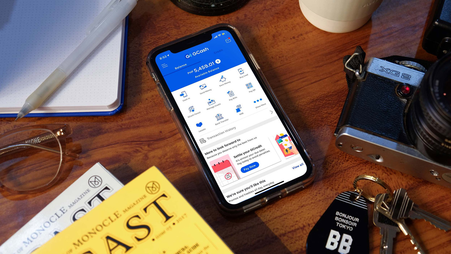
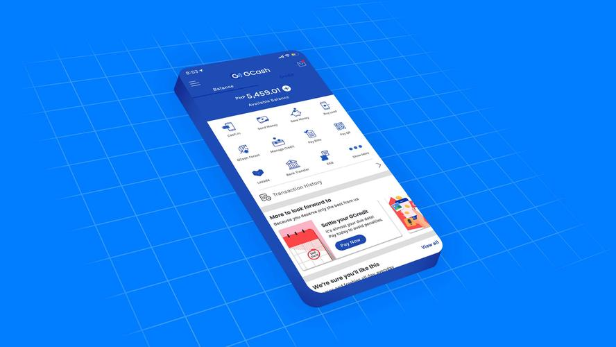
The outcome then is a more playful, more colorful, and more inviting GCash. It looks and feels more like an everyday lifestyle social app and less a digital version of a stodgy and stale bank. But it goes beyond what’s on the surface. GCash has always been about the user experience and now, more than ever, it works and functions as both parties intended: an essential tool in customer empowerment.
The updated and rebranded GCash is seamless and clear which is underscored by its simple yet playful imagery. From its polished visuals, updated color palette, and vibrant aesthetic, it’s smart without coming off stiff. Fun but not frivolous. The product underneath is just as impressive and speaks of how design is essential in making any experience inviting and effortless.
“It wasn’t merely about what would make GCash look different, but more on how we can make GCash the easy brand to recognize, trust and understand,” concludes Serious Studio. “Looking at it this way, design becomes a deeper and more long-term way of looking at things than an arbitrary change of visuals to look trendier and better… Designing the fonts, colors and visuals makes it recognizable, but designing with depth, purpose and intention is what makes it an experience.”
Read our full case study on the GCash rebrand here.