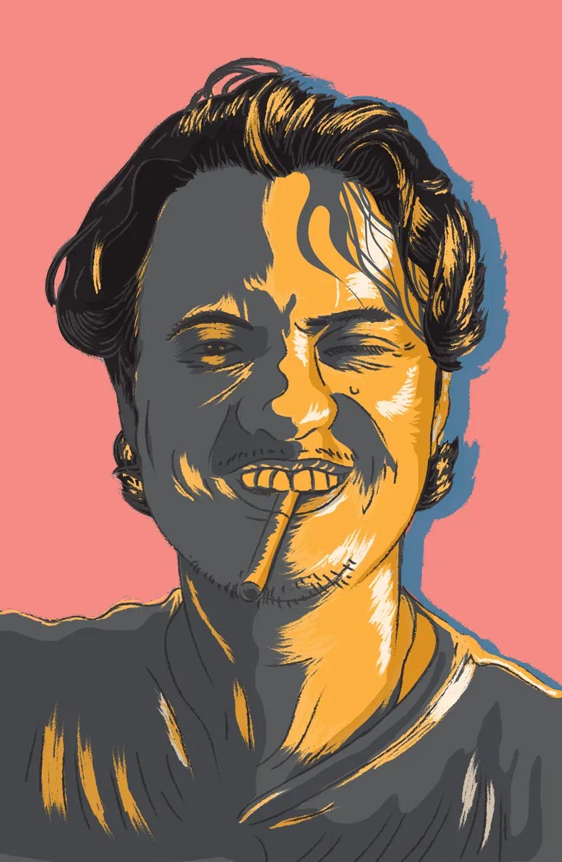
We talk to Miguel about the glory days of Rogue and leaving it behind for the joy of what some would say is an “unexciting existence.”
Article originally published in The Serious Review
In the world of publishing, nothing makes you fall in love with a magazine quicker than its design. The best ones leave you breathless, wide-eyed, and full of wonder. The rush is immediate and you can spend hours upon hours engrossed from cover to cover. Ever since he co-founded Rogue Magazine as its Creative Director over a decade ago, Miguel Mari was the best designer in the business. Every other designer, editor, and magazine wanted to either emulate or collaborate with him and despite leaving Rogue and local publishing a few years ago, his work has still left a lasting imprint on the industry. Now based in Hong Kong, Miguel Mari answers a few of our questions via email.
Hi Miguel. How are you? Anything that occupies your thoughts most days?
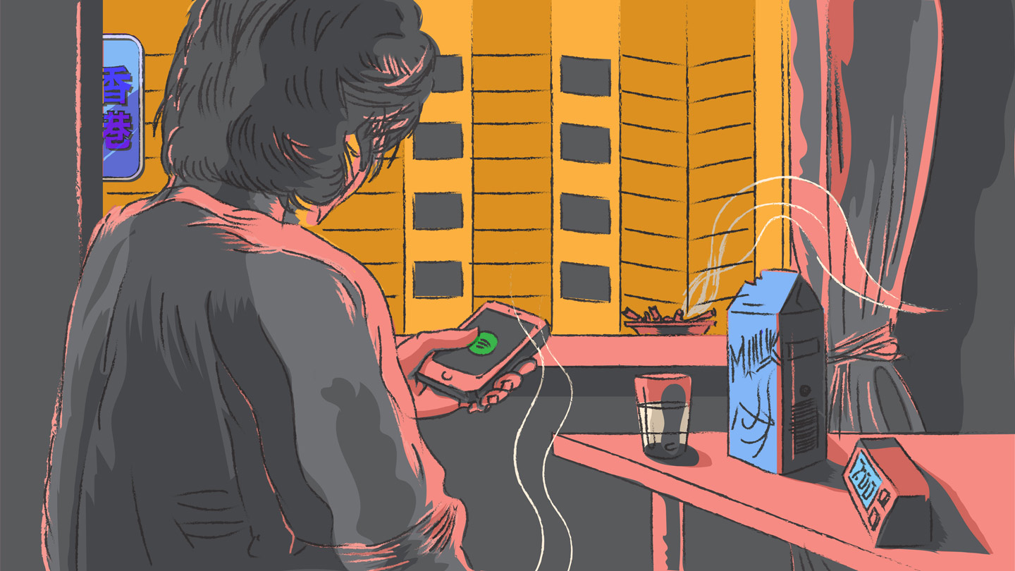
Haha, okay, let’s begin with small talk. Right now, I am pretty happy with the way things are going in my life. My day begins at around 7 a.m., which is a huge leap from what I’ve been used to. I’ve been a night owl as far back as I can remember. It’s probably why I could never really concentrate in school, I was always dozing off in class. Then it’s a cup of coffee—one sugar, no milk—and a few cigarettes. Nothing sends me to the bathroom quicker than that ritual (too much information?) I read the news online just until it starts to irritate me, which is about an hour and a half later, and proceed with the usual rituals before heading out to work at about 8:30.
Then it’s work,work, work, and a ton of meetings. Lunch almost always consists of a sandwich and room temperature water. Workday ends and I head straight home, shower, call my wife, then head out to dinner by myself, back home, and in bed by midnight. I don’t go out at all unless some guys from work twist my arm, but 95 percent of the time it’s home for me. I’m a bit of a gamer and a social media lurker, but I rarely engage. Some might think it’s an unexciting existence, but I love it the way it is. I suppose I get my kicks from the many interactions I have daily with the people I work with.
What did you want to be when you were a kid? Is there a correlation to whatever it was you enjoyed doing growing up to your desire to be in the creative industry?
When I was a “kid” kid, I wanted to be a pig, literally. I found them cute. In the sixth grade I was really, really into horror prosthetic makeup and wanted to do that when I grew up. I used to subscribe to a magazine called Fangoria, which detailed all the techniques and technologies in gore films.
By my junior year, I knew I wanted to be a sound engineer, and got a summer job interning at a small post-production house in Makati. It wasn’t ideal because we weren’t recording music, just dubbing Filipino dialogue over some Japanese puppet show. It was fun nonetheless.
Graphic design was never on my radar but my older sister, who was at UP Fine Arts at the time, was quite talented in it and gave me my first experience on how cool it could be. She would take my bootleg cassette tapes (which had horrible photocopied covers on bond paper) and replace them with geometric designs done by hand. It even had typography scratched on from Letraset. If you don’t know what [Letraset] is, look it up, it was the only way you could buy fonts for use at home back then.
My dad bought our first PC when I was a freshman in college and I found a bootleg copy of a piece of software called Altamira Composer. I played around with that endlessly, trying my hand at design. It was cheesy, for sure, but the fact that I could do so much on a computer got me hooked. Adobe then bought the company and used its layers technology to create Photoshop 3.0, which was the first version to have layers. Prior to that, once you put something down in Photoshop it was instantly “flattened”.
I always equated sound engineering to design in the sense that both dealt with layers of media, and the engineer had to mix the different “layers” to get the perfect composition. In the end, it’s what I decided I wanted to do and used that thought to convince myself that I was still doing what I always dreamed of doing.
“We didn’t strive to be high-society or anti-society. We just wanted everything to be mixed in together because that’s what Manila is. “We were proud of where we came from and flaunted it, but always with a mischievous edge, because, well… Rogue.”
Were you always into magazines?
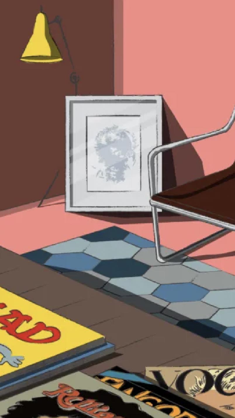
Always. I used to collect Mad Magazine, and would’ve killed to be able to draw like Mort Drucker, Al Jaffee, Dave Berg, and all the other regulars at the time. I mentioned Fangoria, also Jingle when I picked up my first guitar. Later on, music mags like Guitar and Rolling Stone, and a great Hollywood film mag called Premier. Later on, as I started to appreciate editorial design, I picked up on Details, Car UK, Vogue (Italia and Paris especially), GQ, Vanity Fair, Esquire, and all the usual suspects.
Funnily enough, it was never other magazines that inspired me creatively. It was all the album art from all my years collecting vinyl, cassettes, and CDs. To this day, when I’m feeling stuck, I just trawl through Spotify because some of the best layouts are in album art. It’s basically photos, typography, illustration, design—all the ingredients that comprise a magazine, right? I love how album art interprets a mood or a particular message. The music that I listen to while working on layouts still informs heavily what I do on a page or project.

What was your first job? How was that like, and how did any of your previous jobs contribute to who you are now?
My first actual paying job was doing UX for a touchscreen software company. In 1994, my second year of college, I met the owner of the small company at a party and he convinced me to quit school and start doing what I loved. It took all of 40 seconds for me to agree. My parents were definitely not happy about that decision. I have not switched careers since then and never really looked back. It’s all I ever did, and probably all I will ever do. I was never properly schooled in any art or design course but I made a commitment to it in my 19-year-old brain and have stuck it out.
How was it like in the early days of Rogue—what was your initial vision for the magazine and how do you think that was achieved? Is there a deeper part to the idea or the identity?
Rogue’s first Editor-in-Chief, [Jose Mari Ugarte], and I had been friends from the day I was born and our parents were quite close. Sometime in the late 90s, he and I penned an outline for a magazine one night after drinking heavily. We just spoke about how we loved magazines like Vanity Fair and Rolling Stone but the only magazines offered to men in Manila at the time were either lad mags or fashion mags.
We wanted something that told all the stories we heard from older friends, brothers, uncles, etc. Great stories of how wild and crazy things were “back in the day.” We loved the nostalgia of it all. We wanted to mix that in with things that were relevant to what we were interested in. Music, art, books, film, and everything that was in early Rogue. We explained to the early editors that it should feel like a day in the life in a typical city around Manila. You hear some stories, some gossip, walk into some shops, eat, drink, and laugh. We just wanted to represent the fun and often times crazy shit that goes on in that city. We didn’t strive to be high-society or anti-society. We just wanted everything to be mixed in together because that’s what Manila is. We were proud of where we came from and flaunted it, but always with a mischievous edge, because, well… Rogue.
“To this day, when I’m feeling stuck, I just trawl through Spotify because some of the best layouts are in album art. It’s basically photos, typography, illustration, design—all the ingredients that comprise a magazine, right? I love how album art interprets a mood or a particular message.”
How was the creative environment in Rogue at the start? How big was the weight of responsibility for someone like you at the helm?
We were all a bit naive in the beginning, but I think that worked to our advantage. Not financially, for sure, but editorially. None of us had really worked in the industry so we didn’t bring any habits or rules to how a magazine should be run. We made it up as we went along and pissed off a lot of people, advertisers included. One of our early editors, Vanni [de Sequera], used to say, “This place is so chaotic but somehow, at the end of the month, a great magazine gets delivered.” Or was that Erwin [Romulo] who said that? I don’t recall but, anyway, it was absolutely true. We had infinite flexi-time; come in whenever you want, as long as you meet your deadlines. But the environment was so friendly to creatives that everyone would come in the day and stay well past 3 a.m. Story ideas usually came about organically during those late nights just chatting and messing around. Personally, I would always try to think of something that I wanted to learn about and pitched a story around that. I think we all did. We figured that if we were interested in learning something new about a person, a subculture, or any topic, that there were probably a hundred more out there who had the same interest.
How did Rogue change for you over the years? What were some of the things you did right and what were some of the things you wish you could’ve improved on? 2007 to about 2012 were the best years editorially. Design-wise, I look back and it was a mess, but it had soul. It was honest work, unpretentious and with no regard for financial outcomes.
Over the years, our investors started to get impatient and we had to implement a lot of internal rules and start being more commercially friendly. For a while, it worked and we got the balance right, but as the years went by, it started to be all about the money and less about the content. Maybe it’s inevitable for all business, but the evolution didn’t sit well with me. I started to feel dissatisfied with the work and my relationships within the company started to suffer, probably because I was unhappy.

What are the 3 essential elements to making a successful or quality magazine?
1. A publisher who understands the advertising market really well and is a charming salesperson at heart.
2. An editorial team that has the strength and confidence to push back on the publisher’s demands but also the maturity to know when to cave in for the sake of the business. Because in the end, neither can exist without the other.
3. A design team that actually reads the stories and can interpret them in abstract forms—and on-brand—knowing that half of a good magazine is in its design sensibilities.
What makes design so important in telling a narrative?
Design isn’t necessarily an art; it’s a communication tool. In a magazine, it’s all about setting the mood of a feature and visually interpreting the voice of the magazine and its editors. We’re here to service the writing and to make it captivating enough for people to want to sit down and go through 7,000 words and want more. We always tried (and sometimes failed) to curb our self-indulgence as designers. There had to be a reason and logic to everything. If it didn’t feel right for the article, then it would be chopped off.
As a Creative Director and an industry veteran, how would you describe yourself as a leader?
I’m a pretty patient teacher. I allow for a lot of mistakes because that’s the only way I feel people can learn without micromanaging everything that they do. As long as I see that the attitude of the designers I work with are healthy, I’m willing to spend a lot of time working with them. A good attitude means they’re eager and passionate about one element of graphic design or another (typography, illustration, grids, whatever). If it’s just a job to them, a way to earn a living, I’m not really interested in investing my time with them.
I believe that I’m pretty good at spotting potential and I love to work with young designers, even those fresh out of college. I don’t need a CV. I just take a look at a portfolio and I can usually tell who has the right eye to be a potentially unique designer. A lot of the designers I have worked with are so much better than I am at this point! I just enjoy spotting talent, giving them an opportunity to shine and feel like a proud parent when they go off to do greater things.
“I don’t really get obsessed or attached to any brand out there. I have a fairly cynical view of them all and can see the manipulation quite clearly with everything that they do nowadays.”
In today’s landscape, what do you think is a good example of a successful magazine and why do you think they are succeeding despite the changing publishing industry?
I think there are two types of magazines that can still thrive. Either you have a commercial title that has a long legacy and is a brand leader or an ultra-niche magazine with limited print runs and book-like production values. There isn’t any room for something in-between. A magazine like Rogue wouldn’t survive a year in the current advertising climate. We fell right into the middle of the two at a time when the magazine industry was still pretty healthy in the Philippines. Our first issue launched right about the time social media was a new word. Facebook launched around 2007, right? Nine years later and too much advertising money, which is what keeps any magazine alive, had left print and moved to digital, social and otherwise.
We were an indie magazine that tried very hard to emulate the larger commercial titles that came before us. What seems to be doing well globally are titles that ditch the old business model and moved to quarterly or bi-annual releases, focused on very specific topics and, because of the low print run and large gaps between publishing, used higher quality paper and more curated content and design.
Outside of publishing, what brands are you currently obsessed with? What do they get right about building a culture or a community around their brand?
I don’t really get obsessed or attached to any brand out there. I have a fairly cynical view of them all and can see the manipulation quite clearly with everything that they do nowadays.
A lot of brands have their own content divisions and have bypassed the need for magazines or gatekeepers of information. My attention span is short when it comes to brands or trends, and I like what I like because they serve a purpose in my life at any given moment. I can’t even see myself obsessing over a “brand” or rushing to promote and defend any of them free of charge—which is what brands count on nowadays especially on social media.
