FOOTHOLD REALTY PHILIPPINES BRAND DESIGN
Human Spaces by Design
BRANDING SCOPE
Brand Strategy
Brand Identity
Environment Graphics Design
Website Design and Wireframing
OVERVIEW
Foothold Realty is a property development company with decades of experience and expertise. Armed with insights from their developments in the past, they are redefining what spaces for humans should be like in the future.
From the get go, Foothold Realty already knew exactly where they wanted their brand to be. Our first meetings, usually meant for us to know more about the client and their brand, became more of a discussion about empathy and design philosophy—something very much needed in both our industries.
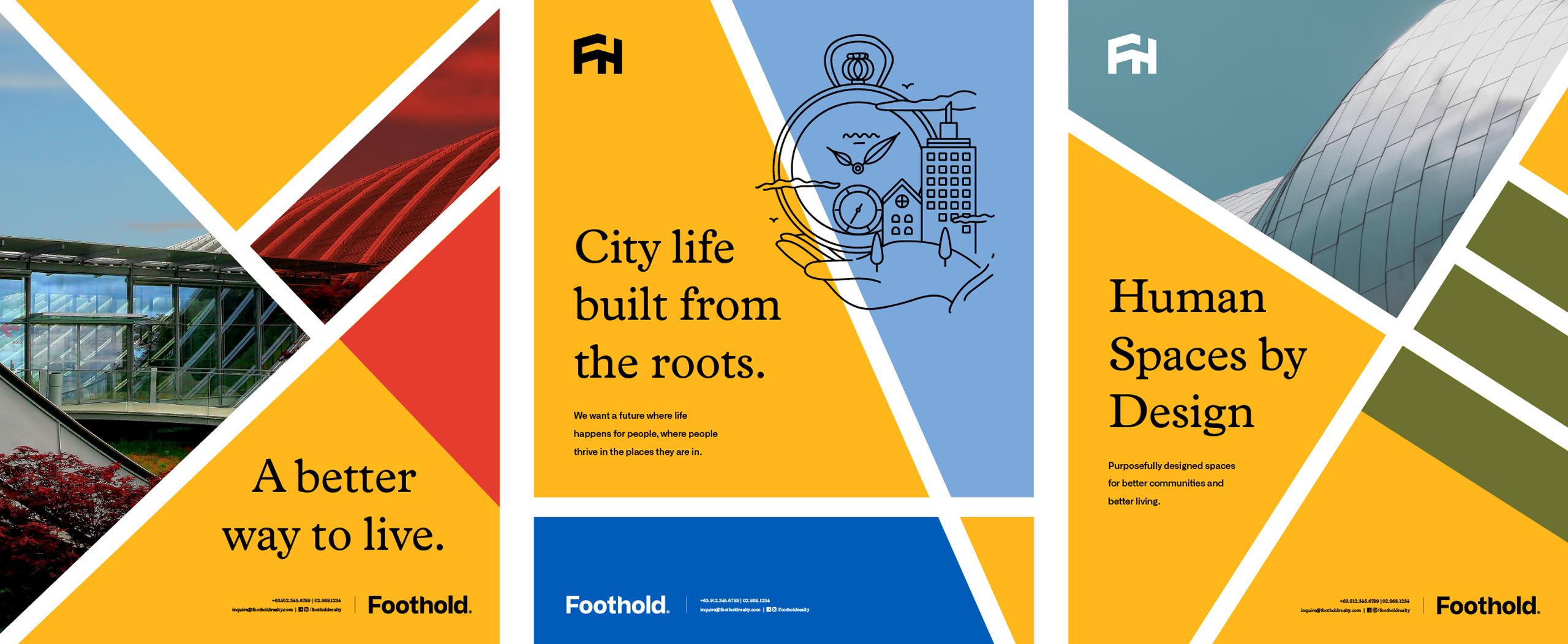
Their vision was clear: to improve the way people lived through intentionally created spaces. Our job was to translate that vision into visuals and words.
"Working with Serious Studio was a breeze. They asked the right questions to find the right answers to our project concerns. They're also fun to work with which is a plus when there are plenty of unknowns to face and deadlines to meet.” — Kyle De Leon, Head of Business Development
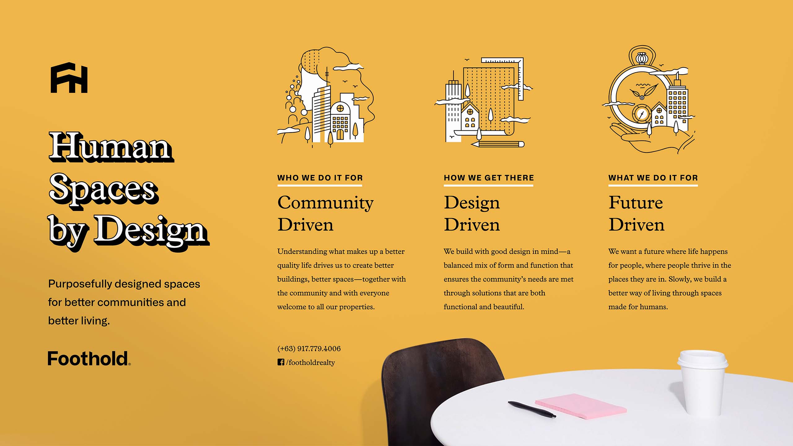
With their many and diverse stakeholders in mind, we were able to determine the three drivers of their philosophy that resonated with everyone: they are community-driven, design-driven, and future-driven. Community-driven, because they are doing it not only for themselves but for their community and everyone involved. Design-driven, because their definition of design is more than just aesthetic but also about designing spaces for the use and purpose of the very people they are built for. Future-driven, because it is their vision of better living for everyone that sets them apart—and dare we say, ahead—of other people in the game.
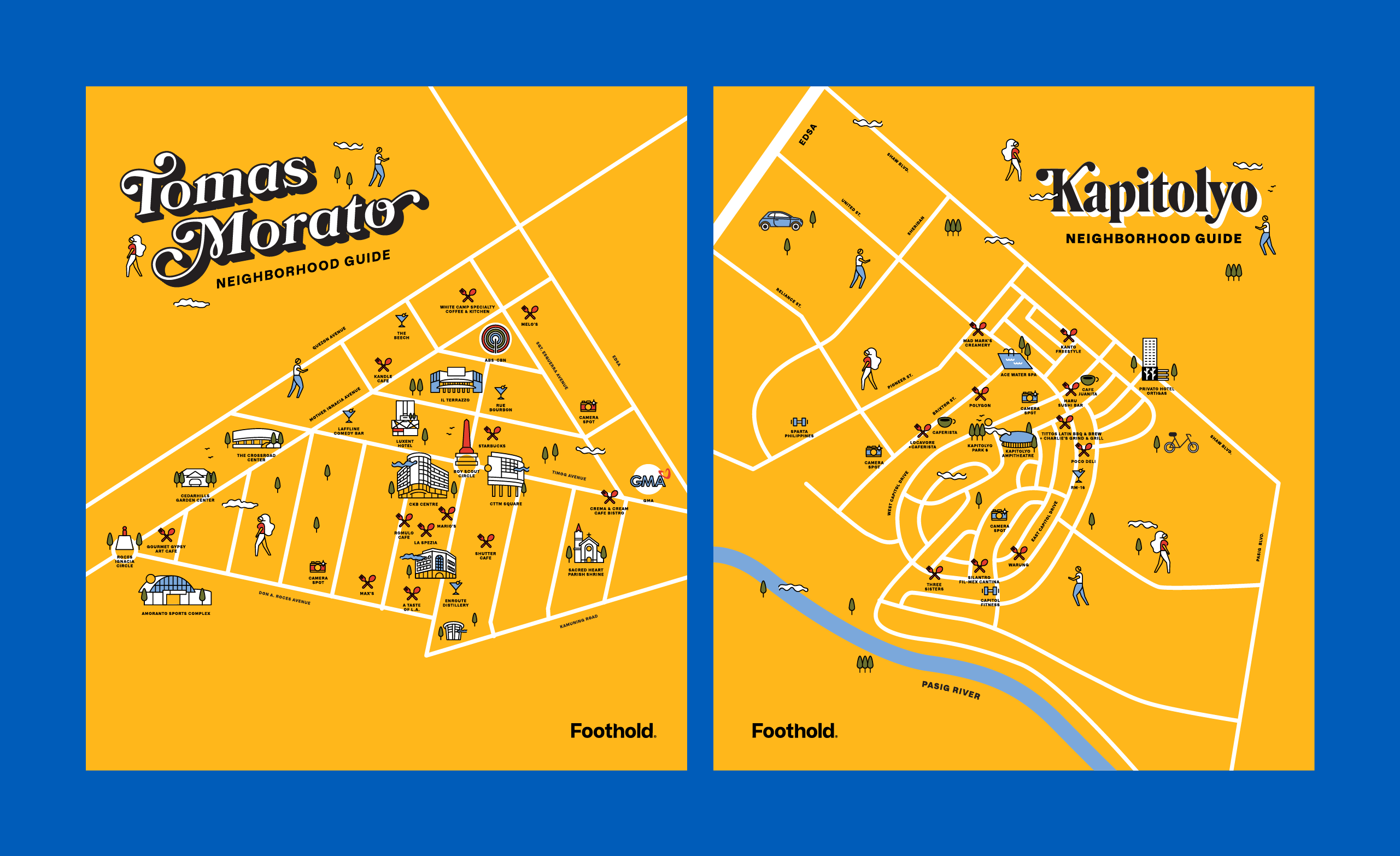
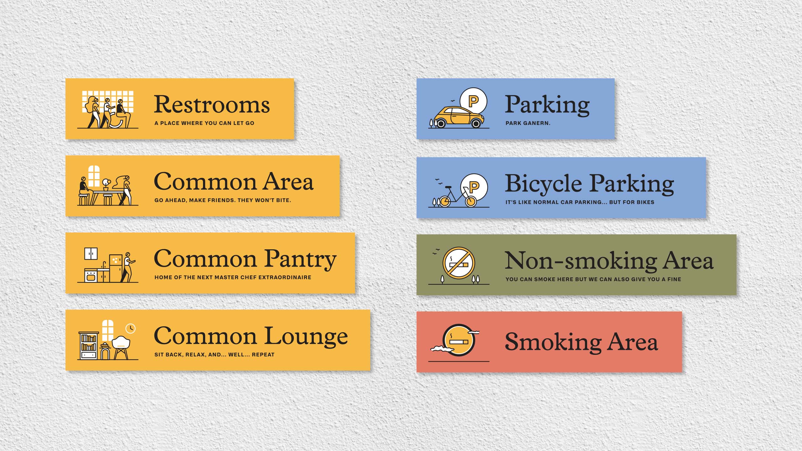
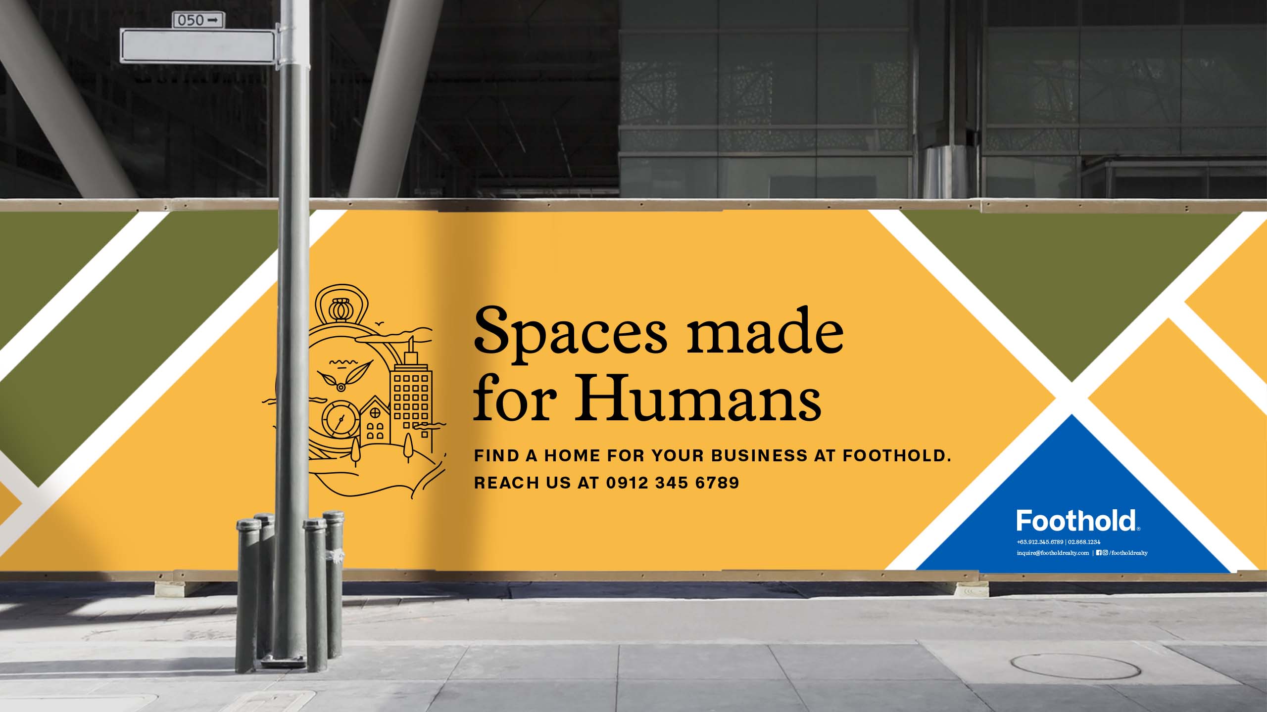
We created wayfinders to help people navigate the different properties, designed with a bit of quirk to brighten up anyone's day. The accompanying community board is designed to be modular, making it easy for tenants and community members to share updates and invites. We also created maps for each neighborhood Foothold's properties are currently in. For Tomas Morato, where Foothold currently has 2 properties, we also designed a signage that will bring even more light and life to the neighborhood.
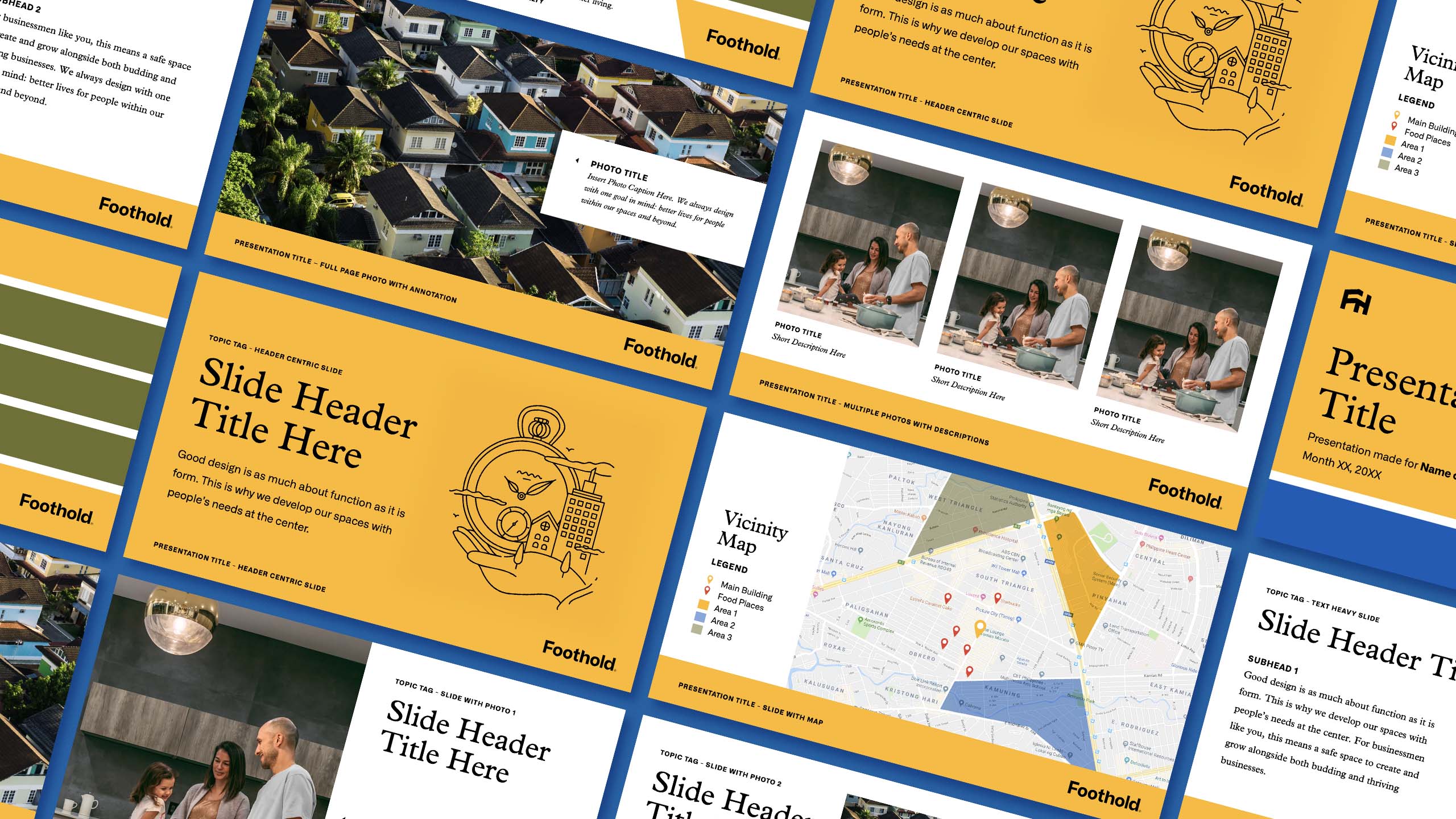
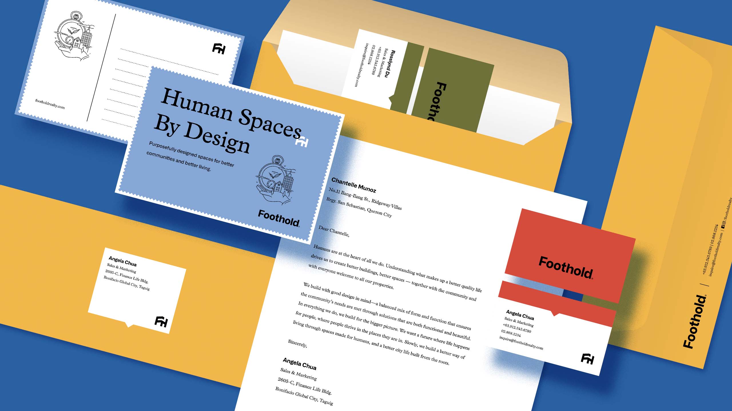
Early on, the Foothold team brought up the importance of being able to communicate the company's core beliefs and purpose to everyone, especially within their own team. To do this, we designed a brand wall that serves as a reminder of the company's bigger purpose. They also asked us to redesign their internal documents and onboarding booklets to make it easier for employees and tenants to read.
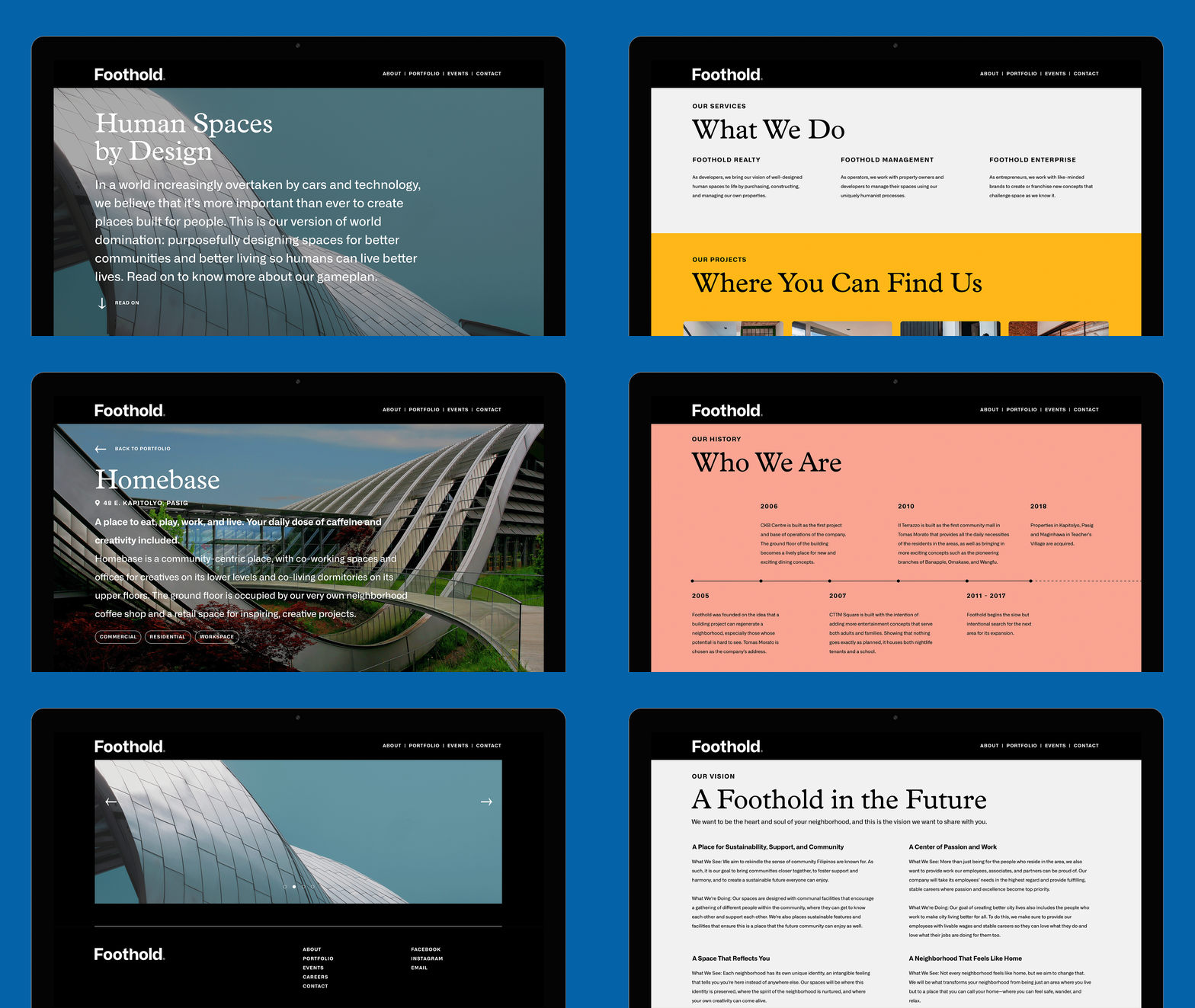
We designed the Foothold site to capture their cohesive vision for their properties and neighborhoods. It serves not only as a portfolio for potential investors and tenants but also as an online resource for their neighborhoods, for the people in it, and for the people beyond.
Today, Foothold continues to build human-centric spaces across the metro in the hopes of making urban living better for its countless residents and workers. In addition to its portfolio of commercial spaces, it is currently developing mixed-use buildings that include residential and office spaces and is planning to create cultural spaces in the near future.
