NIFTY STORE PHILIPPINES BRANDING
Discover a Smarter Life
BRANDING SCOPE
Brand Strategy
Brand Naming
Brand Identity
Copywriting
Environment Design
OVERVIEW
Nifty is a multi-brand tech store dedicated to the vision of a smarter life. Its showcase of products guides you through innovative ways of smarter living, smarter travel, smarter wellness, smarter sound and more. In a world that is constantly transforming to be more complex and fast-paced, Nifty invites you to live, move, explore, and play with innovative technology.
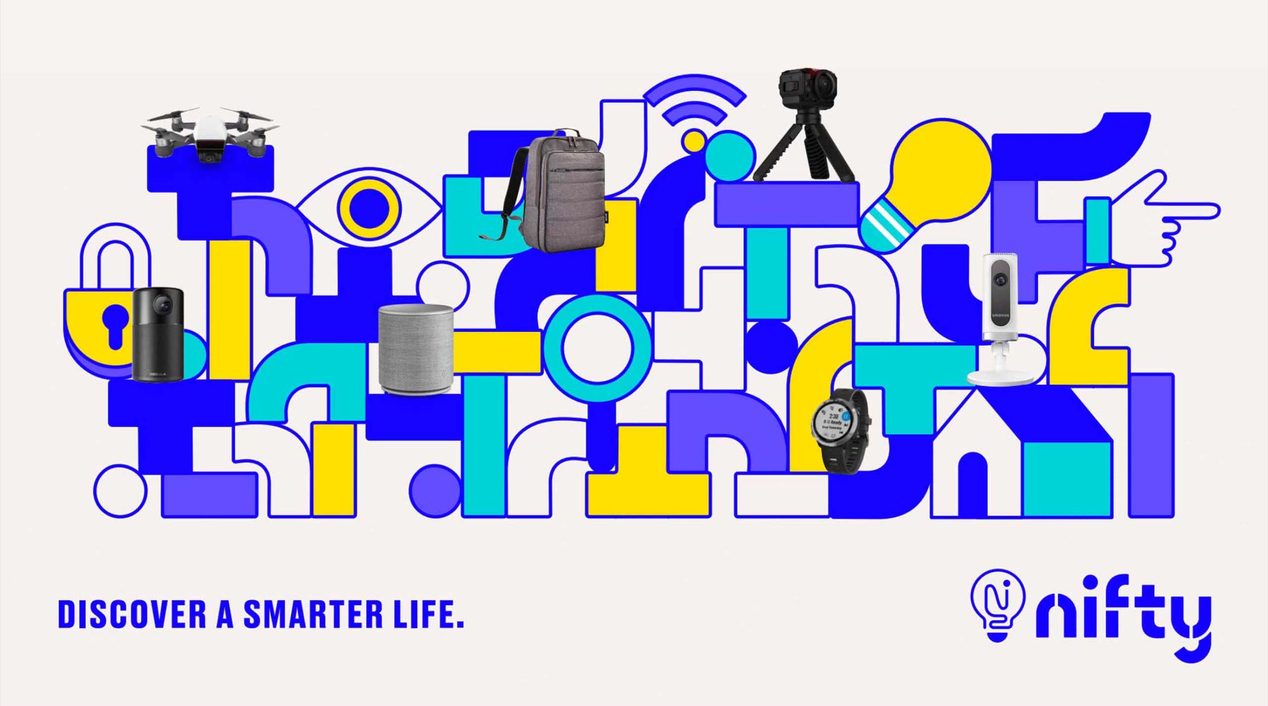
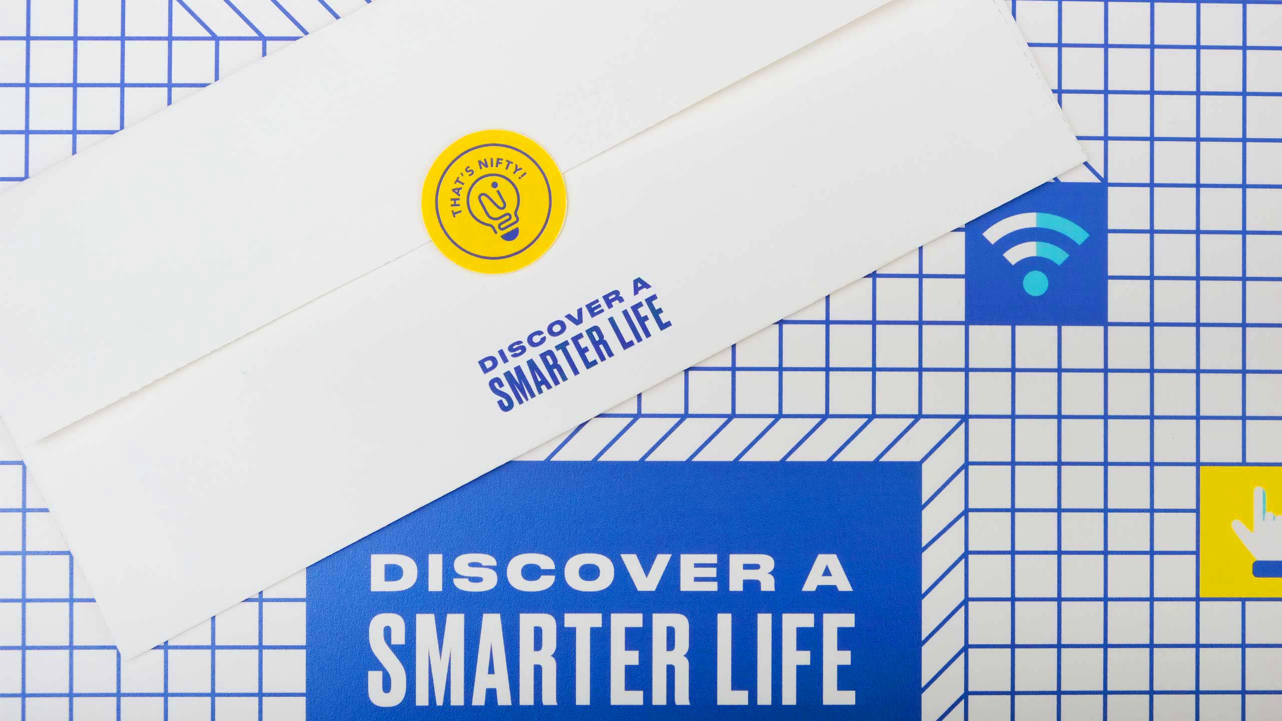
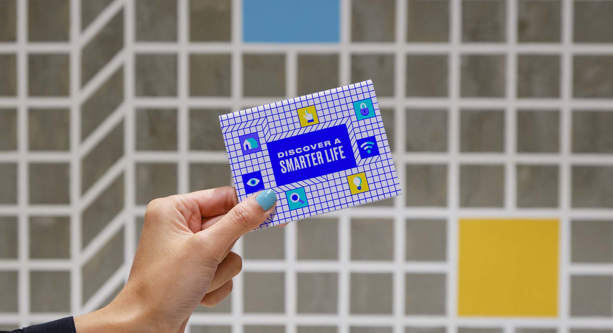
We had a clear goal: design for discovery. We wanted people to step into the store, freely experience the brand, tinker with a product and say, "Hey, that's Nifty!" With that in mind, we developed the visual identity of the brand: bold and fun to pique your curiosity.
MORE INFORMATION
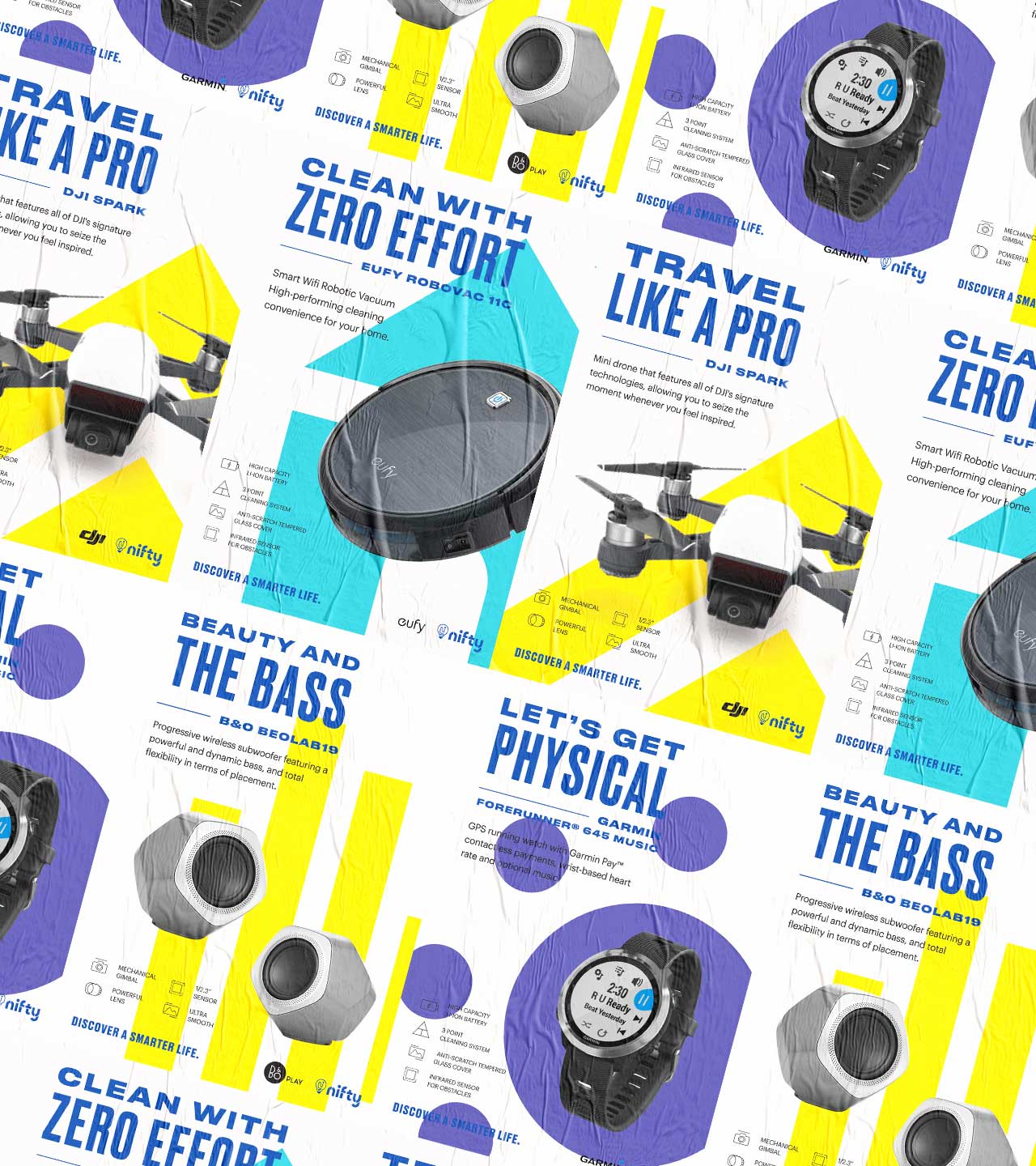
Nifty wanted to talk to the "tech-curious:" those who may not be naturally tech-savvy but have a budding interest in technology. We found that technology could be intimidating especially to the average customer. We had to understand what was important to Nifty's market, from the store experience to the way it marketed its wide selection of products.
Through a study of market insights and interviews, we came to realize that the market cared about three things: function, trustworthiness, and benefit. Ticking the boxes of function and trust meant striking the perfect balance between expertise and human warmth. When it came to benefit, it meant communicating a product's worth and value in a way that mattered to the everyday consumer. But how? The key was in the idea of discovery. The brand needed to inspire curiosity and wonder, allowing the customers to discover a smarter life for themselves.
Through a study of market insights and interviews, we came to realize that the market cared about three things: function, trustworthiness, and benefit. Ticking the boxes of function and trust meant striking the perfect balance between expertise and human warmth. When it came to benefit, it meant communicating a product's worth and value in a way that mattered to the everyday consumer. But how? The key was in the idea of discovery. The brand needed to inspire curiosity and wonder, allowing the customers to discover a smarter life for themselves.
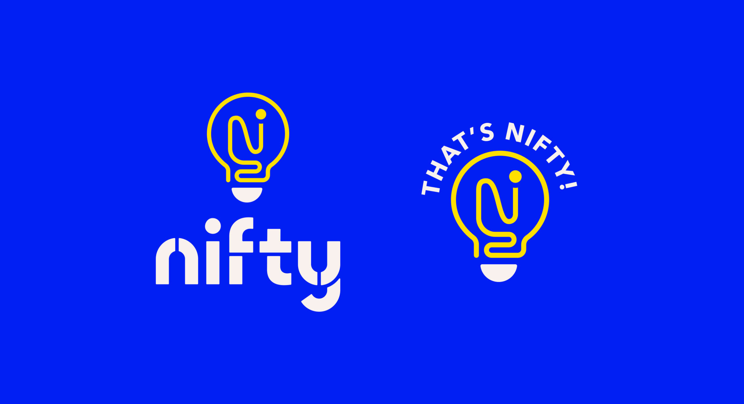
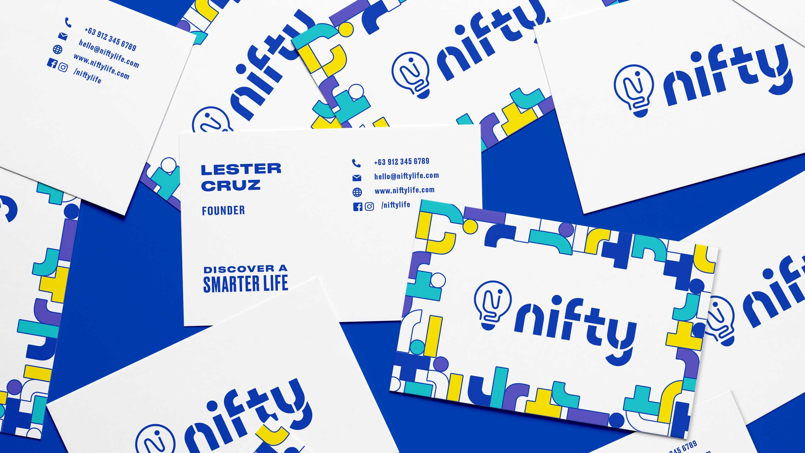
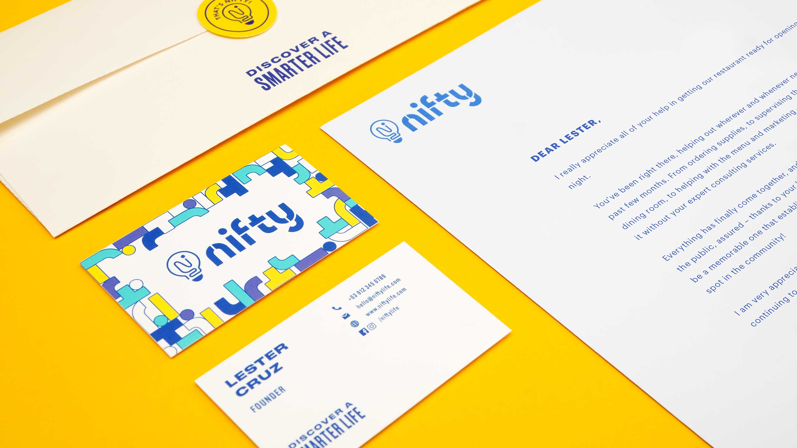
The brand's logo icon, meant to depict a light bulb moment, was inspired by the name which was derived from the saying: "that's nifty!"
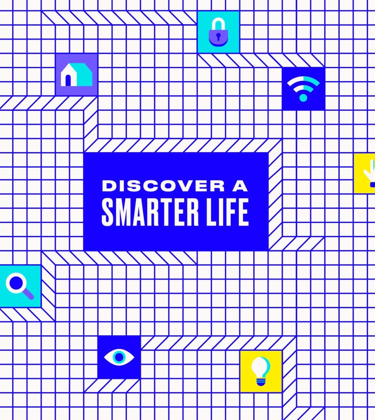
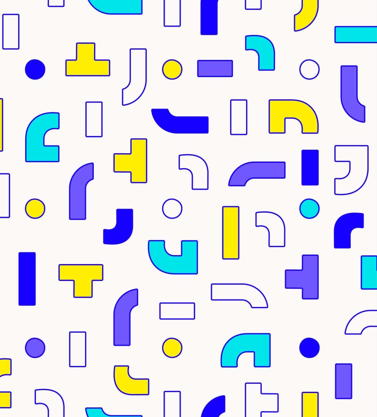
We developed Nifty's visual identity based on the concept of building blocks, inspired by the idea of building a smarter life with tech. This was also a reflection of the modular approach to the brand system, akin to how technology can fit into our lives in different ways—whether it’s to live, explore, move, or play smarter.
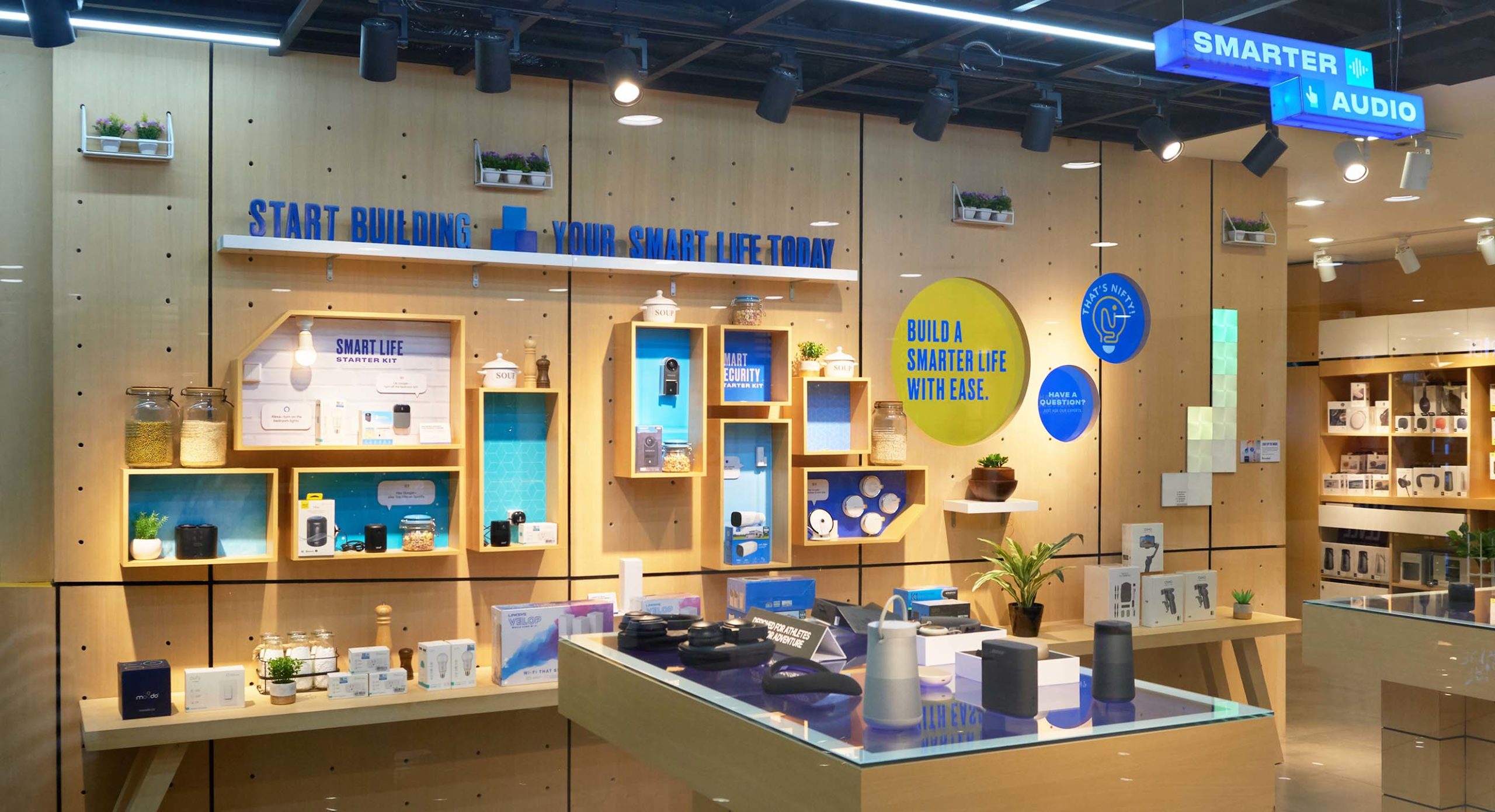
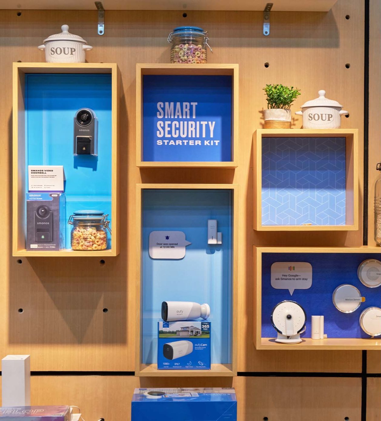
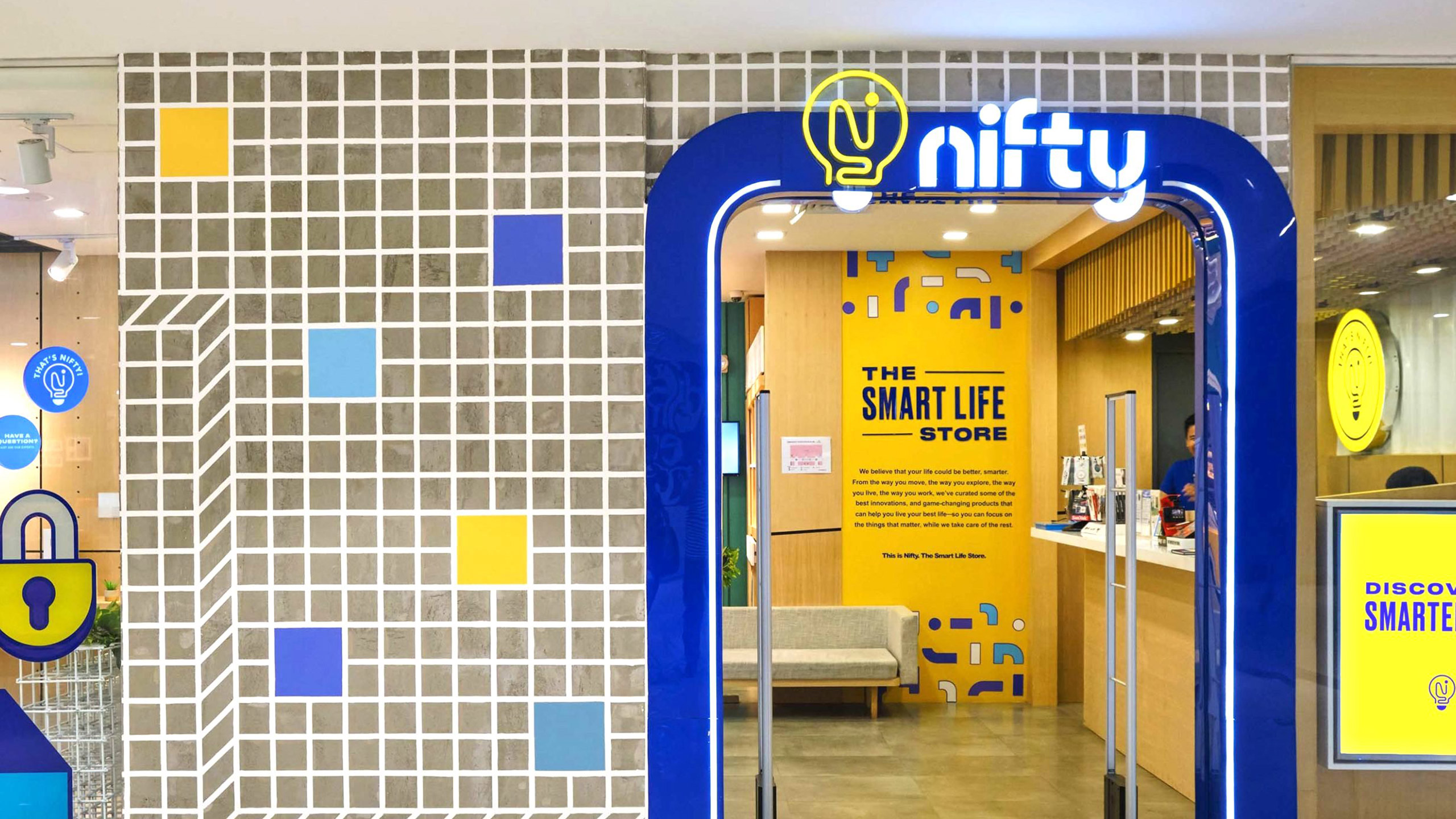
We were consultants for the brand's environment and helped design key areas of the space. We made sure the design encouraged discovery and enabled customers to be fully immersed in the store experience. The space was then executed by One Zero Design Co.
Nifty currently has two stores: one in Robinsons Ermita and the other in SM Megamall, offering the latest and greatest in smart technology. Since the brand's launch, the Nifteam continues in its pursuit of a smarter life, one store at a time.
Make Sense & Look Good®. Made by Serious People. Creating brands that shape tomorrow, today. Boring is the Enemy. Humans deserve nice things™. Seriously. Hi Mom. Success is found in the details. With great budgets come great work. We are known to make brands human. We enjoy creating brands from the ground up. Great brands invest in great design. Ugly brands don’t care about people. Your brand could always be better. Trust us. Branding is like mind control, but cooler. We will tell you if you have food stuck in your teeth. For a relaxing time, make it Suntory time. Make Sense & Look Good®. Made by Serious People. Creating brands that shape tomorrow, today. Boring is the Enemy. Humans deserve nice things™. Seriously. Hi Mom. Success is found in the details. With great budgets come great work. We are known to make brands human. We enjoy creating brands from the ground up. Great brands invest in great design. Ugly brands don’t care about people. Your brand could always be better. Trust us. Branding is like mind control, but cooler. We will tell you if you have food stuck in your teeth. For a relaxing time, make it Suntory time. Make Sense & Look Good®. Made by Serious People. Creating brands that shape tomorrow, today. Boring is the Enemy. Humans deserve nice things™. Seriously. Hi Mom. Success is found in the details. With great budgets come great work. We are known to make brands human. We enjoy creating brands from the ground up. Great brands invest in great design. Ugly brands don’t care about people. Your brand could always be better. Trust us. Branding is like mind control, but cooler. We will tell you if you have food stuck in your teeth. For a relaxing time, make it Suntory time. Make Sense & Look Good®. Made by Serious People. Creating brands that shape tomorrow, today. Boring is the Enemy. Humans deserve nice things™. Seriously. Hi Mom. Success is found in the details. With great budgets come great work. We are known to make brands human. We enjoy creating brands from the ground up. Great brands invest in great design. Ugly brands don’t care about people. Your brand could always be better. Trust us. Branding is like mind control, but cooler. We will tell you if you have food stuck in your teeth. For a relaxing time, make it Suntory time.