SNAPCHAT MERCHANDISE GRAPHIC DESIGN
Snapchat:
Capture every moment
BRANDING SCOPE
Creative Direction
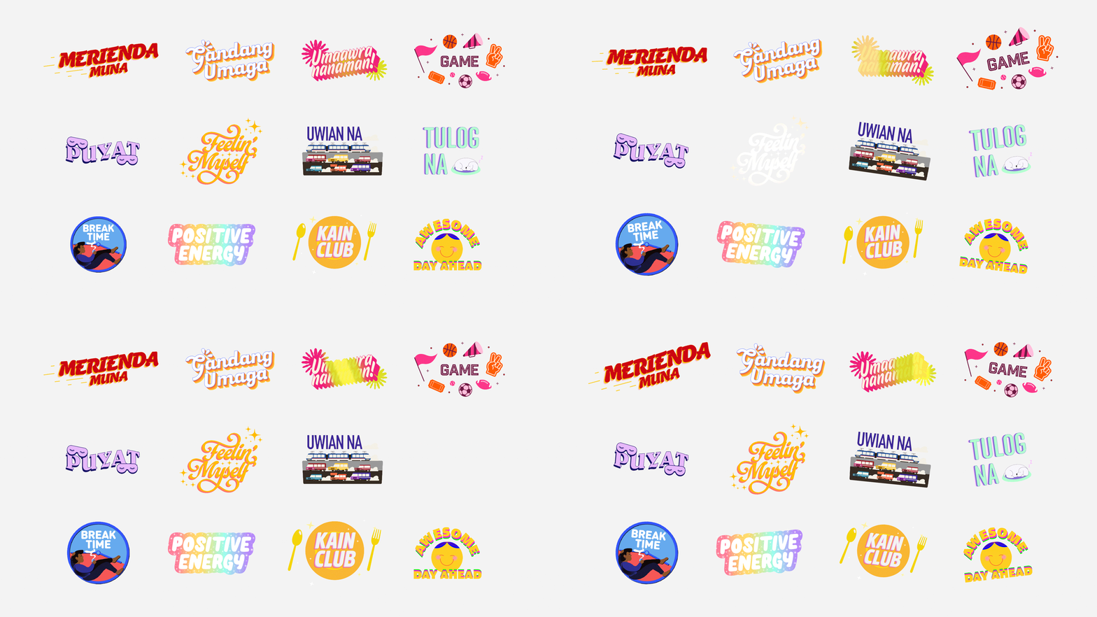
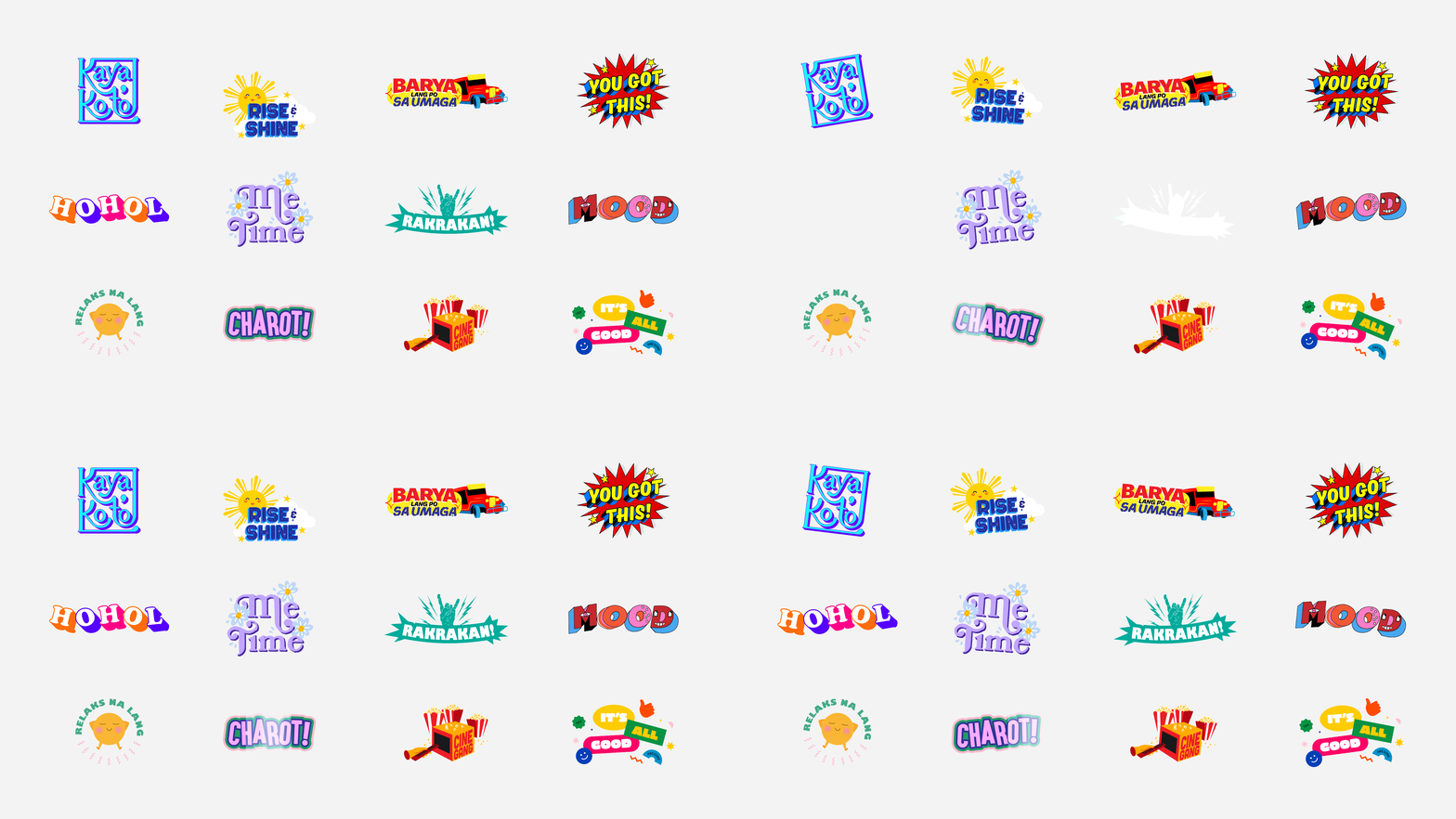
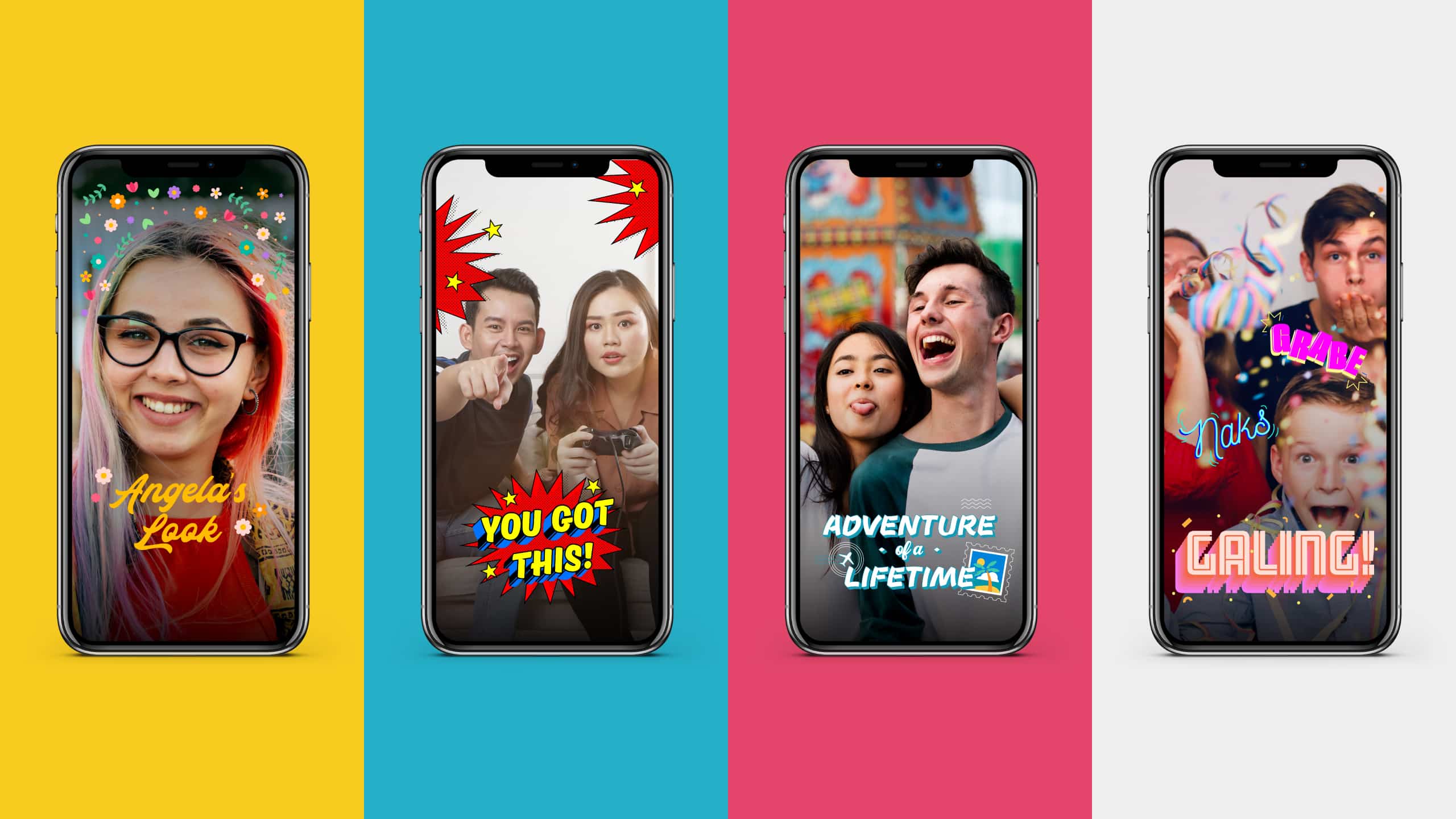
Filter & Sticker Designs
OVERVIEW
Snapchat is a unique way to capture the moment. It connects you to your friends and the world. Whether that connection be to talk, share, or play, there's a filter and sticker for any kind of mood made just for you.
MORE INFORMATION
THE CHALLENGE
When the team behind Snapchat approached us to create a set of filters and stickers unique to the Philippines, we were excited. Filters and stickers are key elements to the Snapchat user experience, and add an element of fun and surprise to each photo. However, another layer to this design challenge was these filters and stickers had to be localized. This meant using imagery and jargon that spoke to the Filipino audience. With this in mind, we had two major considerations:
1. Match Snapchat's playful tone; follow the brand's best practices
2. Ensure that the filters and stickers appeal to the local market.
2. Ensure that the filters and stickers appeal to the local market.
THE STRATEGY
Before we began, we studied how filters and stickers worked in-app, listing down best practices to take note of for when we designed our own. We noticed that layout and placement, although could be easily overlooked, played an important part in the design. We also took note that it's vital that the visuals match the copy or statement of the filter and sticker to give them proper context.
When it came to the localization of these materials, it was easy enough to incorporate modern colloquial Tagalog words. Apart from this, for some filters and stickers we chose to use distinct local imagery such as the jeepney or a plate of longganisa and eggs, which is a common Filipino breakfast dish. These thoughtful cues helped add a bit of local flair to the Snapchat filters and stickers.
Equipped with our insights, we were able to address the two needs of this project. Other than that, we had complete freedom. The fun part was we were only limited by our own creativity. In terms of the overall look of each material, we had free reign so we made sure to keep things vibrant, playful, and exciting.


Make Sense & Look Good®. Made by Serious People. Creating brands that shape tomorrow, today. Boring is the Enemy. Humans deserve nice things™. Seriously. Hi Mom. Success is found in the details. With great budgets come great work. We are known to make brands human. We enjoy creating brands from the ground up. Great brands invest in great design. Ugly brands don’t care about people. Your brand could always be better. Trust us. Branding is like mind control, but cooler. We will tell you if you have food stuck in your teeth. For a relaxing time, make it Suntory time. Make Sense & Look Good®. Made by Serious People. Creating brands that shape tomorrow, today. Boring is the Enemy. Humans deserve nice things™. Seriously. Hi Mom. Success is found in the details. With great budgets come great work. We are known to make brands human. We enjoy creating brands from the ground up. Great brands invest in great design. Ugly brands don’t care about people. Your brand could always be better. Trust us. Branding is like mind control, but cooler. We will tell you if you have food stuck in your teeth. For a relaxing time, make it Suntory time. Make Sense & Look Good®. Made by Serious People. Creating brands that shape tomorrow, today. Boring is the Enemy. Humans deserve nice things™. Seriously. Hi Mom. Success is found in the details. With great budgets come great work. We are known to make brands human. We enjoy creating brands from the ground up. Great brands invest in great design. Ugly brands don’t care about people. Your brand could always be better. Trust us. Branding is like mind control, but cooler. We will tell you if you have food stuck in your teeth. For a relaxing time, make it Suntory time. Make Sense & Look Good®. Made by Serious People. Creating brands that shape tomorrow, today. Boring is the Enemy. Humans deserve nice things™. Seriously. Hi Mom. Success is found in the details. With great budgets come great work. We are known to make brands human. We enjoy creating brands from the ground up. Great brands invest in great design. Ugly brands don’t care about people. Your brand could always be better. Trust us. Branding is like mind control, but cooler. We will tell you if you have food stuck in your teeth. For a relaxing time, make it Suntory time.