An exercise in exploring our Filipino identity through typography.
Article originally published in The Serious Review
The recent SEA Games 2019 held in the Philippines last December has met a lot of controversies. Designers and non-designers alike have put in their various two centavos’ worth when it came to its brand identity. A range of sentiments has been voiced out from the molecular blob whatchamacallit logo to the questionable brand executions. People have chimed in and designed their own versions to show how the design could have been better or more intentional. It seemed that people did not feel well represented with the identity; not to mention the fact that the Philippines hired an international agency to represent our Filipino identity. A frustrating sentiment begrudges many of us: can we root for ourselves and for our talents for once?
This recent event brings us back to the ever-elusive question of “What does the Filipino identity even look like?” It feels as though the Philippines has been cursed with an identity crisis… so where do we even begin?
But as the cliche goes, we begin with each other.
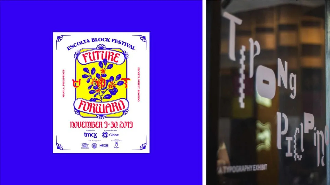
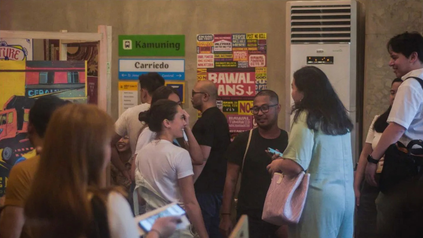
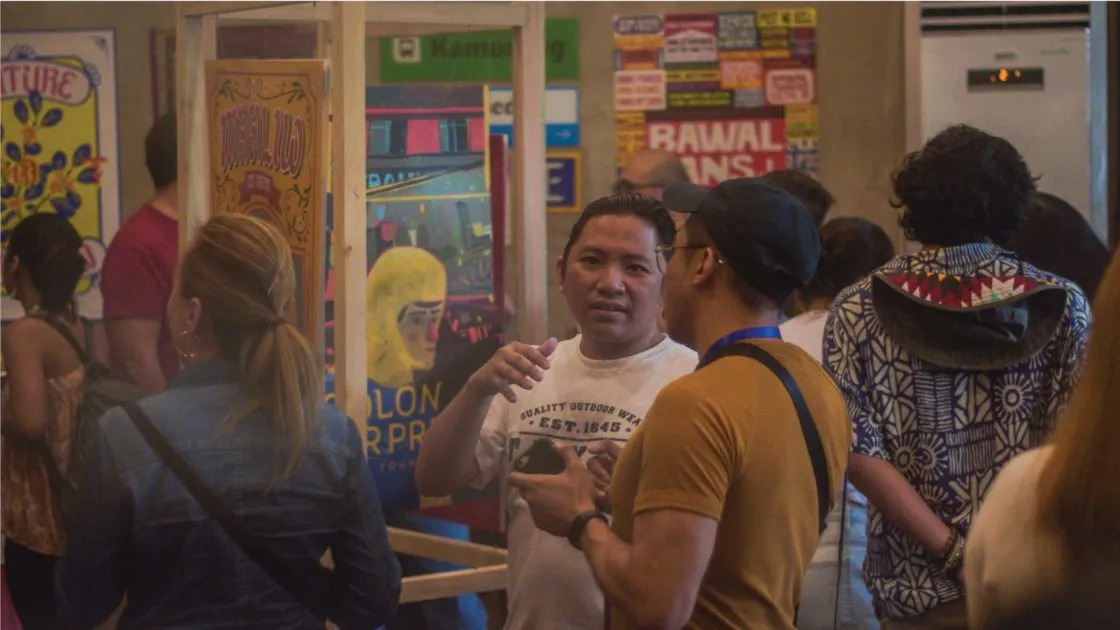
Small groups and communities have been creating ripples of impact. One such community is the Escolta Block who has been constantly hard at work in preserving Escolta as a thriving creative community. We were invited by the Escolta team to participate in their event called Tipong Pilipino, an exhibit that allowed each participant to create Filipino custom type that reflects their region.
Hailing from Metro Manila, we had to come up with a font that best represents this metropolitan area. On the surface, it is so easy to define the area by its traffic, its bad governance, horrible urban planning. The list goes on as long as the EDSA traffic on a rush hour Friday. But in the nooks and crannies of the everyday, pockets of beauty sprawl throughout. It comes in the form of the people who have promoted action with passion, imbued with the persevering spirit of desire despite the despair.
And that was the keyword—desire, a word that embodies a deep longing for something or someone that may or may not be attainable. Loving the Philippines is like going through a painful journey that can disappoint, but over and over hoping for the better. This undying dedication and love has been long present, and at one point in time, it was expressed through the kundiman.
The kundiman is a traditional means of serenade in the Philippines, a humble profession of love with the admirable willingness to go all in and all out. Said to be a contraction of the Tagalog words Kung Hindi Man (if it’s not meant to be), this generous vulnerability has produced painfully poetic lyrics slowly, rhythmically and gently flowing to the hearts. Written as if for a lover but dedicated to the country, there is beauty in knowing that revolution can come in the form of romanticism; that war can be waged with words of wisdom; that love is triumphant over hatred and deceit. That is it. That is what we wanted to do. That is what we wanted it to feel. We wanted to fight back with beauty, and to do it with the undying passion that yearns for better.

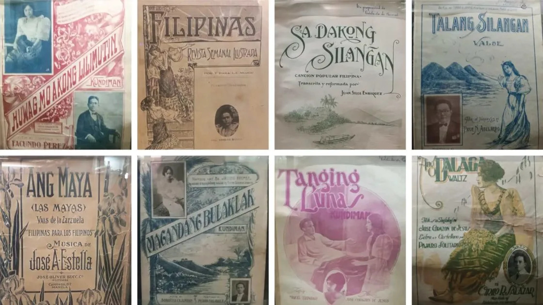
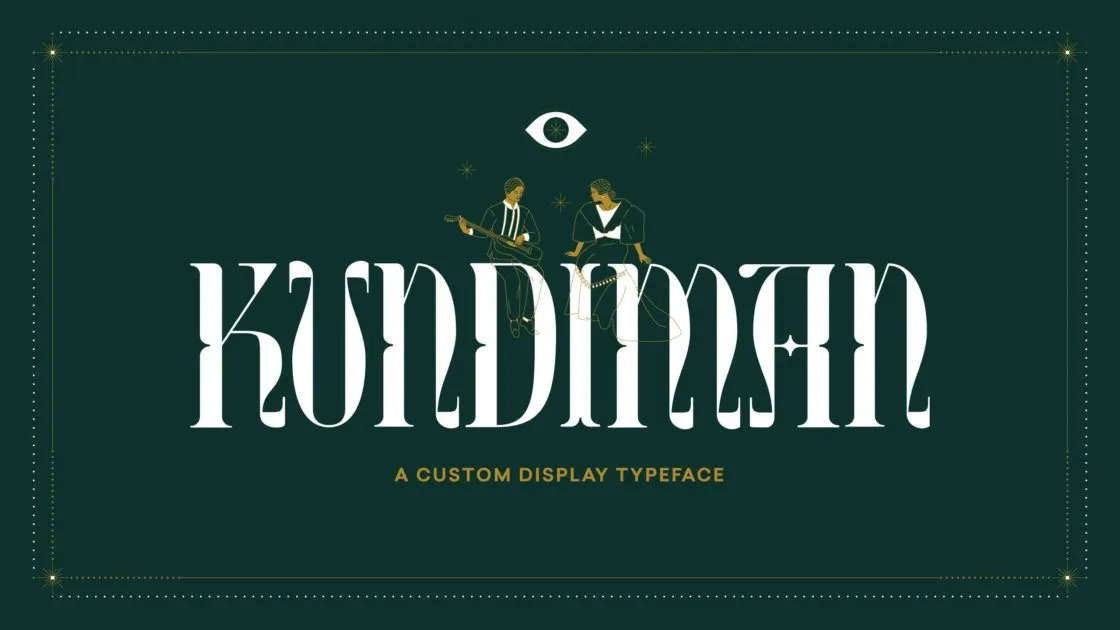
The letterforms were inspired by a trip to Calvo Museum, where an archive of kundiman and Filipino sheet music covers are carefully displayed behind a glass wall. One can admire an array of beautiful Tagalog-titled words set in stylized letters and accompanied by detailed illustrations. Contrasts between sharp, heavy strokes and thin, delicate swooshing lines romantically create tension and release within each letter. The stylish intricacy of the letters and the details of the sheet music cover designs allow for slow reading and viewing, allowing one to take their time to appreciate and digest the details and intention behind each line, curve, and shape. It was noticeable how each cover on exhibit was once handled and designed with consideration and attention. And in that same vein, it reflects the same amount of attention and awareness required to enjoy a kundiman song sinking deeply into the essence of hearts and minds.
Taking cues from this beautiful genre of Filipino love songs, Kundiman Display is characterized by romantic swashes, delicate ornamentality, and graceful intricacies. We envisioned our work to serve as a love letter to the Philippines — an expression of hope and desire for a country that deserves more.
Hence, for the exhibit, we applied the Kundiman font into a poster inspired by kundiman sheet music covers. We chose Nicanor Abelardo’s “Bituing Marikit” (Beautiful Star) to best represent our take on Metro Manila. The first line, “Bituing marikit sa gabi ng buhay” (Beautiful star amidst the darkness of life), perfectly encapsulates the romantic hopefulness that we have for our country. It is a longing that is hard to reach but never out of sight. The words are bordered by a window, an invitation to gaze upon a view of vastness and opportunity. Accompanied by the words in the poster is intricate line work, delicately designed and intentionally embellished. The ornate quality of the poster attempts to revive the art of slowness; that in a busy and bustling Metro Manila, it is an important reminder to stop and smell the sampaguitas—to sense the fragrance among the mess, to find the delicate beauty hidden within the corners of disappointing design decisions.
The production of the poster was equally as important as the design. In partnership with KolourPro, a print studio specializing in both digital and large format prints, we had the poster printed with gold foil details so that it shines bright amidst the darkness, a visual and tactile expression of a beautifully written piece. It was important for us to represent our Filipino type with dignified sophistication, not for the sake of mere elegance but to take pride in our capacity to craft things of refined quality. It has always been a Filipino feat that is often overlooked and underestimated, sometimes by our own.
Our Kundiman Display project is only one of many featured in the Tipong Pilipino exhibit. It was placed alongside the other works of designers and studios who wholeheartedly shared their interpretations of Filipino-inspired type. To have an exhibit that displays this range of culturally driven type brings a light of optimism that Filipino design is well-alive and thriving. When these artworks are collectively displayed, encouraged and celebrated, attention is commanded, cultural impact is multiplied, stronger communities are formed and new ideas are welcomed. The impact of little individuals, groups and communities rallying together towards the same vision and purpose amplifies multiple voices into a resounding unison—diverse yet harmonically in sync.
So we go back to the question: “What does the Filipino identity even look like?” Maybe the answer to it is that it remains a question, and that’s okay. Discovering and unraveling Filipino identity is a journey inviting us to look, to be more aware, to pay more attention. Our identity could be present in the seemingly ordinary, the oftentimes overlooked and underestimated. But like diamonds in the rough, polishing it and holding it up against the light reveals beauty in many facets. Like our tiny islands, we are not just one thing but many things in one. Our identity then relies on building up each other and on encouraging openness to the idea that our beauty arises from diversity.
Such is the importance of the written word in our identity. Through lines, curves, and shapes, we can breathe life, experience, and culture that are unique to how we perceive our identity. Our type culture gives us a visual voice that can literally speak for us. And when something speaks for us, then we can feel represented, seen, acknowledged. Sure, the power of type may not have the capacity to save lives, but something else comes to life when we know that we are being rooted for—our sense of worth, our sense of belonging. The hope for the future is to compile these Filipino-inspired fonts into a single repository, a Filipino Type Foundry where the public can bear witness of what the many sides of our Filipino identity have to say. Let these fonts, like our many islands, come together to highlight how the narratives within our own communities contribute to the collective identity: transforming, breathing, always full of life.
Special thanks to our paper partner, KolourPro.
Kundiman Display was designed by Serious Studio® and is available to download free for personal use. This typeface cannot be sold or modified. For commercial purposes or use, please email hello@serious-studio.com.
