ABSI BRAND IDENTITY CAMPAIGN
Above and Beyond Service Innovation
BRANDING SCOPE
Brand Identity
Brand Strategy
Copywriting
OVERVIEW
ABSI is a business process solutions company under the subsidiary of Asticom Technology Incorporated, providing business partners with Above and Beyond Service Innovation to make growing easier.
MORE INFORMATION
The BPO industry is definitely one which is often misunderstood. With the stigma and close ties to contact center outsourcing, BPO is often undervalued in the Philippines. ABSI aims to break that mold, and redefine what it means to be a modern day BPO. It's actively shifting the conversation to communicate its relevance today, which is to aid in growth and to make growth easy. How so?
ABSI is more than a mere service provider. It's a partnership. The manner in which it conducts business is both innovative and collaborative in line with its thrust to provide effortless growth through meaningful partnerships. It focuses on big picture growth—in other words, mutual growth for all its stakeholders. We wanted a visual identity that properly conveyed that message and captured what ABSI was: a team of thoughtful visionaries, trusted experts, and committed partners.
ABSI is more than a mere service provider. It's a partnership. The manner in which it conducts business is both innovative and collaborative in line with its thrust to provide effortless growth through meaningful partnerships. It focuses on big picture growth—in other words, mutual growth for all its stakeholders. We wanted a visual identity that properly conveyed that message and captured what ABSI was: a team of thoughtful visionaries, trusted experts, and committed partners.
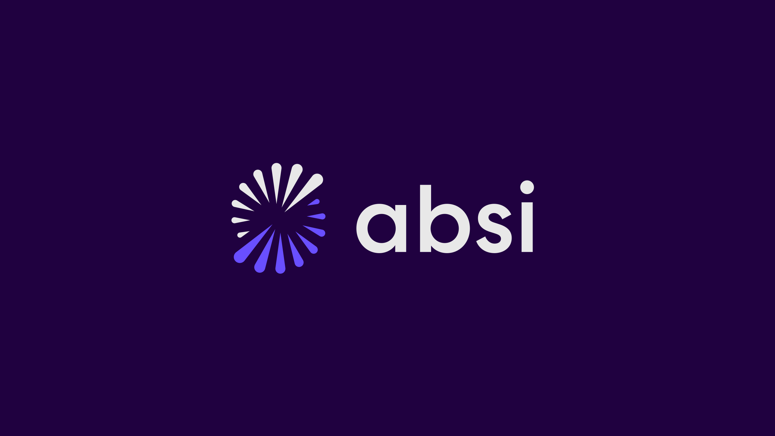
The logo symbolizes ABSI as a growth catalyst, embodying a spark. The circular design represents continuity and progression in growth. While the spark icon is a unified whole, its distinct parts signify the collaboration of various stakeholders, highlighting the company's partnership-driven growth approach.
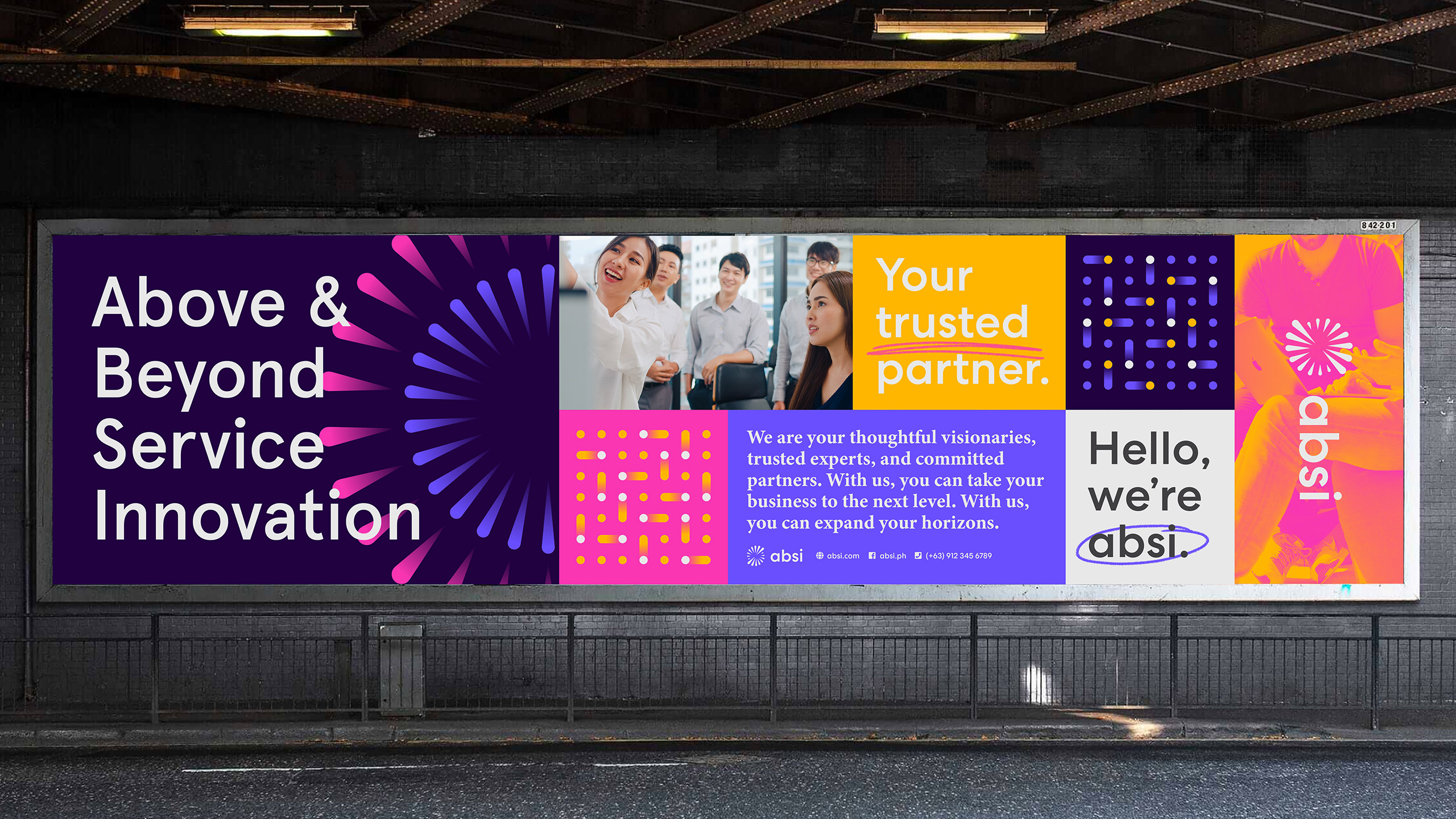
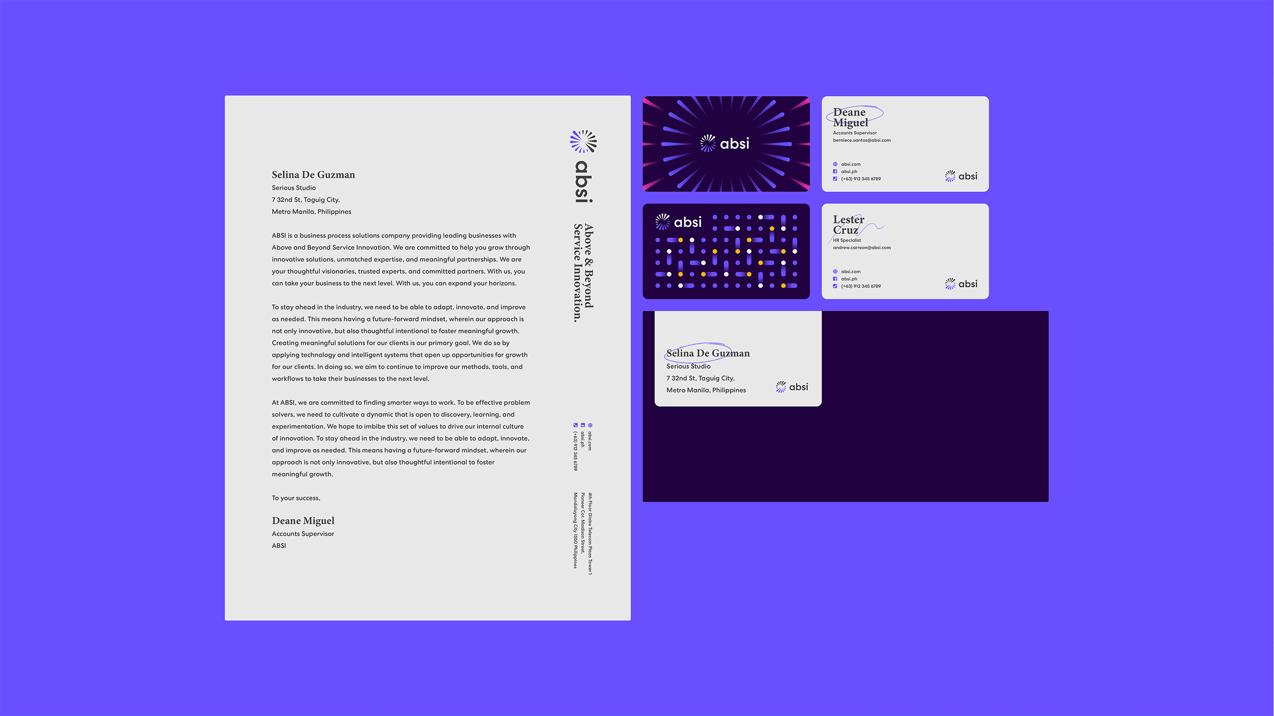
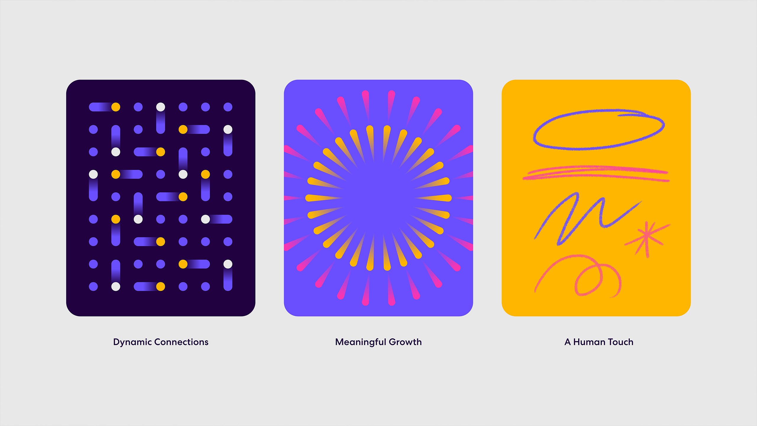
The logo symbolizes ABSI as a growth catalyst, embodying a spark. The circular design represents continuity and progression in growth. While the spark icon is a unified whole, its distinct parts signify the collaboration of various stakeholders, highlighting the company's partnership-driven growth approach.In creating the brand identity, we were careful in making sure it would have a look and feel that would stand out in its industry. Other brands in the BPO space were either bright and loud, or cold and technical—two very opposite ends of the spectrum. We worked on finding the perfect balance between professional and modern, with a human touch. With its strong thrust towards meaningful growth and partnerships, we intentionally created elements to represent these key focal points. The radial sparks, derived from the logo, depicts growth, while the dotted pattern and dynamic strokes depict the human aspect of the brand.


Make Sense & Look Good®. Made by Serious People. Creating brands that shape tomorrow, today. Boring is the Enemy. Humans deserve nice things™. Seriously. Hi Mom. Success is found in the details. With great budgets come great work. We are known to make brands human. We enjoy creating brands from the ground up. Great brands invest in great design. Ugly brands don’t care about people. Your brand could always be better. Trust us. Branding is like mind control, but cooler. We will tell you if you have food stuck in your teeth. For a relaxing time, make it Suntory time. Make Sense & Look Good®. Made by Serious People. Creating brands that shape tomorrow, today. Boring is the Enemy. Humans deserve nice things™. Seriously. Hi Mom. Success is found in the details. With great budgets come great work. We are known to make brands human. We enjoy creating brands from the ground up. Great brands invest in great design. Ugly brands don’t care about people. Your brand could always be better. Trust us. Branding is like mind control, but cooler. We will tell you if you have food stuck in your teeth. For a relaxing time, make it Suntory time. Make Sense & Look Good®. Made by Serious People. Creating brands that shape tomorrow, today. Boring is the Enemy. Humans deserve nice things™. Seriously. Hi Mom. Success is found in the details. With great budgets come great work. We are known to make brands human. We enjoy creating brands from the ground up. Great brands invest in great design. Ugly brands don’t care about people. Your brand could always be better. Trust us. Branding is like mind control, but cooler. We will tell you if you have food stuck in your teeth. For a relaxing time, make it Suntory time. Make Sense & Look Good®. Made by Serious People. Creating brands that shape tomorrow, today. Boring is the Enemy. Humans deserve nice things™. Seriously. Hi Mom. Success is found in the details. With great budgets come great work. We are known to make brands human. We enjoy creating brands from the ground up. Great brands invest in great design. Ugly brands don’t care about people. Your brand could always be better. Trust us. Branding is like mind control, but cooler. We will tell you if you have food stuck in your teeth. For a relaxing time, make it Suntory time.