SUYEN BRAND IDENTITY
Life, Styled
BRANDING SCOPE
Brand Strategy
Brand Identity
Brand Illustrations
OVERVIEW
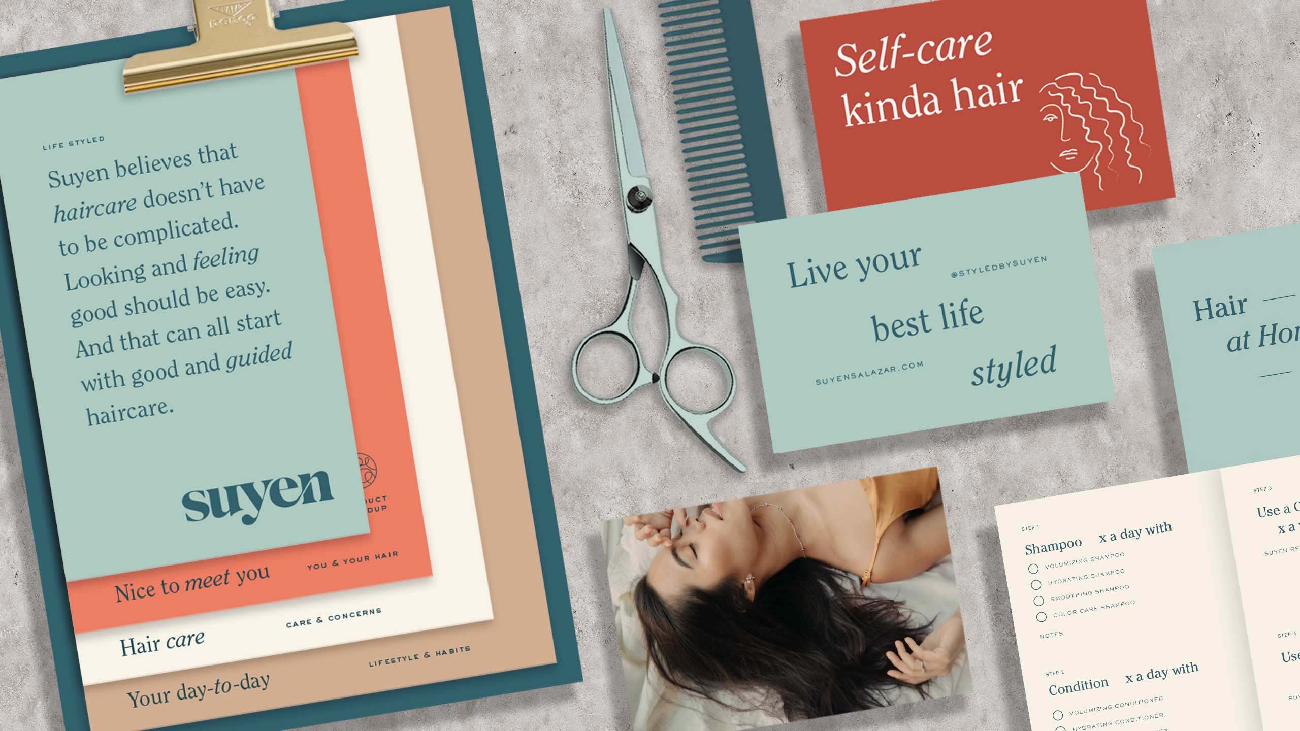
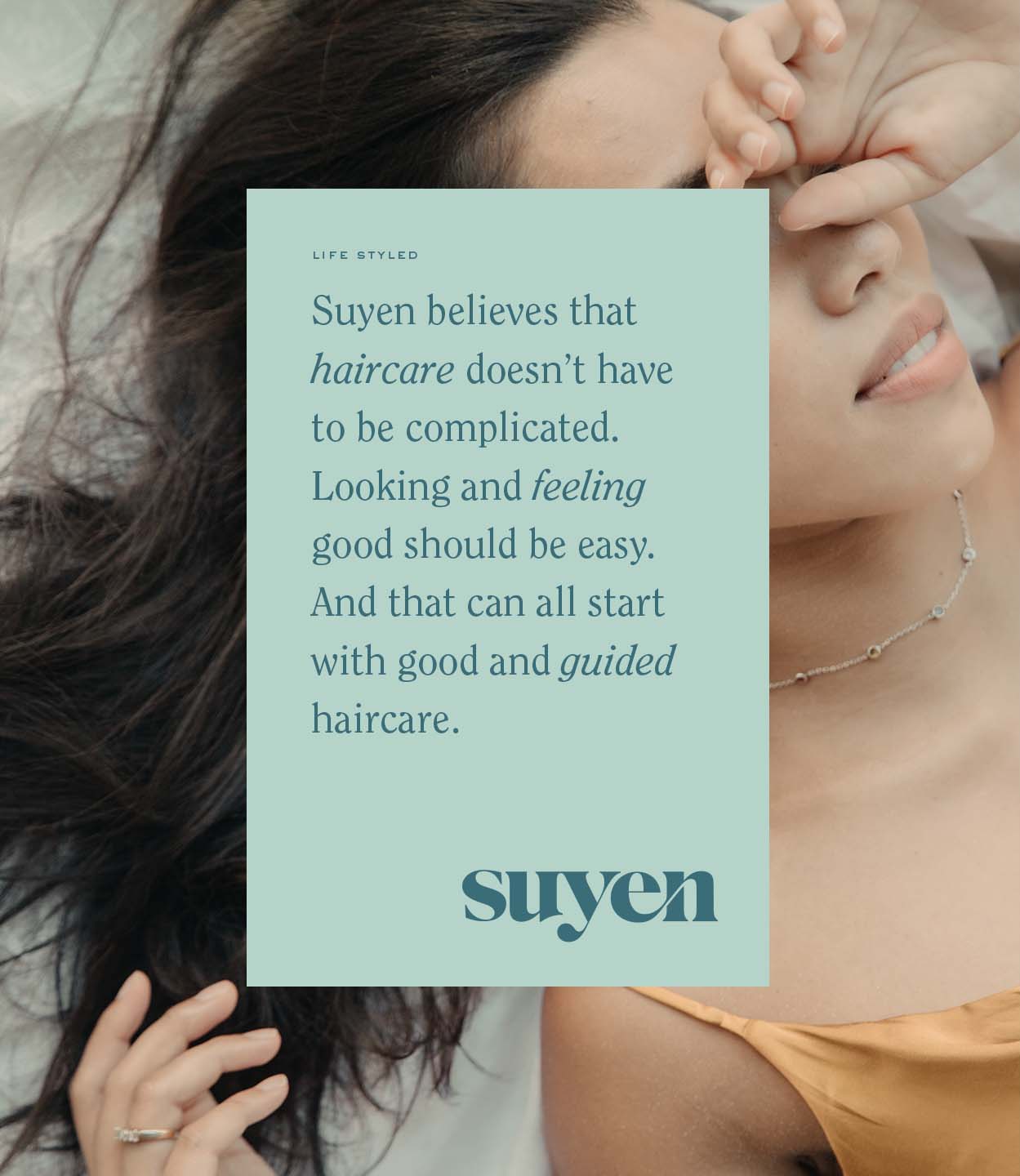
If "Suyen Salazar" rings a bell, it may be because you've seen her works on Instagram feeds of publications, it girls, celebrities, and brands everywhere. Suyen is a hairstylist, and Styled by Suyen is her brand—one that is more than just cutting and styling hair. It's a lifestyle of self-transformation that goes beyond the physical, all thanks to the more guided, careful, and thoughtful approach that encourages people to love their own hair because they understand it and they understand how to care for it.
MORE INFORMATION
THE CHALLENGE
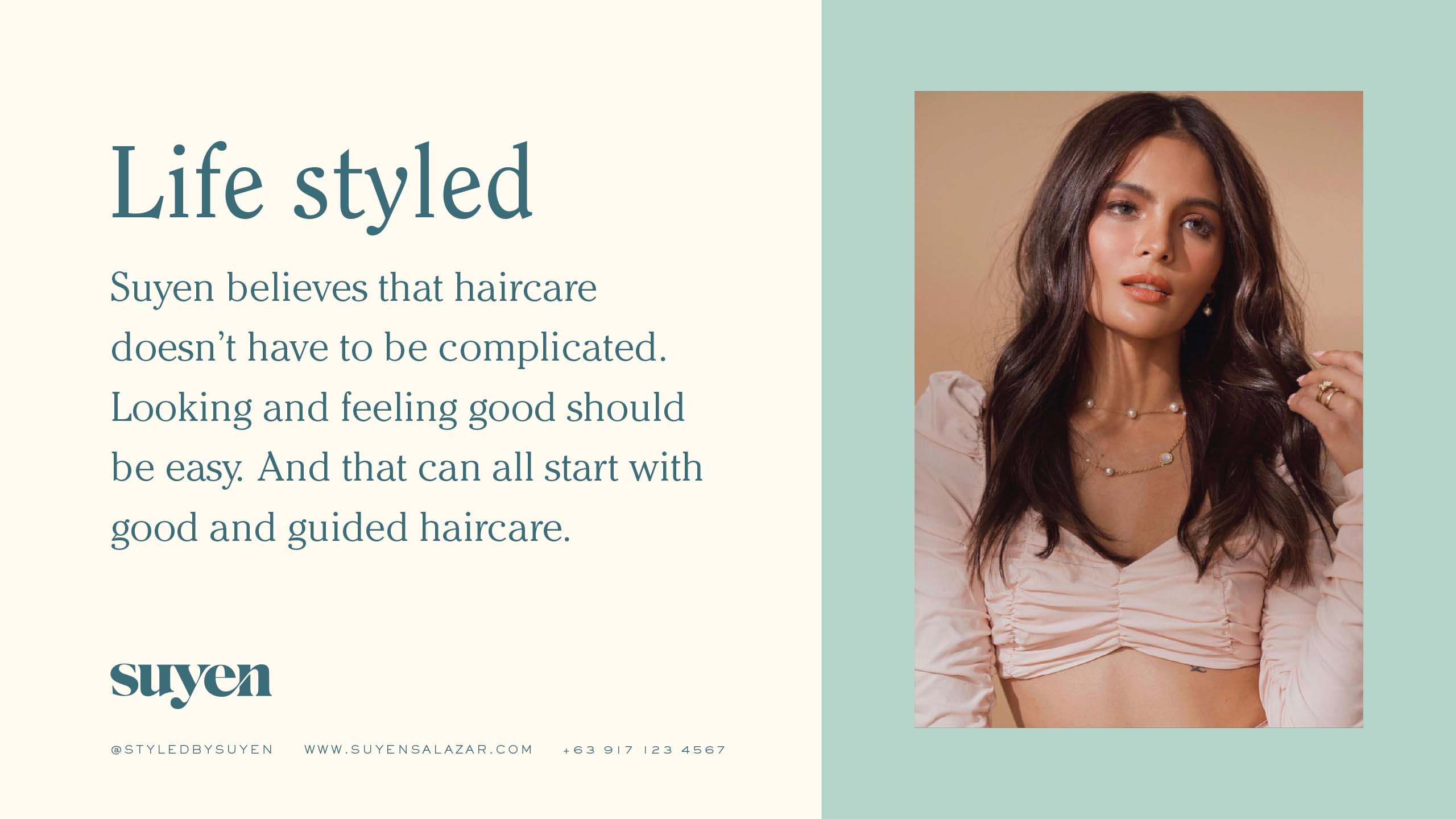
Hair is a huge part of our identities in more ways than one. It goes beyond just a visual representation. It is also a reflection of your culture and a new point of connection. When considering the launch of Suyen's rebrand, we had a bigger ambition: to be more than just another haircare brand that lets people "look and feel good." Together with the client, we believe that haircare shouldn't just end there. So we helped express Suyen's distinctive approach by shifting the conversation from hair outcomes to hair journeys.
THE SOLUTION
By highlighting responsibility, diversity, and wellness, we anchored the brand in a position of approachable aspiration. Our goal was for people to go to Suyen for more than just great hair. We wanted to show that great hair is only achievable when it's guided. We rooted the brand's visual sensibilities to the hairstylist herself, using elements that are reflective of a carefree yet cool attitude. We took cues from LA's coastal style, NYC's unpredictability, and PH's sociability—all three were instrumental in Suyen's career growth and her personality as a person.
PROCESS
PROCESS
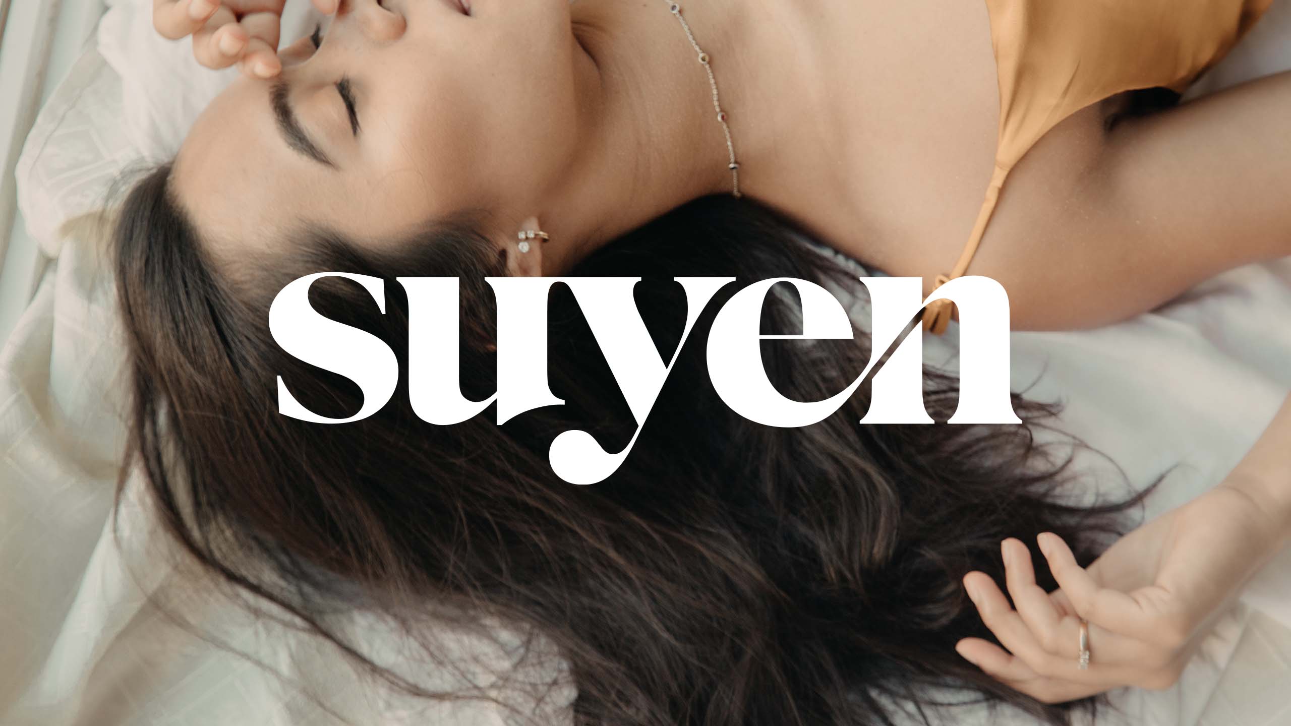
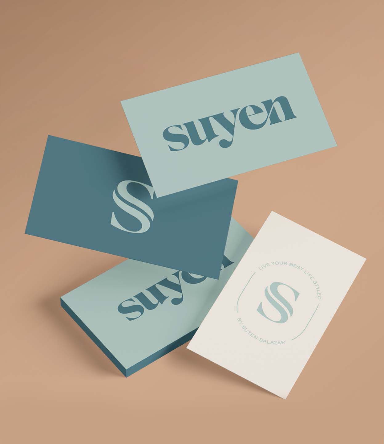
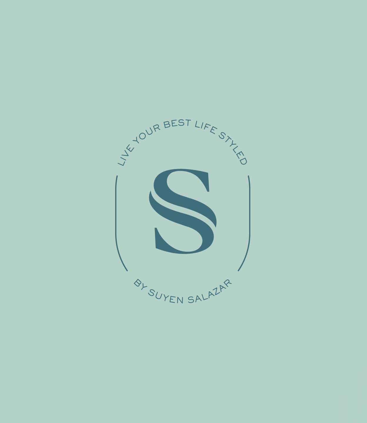
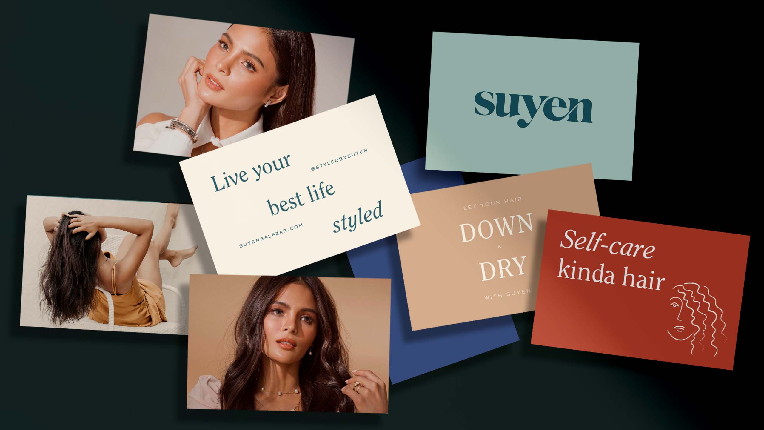
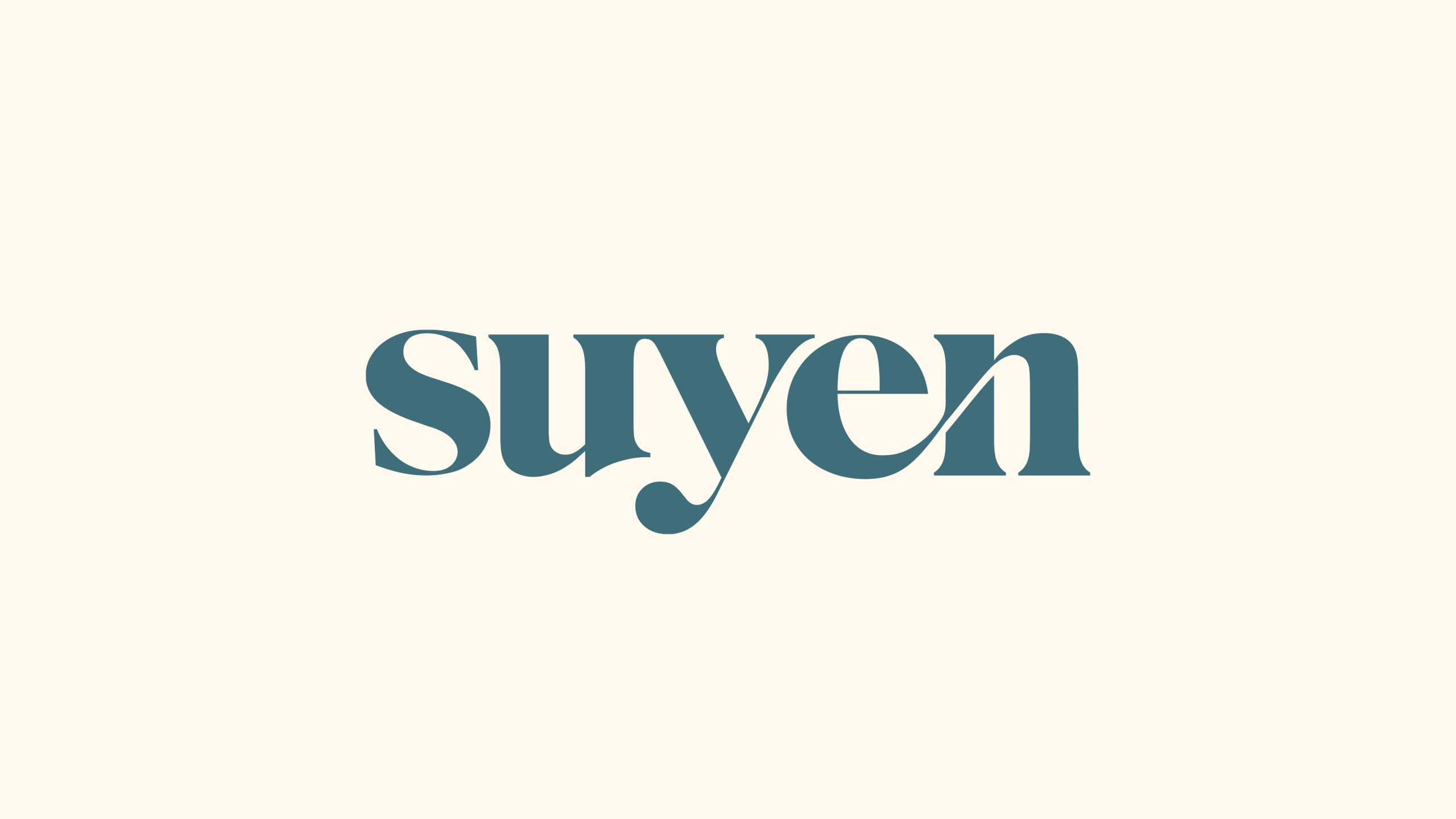
Being a personality herself, Suyen deserved a logo that's simple, sharp, and ownable so we set on a logotype and a monogram. We wanted to exude a sense of confidence and elegance through a logotype that is strong yet sleek, bold with the letters yet soft with the rounded movement that flows through the whole logo. The distinct curve on the "e" and "n" is also symbolic of flowing hair.
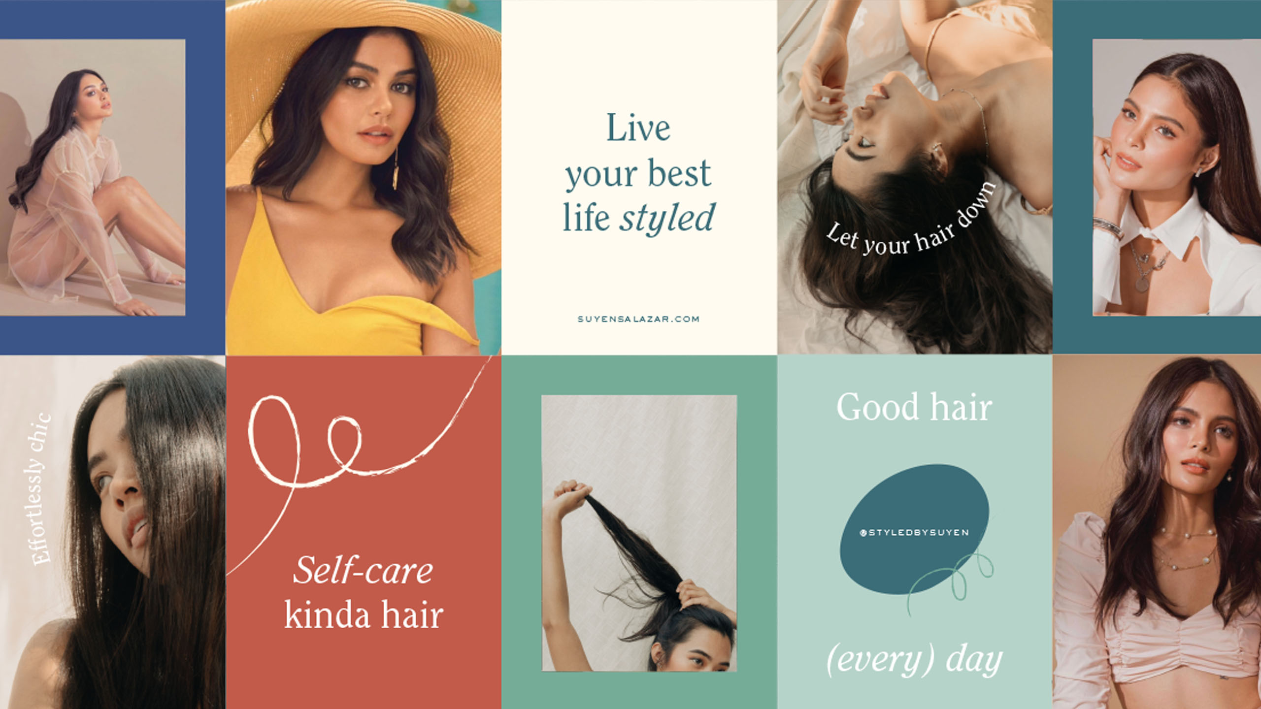
The color palette is mature yet optimistic, using a cool shade of sage as the primary color, with two other secondary shades of greens that Suyen can own. The tertiary colors of blue, tan, pink, and terracotta add a sense of playfulness and warmth to the brand and help keep everything balanced.
The typesetting takes the professionalism and polished look found in classic serifs, but implementing a warmer and friendlier tone because of the height and round serifs. This is balanced with a simple sans serif meant for clean and easy-to-read footnotes.
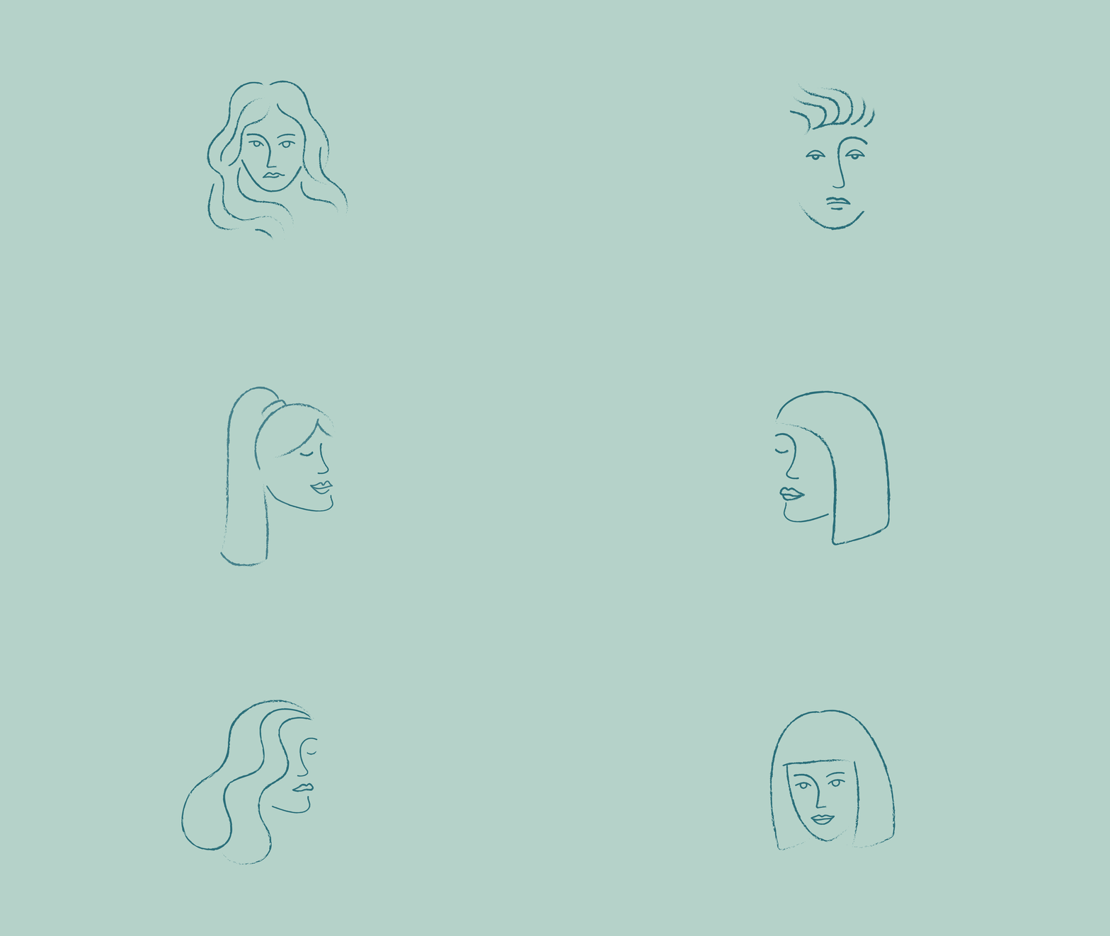
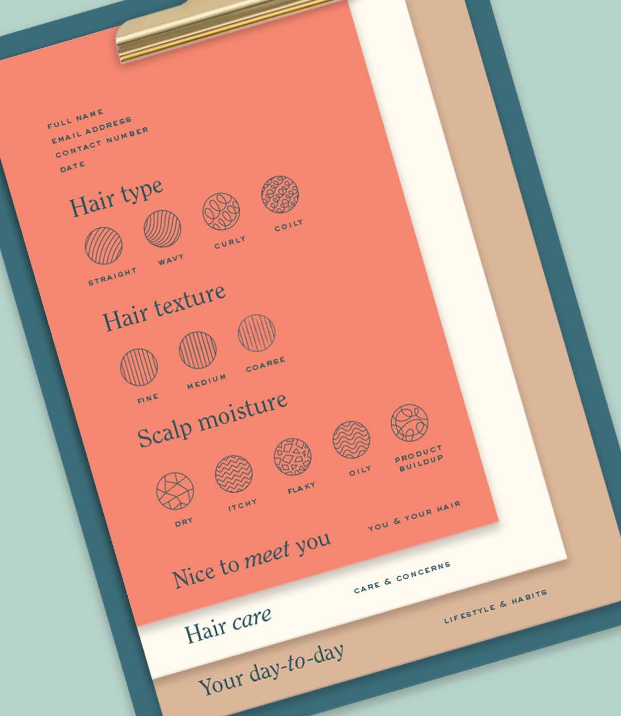
The system enhances a minimalist brand with vibrancy and fun, striking a balance between Suyen's credibility and approachability. The brand features organic lines reminiscent of hair, reflecting a fluid creative direction. These strokes nod to Suyen's signature dry cuts and add depth, especially when combined with natural elements and subtle textures.

Make Sense & Look Good®. Made by Serious People. Creating brands that shape tomorrow, today. Boring is the Enemy. Humans deserve nice things™. Seriously. Hi Mom. Success is found in the details. With great budgets come great work. We are known to make brands human. We enjoy creating brands from the ground up. Great brands invest in great design. Ugly brands don’t care about people. Your brand could always be better. Trust us. Branding is like mind control, but cooler. We will tell you if you have food stuck in your teeth. For a relaxing time, make it Suntory time. Make Sense & Look Good®. Made by Serious People. Creating brands that shape tomorrow, today. Boring is the Enemy. Humans deserve nice things™. Seriously. Hi Mom. Success is found in the details. With great budgets come great work. We are known to make brands human. We enjoy creating brands from the ground up. Great brands invest in great design. Ugly brands don’t care about people. Your brand could always be better. Trust us. Branding is like mind control, but cooler. We will tell you if you have food stuck in your teeth. For a relaxing time, make it Suntory time. Make Sense & Look Good®. Made by Serious People. Creating brands that shape tomorrow, today. Boring is the Enemy. Humans deserve nice things™. Seriously. Hi Mom. Success is found in the details. With great budgets come great work. We are known to make brands human. We enjoy creating brands from the ground up. Great brands invest in great design. Ugly brands don’t care about people. Your brand could always be better. Trust us. Branding is like mind control, but cooler. We will tell you if you have food stuck in your teeth. For a relaxing time, make it Suntory time. Make Sense & Look Good®. Made by Serious People. Creating brands that shape tomorrow, today. Boring is the Enemy. Humans deserve nice things™. Seriously. Hi Mom. Success is found in the details. With great budgets come great work. We are known to make brands human. We enjoy creating brands from the ground up. Great brands invest in great design. Ugly brands don’t care about people. Your brand could always be better. Trust us. Branding is like mind control, but cooler. We will tell you if you have food stuck in your teeth. For a relaxing time, make it Suntory time.