AMIGO DELIVERY PHILIPPINES BRANDING
We Take You Further
BRANDING SCOPE
Brand Identity
Brand Strategy
Copywriting
Illustrations
OVERVIEW
Amigo was essentially born out of the passion to help. In the new normal, where hundreds and thousands of Filipinos are cooped up inside their homes, empowering people through the safe means available, delivery, can be a challenge. At the core of it all — bringing both essentials and wants to everyone — is the intent to connect and to uplift each other’s lives — and Amigo knew it was a need it had to fill.
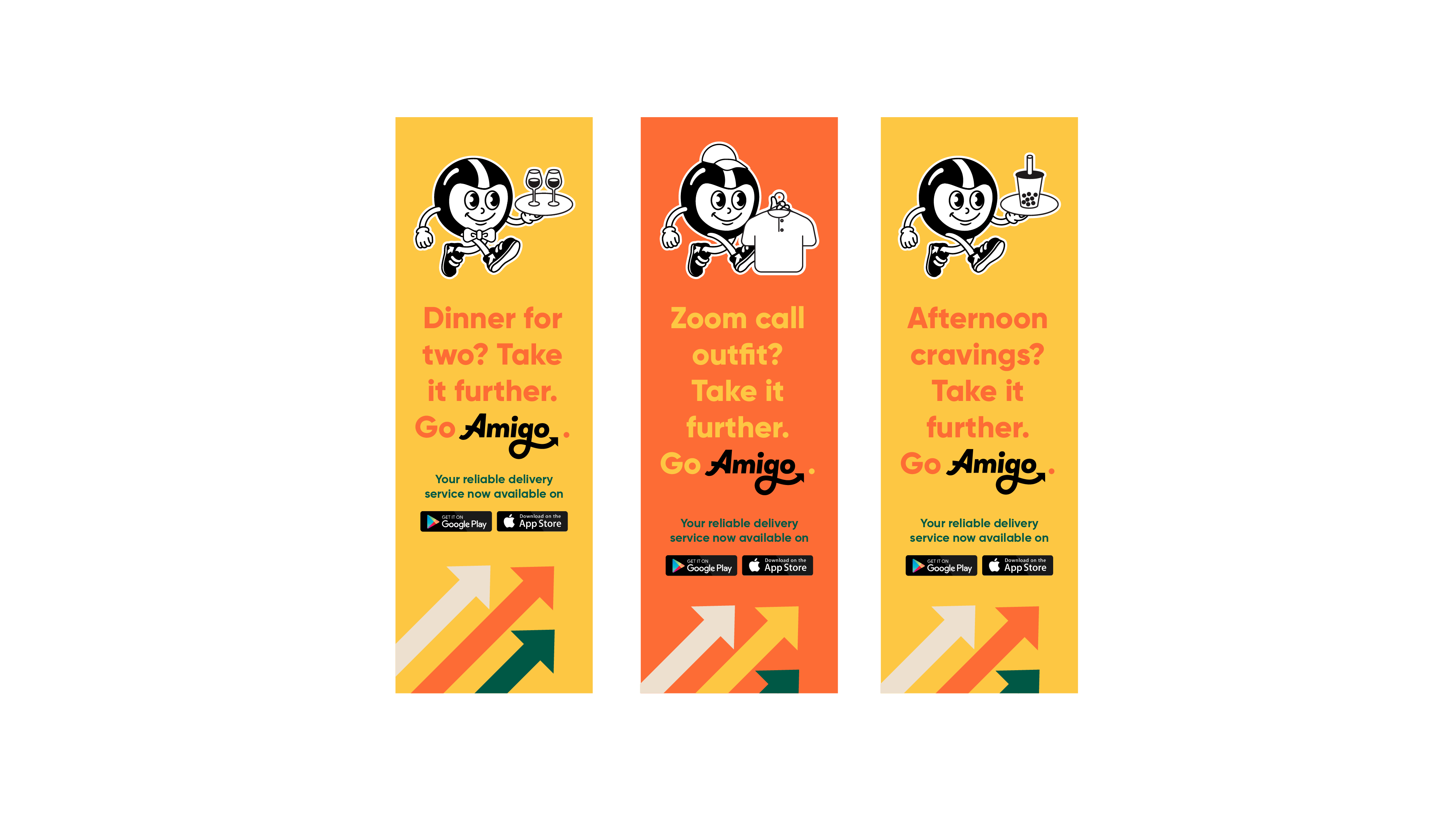
Aptly named “Amigo” (Bisaya for "Friend"), the app is designed to cater especially to everyone's needs. As an on-demand delivery service, we saw the opportunity to present this as a character that would aid in humanizing the whole service.
MORE INFORMATION
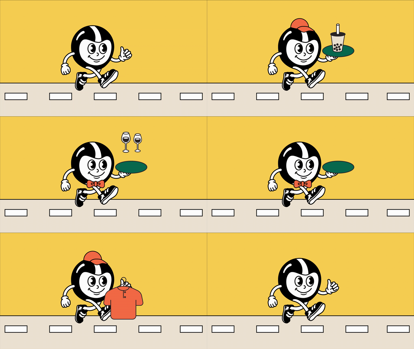
The logo mascot is an imaginative fusion of riders and retro characters. We wanted to convey comfort in a subtle way, hence the mascot hinging on the familiarity of games we used to play, with the friendliness and reliability of partner-riders. With inclusivity at the forefront of Amigo, the mascot is easily and freely up to anybody to interpret.
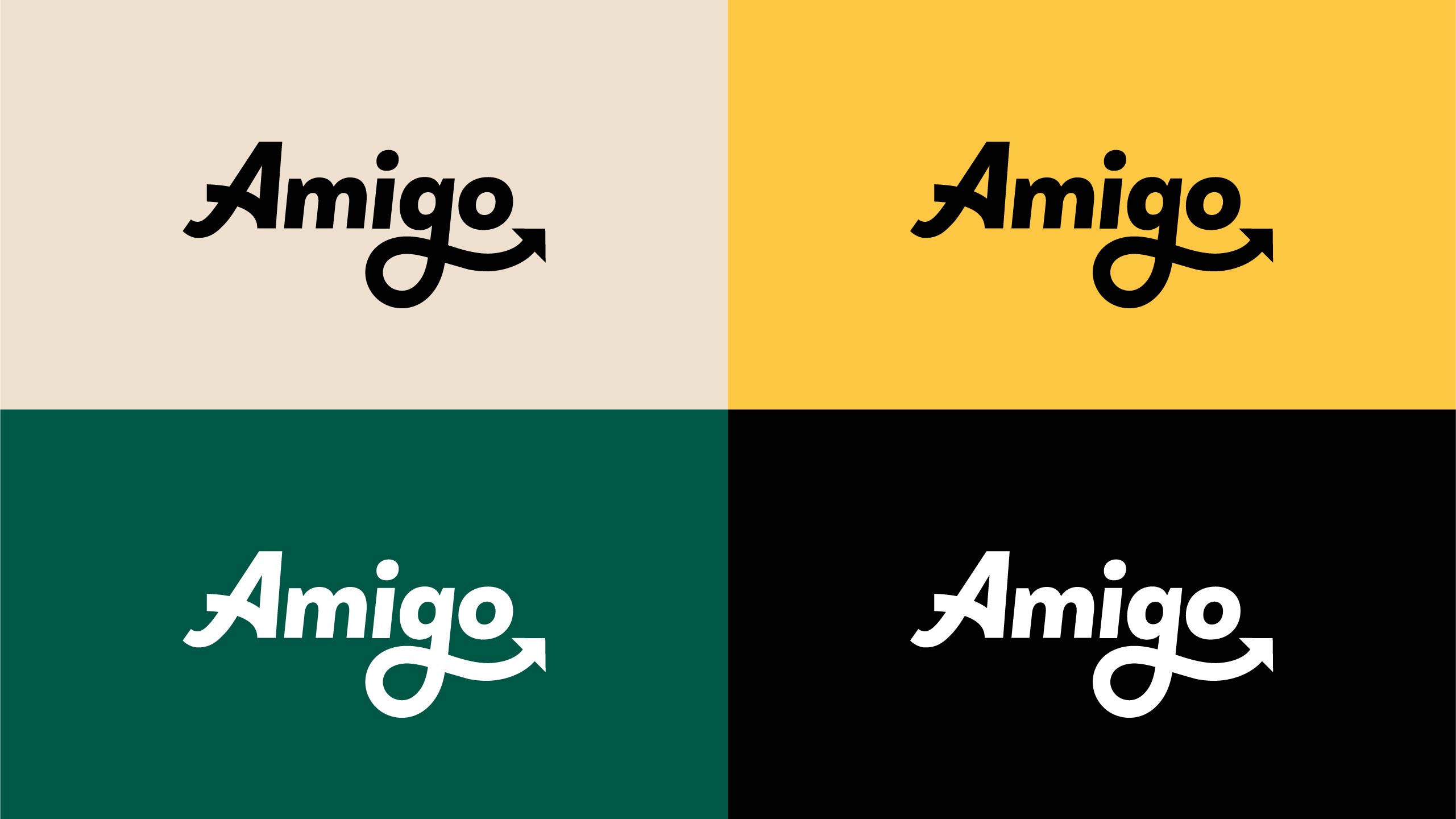
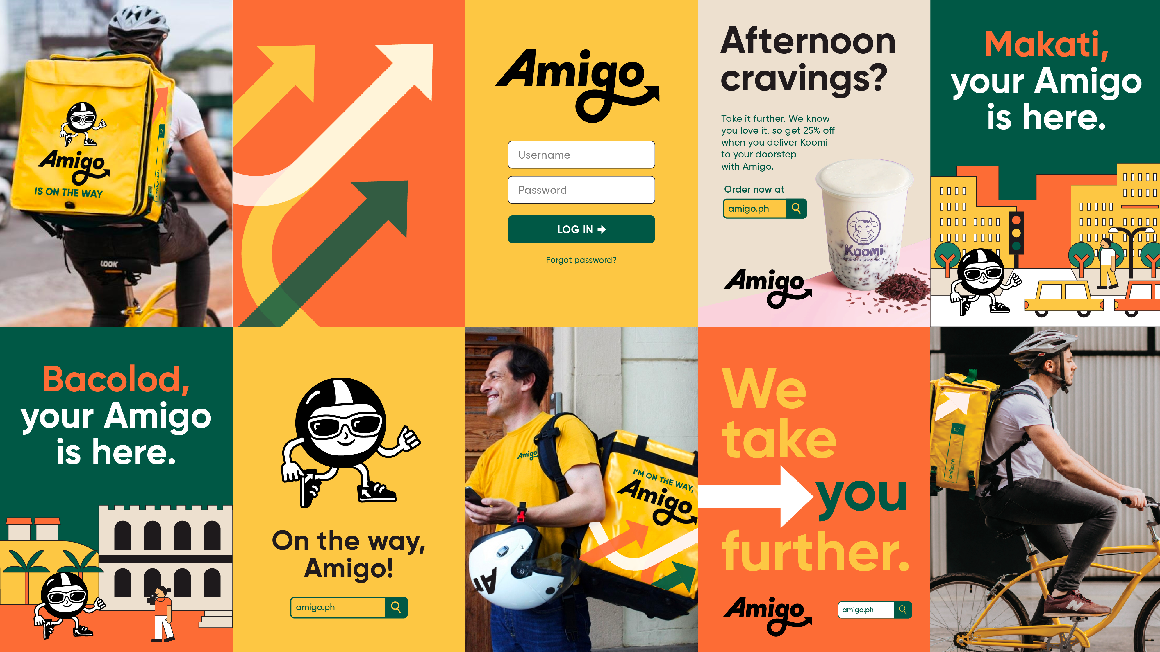
The accompanying type for the logo is stylised to express action. Slightly skewed towards the right with small accents — like a flourish in the letter “A” and an arrow in the letter “G” — the type evokes a sense of motion that isn’t rigid and isn’t furious. Instead, it shows that Amigo can take you anywhere, whichever direction you need it to.
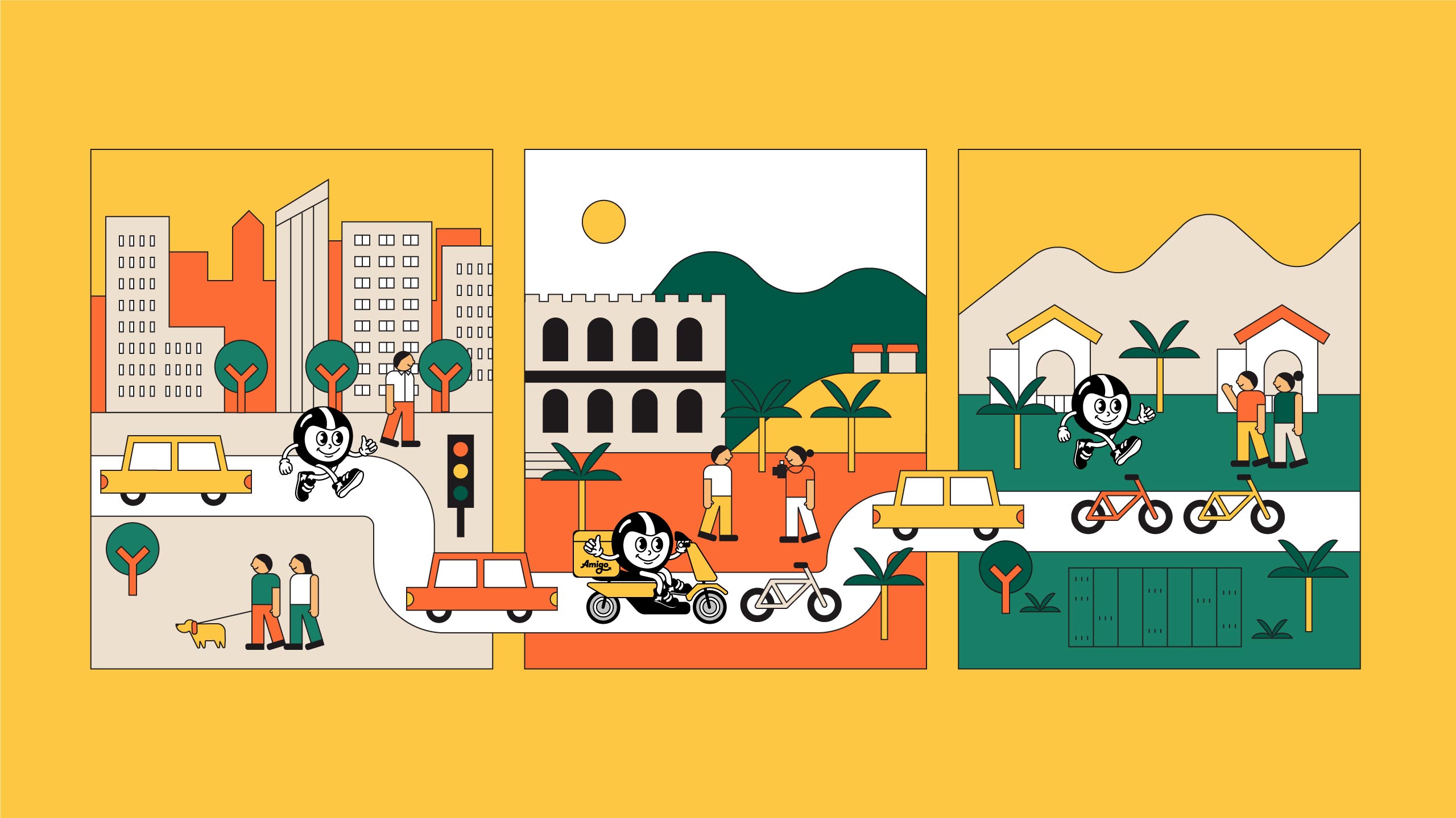
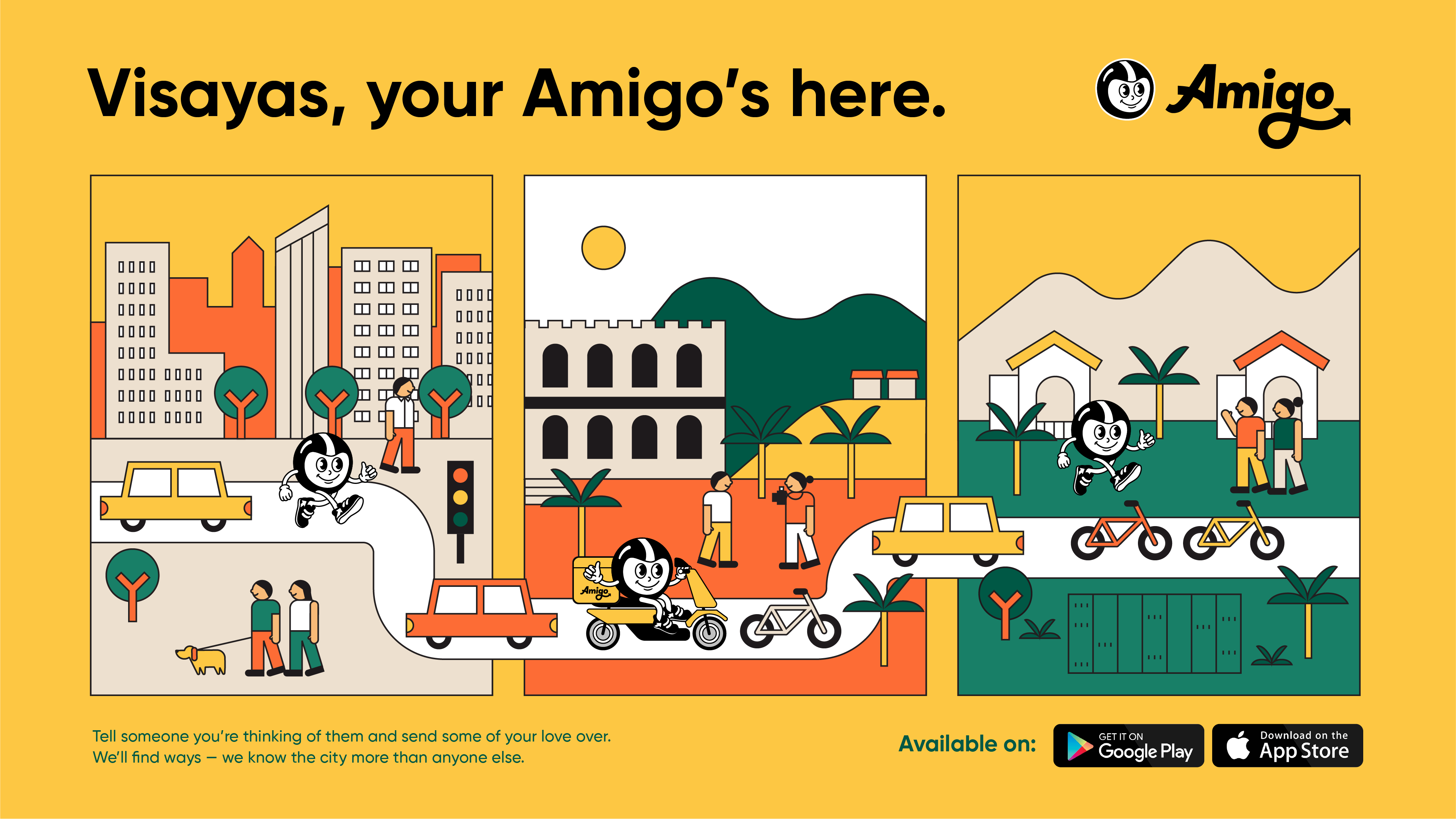
Apart from the arrow being a defining shape for Amigo, the idea of connection was also fully fleshed out in the illustrations and other brand assets. We illustrated some scenes that were inspired by retro board games and those wooden bricks we used to play as kids, creating cities that you and your friends would make and explore—quite easily with Amigo around.
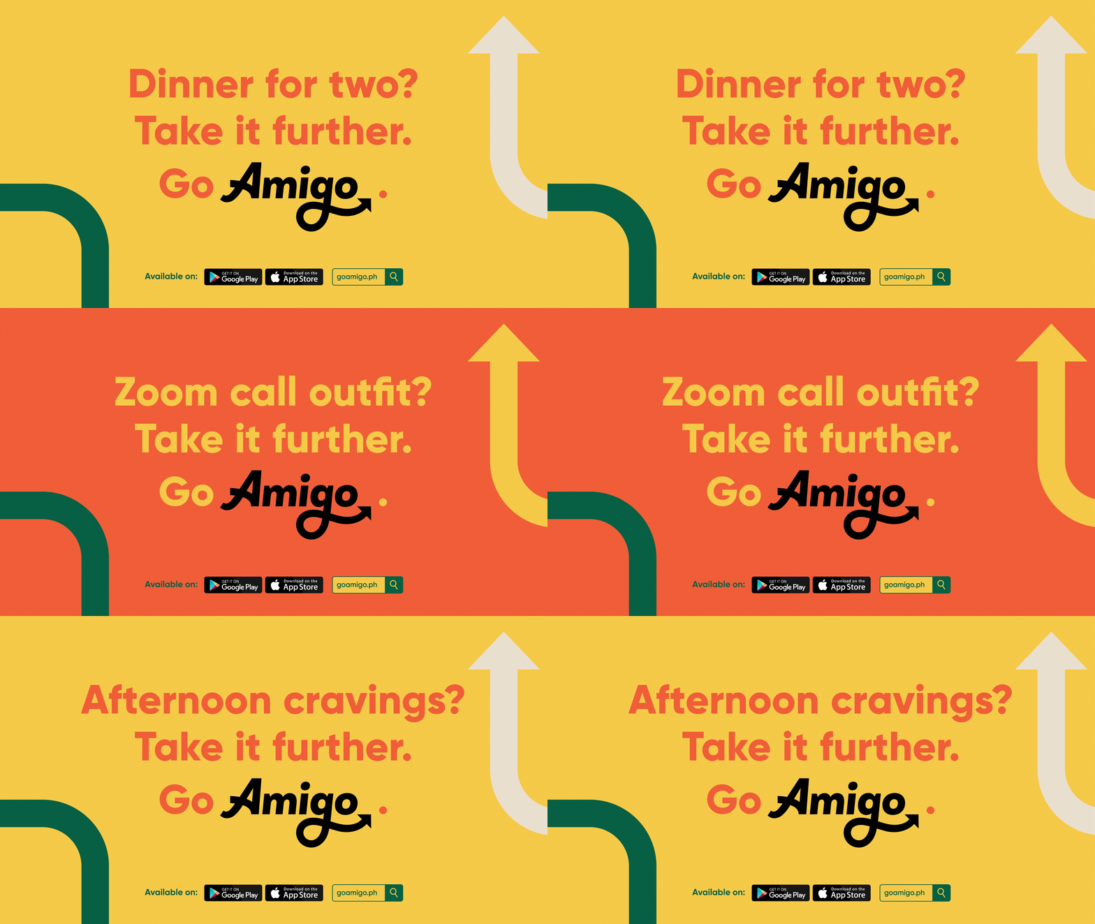
Humanising the product didn't just mean creating a mascot for the brand, but also highlighting what makes them more human. Through the brand identity, we made sure that we get to feature the delivery service but also emphasize that this service is established with the human in the centre — knowing the needs of the people, pioneering inclusivity in the industry, and setting life back in motion after a long pause.
Make Sense & Look Good®. Made by Serious People. Creating brands that shape tomorrow, today. Boring is the Enemy. Humans deserve nice things™. Seriously. Hi Mom. Success is found in the details. With great budgets come great work. We are known to make brands human. We enjoy creating brands from the ground up. Great brands invest in great design. Ugly brands don’t care about people. Your brand could always be better. Trust us. Branding is like mind control, but cooler. We will tell you if you have food stuck in your teeth. For a relaxing time, make it Suntory time. Make Sense & Look Good®. Made by Serious People. Creating brands that shape tomorrow, today. Boring is the Enemy. Humans deserve nice things™. Seriously. Hi Mom. Success is found in the details. With great budgets come great work. We are known to make brands human. We enjoy creating brands from the ground up. Great brands invest in great design. Ugly brands don’t care about people. Your brand could always be better. Trust us. Branding is like mind control, but cooler. We will tell you if you have food stuck in your teeth. For a relaxing time, make it Suntory time. Make Sense & Look Good®. Made by Serious People. Creating brands that shape tomorrow, today. Boring is the Enemy. Humans deserve nice things™. Seriously. Hi Mom. Success is found in the details. With great budgets come great work. We are known to make brands human. We enjoy creating brands from the ground up. Great brands invest in great design. Ugly brands don’t care about people. Your brand could always be better. Trust us. Branding is like mind control, but cooler. We will tell you if you have food stuck in your teeth. For a relaxing time, make it Suntory time. Make Sense & Look Good®. Made by Serious People. Creating brands that shape tomorrow, today. Boring is the Enemy. Humans deserve nice things™. Seriously. Hi Mom. Success is found in the details. With great budgets come great work. We are known to make brands human. We enjoy creating brands from the ground up. Great brands invest in great design. Ugly brands don’t care about people. Your brand could always be better. Trust us. Branding is like mind control, but cooler. We will tell you if you have food stuck in your teeth. For a relaxing time, make it Suntory time.