ANCHORLAND REAL ESTATE BRANDING
The Landmarks of Tomorrow
BRANDING SCOPE
Brand Identity
OVERVIEW
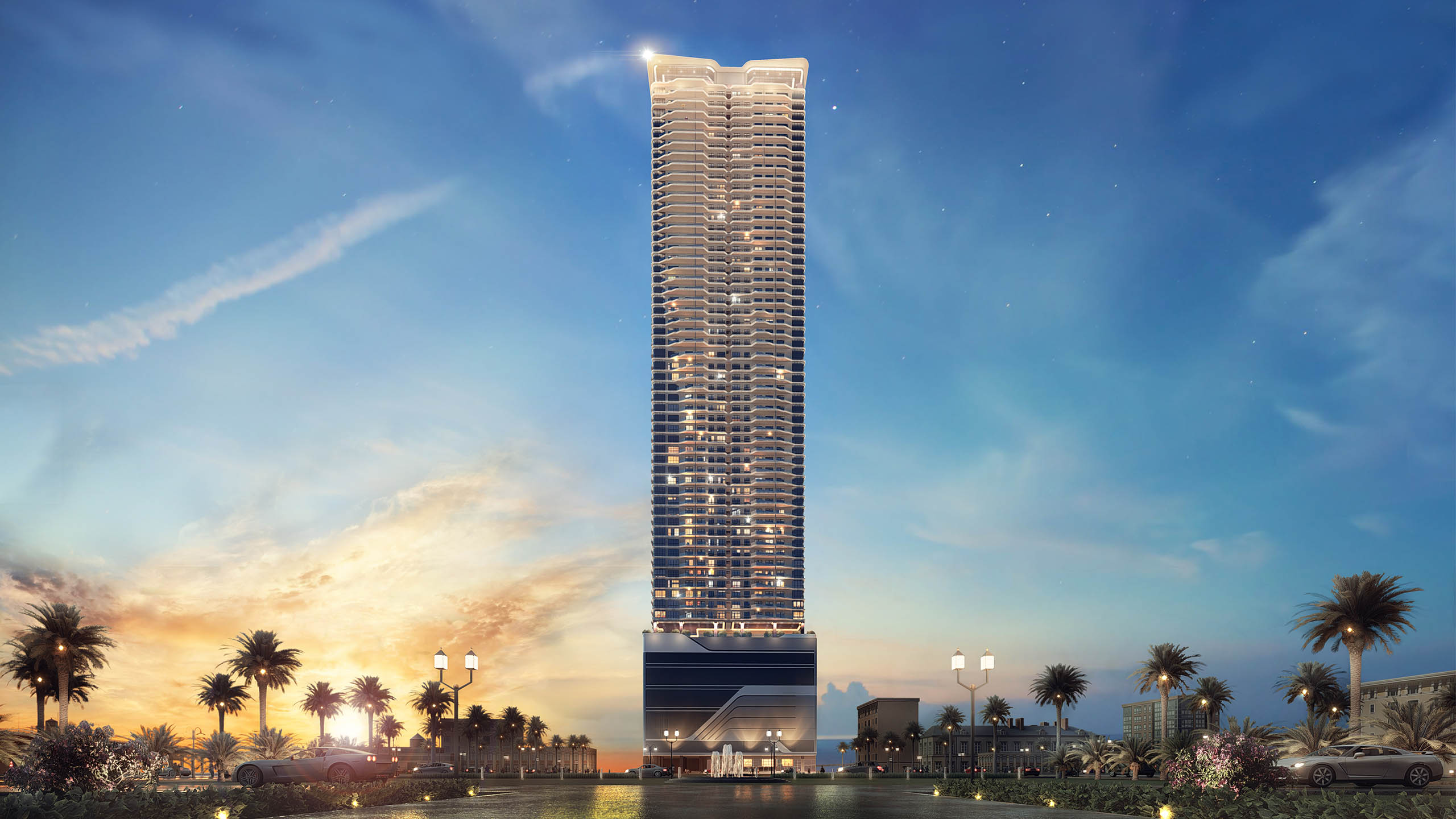
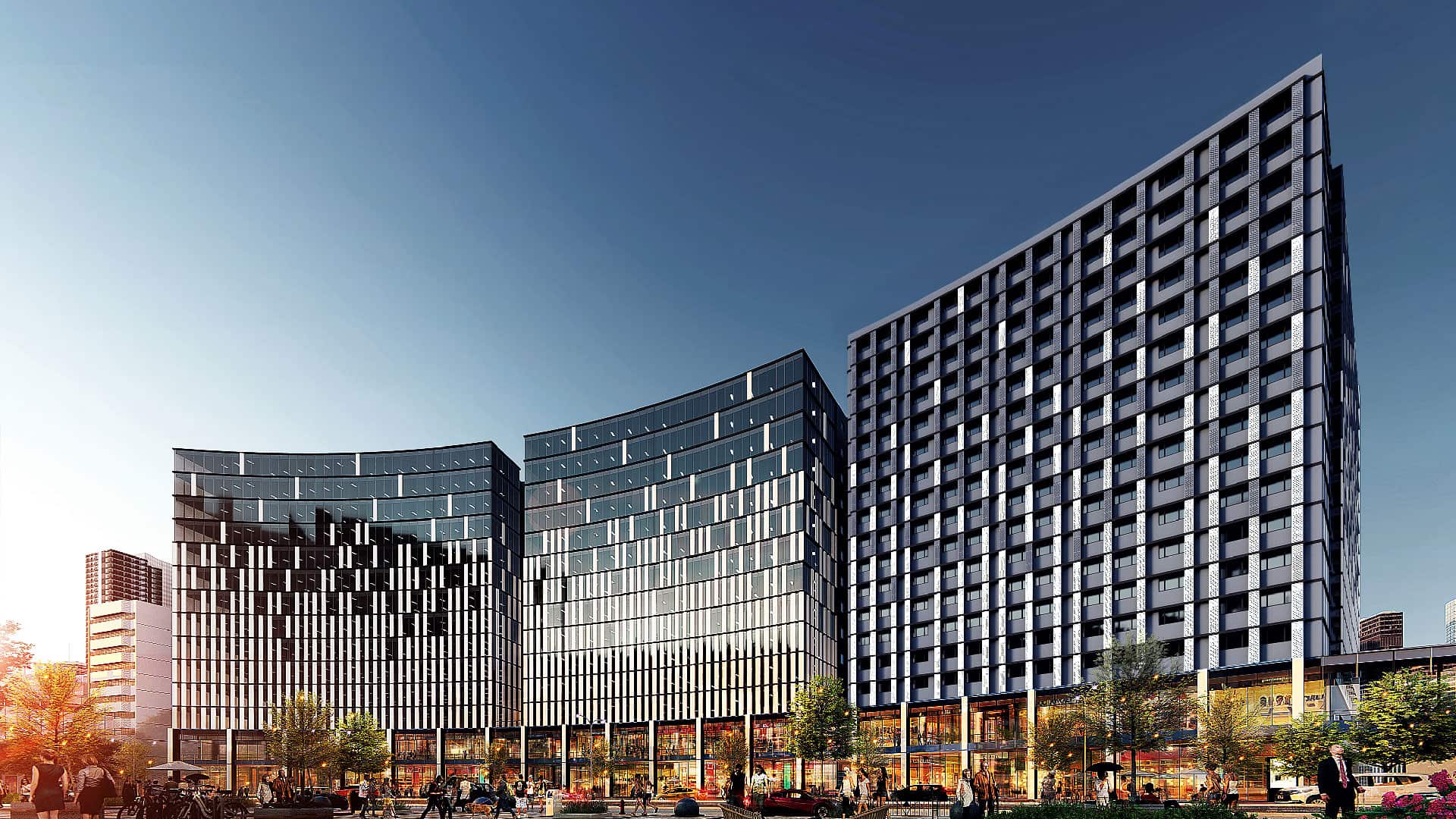
Anchor Land Holdings, Inc. is an esteemed property developer in the Philippines. Its diverse portfolio includes commercial, retail, office, warehousing, and hotel and resort developments—all of which are anchored on the company's promise of excellent value.
MORE INFORMATION
THE CHALLENGE
With its years of experience and success in the industry, Anchor Land needed an updated look to match its position in the market. The brand wanted to exude professionalism, prestige, and sophistication—which were values it certainly embodied, but the existing visual language did little to create a strong profile for the brand.
With its years of experience and success in the industry, Anchor Land needed an updated look to match its position in the market. The brand wanted to exude professionalism, prestige, and sophistication—which were values it certainly embodied, but the existing visual language did little to create a strong profile for the brand.
THE SOLUTION
We aimed to craft a brand identity that was meaningful to the essence of Anchor Land and its brand promise. That said, we put our focus on what it valued and made sure to concretize them in its renewed identity.
We aimed to craft a brand identity that was meaningful to the essence of Anchor Land and its brand promise. That said, we put our focus on what it valued and made sure to concretize them in its renewed identity.
Unparalleled excellence
Commitment to growth
Prestigious value
Commitment to growth
Prestigious value
—
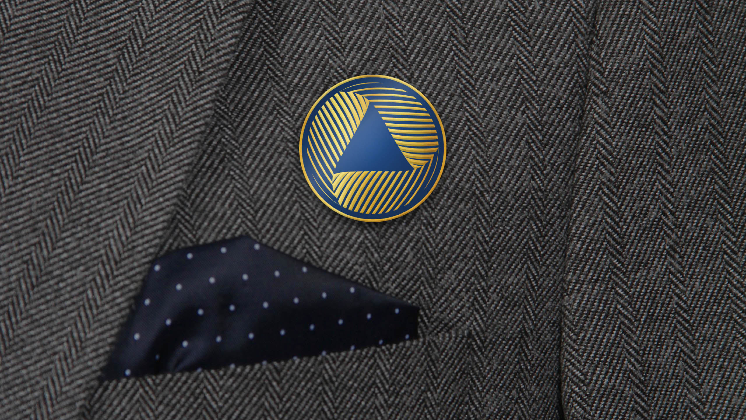
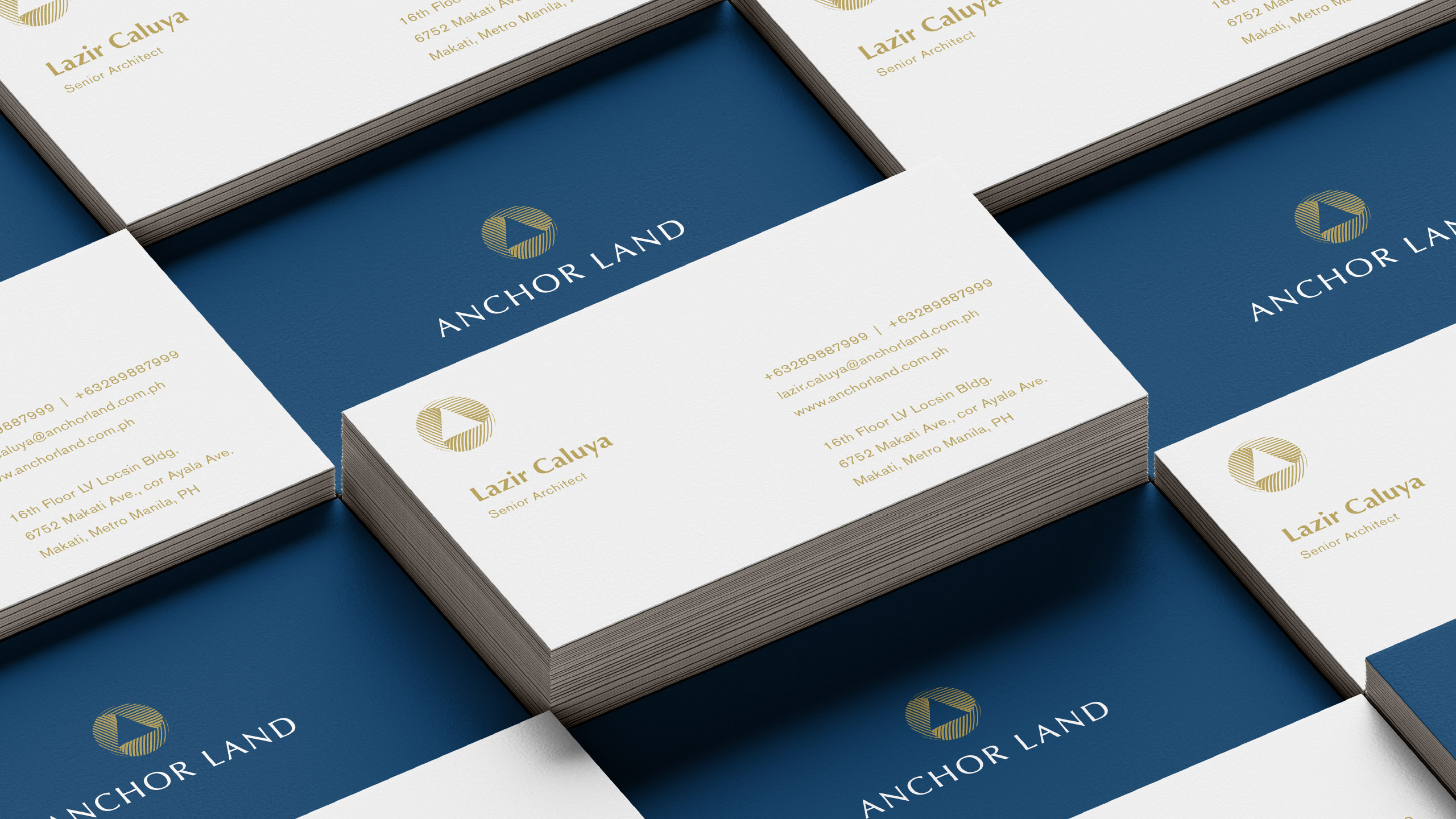
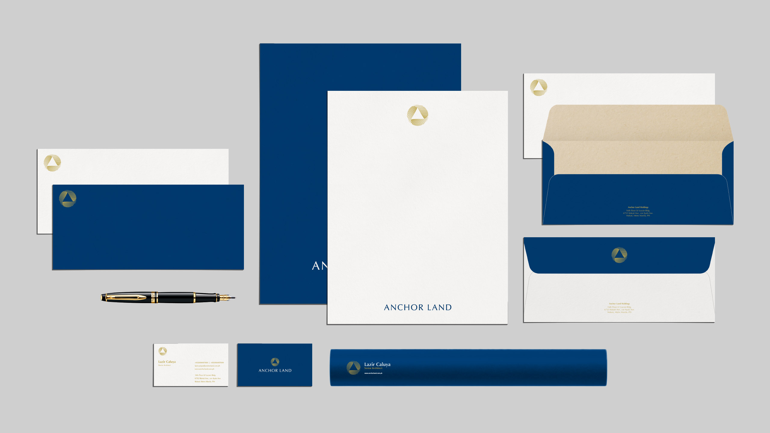
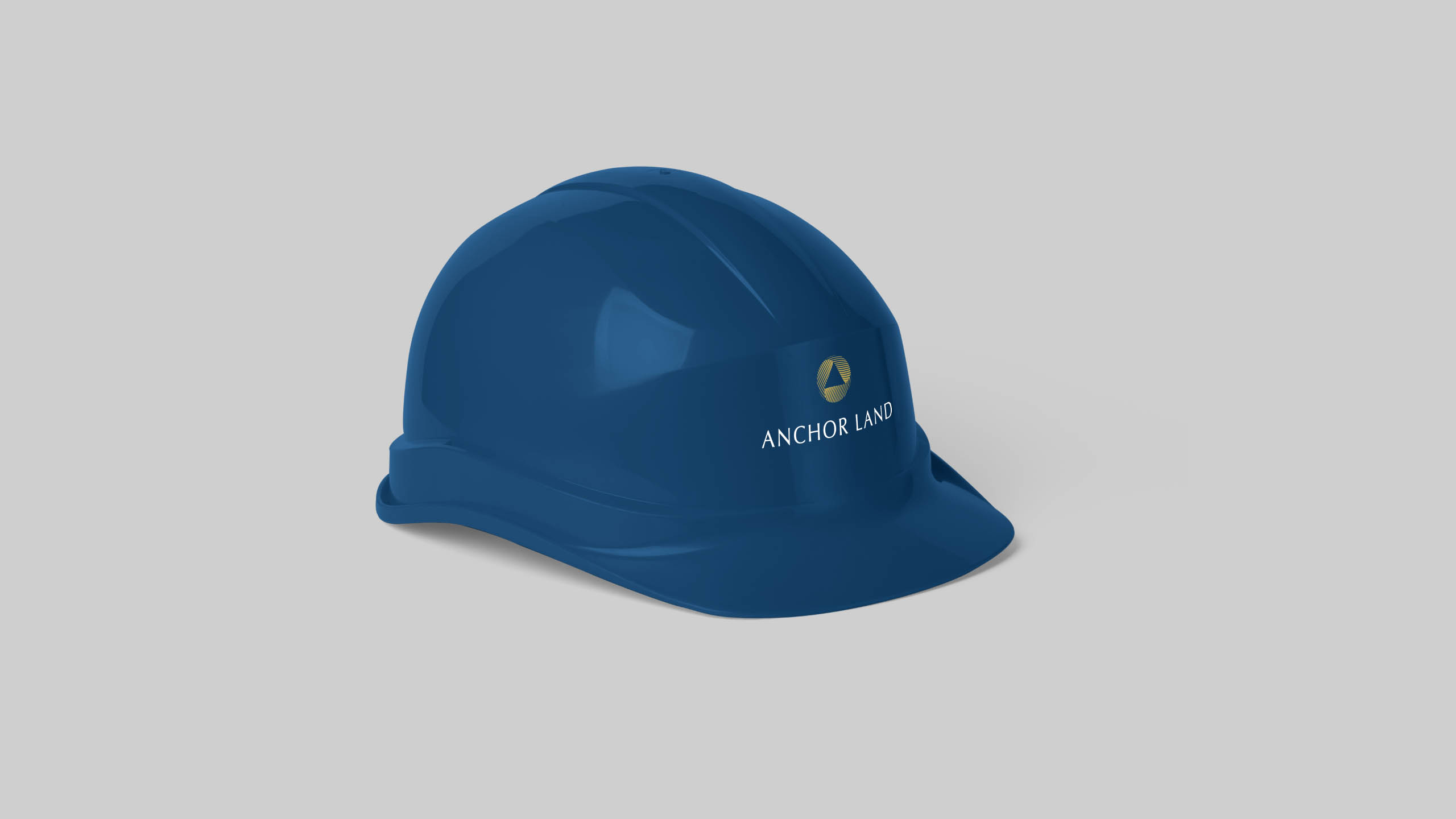
Anchor Land's logo icon is made up of two contrasting key elements: the triangle and the circle, each with its own meaning. The circle symbolizes Anchor Land's excellence, growth, and dynamism, contrasting the static nature of the triangle.
While the logo focused on the brand's unparalleled excellence and commitment to growth, we wanted the colors to touch on its desire to communicate its prestigious value. Its original color palette focused on a dark red, paying tribute to its roots in Manila Chinatown. However, this didn't particularly communicate the brand's high-end value. Instead, we chose a dark blue which symbolizes abundance, balance, and prestige. The specific hue perfectly complements the gold that we introduced, which adds a touch of luxury and sophistication to the overall look and feel.
Make Sense & Look Good®. Made by Serious People. Creating brands that shape tomorrow, today. Boring is the Enemy. Humans deserve nice things™. Seriously. Hi Mom. Success is found in the details. With great budgets come great work. We are known to make brands human. We enjoy creating brands from the ground up. Great brands invest in great design. Ugly brands don’t care about people. Your brand could always be better. Trust us. Branding is like mind control, but cooler. We will tell you if you have food stuck in your teeth. For a relaxing time, make it Suntory time. Make Sense & Look Good®. Made by Serious People. Creating brands that shape tomorrow, today. Boring is the Enemy. Humans deserve nice things™. Seriously. Hi Mom. Success is found in the details. With great budgets come great work. We are known to make brands human. We enjoy creating brands from the ground up. Great brands invest in great design. Ugly brands don’t care about people. Your brand could always be better. Trust us. Branding is like mind control, but cooler. We will tell you if you have food stuck in your teeth. For a relaxing time, make it Suntory time. Make Sense & Look Good®. Made by Serious People. Creating brands that shape tomorrow, today. Boring is the Enemy. Humans deserve nice things™. Seriously. Hi Mom. Success is found in the details. With great budgets come great work. We are known to make brands human. We enjoy creating brands from the ground up. Great brands invest in great design. Ugly brands don’t care about people. Your brand could always be better. Trust us. Branding is like mind control, but cooler. We will tell you if you have food stuck in your teeth. For a relaxing time, make it Suntory time. Make Sense & Look Good®. Made by Serious People. Creating brands that shape tomorrow, today. Boring is the Enemy. Humans deserve nice things™. Seriously. Hi Mom. Success is found in the details. With great budgets come great work. We are known to make brands human. We enjoy creating brands from the ground up. Great brands invest in great design. Ugly brands don’t care about people. Your brand could always be better. Trust us. Branding is like mind control, but cooler. We will tell you if you have food stuck in your teeth. For a relaxing time, make it Suntory time.