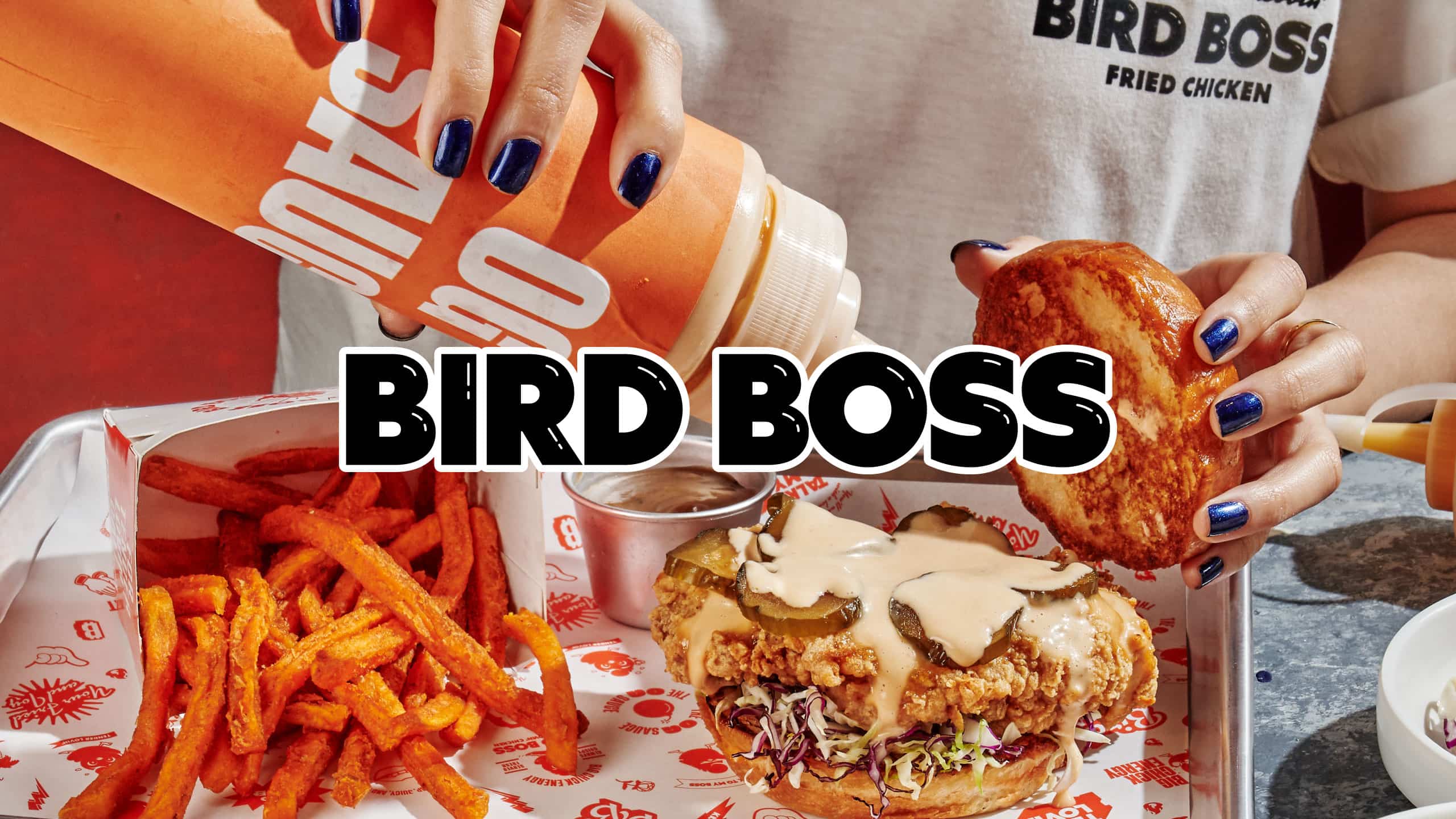
BIRD BOSS PHILIPPINES RESTAURANT BRANDING
Tender Lovin' Chicken
BRANDING SCOPE
Brand Strategy
Brand Identity
OVERVIEW
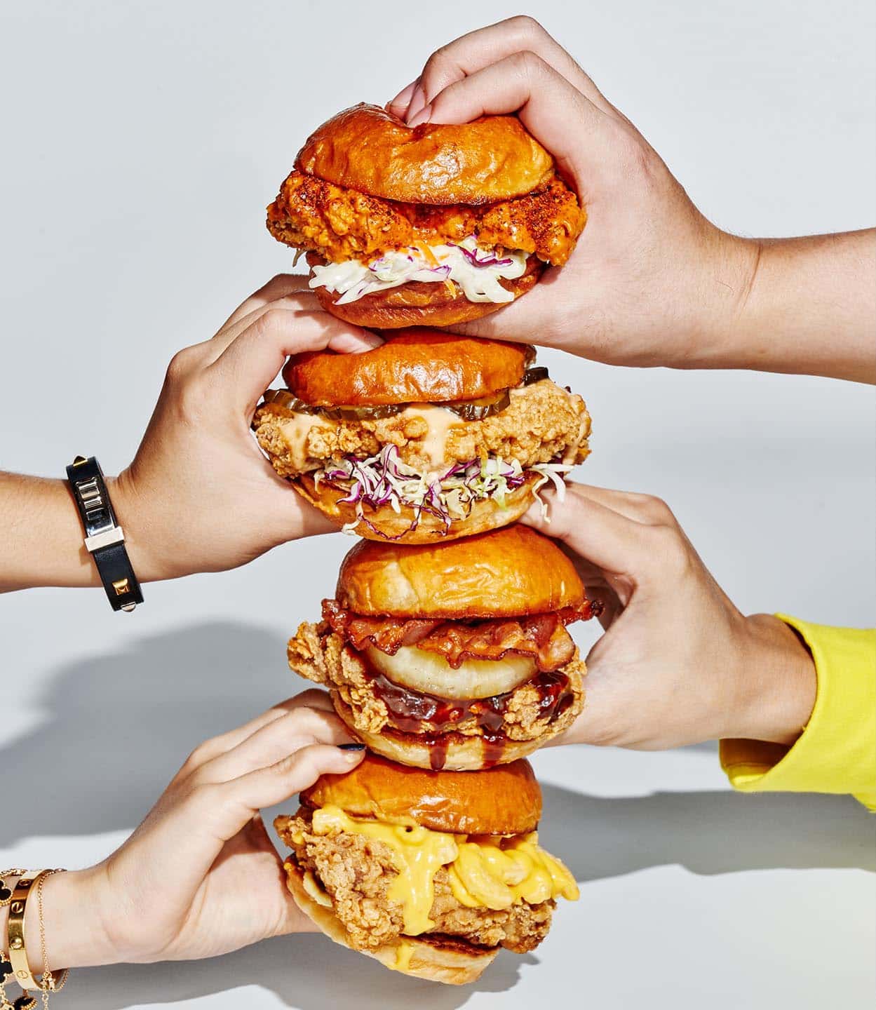
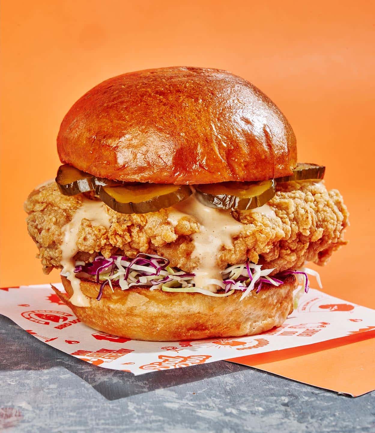
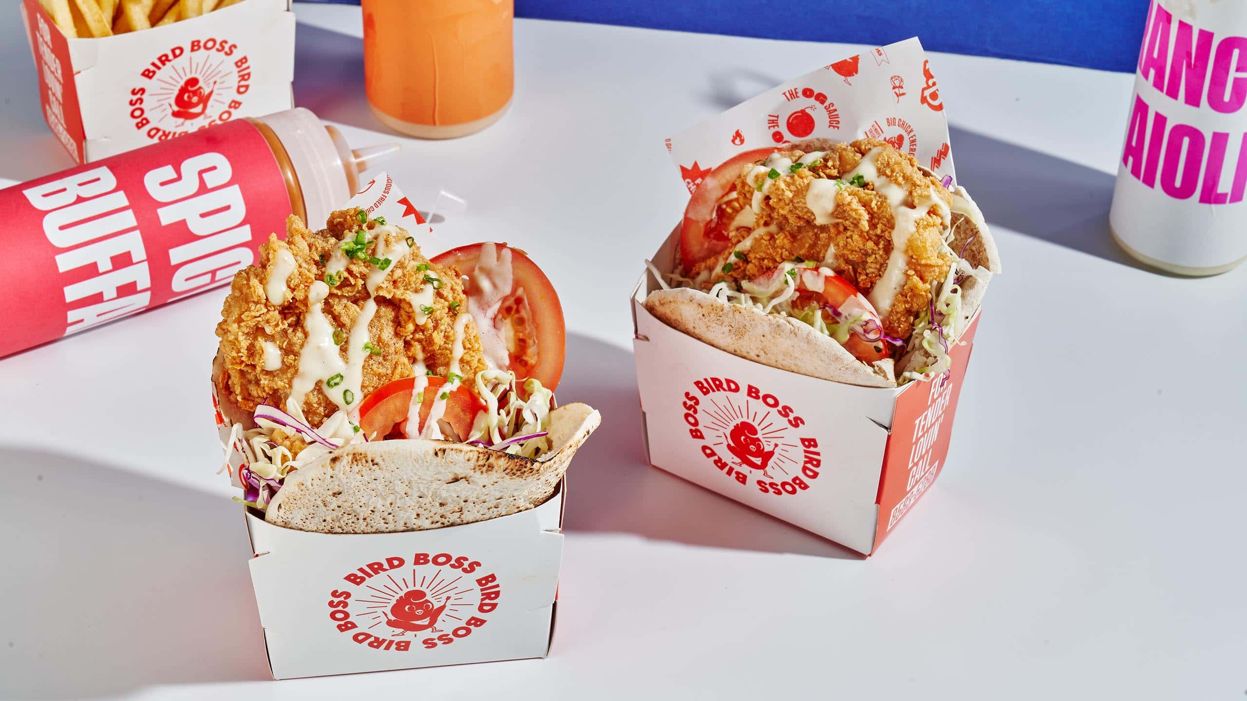
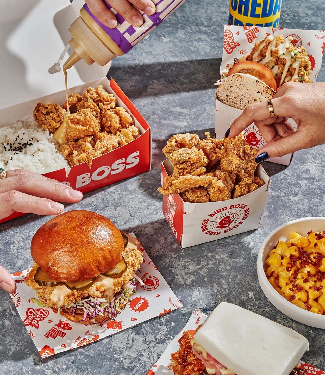
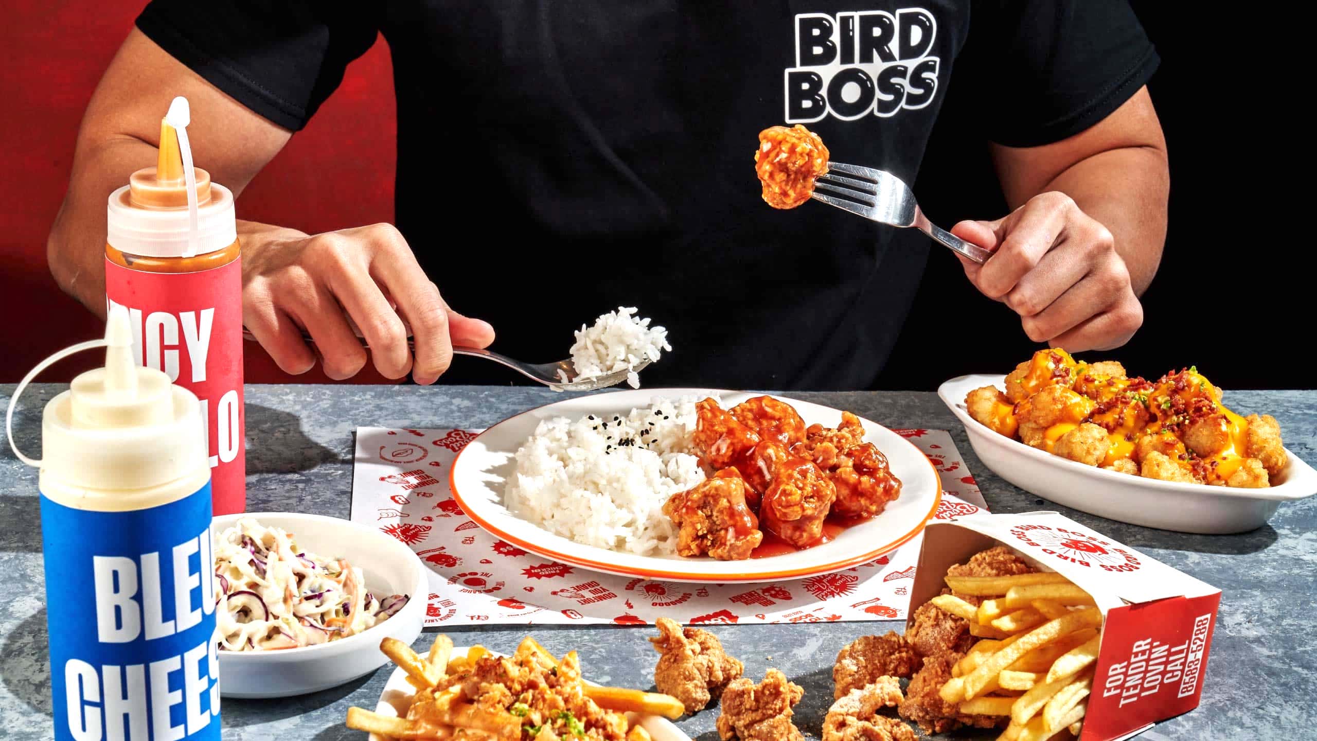
Bird Boss is the new bird on the block. It's a fast casual restaurant with deliciously fried chicken you can enjoy in more ways than one. Buns, baos, wraps—you name it. Eat your heart out at this chicken joint. You'll never go hungry with a love so tender.
With a saturated market full of new F&B concepts popping up here and there, standing out in the food scene is a challenging feat. All high calorie, low originality. Fried chicken in itself was nothing new to the market so we had to put our own spin to it. Inject a little of our signature blend of MSLG™ (Make Sense, Look Good).
MORE INFORMATION
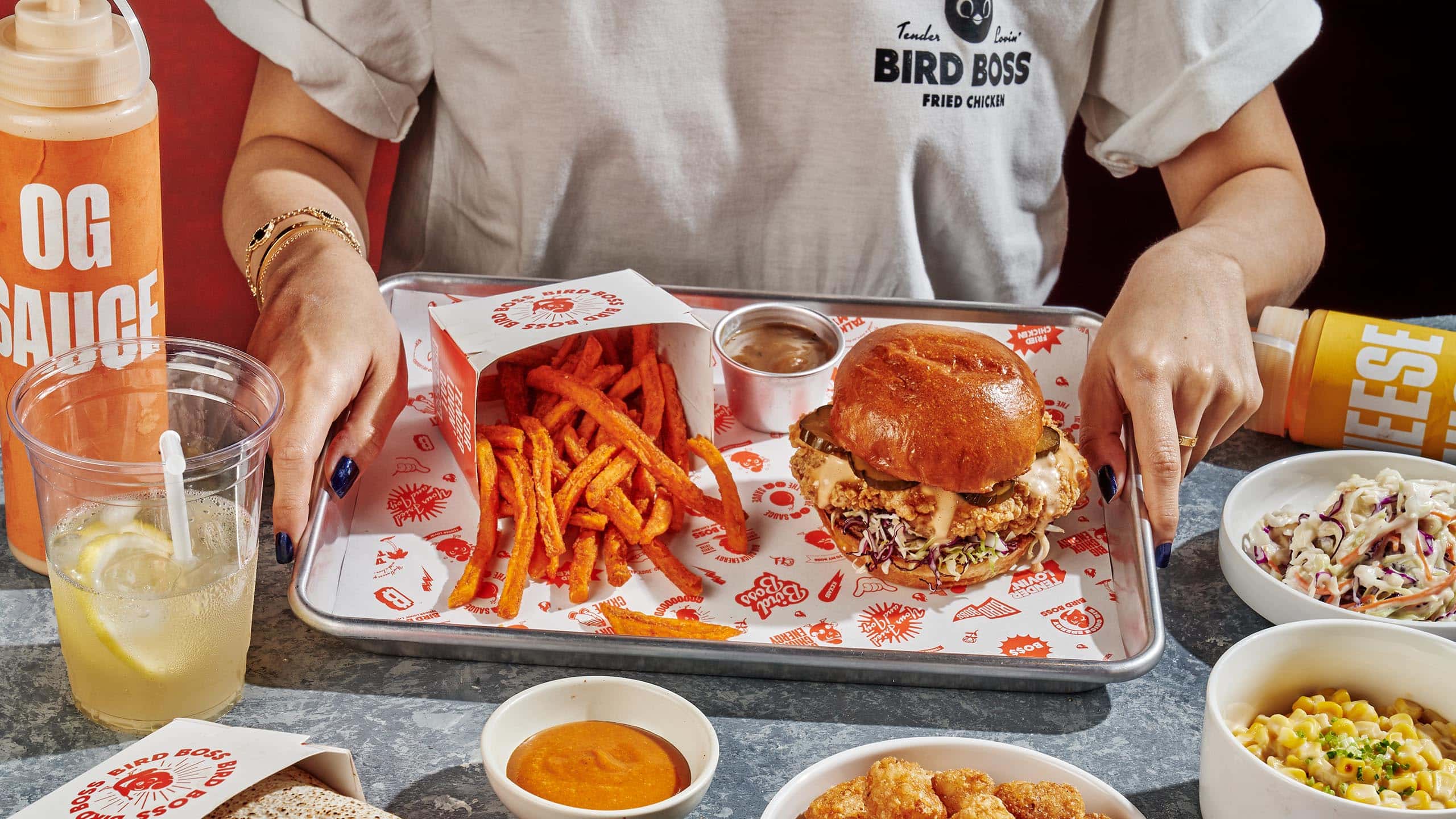
What makes a brand memorable is a well-conceived concept and story to tie everything together. With the name "Bird Boss," coming up with this direction was easy enough that it was almost natural. The name itself had so much authority that the brand needed a visual identity to match the name's boldness. This called for spicing up the brand with as much personality as the food has in flavor.
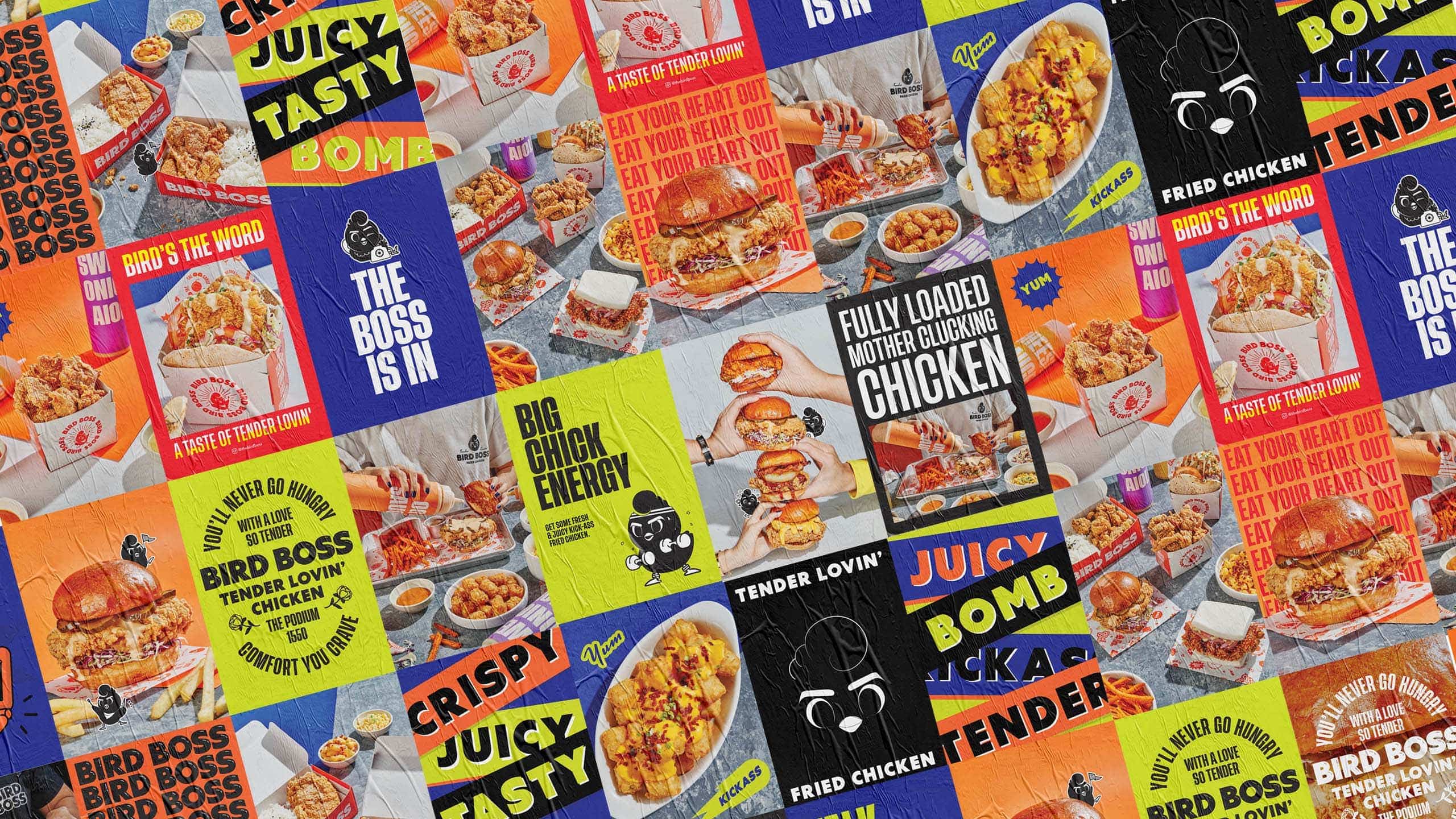
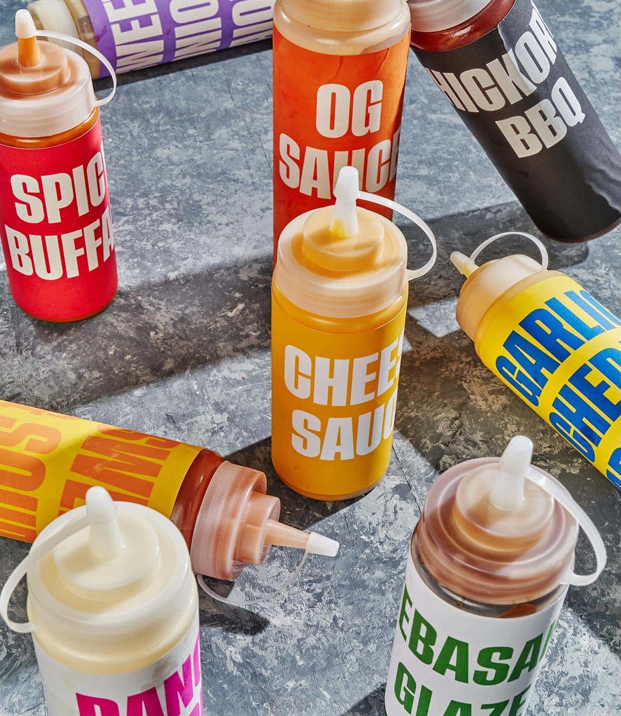
This meant that the brand identity had to be different, unlike any other friend chicken joint we've seen. All while finding the sweet spot between playful and effortlessly cool. The logo, for one, was intentionally made to be bold, paired with a typesetting that used a mix of different fonts that were used in various brand collaterals. Even the color palette could be considered unique, utilizing a mix of colors that aren't typically seen in your average restaurant—or any other brand for that matter.
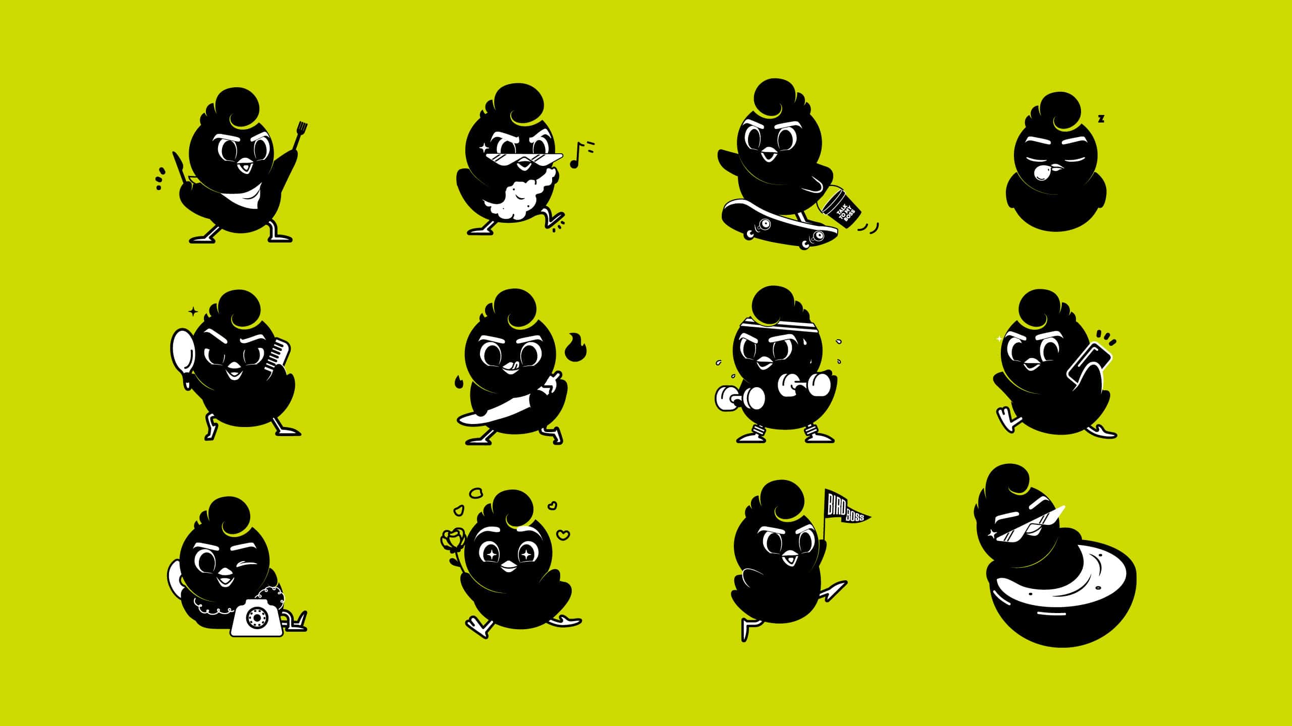
To add even more personality to the brand, we felt it like it was necessary to put a face to the brand. In line with the name itself, we came up with a character that literally personified Bird Boss. To match the brand's cheeky personality, the character needed some spunk to embody the "big chick energy" we were looking for, so to speak. That's where the narrative and story came in.
We imagined this bird character to be a cool little chick with a big personality. A tad bit cocky, suave, and a ton of style—a bit of a playboy, coveted by all. He knows he's the boss and isn't afraid to show it, everyone wants him and he knows it. Thus came the brand's tagline as well: tender lovin' chicken. We illustrated him in varied expressions and playful poses, even giving him a mob of "side chicks" to really put him in the Bird Boss role.
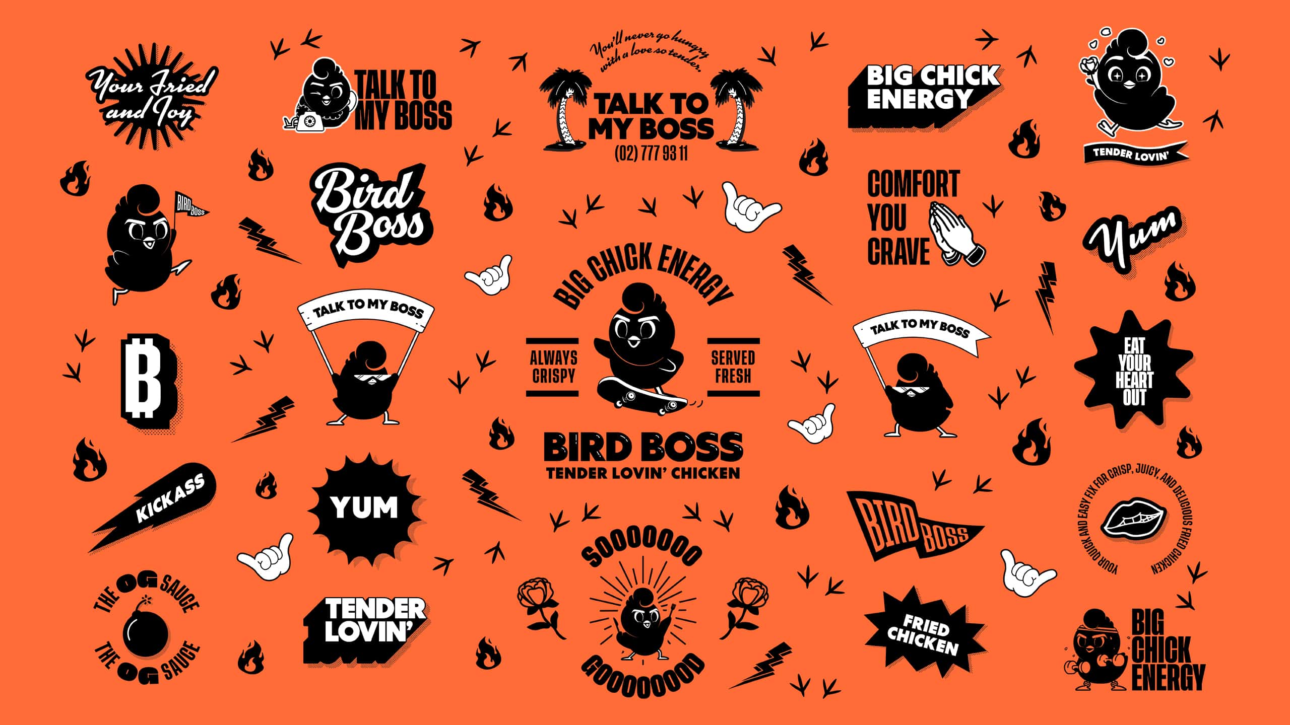
For the cherry on top, we created a wide array of assets to be paired with the basic brand foundations and the bird character. From icons for each sauce to illustrations and patterns for posters and packaging. The flexibility in the use of these assets give the brand a lot of room to be fun and playful.
Make Sense & Look Good®. Made by Serious People. Creating brands that shape tomorrow, today. Boring is the Enemy. Humans deserve nice things™. Seriously. Hi Mom. Success is found in the details. With great budgets come great work. We are known to make brands human. We enjoy creating brands from the ground up. Great brands invest in great design. Ugly brands don’t care about people. Your brand could always be better. Trust us. Branding is like mind control, but cooler. We will tell you if you have food stuck in your teeth. For a relaxing time, make it Suntory time. Make Sense & Look Good®. Made by Serious People. Creating brands that shape tomorrow, today. Boring is the Enemy. Humans deserve nice things™. Seriously. Hi Mom. Success is found in the details. With great budgets come great work. We are known to make brands human. We enjoy creating brands from the ground up. Great brands invest in great design. Ugly brands don’t care about people. Your brand could always be better. Trust us. Branding is like mind control, but cooler. We will tell you if you have food stuck in your teeth. For a relaxing time, make it Suntory time. Make Sense & Look Good®. Made by Serious People. Creating brands that shape tomorrow, today. Boring is the Enemy. Humans deserve nice things™. Seriously. Hi Mom. Success is found in the details. With great budgets come great work. We are known to make brands human. We enjoy creating brands from the ground up. Great brands invest in great design. Ugly brands don’t care about people. Your brand could always be better. Trust us. Branding is like mind control, but cooler. We will tell you if you have food stuck in your teeth. For a relaxing time, make it Suntory time. Make Sense & Look Good®. Made by Serious People. Creating brands that shape tomorrow, today. Boring is the Enemy. Humans deserve nice things™. Seriously. Hi Mom. Success is found in the details. With great budgets come great work. We are known to make brands human. We enjoy creating brands from the ground up. Great brands invest in great design. Ugly brands don’t care about people. Your brand could always be better. Trust us. Branding is like mind control, but cooler. We will tell you if you have food stuck in your teeth. For a relaxing time, make it Suntory time.