BLACKBOUGH BRAND IDENTITY
Designed for the
Tropical Soul
BRANDING SCOPE
Brand Strategy
Brand Identity
Copywriting
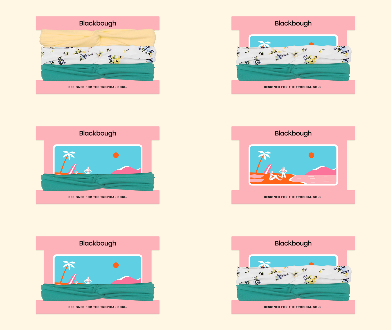
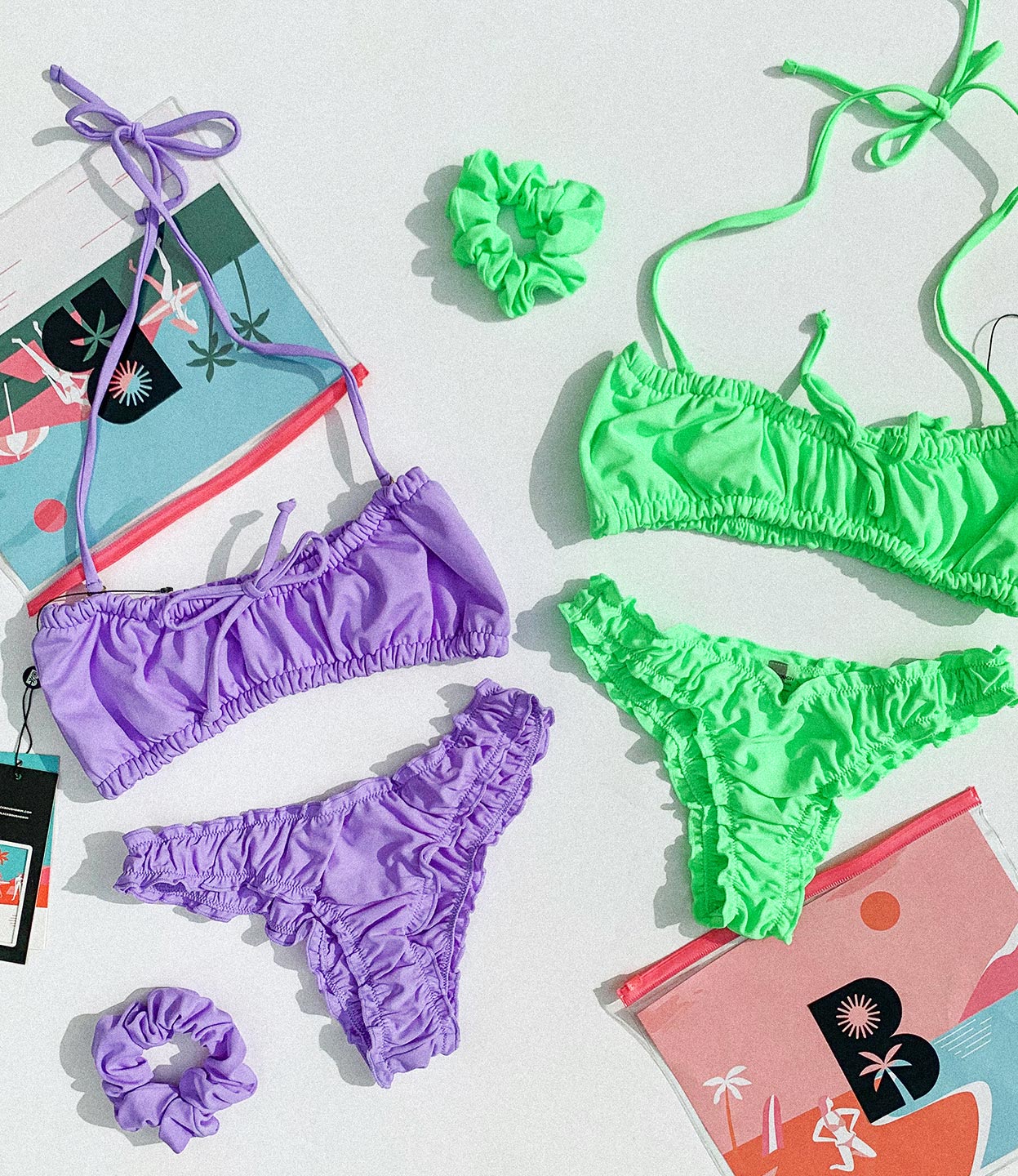
Packaging Design
OVERVIEW
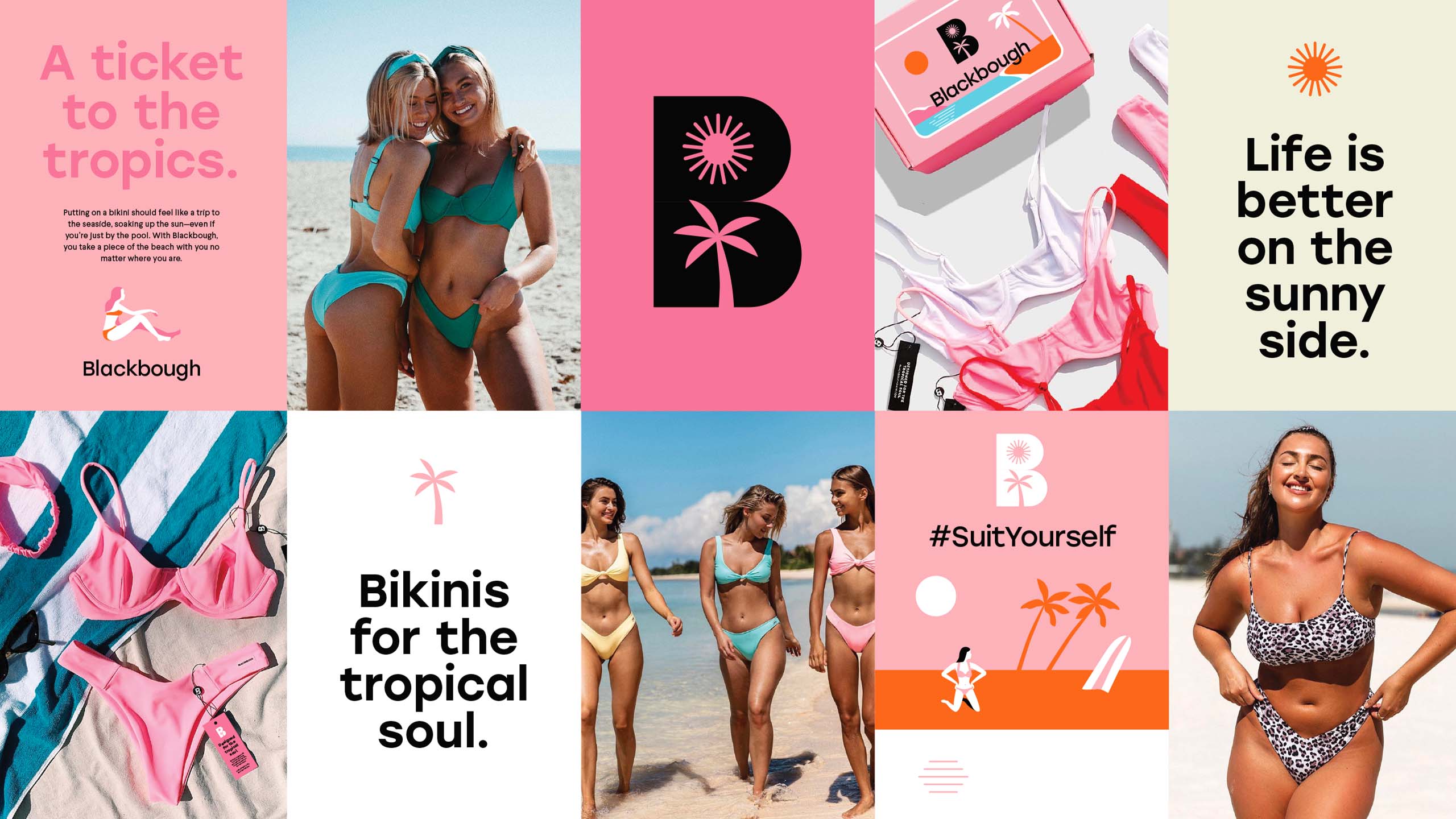
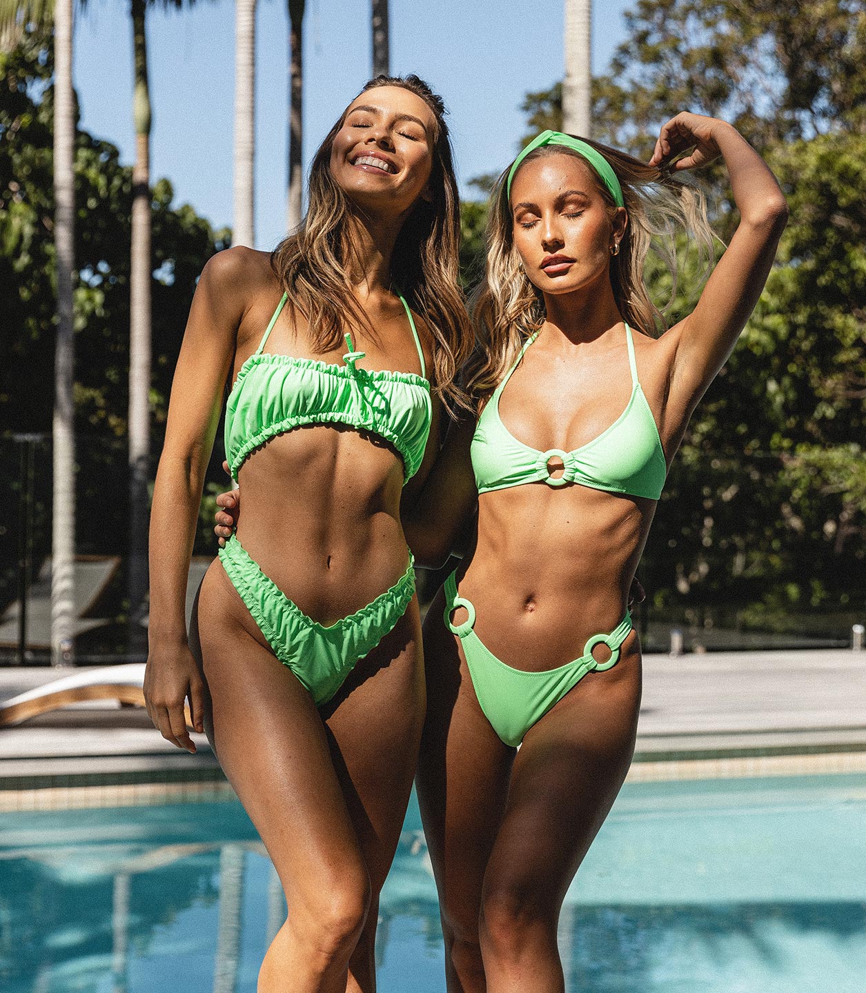
Blackbough is a swimwear brand for girls who love the beach. Its swimsuits are as bold as the women who wear them—and rightfully so—and are worn along beachsides and poolsides all over the world. After all, every day is a beach day when you're wearing the right bikini.
Blackbough, already a leading brand in swimwear, wanted to push its brand further. This was because in such a highly saturated market, even the best brands can find themselves stuck in a pool of similar competitors and lookalikes. Most brands, after all, offer the same thing: the promise of a great bikini and picturesque photos of pretty girls enjoying life by the beach.
Luckily for Blackbough, the brand already had a compelling message: designed for the tropical soul. It just needed to be communicated more effectively through proper visuals and storytelling. That's where we came in. With a more discerning set of customers, constantly changing market needs, and a competitive retail landscape, we wanted to give this brand a platform that properly communicates its value and stand out.
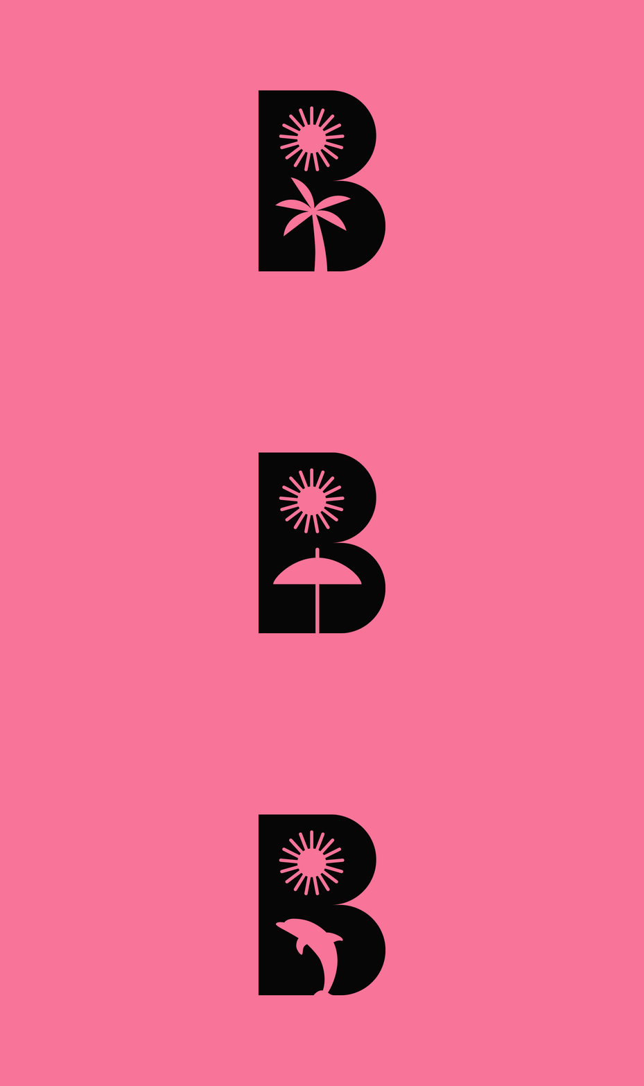
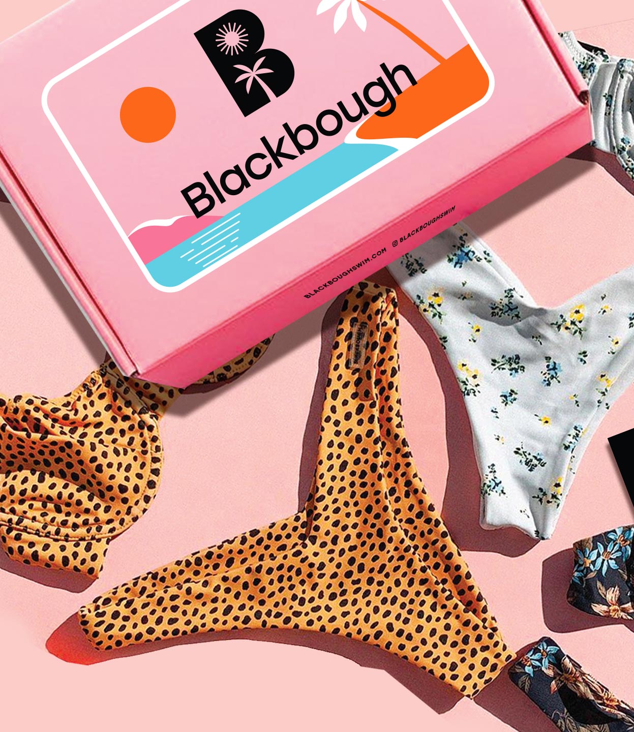
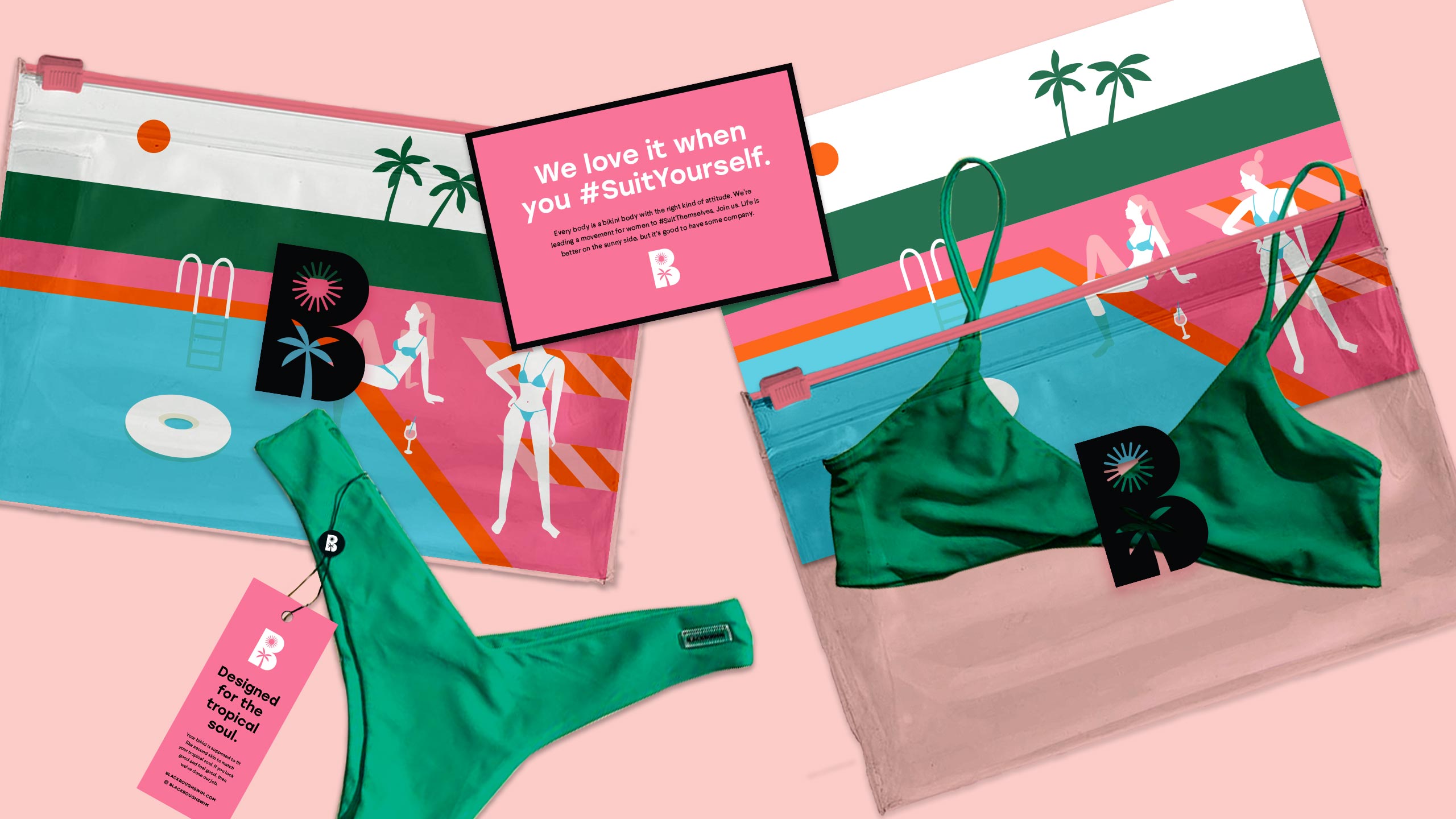
We kept the letter mark approach for the logo icon, highlighting a strong letter B as the main visual cue. To add personality to it, we experimented with various tropical cut-outs and found ourselves drawn to the sun because it immediately communicated the idea of the beach, summer, and the tropics. The bottom half of the letter mark is interchangeable with any element to keep it fun and playful, but its main lockup features the palm tree because of the word "bough" in the brand's name which refers to a branch of a tree. As a whole, the logo icon embraces the idea that you can take your Blackbough swimwear anywhere under the sun.
