THE SERIOUS REVIEW EDITORIAL DESIGN
A Fresh Point
of View
BRANDING SCOPE
Everything ☺
OVERVIEW
The Serious Review is a magazine on branding, business, and design built with intent made be yours truly, global branding and design agency Serious Studio.
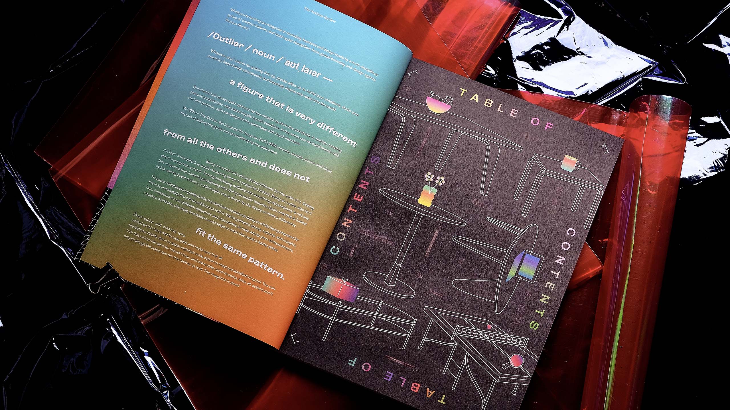
We decided upon "Outliers" being the theme for Vol. 001 because these are people and ideas that are much needed in the world today. More than changing the game and challenging the status quo, it's important that we express that these outliers don't aimlessly aspire to be different. They want to make a difference because their unwavering vision for purpose guides them to a place that transcends everything ever thought of—a road less or never traveled.
MORE INFORMATION
OUTLIERS:
1. Challenge currently accepted concepts and ideas because they are not distracted by fads and are always rigorously disciplined in their pursuit of a vision
1. Challenge currently accepted concepts and ideas because they are not distracted by fads and are always rigorously disciplined in their pursuit of a vision
2. Expand our own fields of vision because they see not one arbitrary thing but a lineage of ideas and solution.
3. Prove to us that things can be of better service to people because this is a world that deserves it.
We have always been inspired by them so it felt natural for us to build Vol. 001's theme as one that appreciates such interest.
THE CHALLENGE.
Our studio's trademark philosophy is "Make Sense and Look Good." We wanted to convey what we meant as a studio and our values in a way that would reach new avenues and platforms. We wanted to make something that will draw upon our vast experience in the industry and that will create a space meant to raise the standard in design, create genuine connections, and improve human conditions.
THE SOLUTION.
The Serious Review is our answer to making sure that our one source of truth, Make Sense and Look Good, extends to anything we do. By providing A Fresh Point of View in a world of clutter and noise, we can contribute in creating a better world through a compilation of this honest and thoughtful takes on branding, business, and design ideas and values worth pursuing. It is also our collective effort to highlight the boundless capacities of our team of visionaries comprised of strategists and designers, while inspiring everyone else who gets their hands on a copy.
THE CREATIVE DIRECTION.
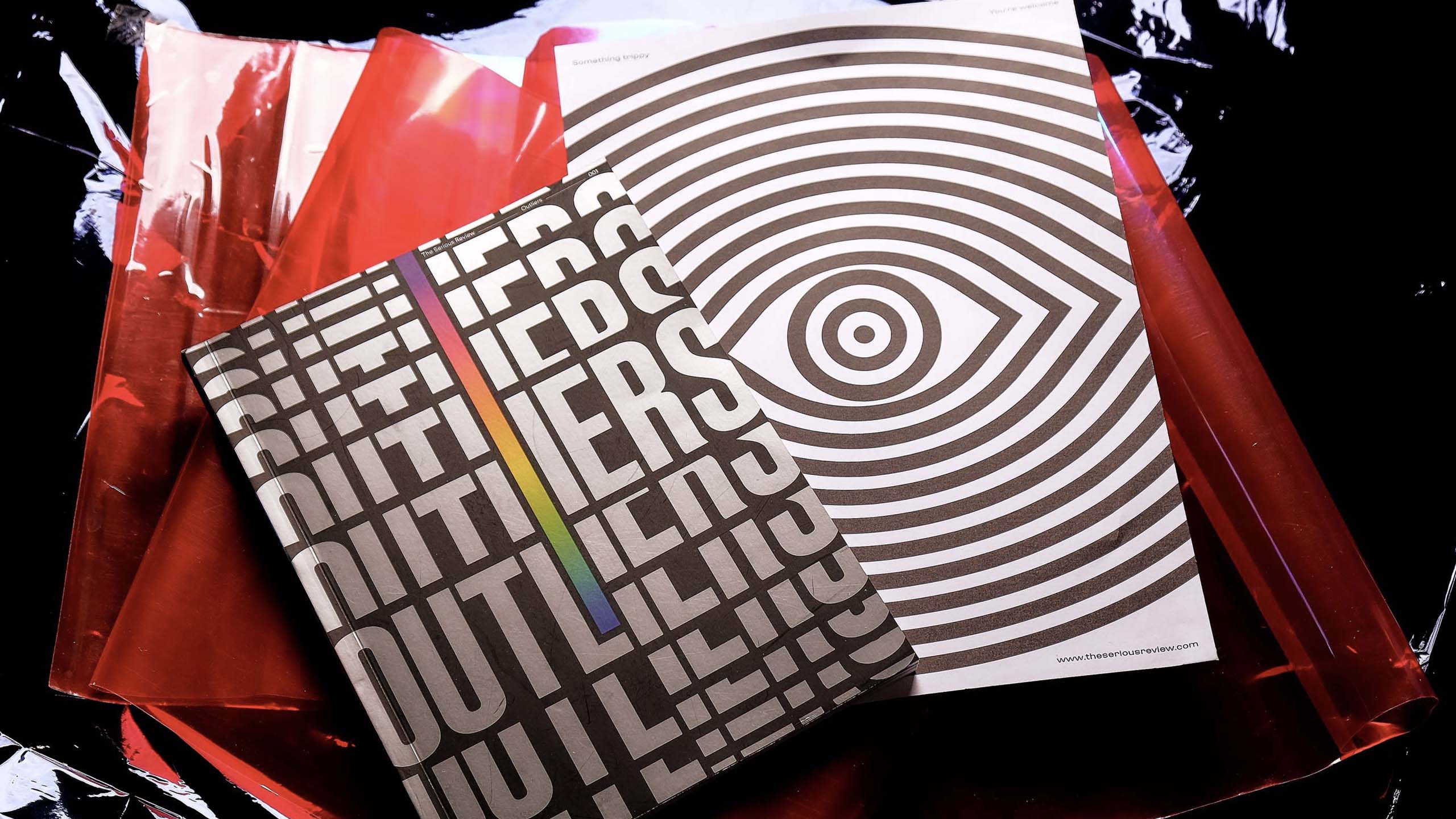
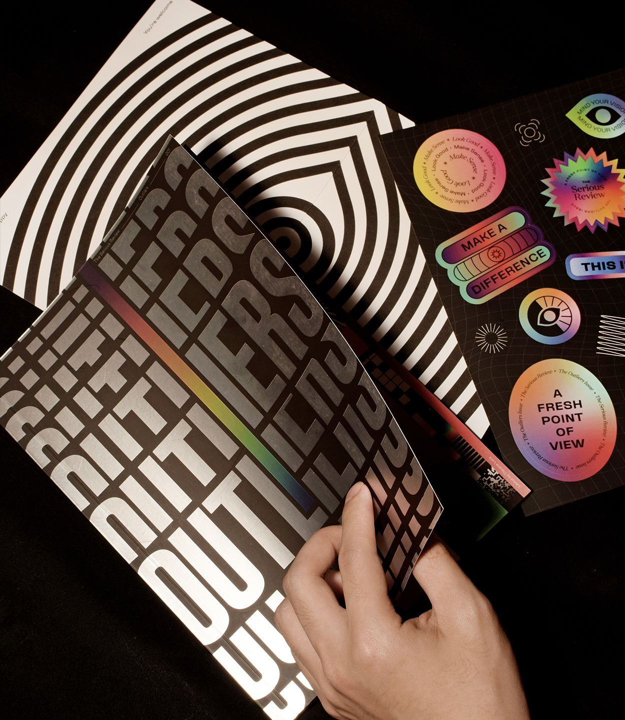
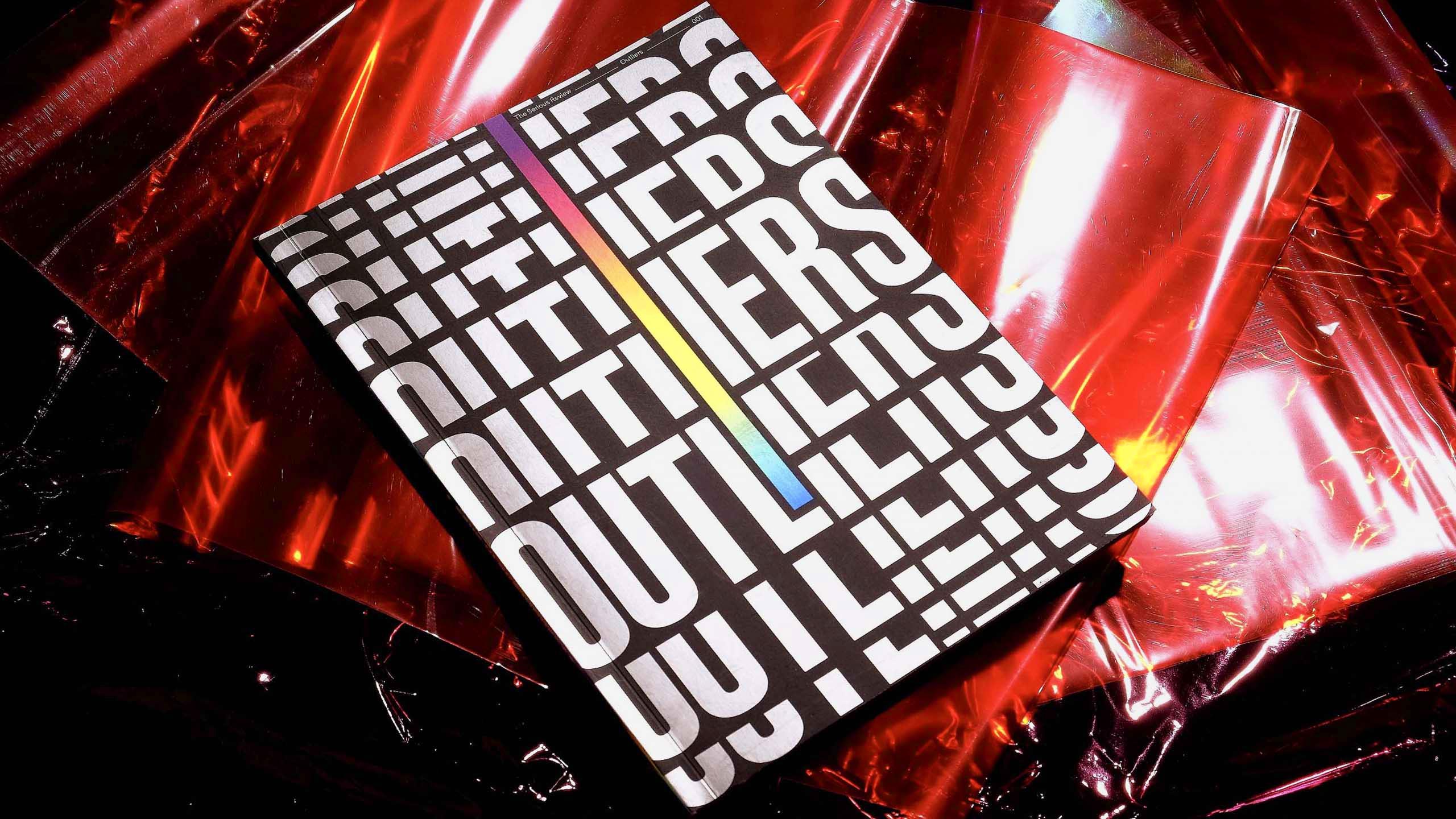
Every The Serious Review issue is planned out to be uniquely its own in terms of content theme and aesthetic. This is why we went all out with Vol. 001: Outliers—a creative direction that's truly representative of a world of ideas, the concept of outliers, and the diverse topics it covers. The studio jokes about how we always want to explore an aesthetic that would probably never get approved by a client. But jokes aside, self-initiated projects like The Serious Review truly becomes an opportunity for us to flex our design muscles.
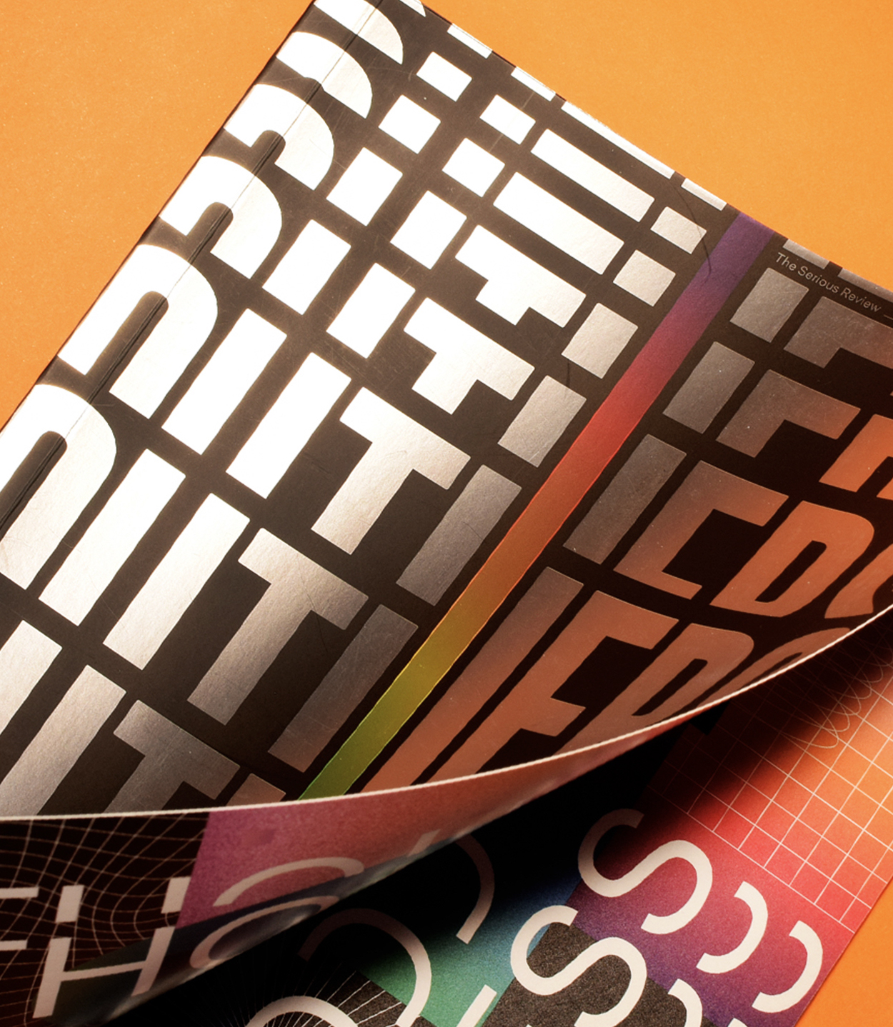
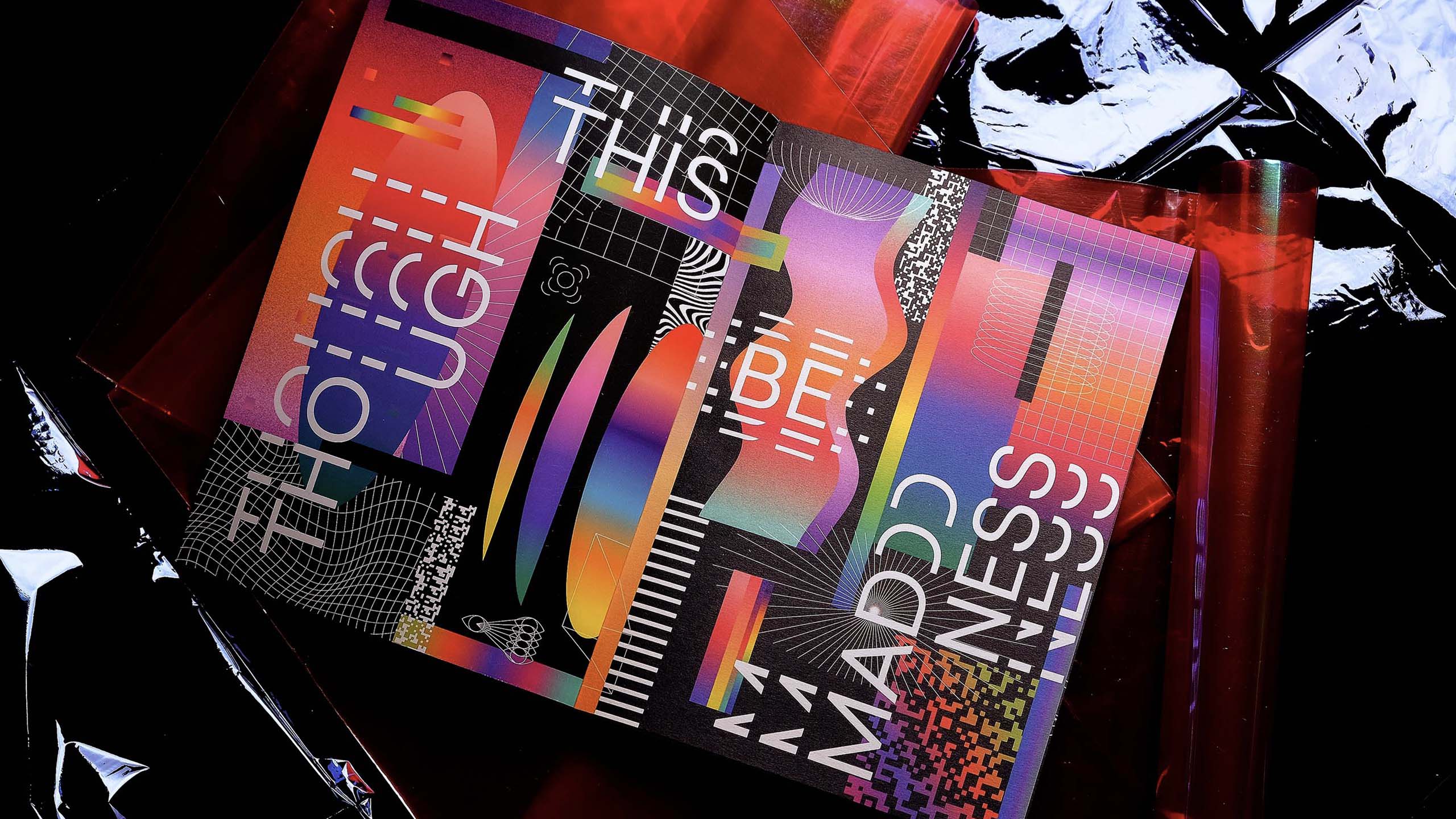
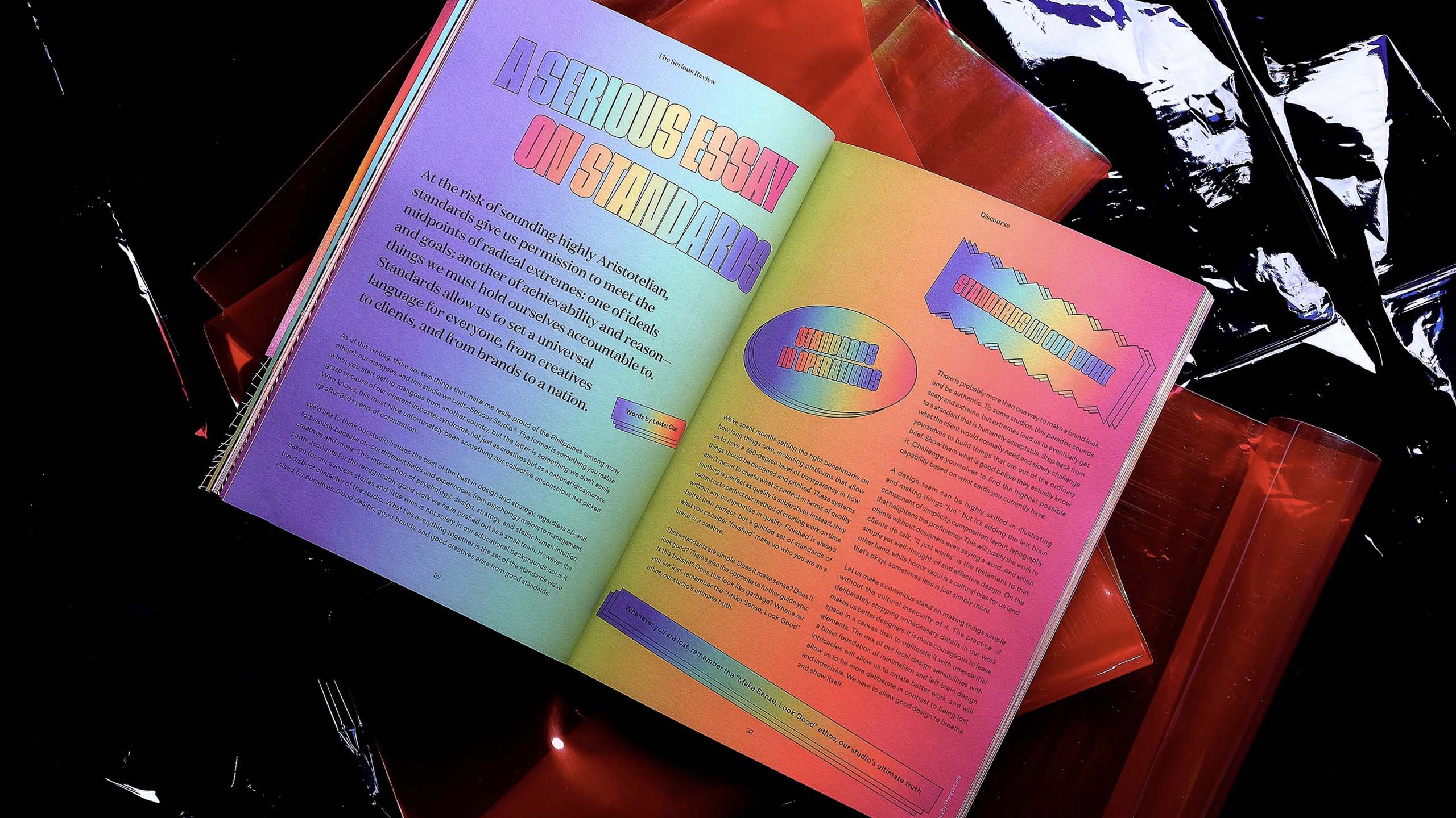
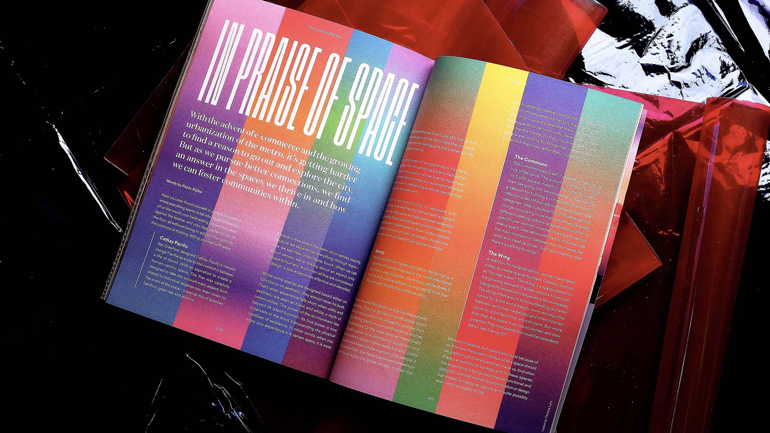
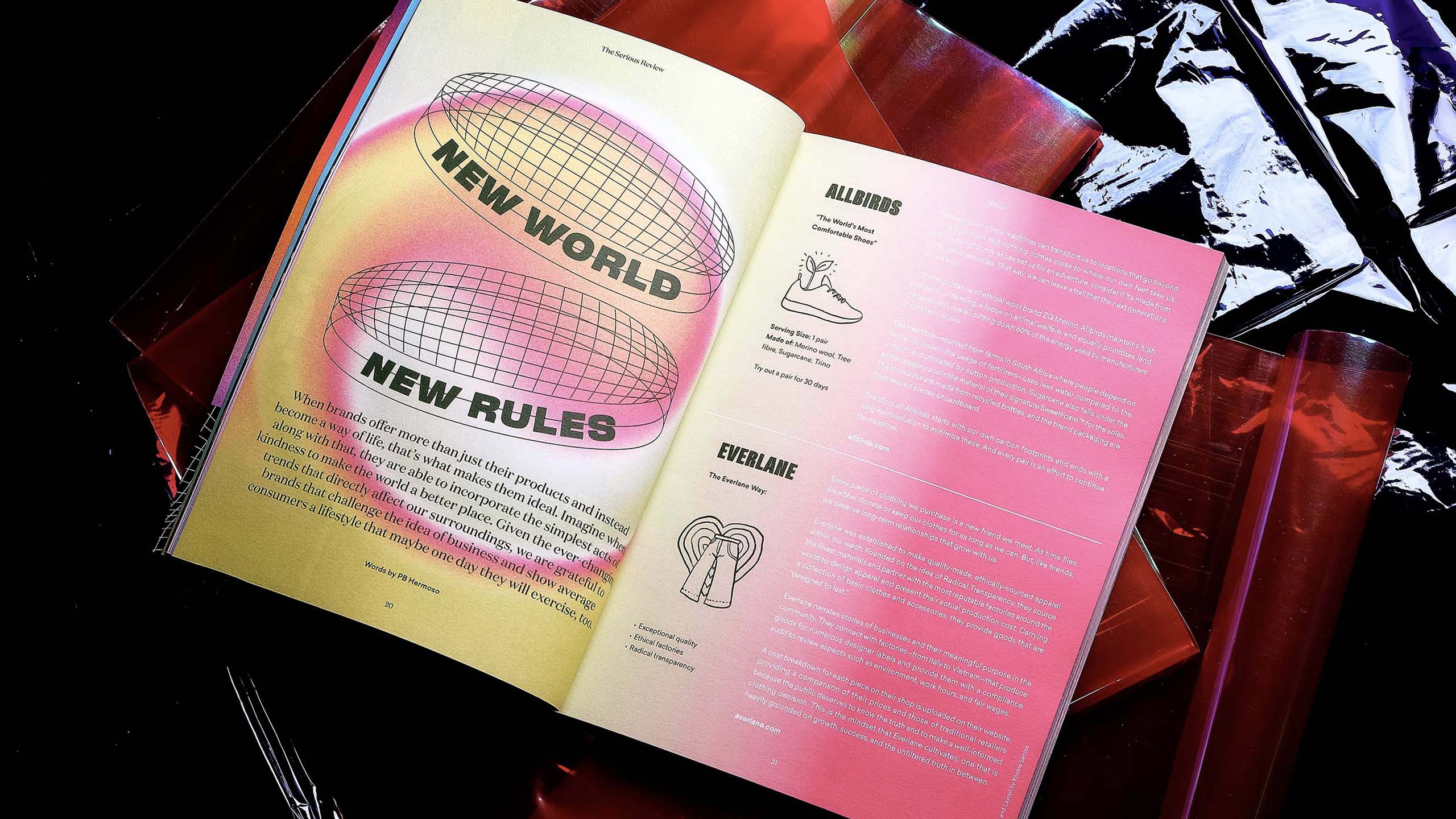
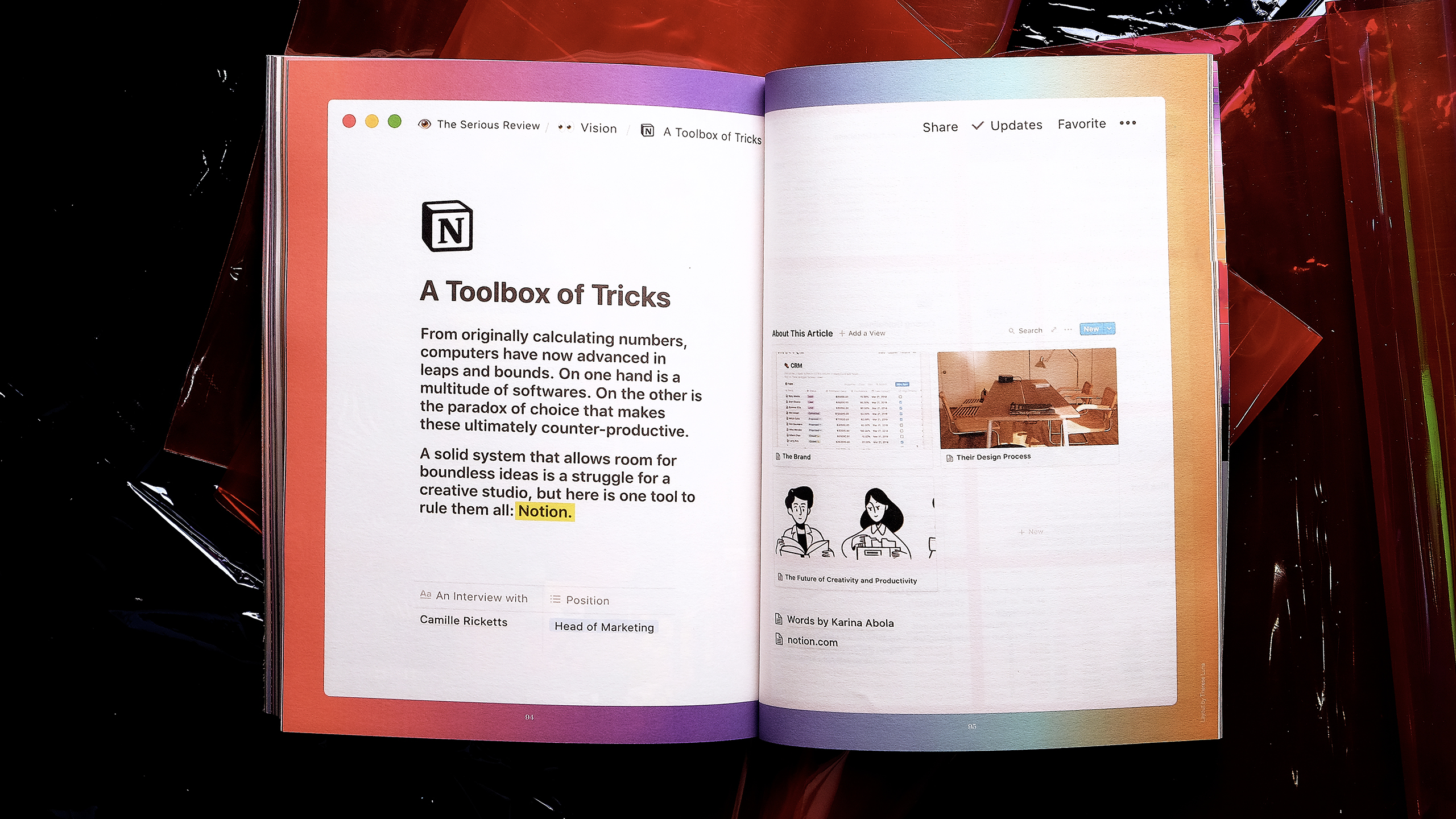
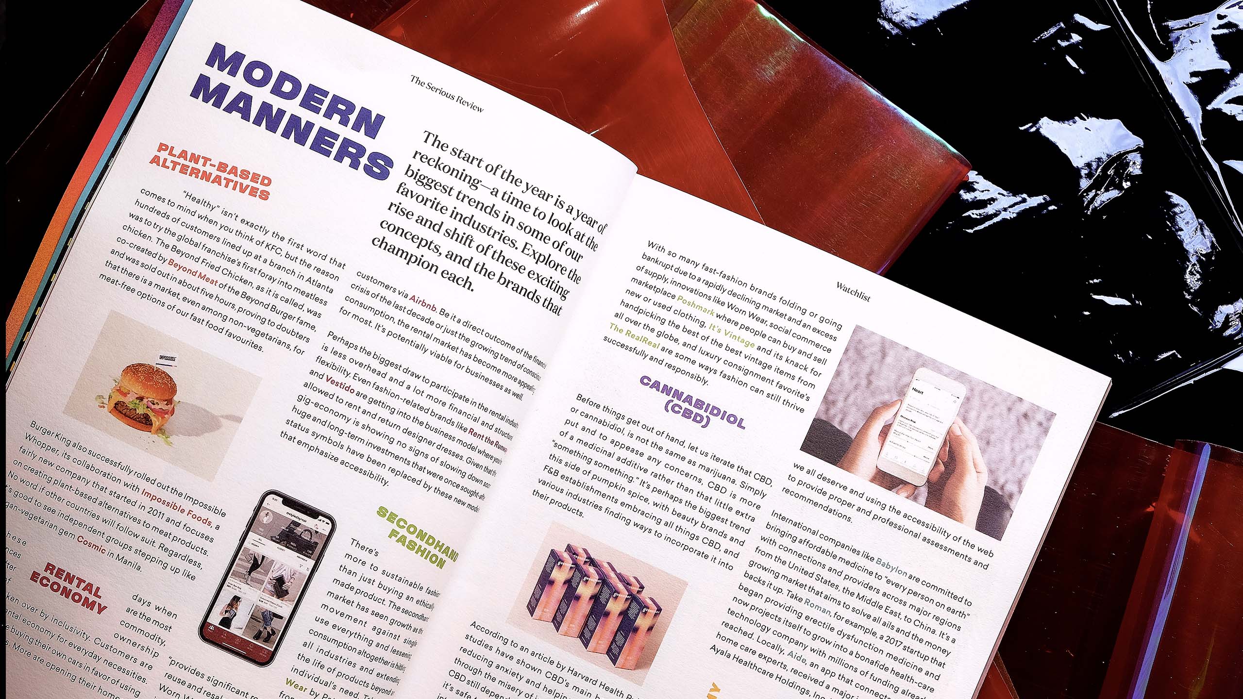
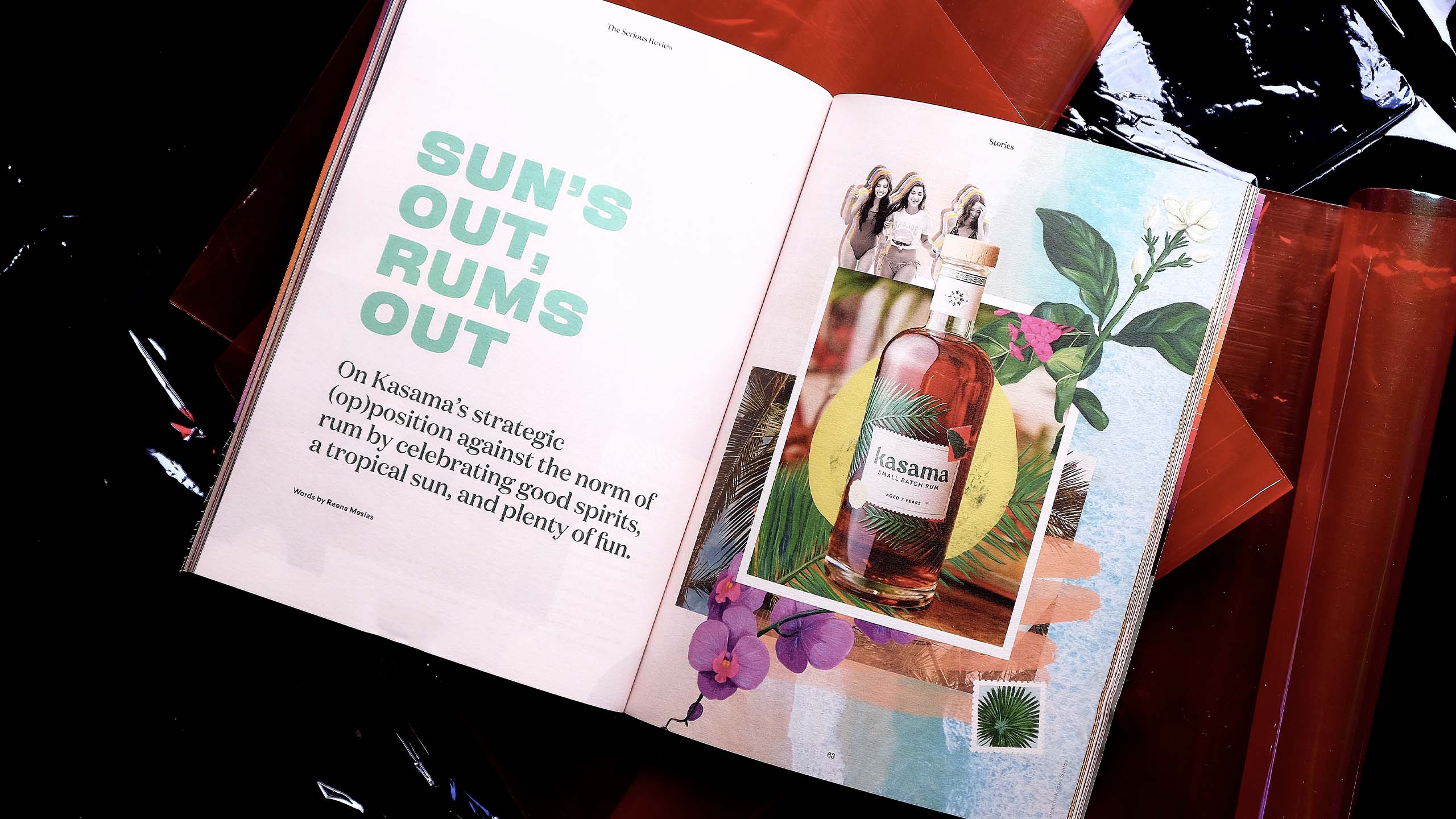
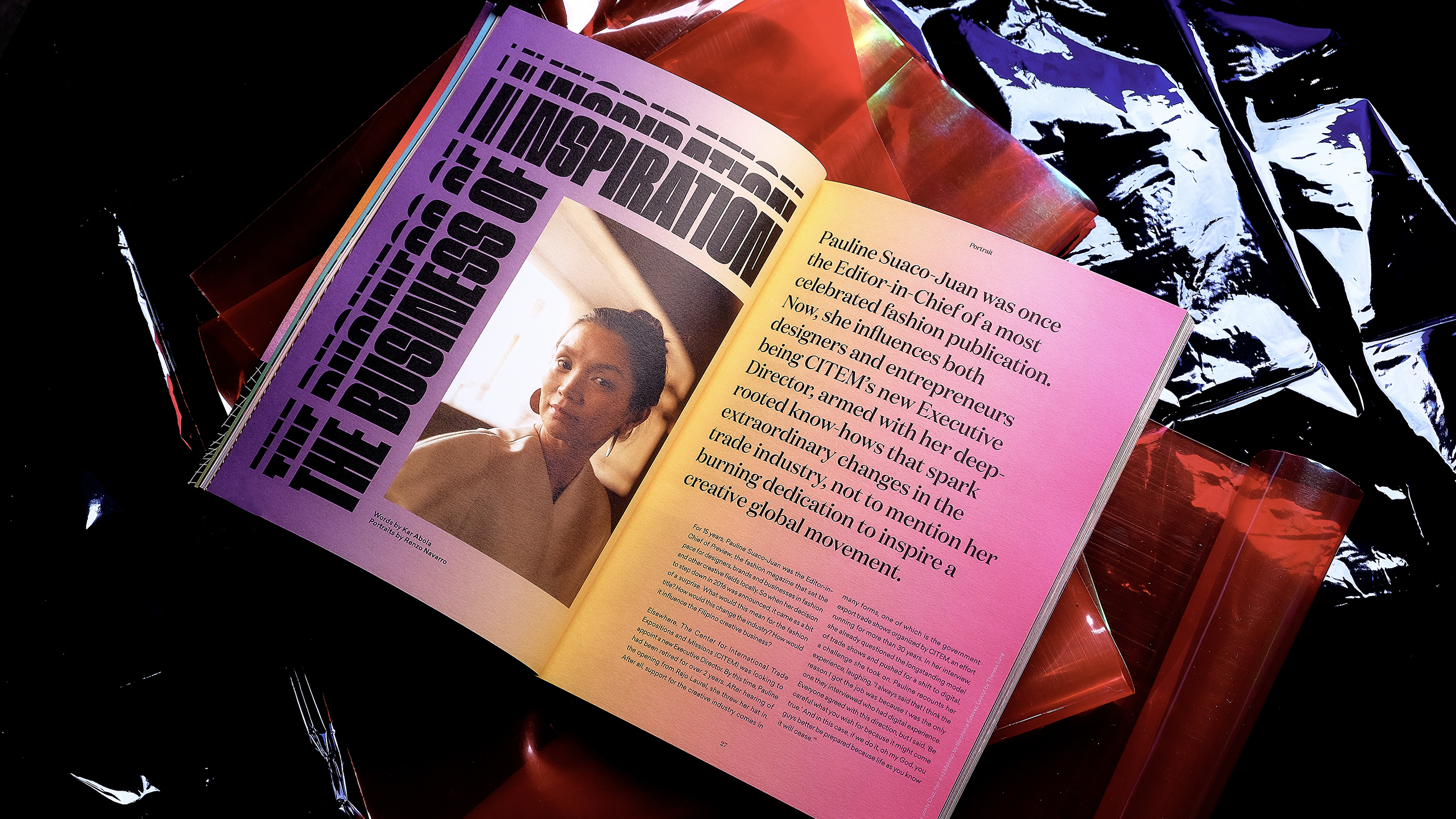
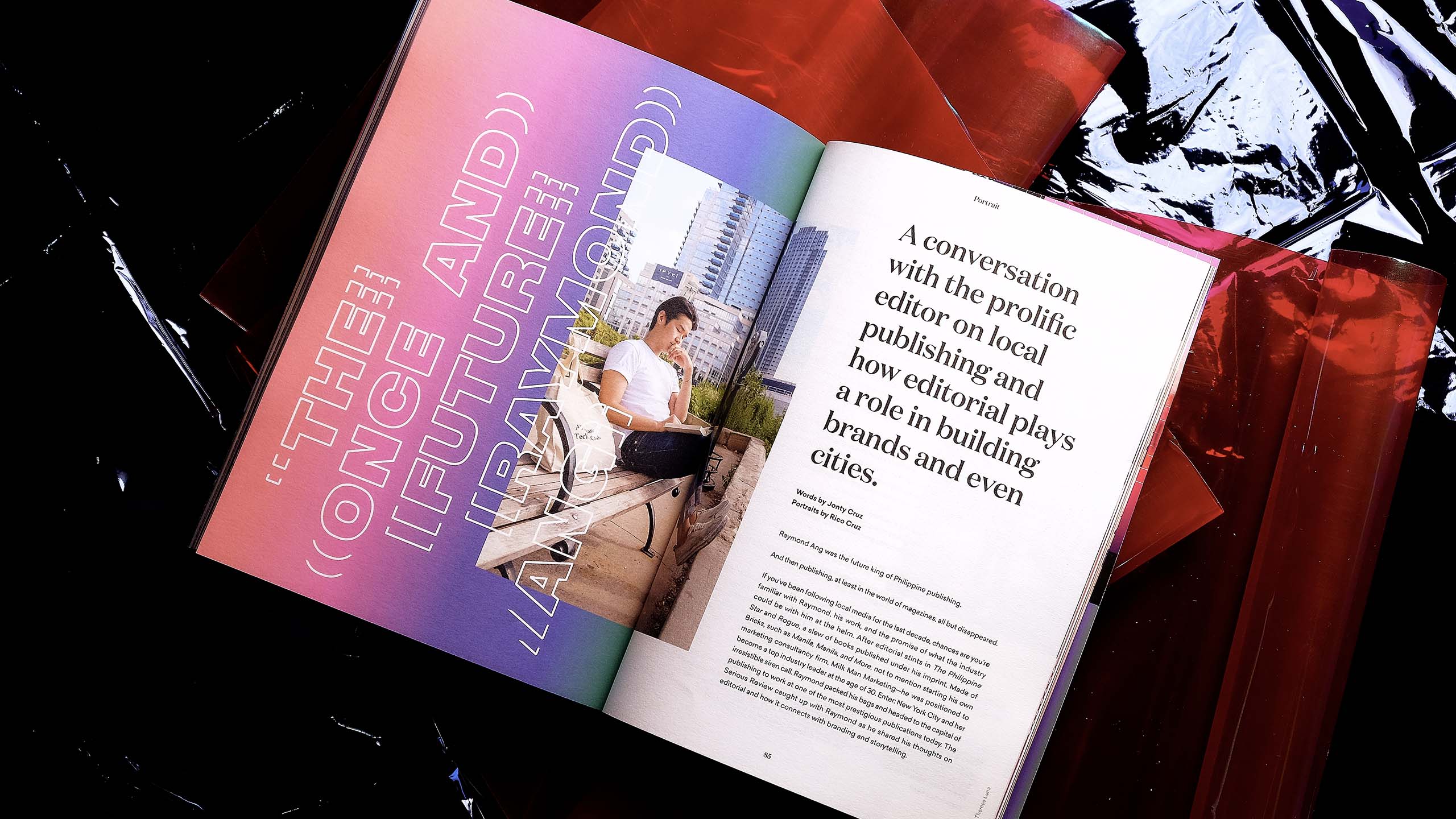
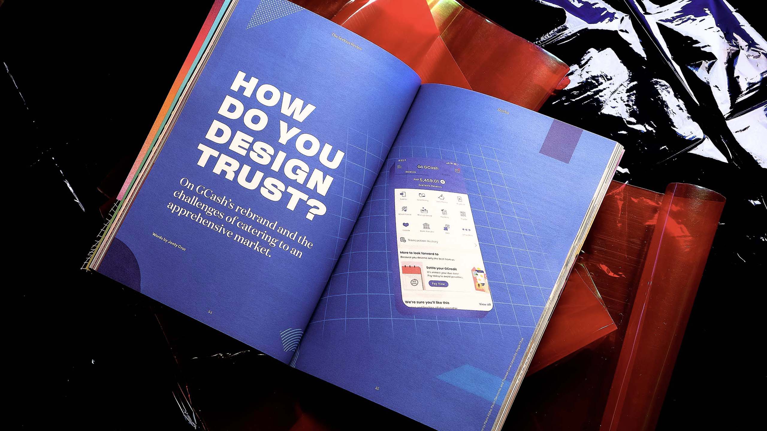
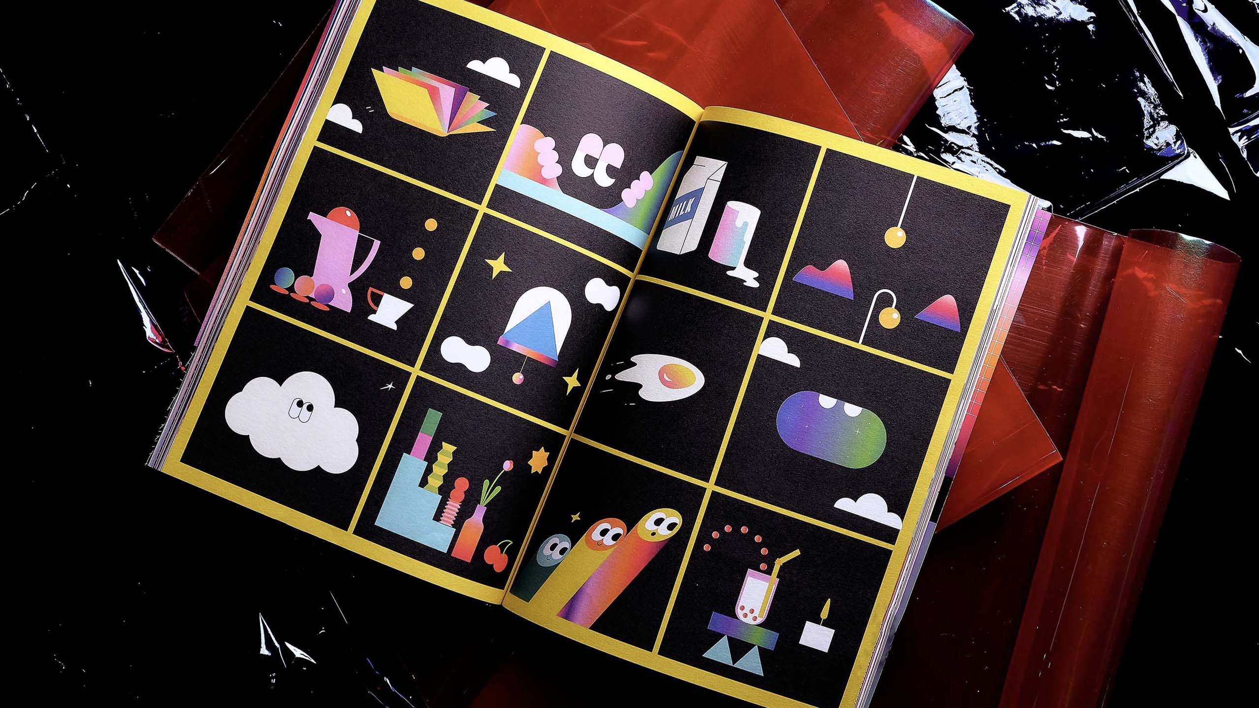
Much like how outliers go beyond, we also connected the content's theme to a design concept that "disrupts." Thus, a multitude of elements in the middle of change, usually in the form of distortion, dynamism, and disassembly. A big key visual in the issue is the use of the gradient, usually perceived as unrefined. But this was a welcome challenge and a chance for us to turn the perception around into a beauty that is refreshed, redefined, and made new. It's a party to the pages and it was seamlessly translated to the Instagram account as well.
Having these elements abstract made us play with them quite easily, making sure that once put together, they can symbolize and can be applied in a broad range of topics that the articles and photos will cover. This resulted in a conscious decision to distinctly and intentionally design every article and every post, to have visually different worlds in themselves because we wanted to immerse readers into the meat of the meticulously written content. The magazine is printed on MGX Metallic Board-O2S 12pt 19x13 Silver [cover] and Astro Bianco 100 GSM [inserts].
THE STORIES AND FEATURES.
In everything that The Serious Review churns out, we want it to be a balanced approach swinging between thought leadership and brilliant design. In this way, we ultimately create and curate content that is sincere, fearless, and resolute.
The process in choosing the brands or people we want to be part of The Serious Review Vol. 001 started with the story we're trying to tell, in this case: outliers. As a branding and design studio, we make sure to keep ourselves updated on trends, brands, and ideas around the world. So when it came to selecting the brands and people, it was natural for us to pick out the ones that we personally admired for the impact that they provide, and the values that they uphold. This level of personal connection with these brands and trends ensures that we vouch for them in ways that we genuinely know and experience.
THE WEBSITE.
The Serious Review is a magazine and a website. The website compiles articles that also relate to branding, business, and design—some are outtakes from the previous issue, others are musings that can no longer wait until the next. We envision the site as a useful guide and source to the incredibly varied lessons, people, and brands surrounding the industry. Whether print or online, the vetting process for topics is extremely important because we eventually want to build a culture of curated knowledge that creates a positive ripple to everyone who cares about such type of content. We want to create a society that will be working for each other and with us.
Special thanks to:
IFEX Inc.
Isabella Argosino
Michelle Ayuyao
PB Hermoso
Rico Cruz
Shaira Luna
Renzo Navarro
Stephanie Estevez
Isabella Argosino
Michelle Ayuyao
PB Hermoso
Rico Cruz
Shaira Luna
Renzo Navarro
Stephanie Estevez



Make Sense & Look Good®. Made by Serious People. Creating brands that shape tomorrow, today. Boring is the Enemy. Humans deserve nice things™. Seriously. Hi Mom. Success is found in the details. With great budgets come great work. We are known to make brands human. We enjoy creating brands from the ground up. Great brands invest in great design. Ugly brands don’t care about people. Your brand could always be better. Trust us. Branding is like mind control, but cooler. We will tell you if you have food stuck in your teeth. For a relaxing time, make it Suntory time. Make Sense & Look Good®. Made by Serious People. Creating brands that shape tomorrow, today. Boring is the Enemy. Humans deserve nice things™. Seriously. Hi Mom. Success is found in the details. With great budgets come great work. We are known to make brands human. We enjoy creating brands from the ground up. Great brands invest in great design. Ugly brands don’t care about people. Your brand could always be better. Trust us. Branding is like mind control, but cooler. We will tell you if you have food stuck in your teeth. For a relaxing time, make it Suntory time. Make Sense & Look Good®. Made by Serious People. Creating brands that shape tomorrow, today. Boring is the Enemy. Humans deserve nice things™. Seriously. Hi Mom. Success is found in the details. With great budgets come great work. We are known to make brands human. We enjoy creating brands from the ground up. Great brands invest in great design. Ugly brands don’t care about people. Your brand could always be better. Trust us. Branding is like mind control, but cooler. We will tell you if you have food stuck in your teeth. For a relaxing time, make it Suntory time. Make Sense & Look Good®. Made by Serious People. Creating brands that shape tomorrow, today. Boring is the Enemy. Humans deserve nice things™. Seriously. Hi Mom. Success is found in the details. With great budgets come great work. We are known to make brands human. We enjoy creating brands from the ground up. Great brands invest in great design. Ugly brands don’t care about people. Your brand could always be better. Trust us. Branding is like mind control, but cooler. We will tell you if you have food stuck in your teeth. For a relaxing time, make it Suntory time.