NALA

A WOMAN-KIND WORLD

NALA

A WOMAN-KIND WORLD

NALA:
A WOMAN-KIND WORLD

NALA:
A WOMAN-KIND WORLD

OVERVIEW

Nala is a femtech brand that focuses on period care products. It exists to “disrupt” periods by taking feminine TLC a little more seriously—through periods that are safer, kinder, and healthier both for the womxn who experience them, and the world that carries them.

WHAT WE DID

Brand Strategy
Brand Identity
Packaging Design
Brand Illustrations

PROJECT TEAM

Creative Direction: Deane Miguel & Kookie Santos
Lead Strategy: Karina Abola
Lead Design: Angela Chua

SPECIAL THANKS

Photography by Aya Cabauatan & Jenny Penas

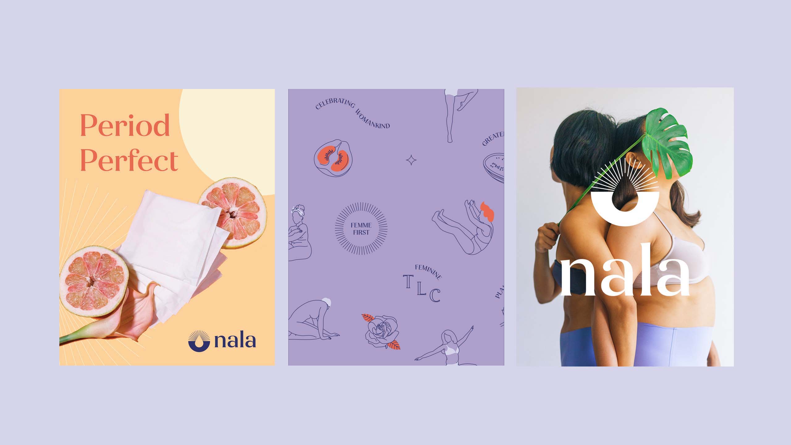
Minimal line art illustrations of women and product photography for femtech brand Nala
THE CHALLENGE

The challenge was to create an identity that would appeal to a diversity of women while taking into account two things: (1) How does Nala compete with the familiar and convenient brands that the market has known all their life? (2) How does Nala stand out from the increasingly similar and minimal design aesthetics of the new wave of alternatives?

Product photography and styling and minimal modern icon set designed for femtech brand Nala
THE SOLUTION

Our design strategy was guided by the remarkably strong commitment to make periods easier, healthier, and more comfortable—of course, with women and their overall well-being as front and center—and to create a visual personality that’s not only fun but also empowering and embracing of their mission. It was a branding process as conscious as Nala.

Modern brand icon and bold feminine sans serif logo type designed for femtech brand Nala

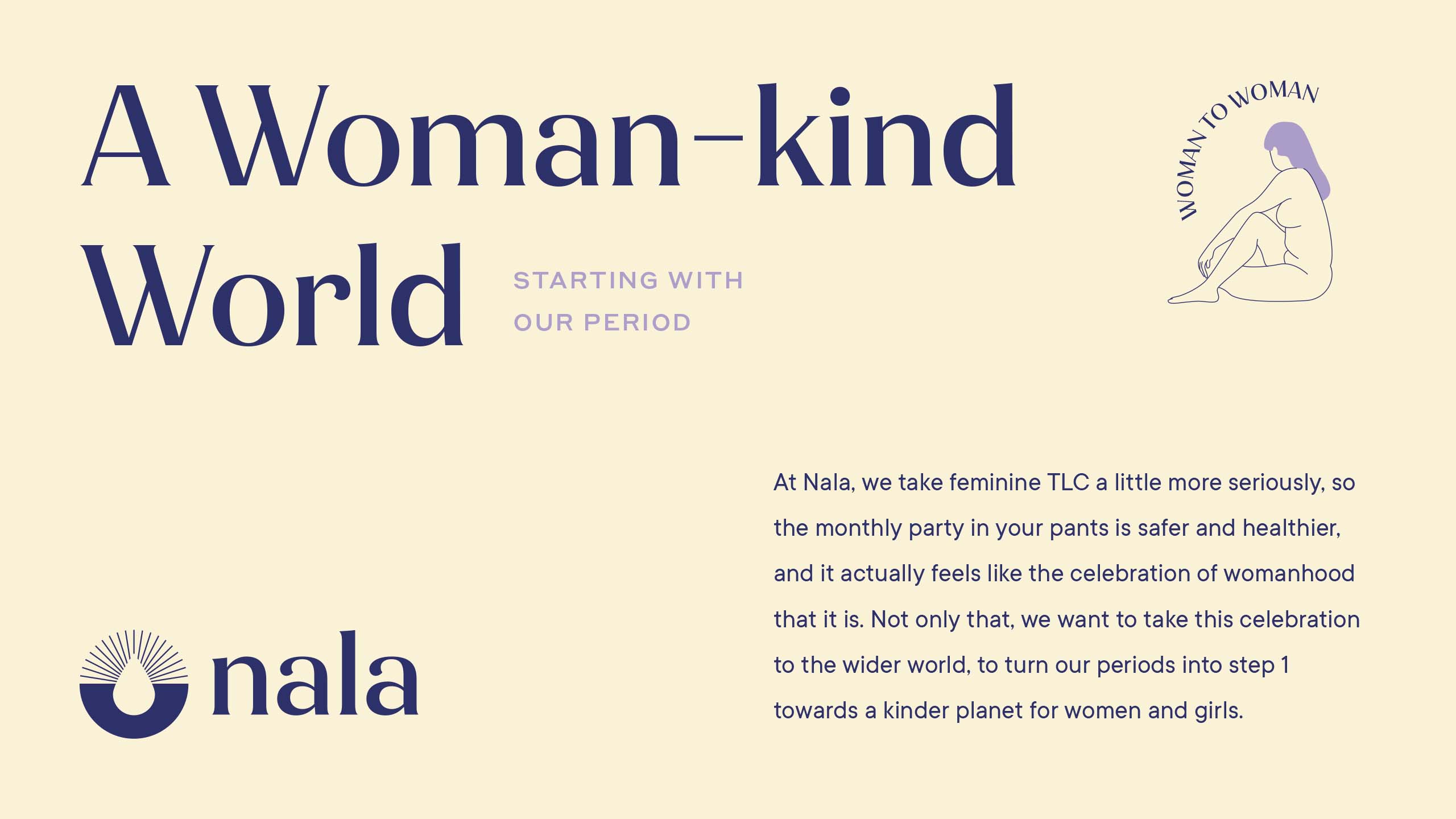
The logo icon contains 3 components: sun rays, the horizon, and the negative space forming a droplet. Together, these form an optimistic brand mark that draws attention to the familiar symbol for a woman’s period.

The brand mark is paired with a sharp sans serif that has contrasting strokes that give it a sophisticated and modern appeal.

Modern and bold typesetting and layout design for femtech brand Nala
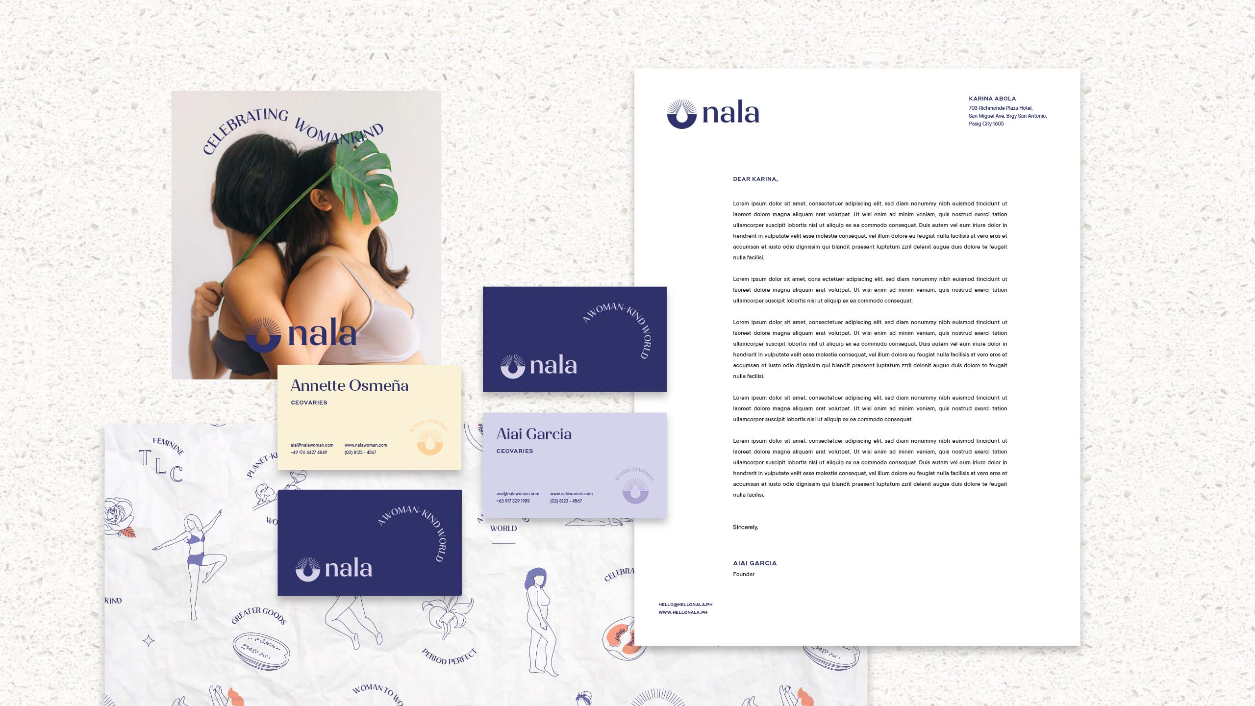
A flat lay of business collaterals for sustainable femtech brand Nala

The color palette balances softness and strength by pairing soothing purple hues and warm tones.

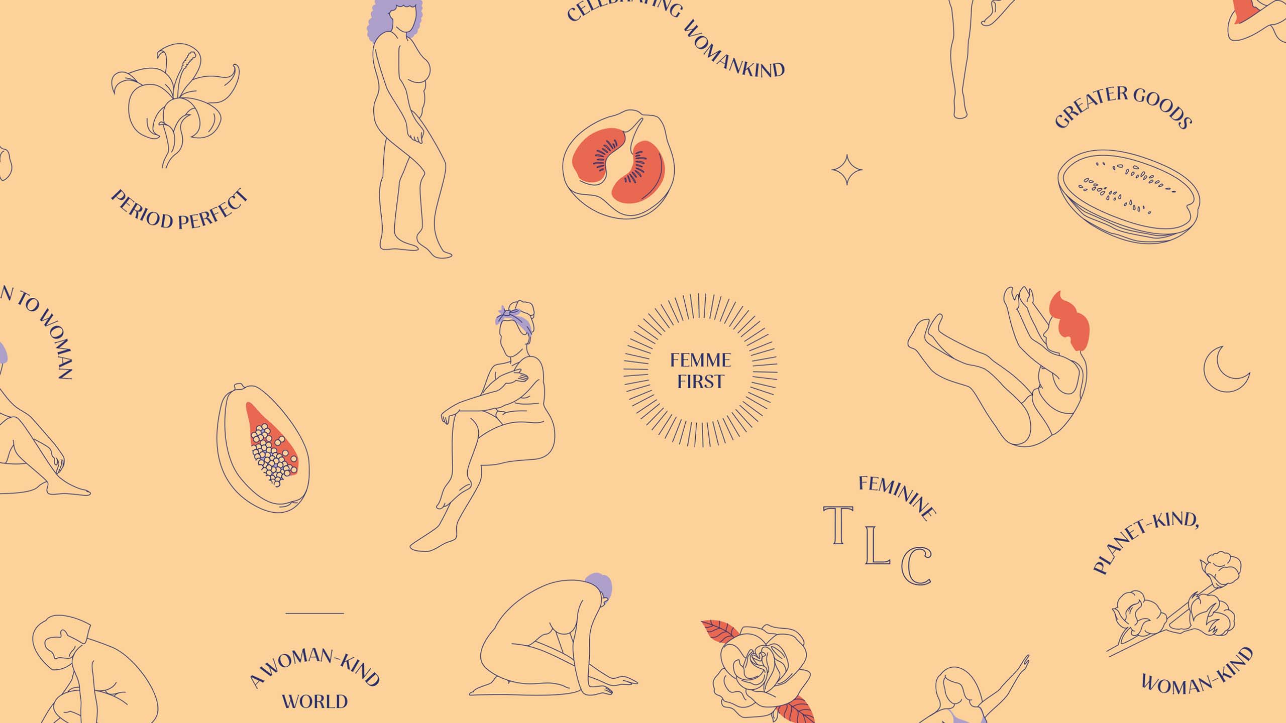
A minimal brand pattern of illustrations of women and fruits designed for femtech brand Nala
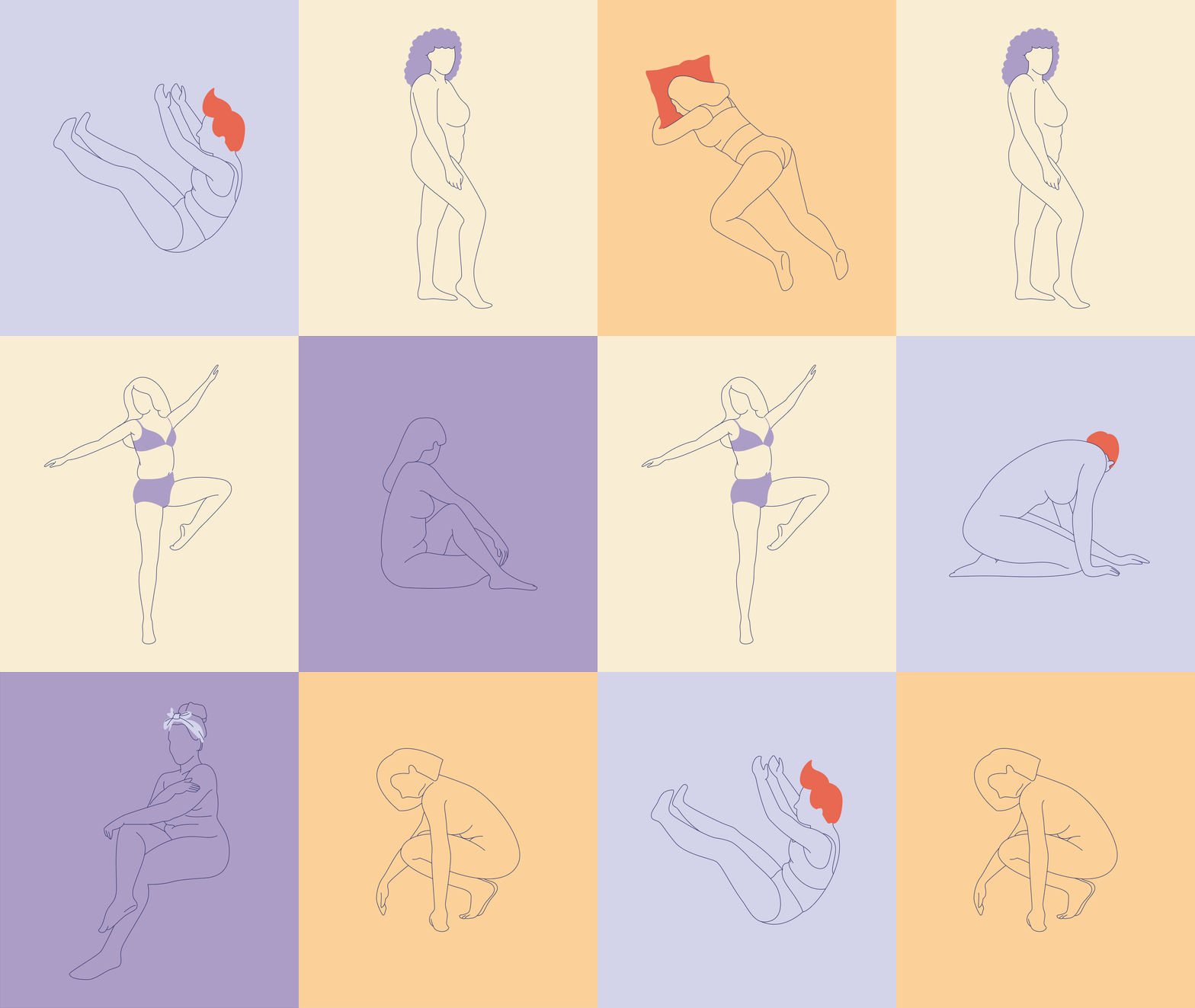
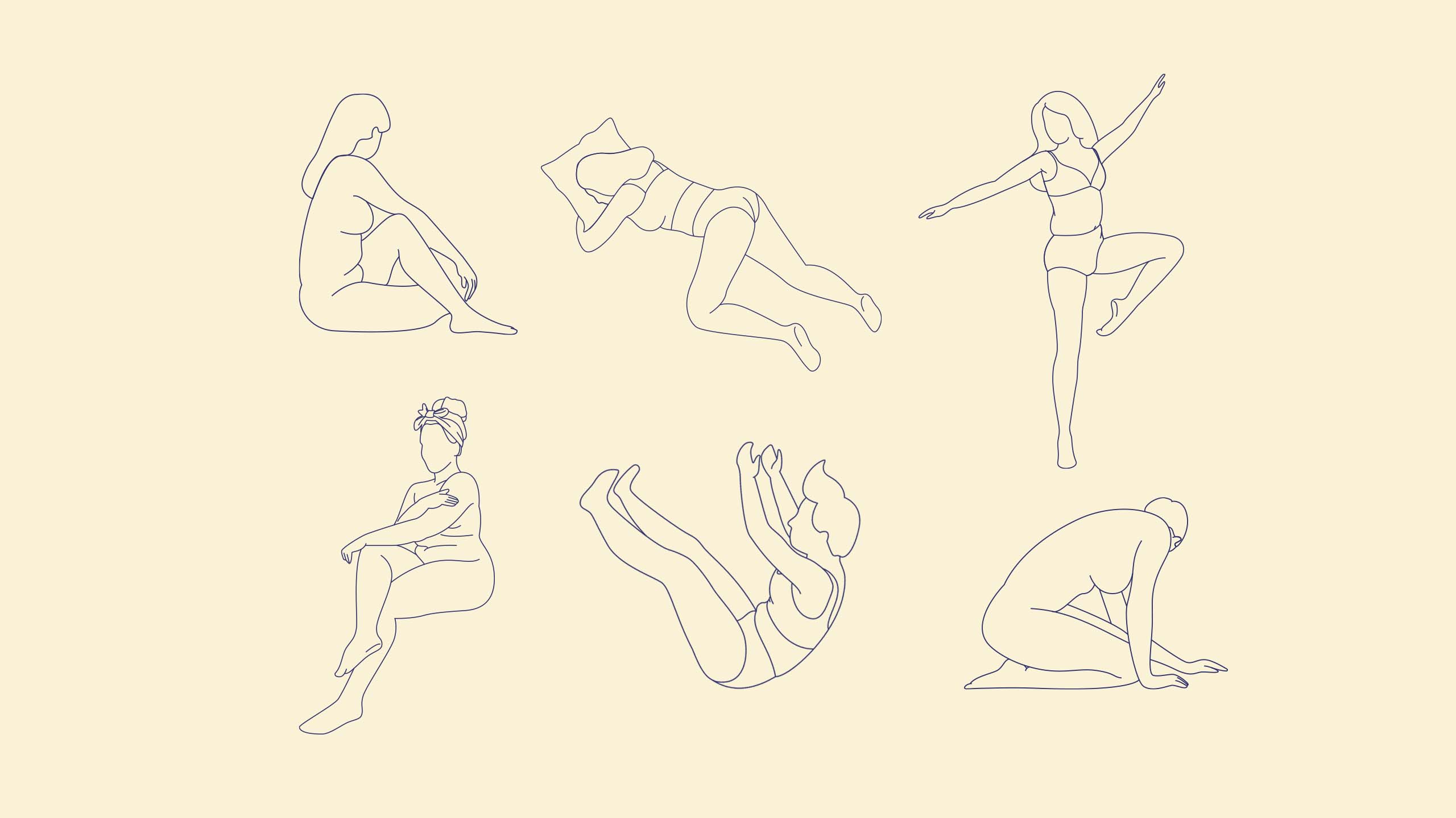
Relatable and minimal line art illustrations of women designed for femtech brand Nala
Animated illustrations of women designed for femtech brand Nala

We designed three main key visuals, all of which ended up serving as building blocks for the brand, and to collectively help in conveying Nala’s point of view and tone. One of those is based on the logo’s icon components of the sun rays, seen repeatedly in the brand’s touchpoints like the packaging. Type treatments were made to give Nala a more energetic and dynamic look, while line art illustrations of the products they offer, of realistic women, and of plants and fruits that resemble women’s body parts were made to humanize the brand and show inclusivity.

Brand photography and patterns designed for femtech brand Nala
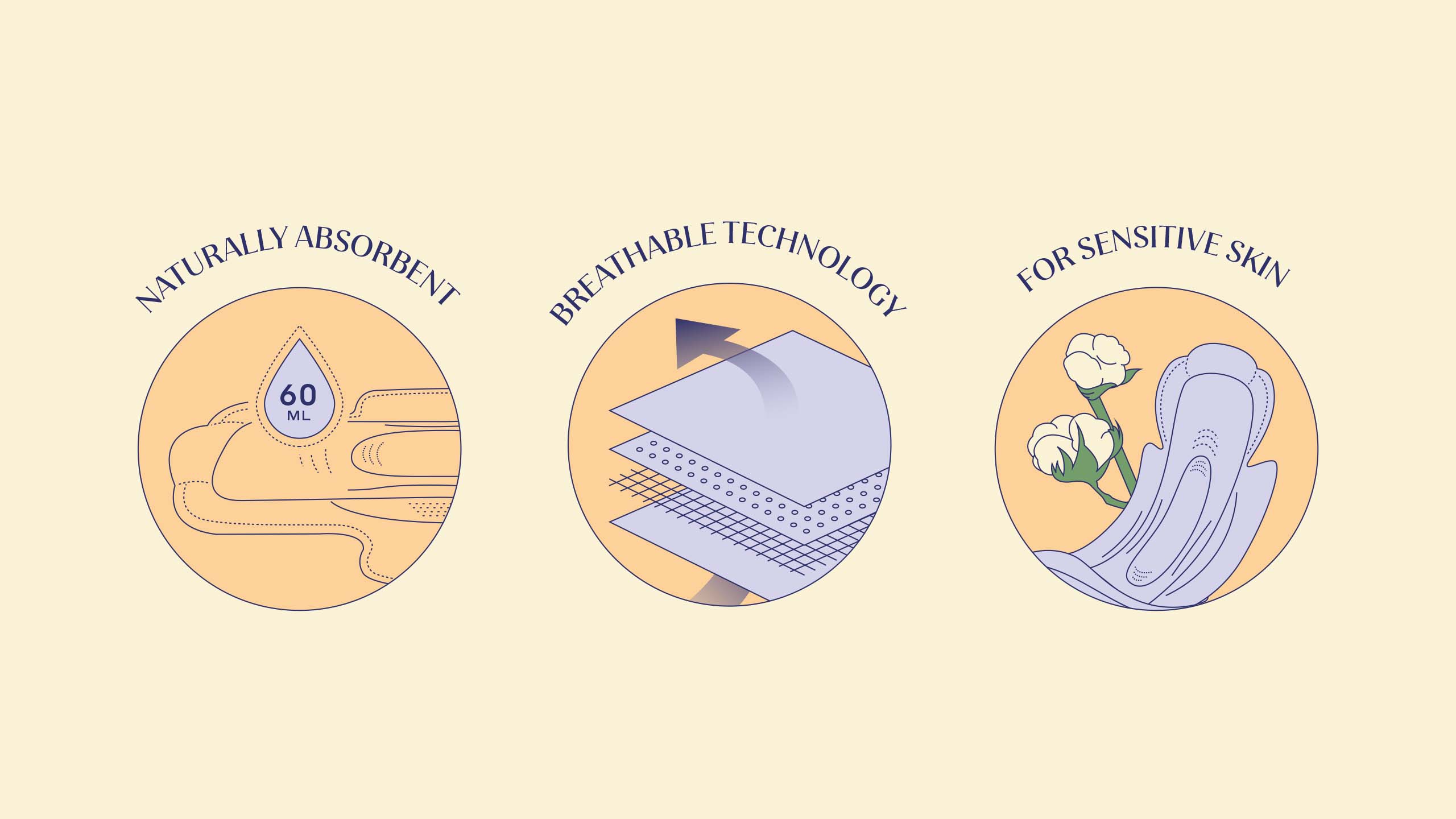
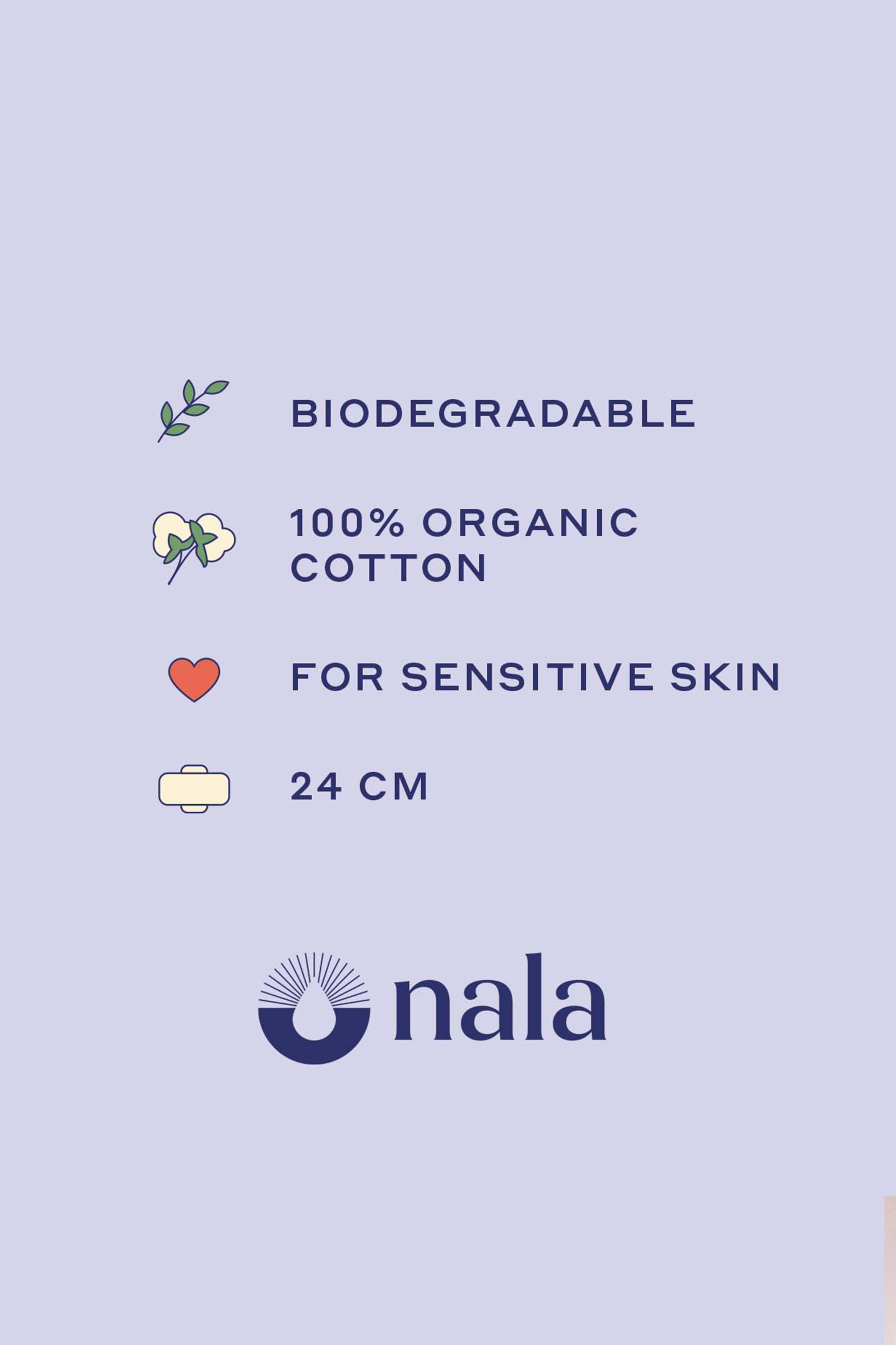
Minimal infographic illustrations designed for femtech brand Nala
Brand illustration and photography for femtech brand Nala
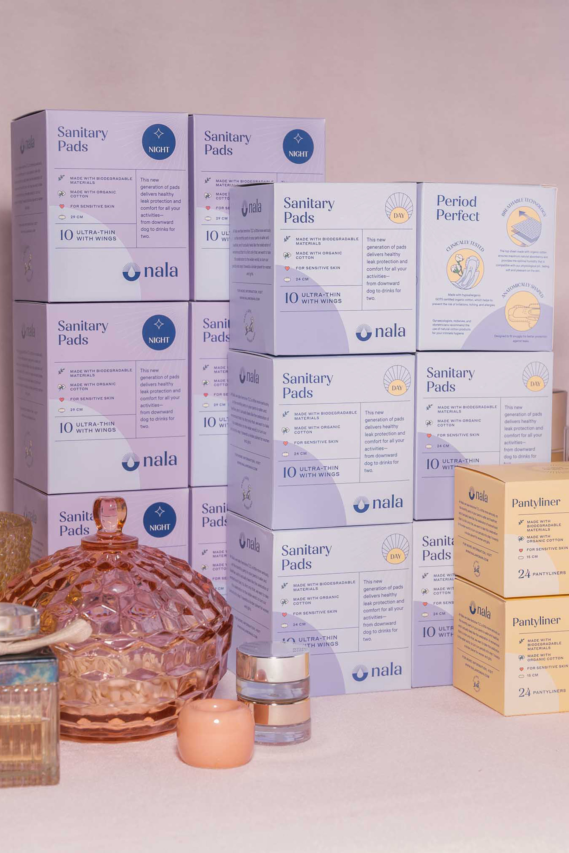
Flat lay photography of sanitary products and packaging design for femtech brand Nala
A flatlay of sanitary products and packaging designed for femtech brand Nala

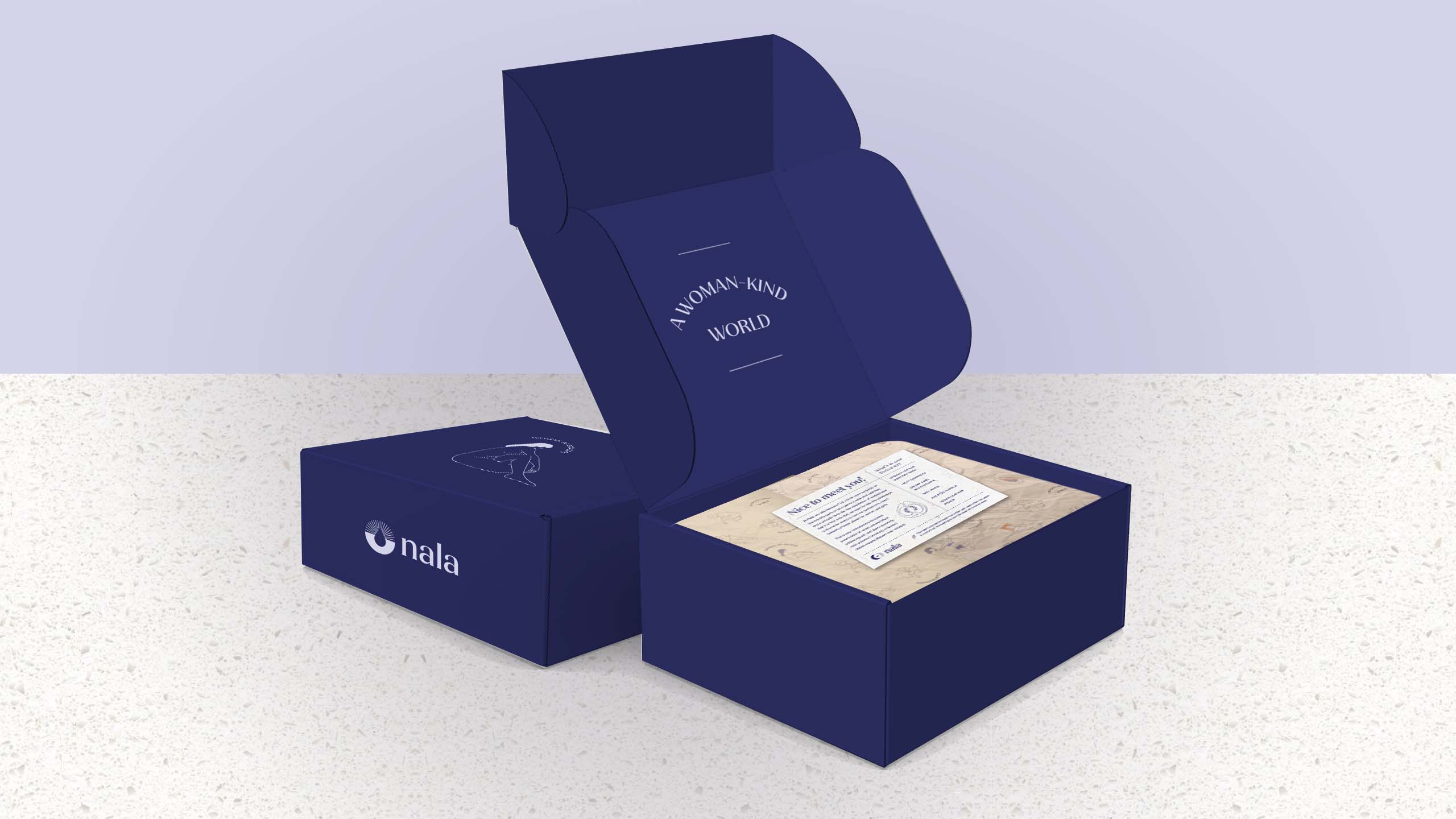
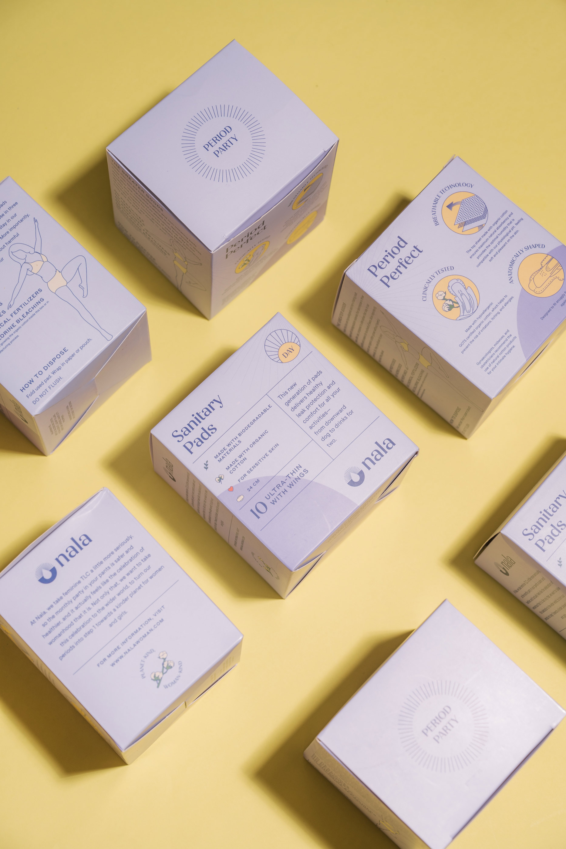
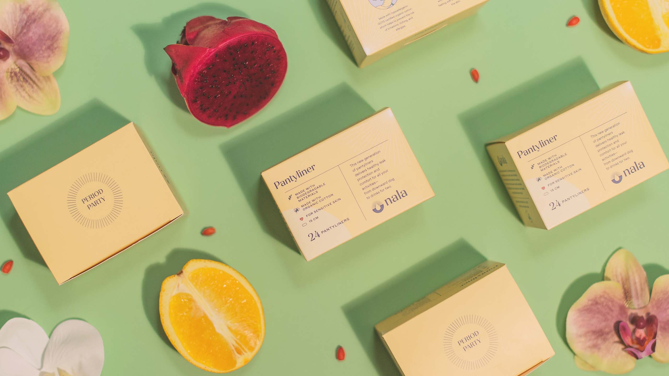
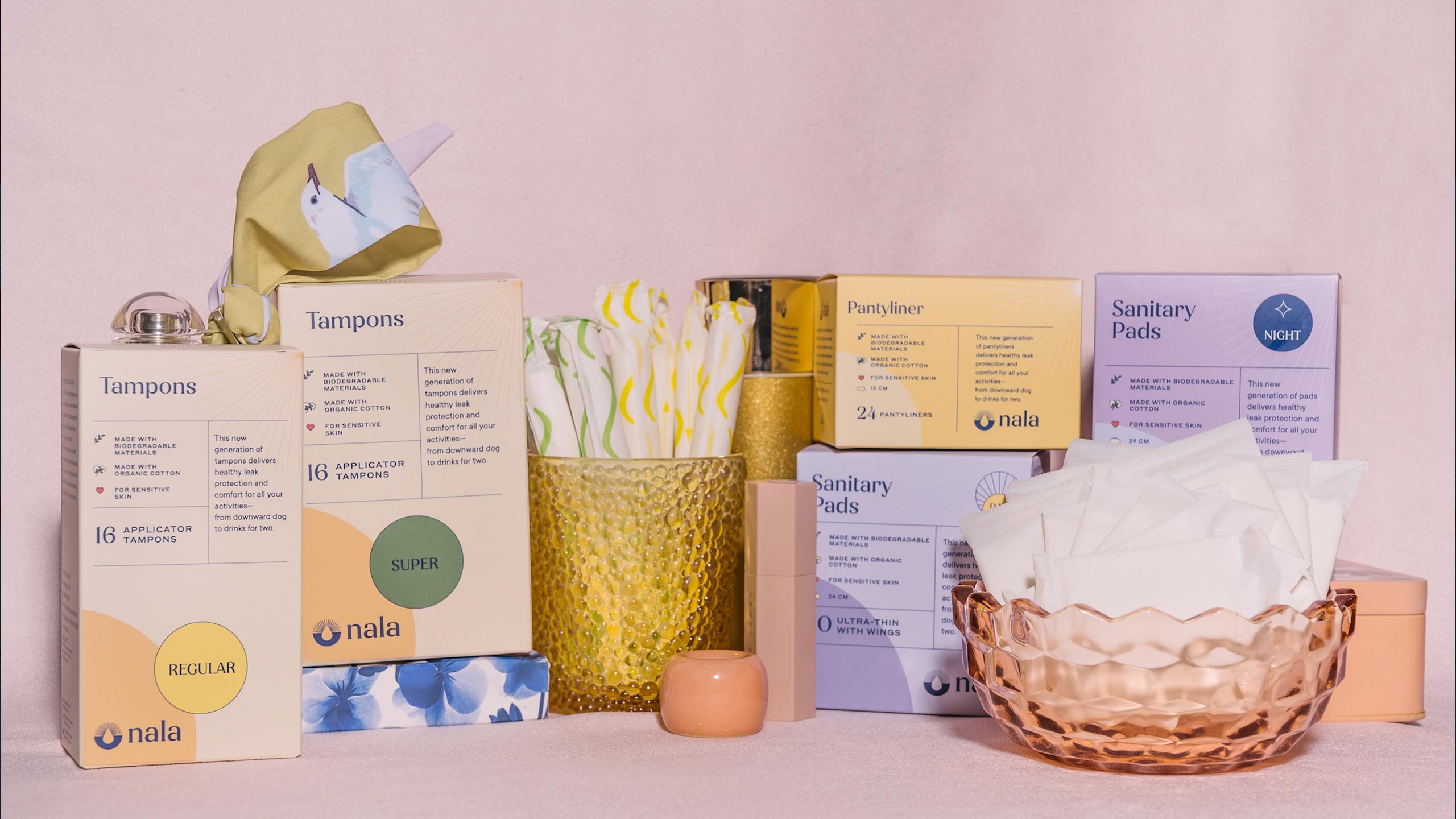
The packaging was designed to be full of small, thoughtful details that add to the Nala experience. Apart from a color-coded system—with the day variation having a light purple tone, the night in a dark purple, pantiliners in yellow orange, and tampons in beige—it was also important that each variant highlighted the various features of Nala's product through illustrations that better explain what sets Nala apart from existing brands in the market.

Bold and bright kraft box packaging designed for femtech brand Nala
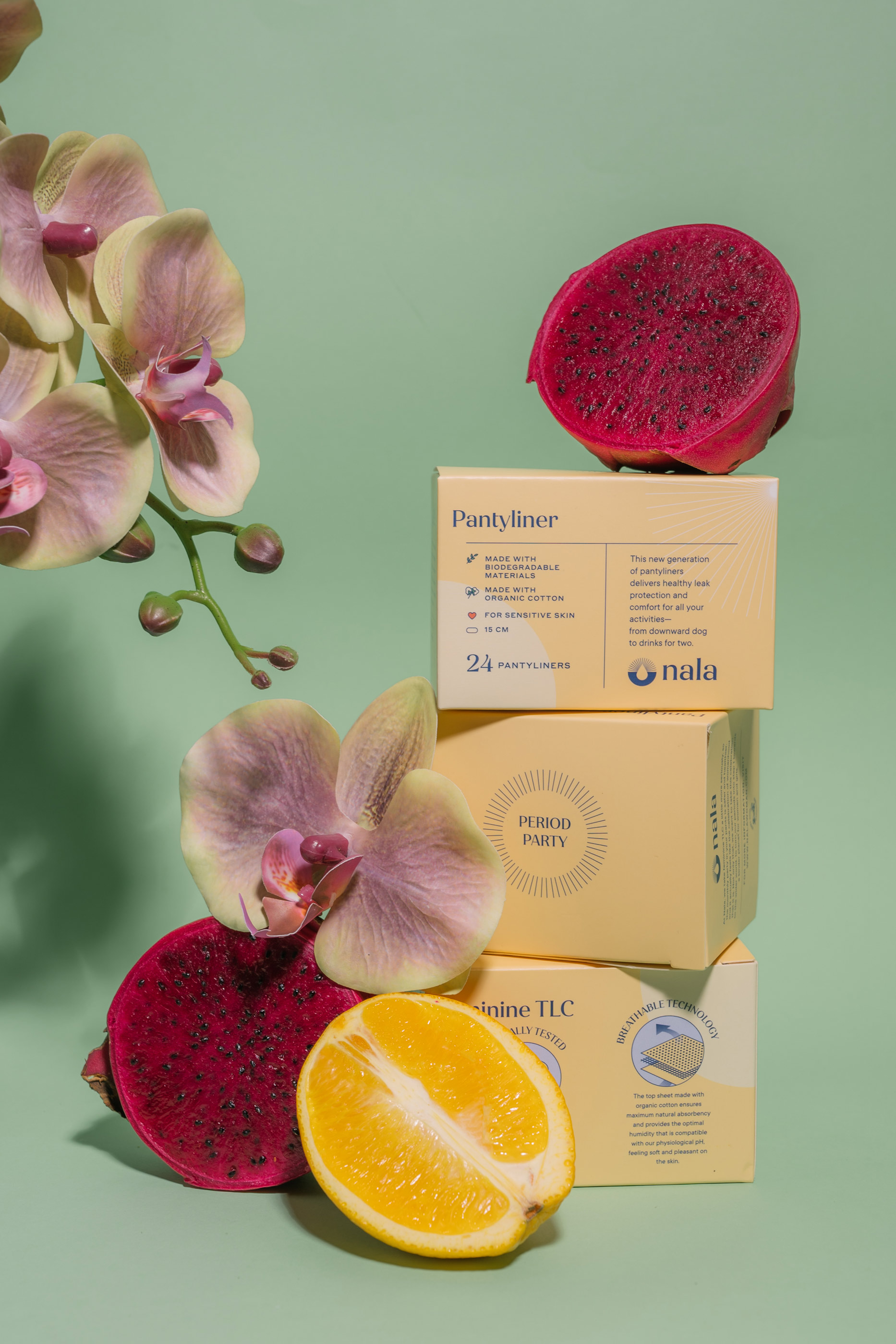
Flatlay photography of sustainable sanitary products and fruits for femtech brand Nala

The brand was successfully launched by the Nala team, building on and going beyond the brand foundations we set, and extending them into various beautiful and compelling executions. Today, we take small victories in things like womxn proudly posting photos of their Nala pads. What was once hidden is slowly embraced, with the help of a strong brand, charming packaging and the genuine intention to empower womxn.

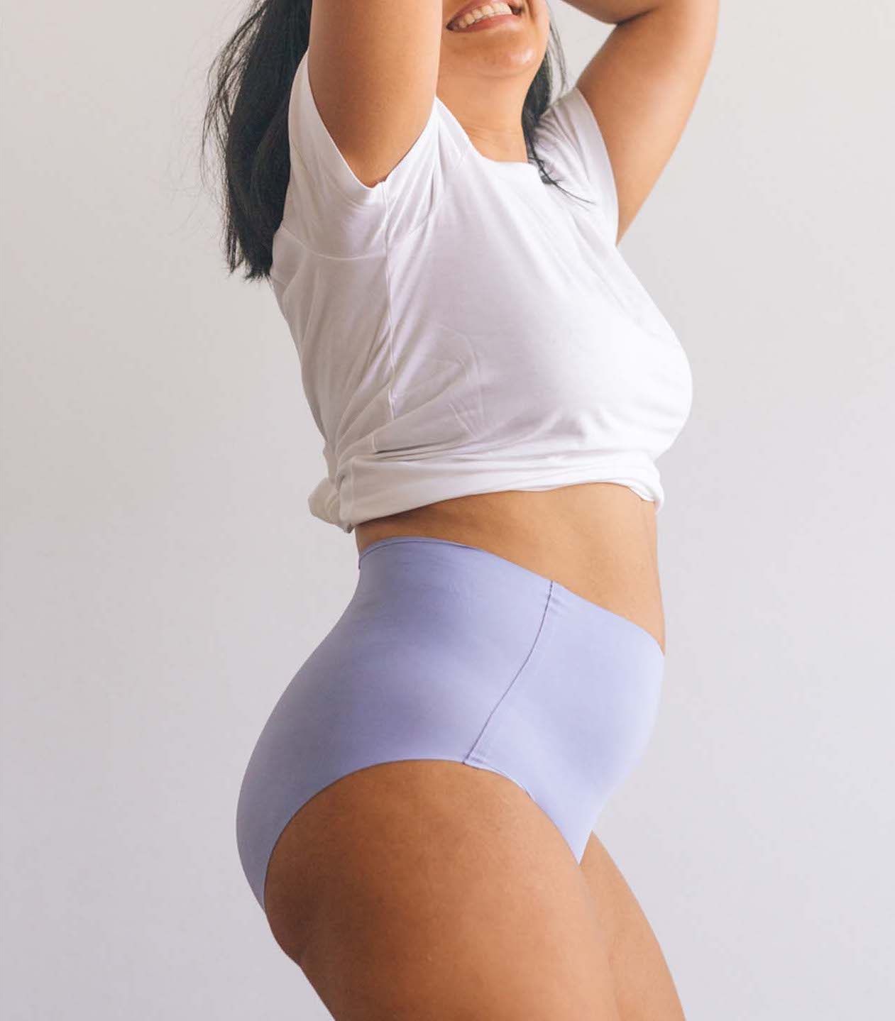
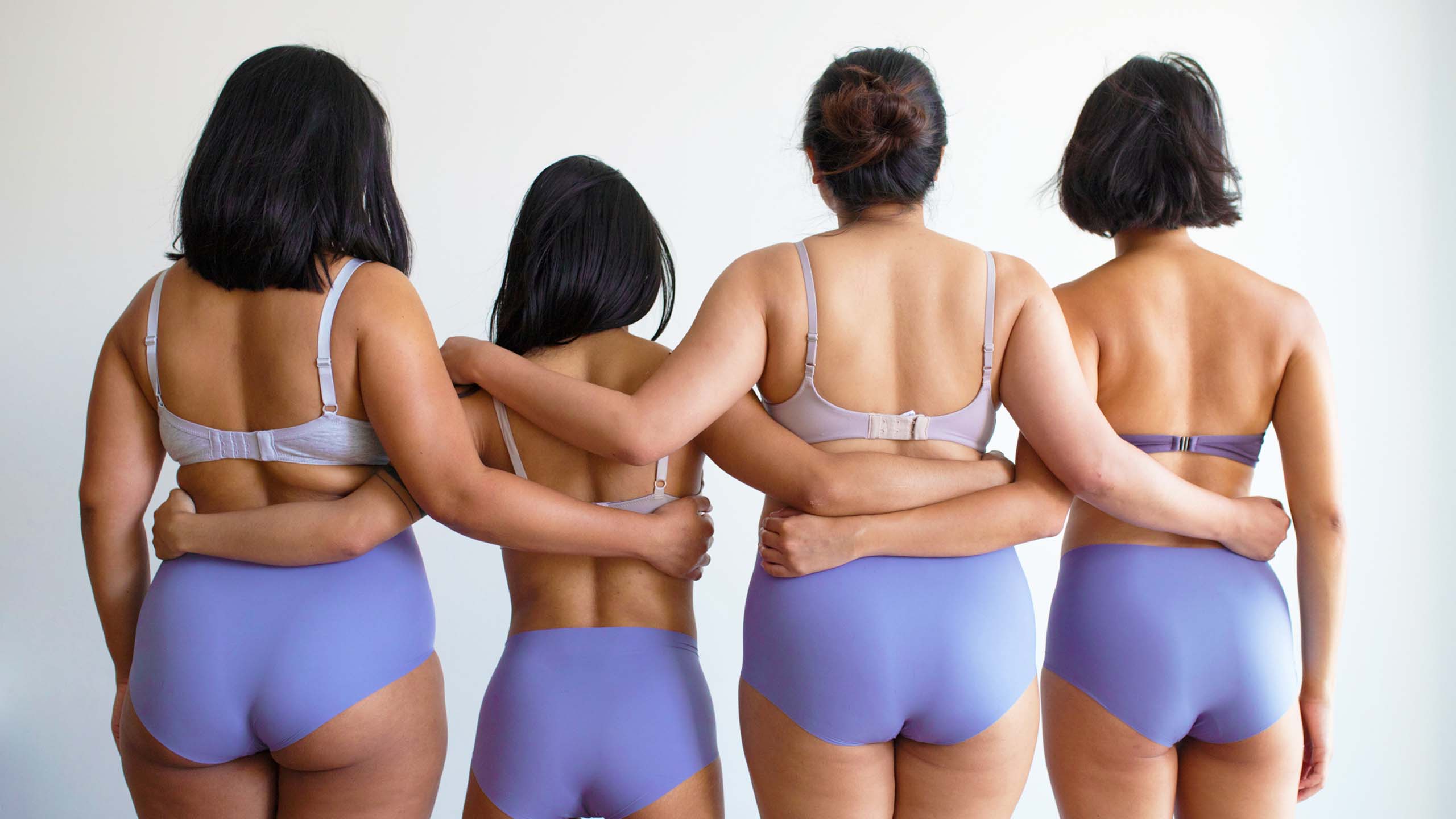
Lifestyle photography of diverse women for femtech brand Nala
CELEBRATE WOMAN-KIND AND PLANET-KIND WITH NALA

VISIT THEIR WEBSITE OR THEIR SOCIAL MEDIA PLATFORMS ON INSTAGRAM AND FACEBOOK.

Make Sense & Look Good® · Creating brands that shape tomorrow, today. Boring is the Enemy · Humans deserve nice things™ · Seriously ·Make Sense & Look Good® · Creating brands that shape tomorrow, today. Boring is the Enemy · Humans deserve nice things™ · Seriously ·Make Sense & Look Good® · Creating brands that shape tomorrow, today. Boring is the Enemy · Humans deserve nice things™ · Seriously ·Make Sense & Look Good® · Creating brands that shape tomorrow, today. Boring is the Enemy · Humans deserve nice things™ · Seriously ·