HEALTHWAY CLINICS REBRANDING
Healthcare for All
BRANDING SCOPE
Brand Strategy
Brand Identity
Branc Collaterals
Brand Environment
OVERVIEW
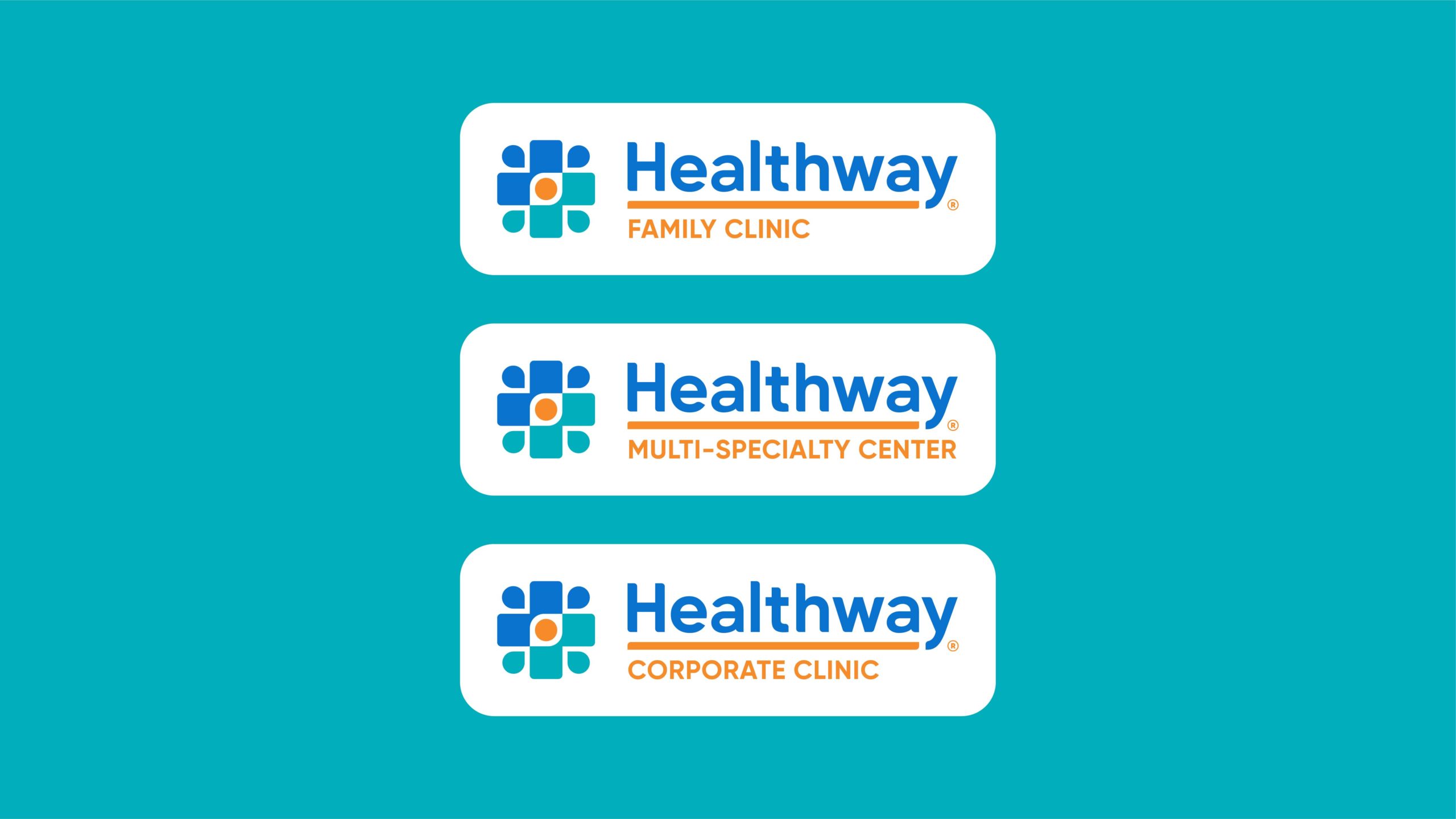
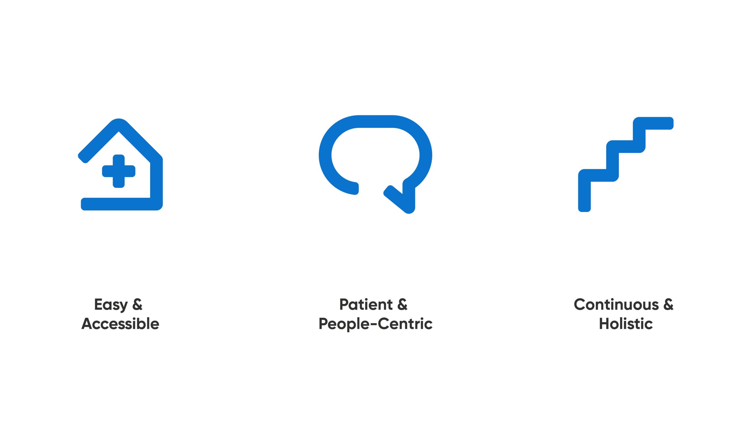
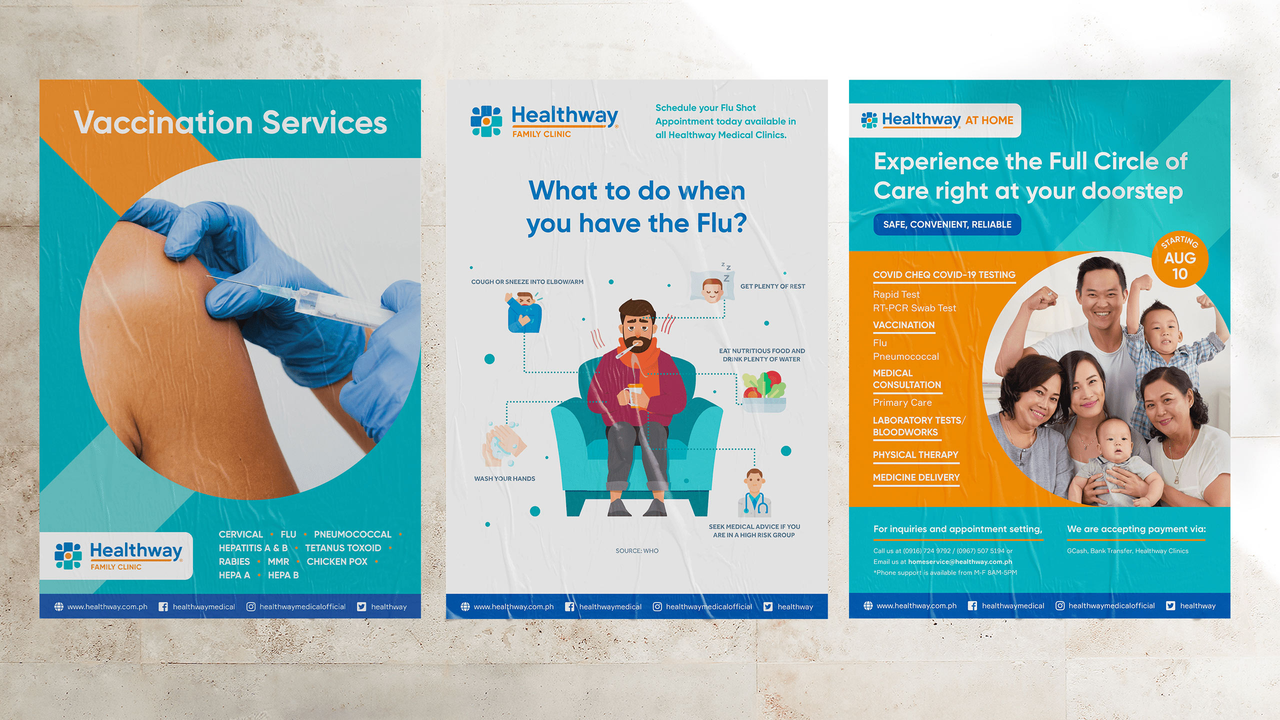
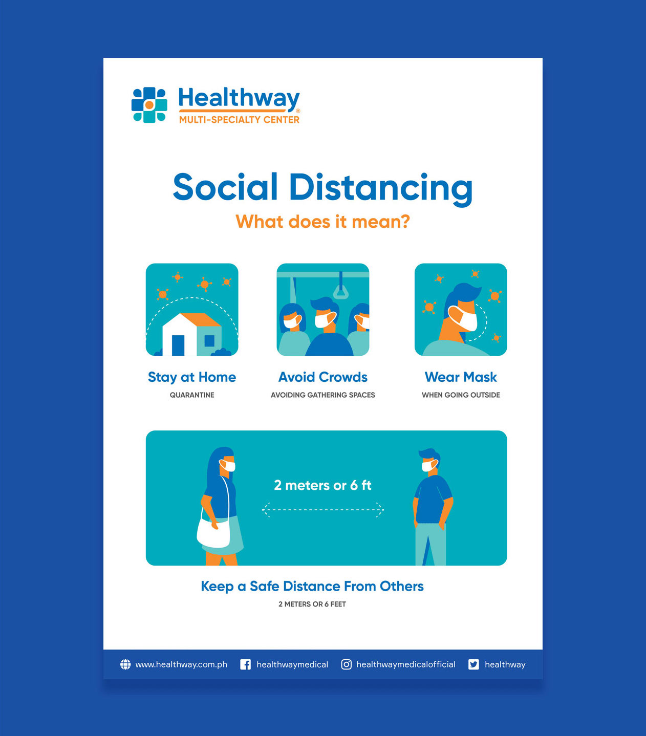
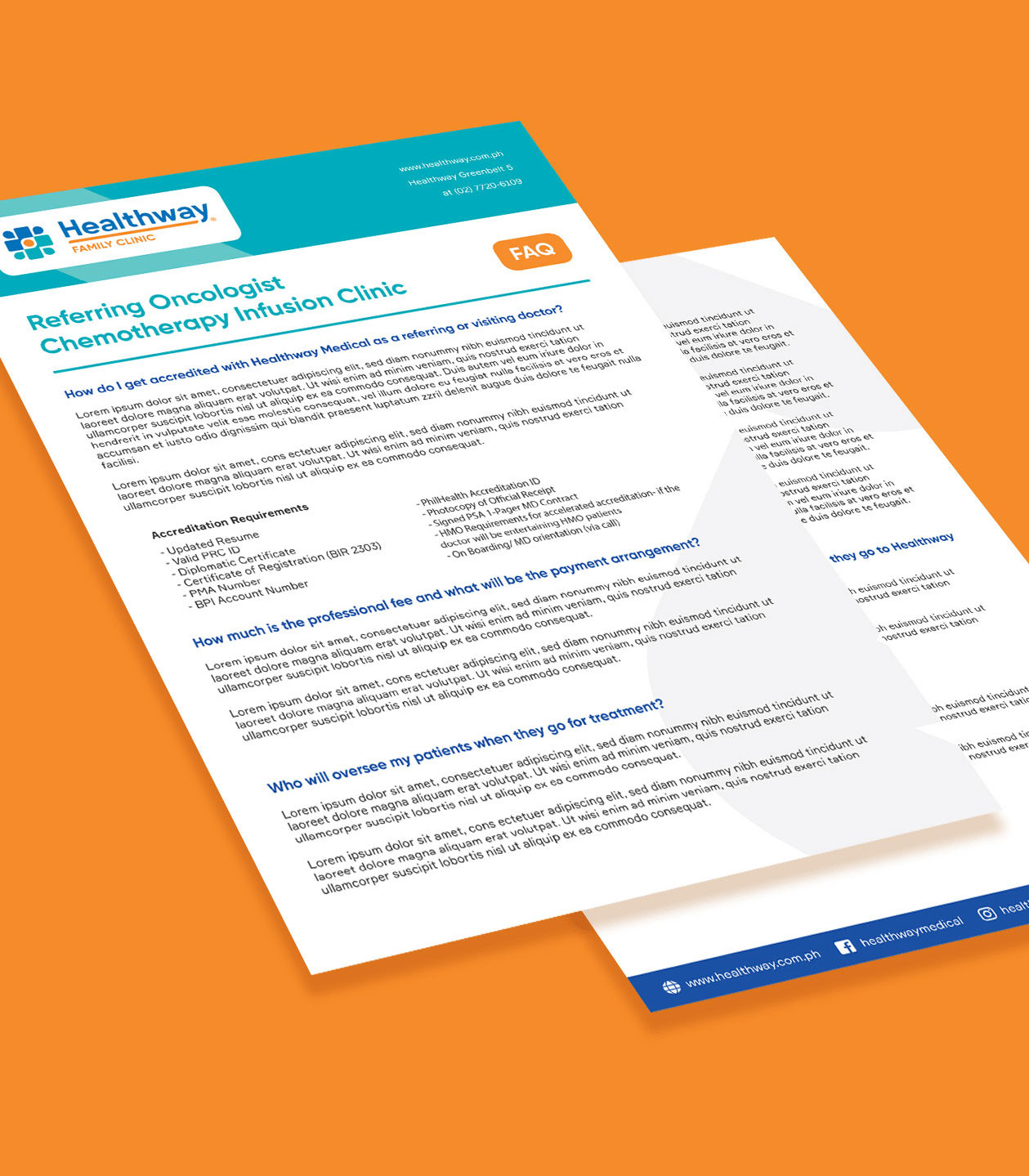
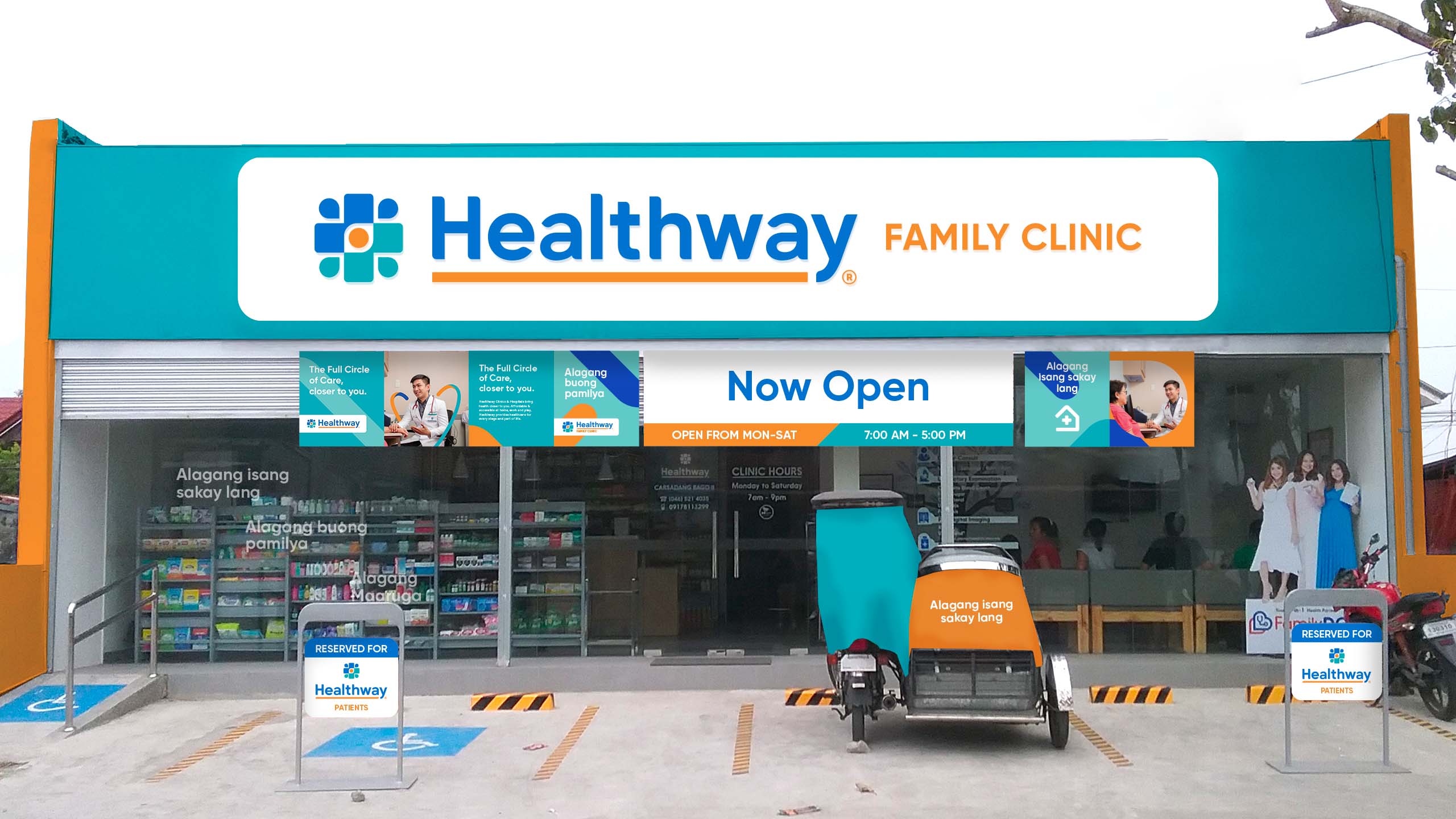
Healthway is the integrated clinic arm of AC Health, a subsidiary of Ayala Corporation that aims to improve healthcare for all. They came to us when they were about to expand to over 100 clinics, to make quality healthcare more affordable and accessible. Our task was to challenge what health could look like to Filipinos and to design an identity that spoke with both care and credibility, across Family, Corporate and Multi-Specialty Clinics.
From the get go, AC Health made their vision very clear: affordable and accessible quality healthcare for as many people as possible. With basic healthcare needs remaining unmet for many Filipinos, the clinics would form an important part of this vision reaching where people already were, in communities, at malls and at work. Our design then had to be inclusive and understanding of a wide range of attitudes towards health, to ensure that we do right by them while also differentiating from other healthcare institutions.
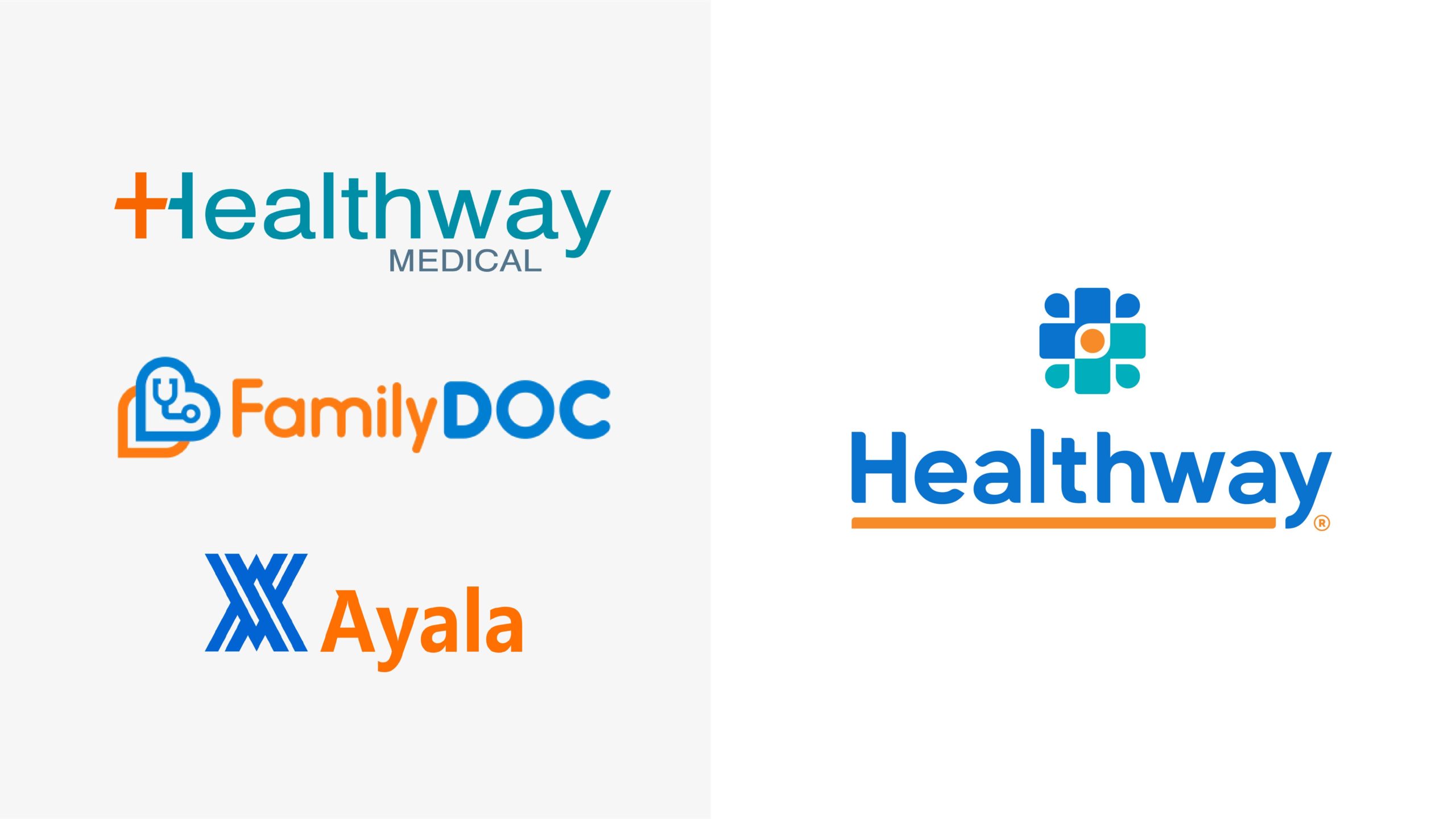
The project also came when AC Health decided to rebrand the clinics of Healthway and FamilyDOC to make the single largest network in the country, covering community and family clinics, mall clinics and corporate clinics. The rebrand then also had to get a deep understanding of the founding values of all three organizations, to be able to unify what they stand for into a single identity that truthfully represented what they all believe.
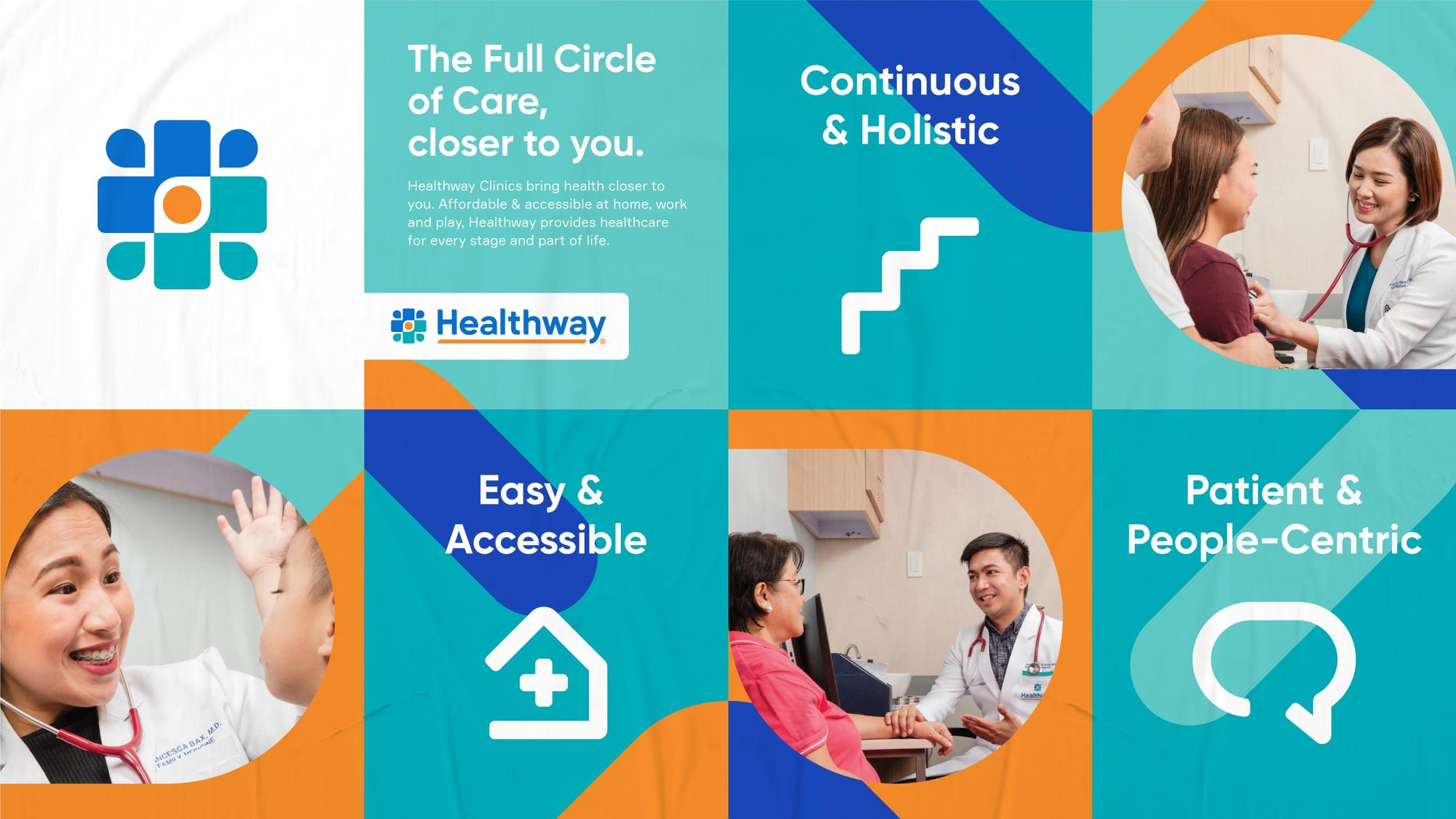
UNDERLINING CONNECTION. The logotype is completed with an orange underline, representing how Healthway is able to close the loop of health by connecting networks of care. Both logo icon and logotype were also designed to accommodate the three formats of the clinics.
1. Linking Networks: Healthway and FamilyDOC, both already strong and reliable destinations for healthcare, are represented by arrows in the two companies’ respective brand colors.
2. The Marker of Health: The two arrows interlock into the universal marker of health: a cross. This also represents their coming together to a stronger healthcare network when united as one.
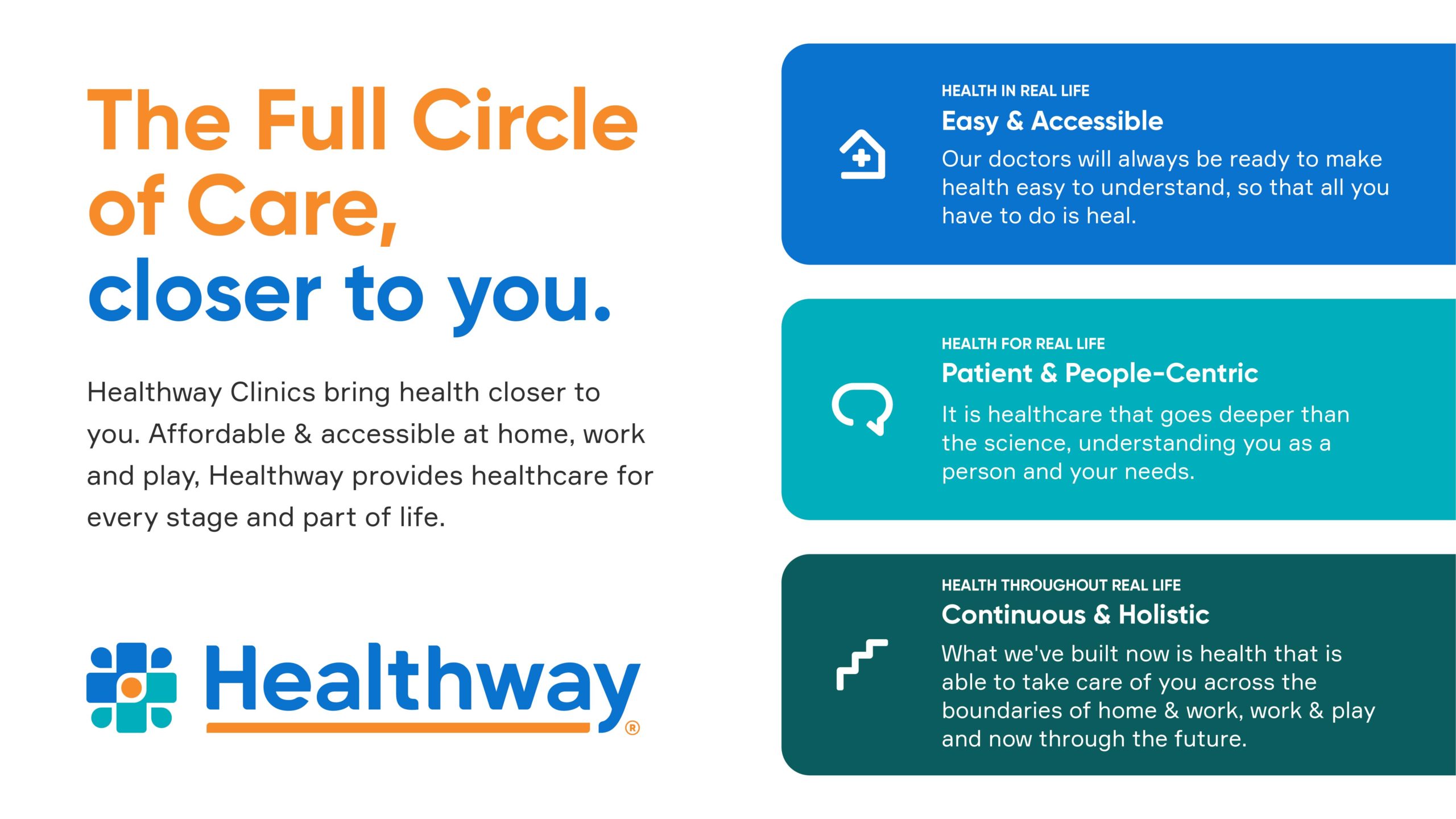
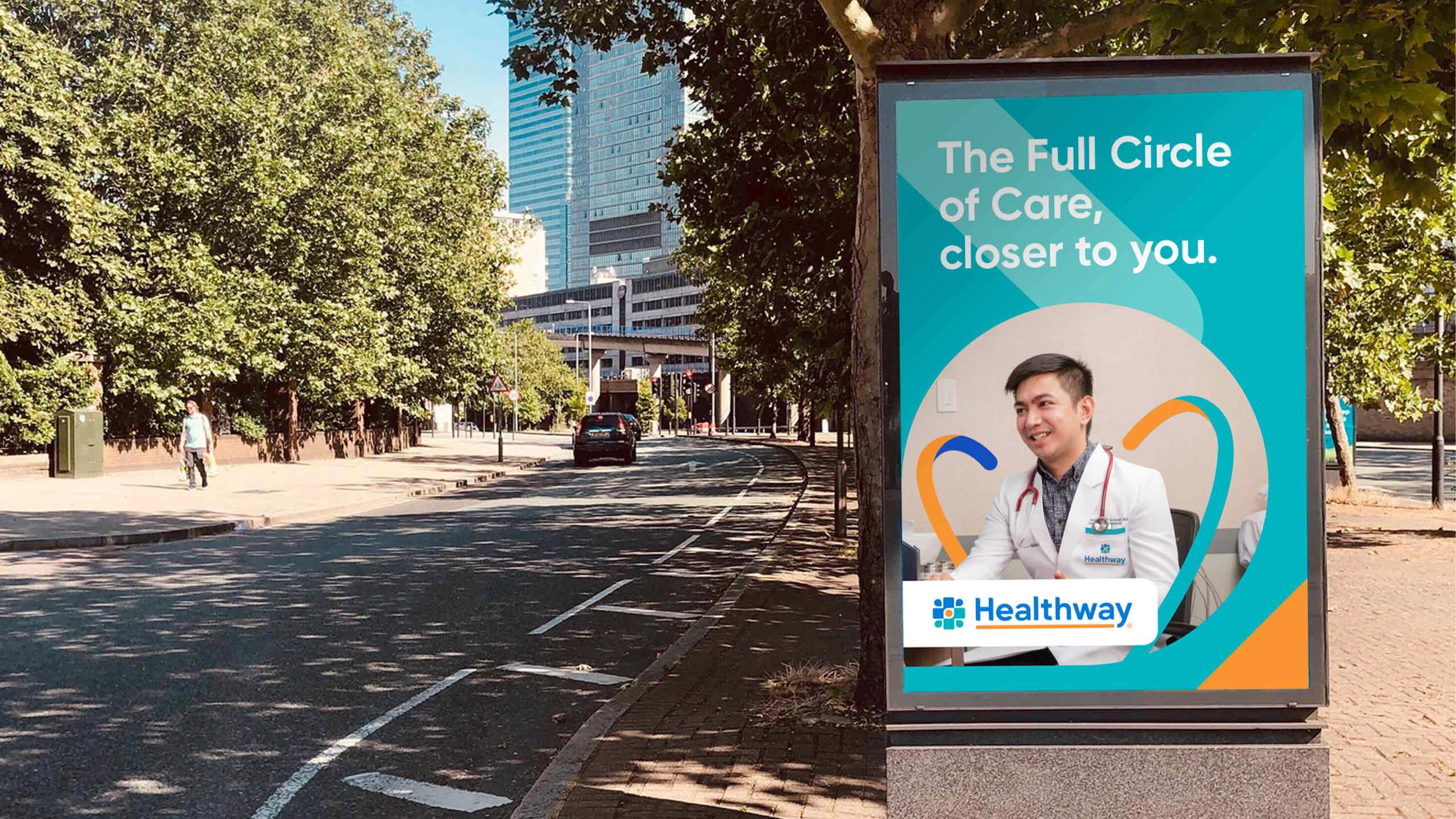
3. The Full Circle of Care: At the central point of convergence is a vibrant orange circle which represents complete and holistic healthcare. This also sets it apart from a largely blue and green health landscape.
4. People as Foundation: The logo is completed by the coming together of different kinds of people with different healthcare needs. This communicates how Healthway brings health closer to you.
5. Convergence to Better Health: With the logo’s overall look, pathways are formed from different directions. This represents health in all ways, all pointing towards the Full Circle of Care.
We were also engaged in a post-project creative consultancy to help guide the execution of the brand by Healthway's in-house team.
Today, Healthway continues in its mission to bring healthcare for all through its COVID-19 response and making RT-PCR testing available, among other services.
