SIMPLY SKIN PHILIPPINES BRANDING
For the
Woman in
Progress
BRANDING SCOPE
Brand Strategy
Brand Naming
Brand Identity
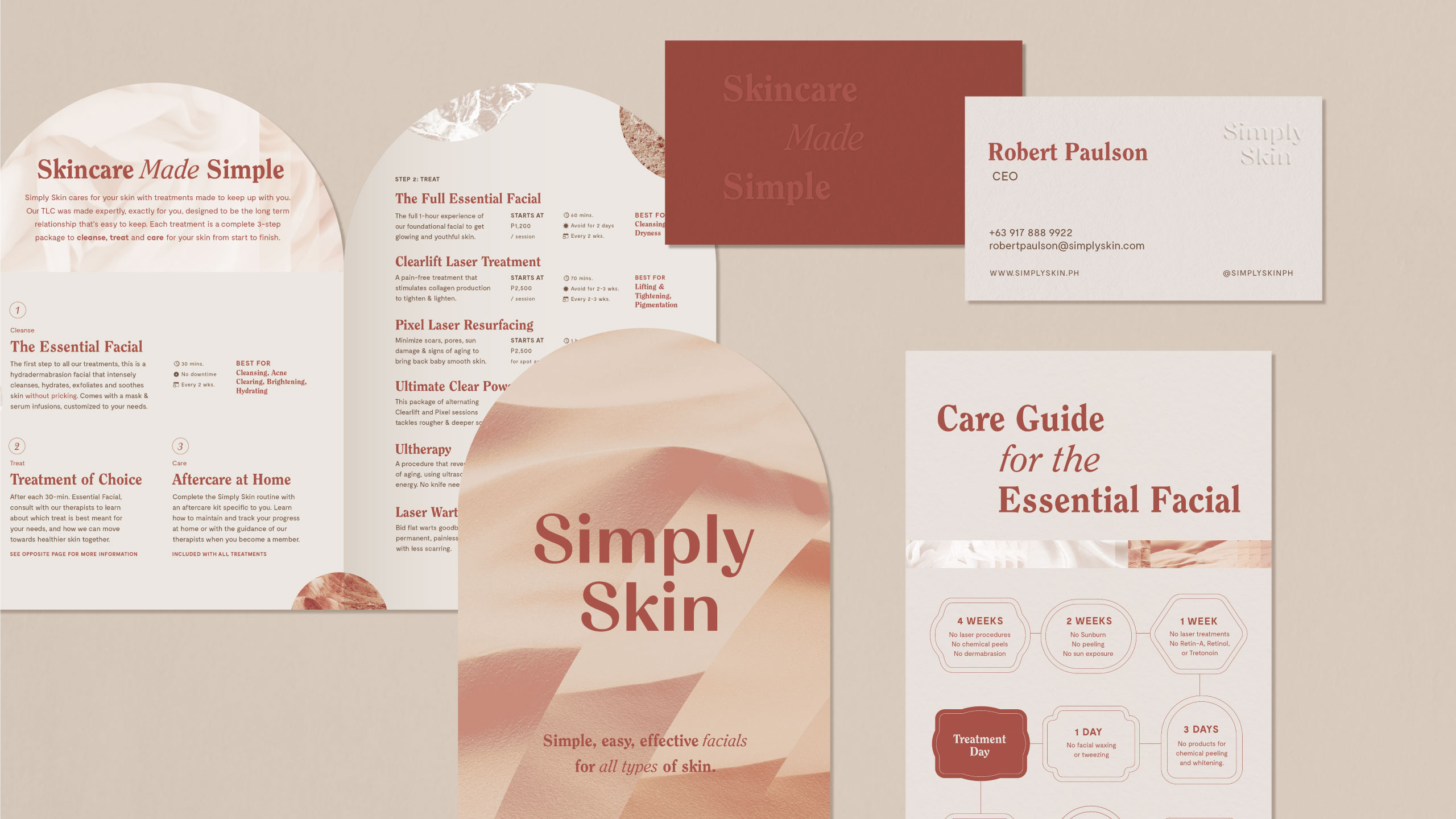
Brand Collaterals
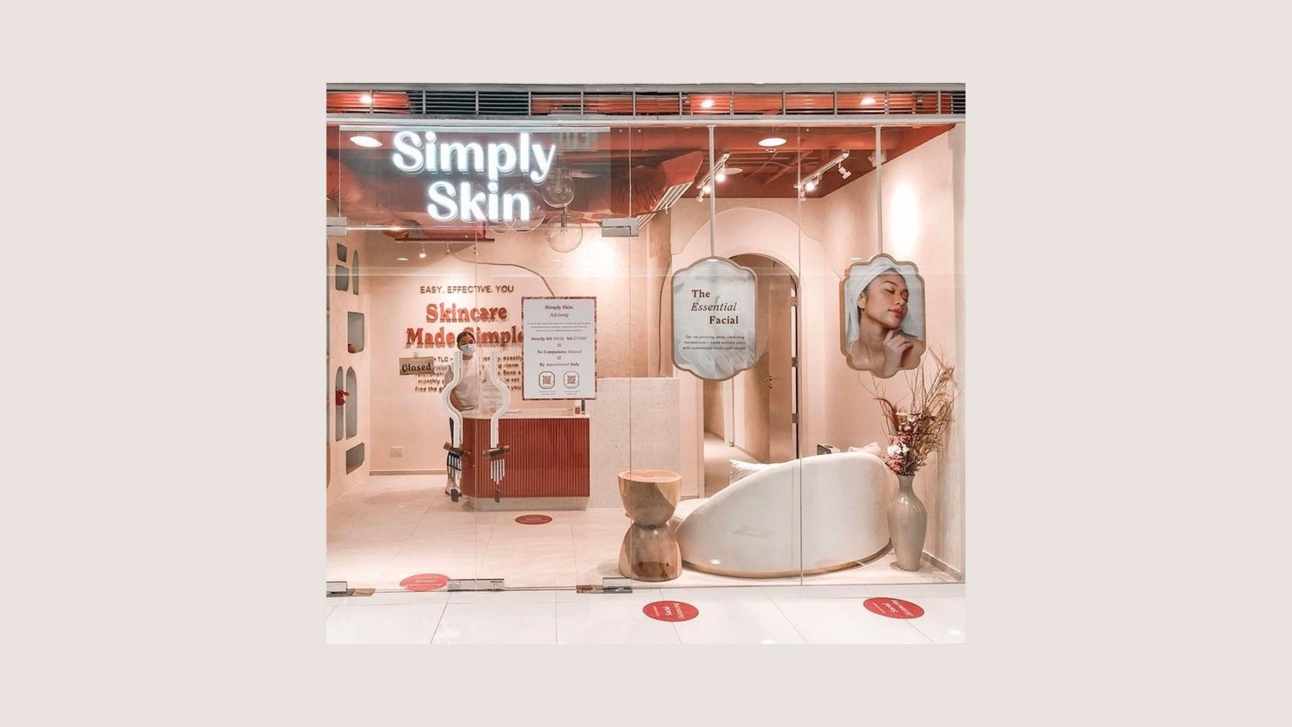
Brand Environment
Website Design
OVERVIEW
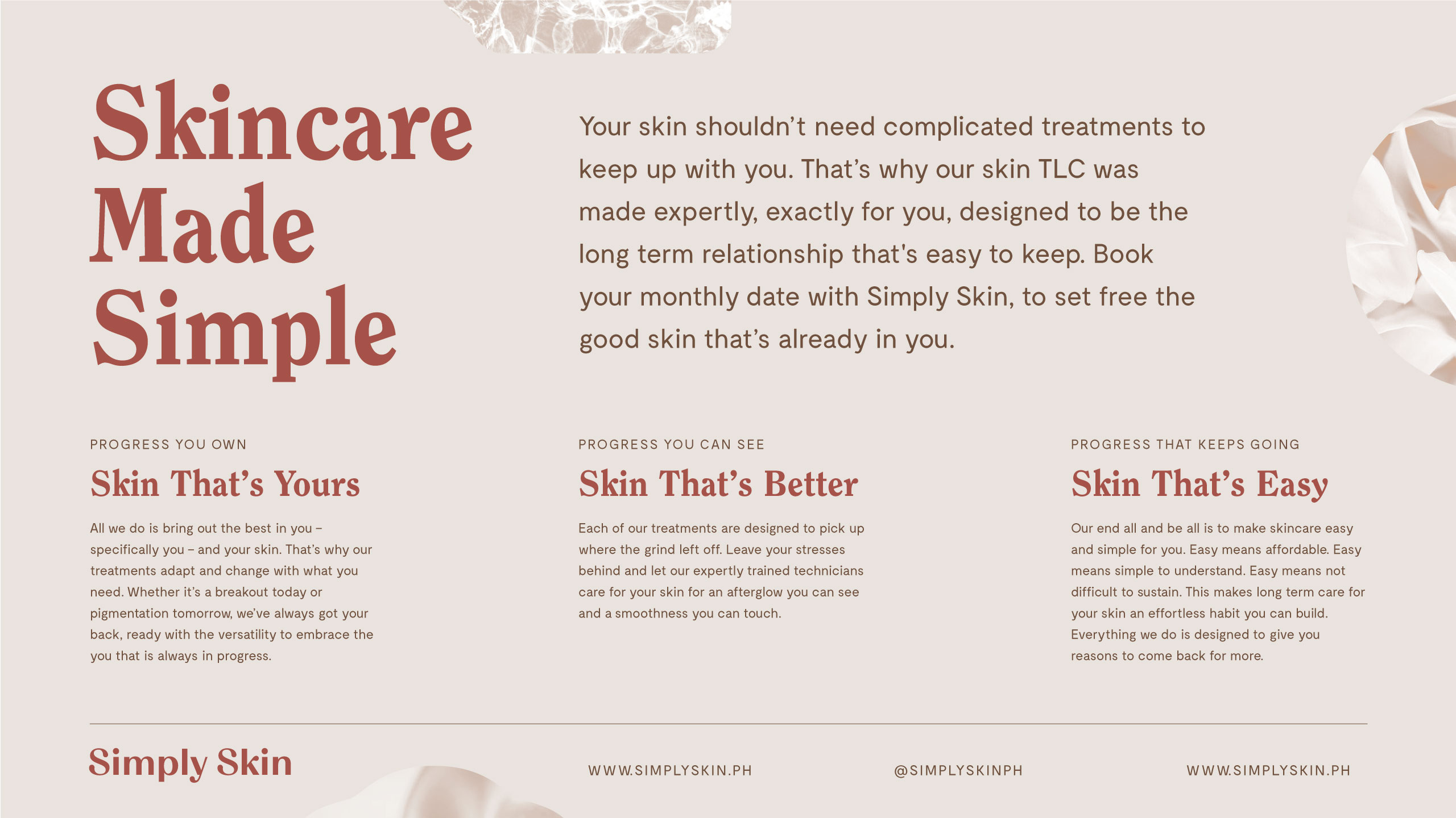
Simply Skin provides easy, simple & effective treatments, made to keep up with the (Wo)man in Progress®. Simply Skin believes that good skin is in every man and woman, in need only of warm, expert TLC to set it free. Designed to be the long-term relationship that's easy to keep, Simply Skin embraces everyone and every skin just as they are—always a work in progress.
When it comes to redesigning well-loved brands, we make sure to understand the audience and market as well as the company’s vision. The challenge was to refresh the brand of Bibingkinitan to be more consistent, contemporary while retaining what people loved about it—the colors, the circular pendant, and the Filipino visual cues.
MORE INFORMATION
Simply Skin was founded at a time when skincare was changing. They first came to us in 2016 and together we built a brand about beauty free from vanity, rooted only in love and care for one's self. Through the years and several branches later, the concept of skincare as self-care became widely accepted and Simply Skin's once unique messaging—values they've always held dear—no longer stood out. It was then up to us to understand how beauty had evolved, to find what people valued most about skincare as self-care, and once again, set Simply Skin apart.
We analyzed how the competition communicated, visited their branches and tried some of their services to find where gaps lay. We also surveyed Simply Skin's clientele to learn what motivates them to care for themselves and their skin. We found that the everywoman (and man) always craves for continuous progress and is willing to work to achieve it, as much for their skin as for their lives. And so we designed the new Simply Skin to embrace beauty and life as always growing, always unfinished, and built a brand experience around progress that can be easily felt, owned and sustained.
We analyzed how the competition communicated, visited their branches and tried some of their services to find where gaps lay. We also surveyed Simply Skin's clientele to learn what motivates them to care for themselves and their skin. We found that the everywoman (and man) always craves for continuous progress and is willing to work to achieve it, as much for their skin as for their lives. And so we designed the new Simply Skin to embrace beauty and life as always growing, always unfinished, and built a brand experience around progress that can be easily felt, owned and sustained.
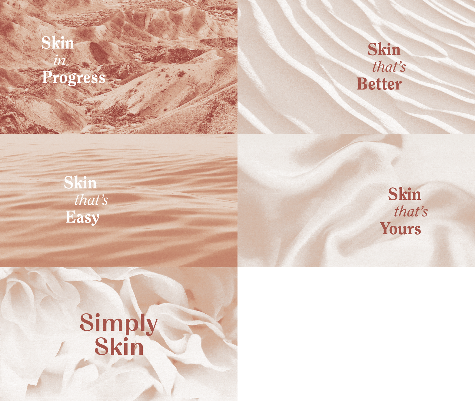
The central idea of progress guided all our creative decisions. The logotype and primary brand mark uses letterforms with gentle progressions from thick widths to thin, and from sharp edges to graceful dew drops. The color palette is also derived from the changing colors of the earth, grounded by a strong earthy red.
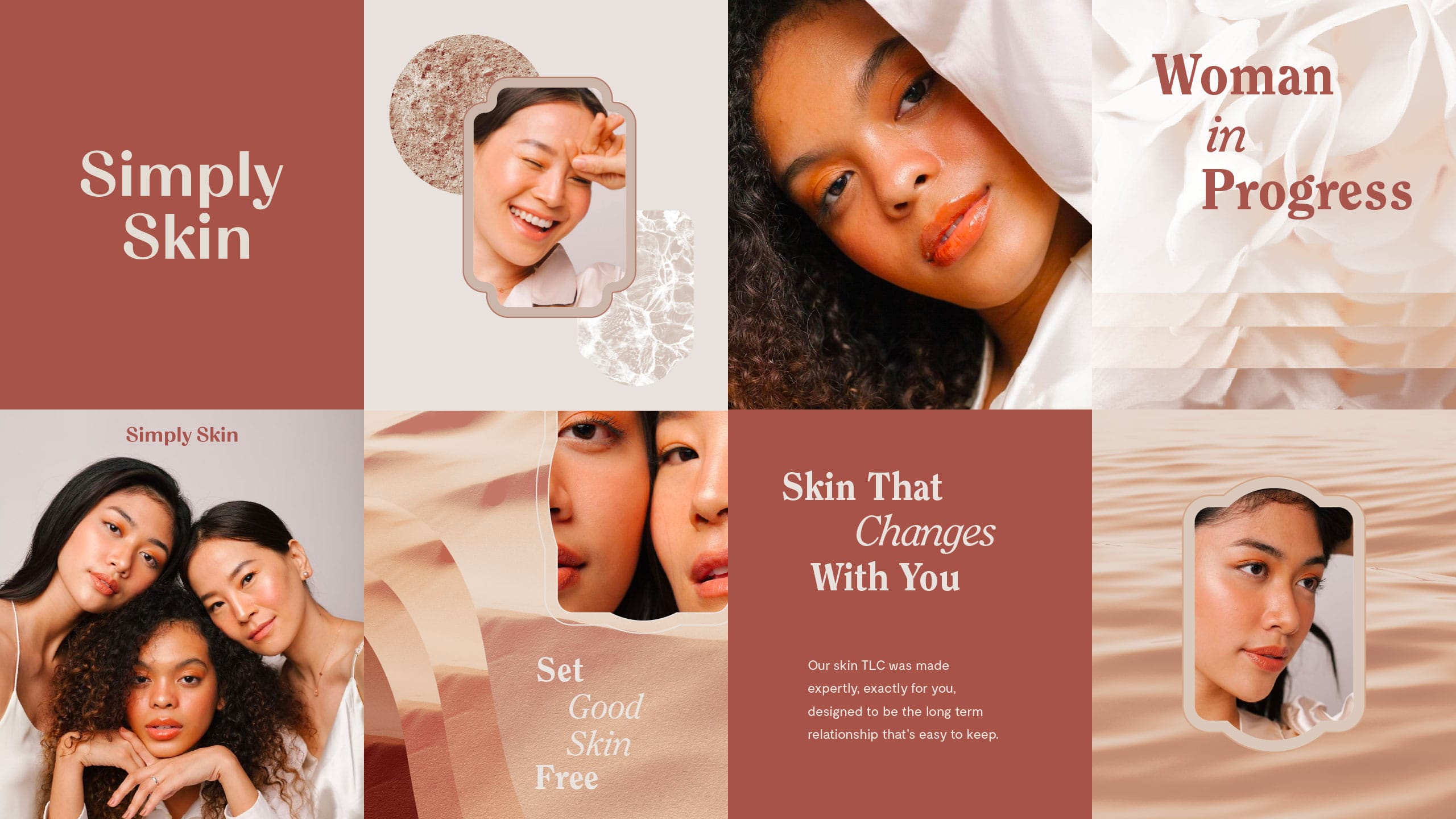
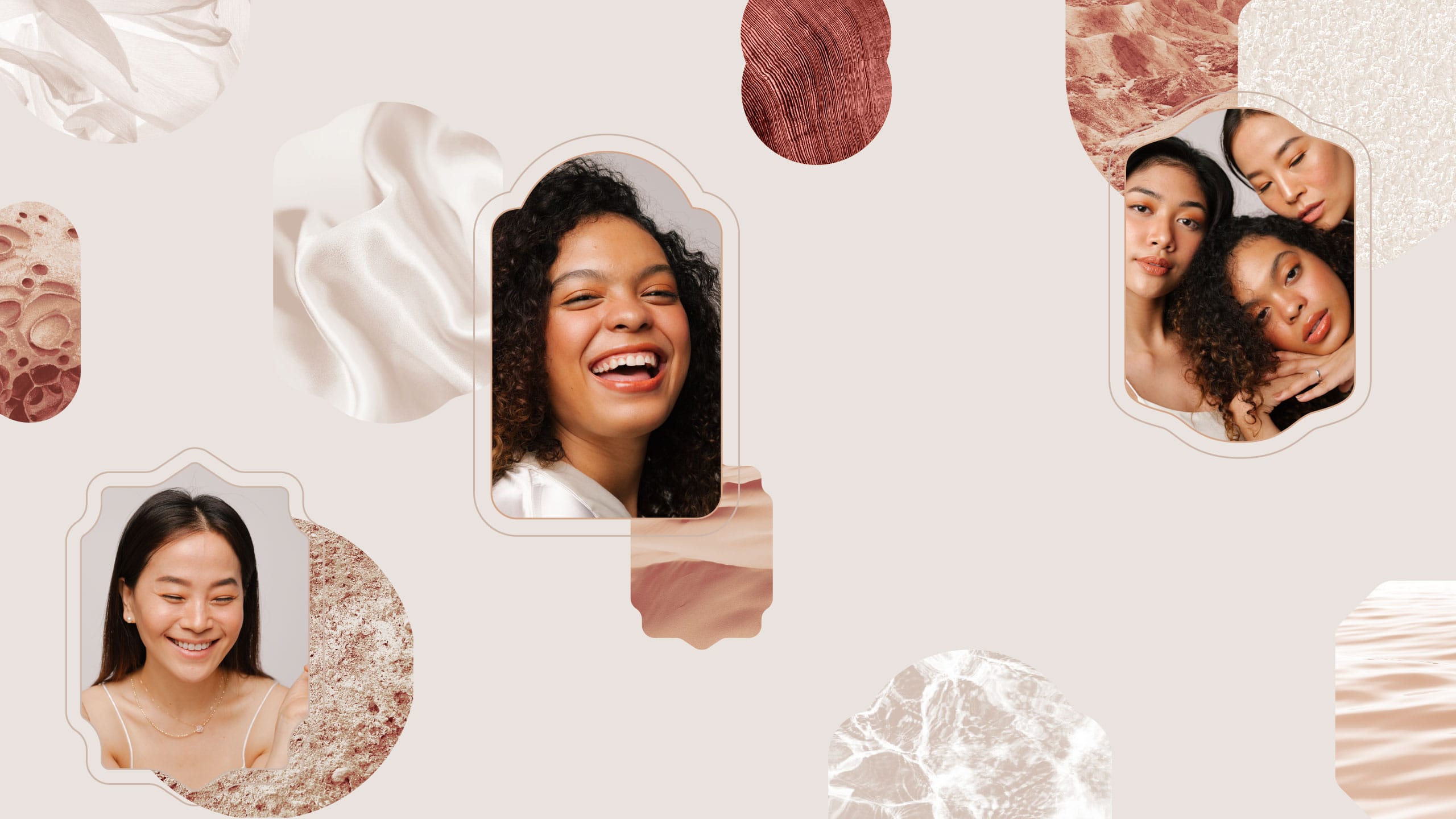
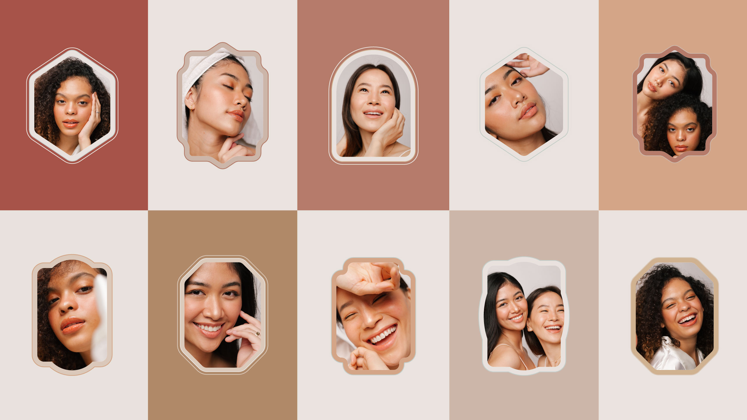
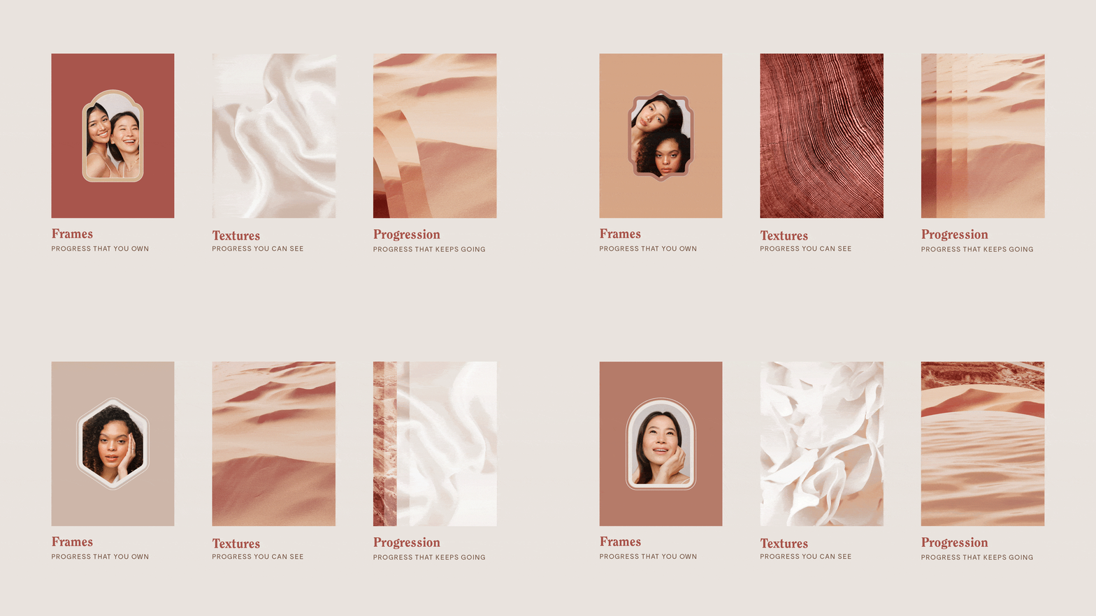
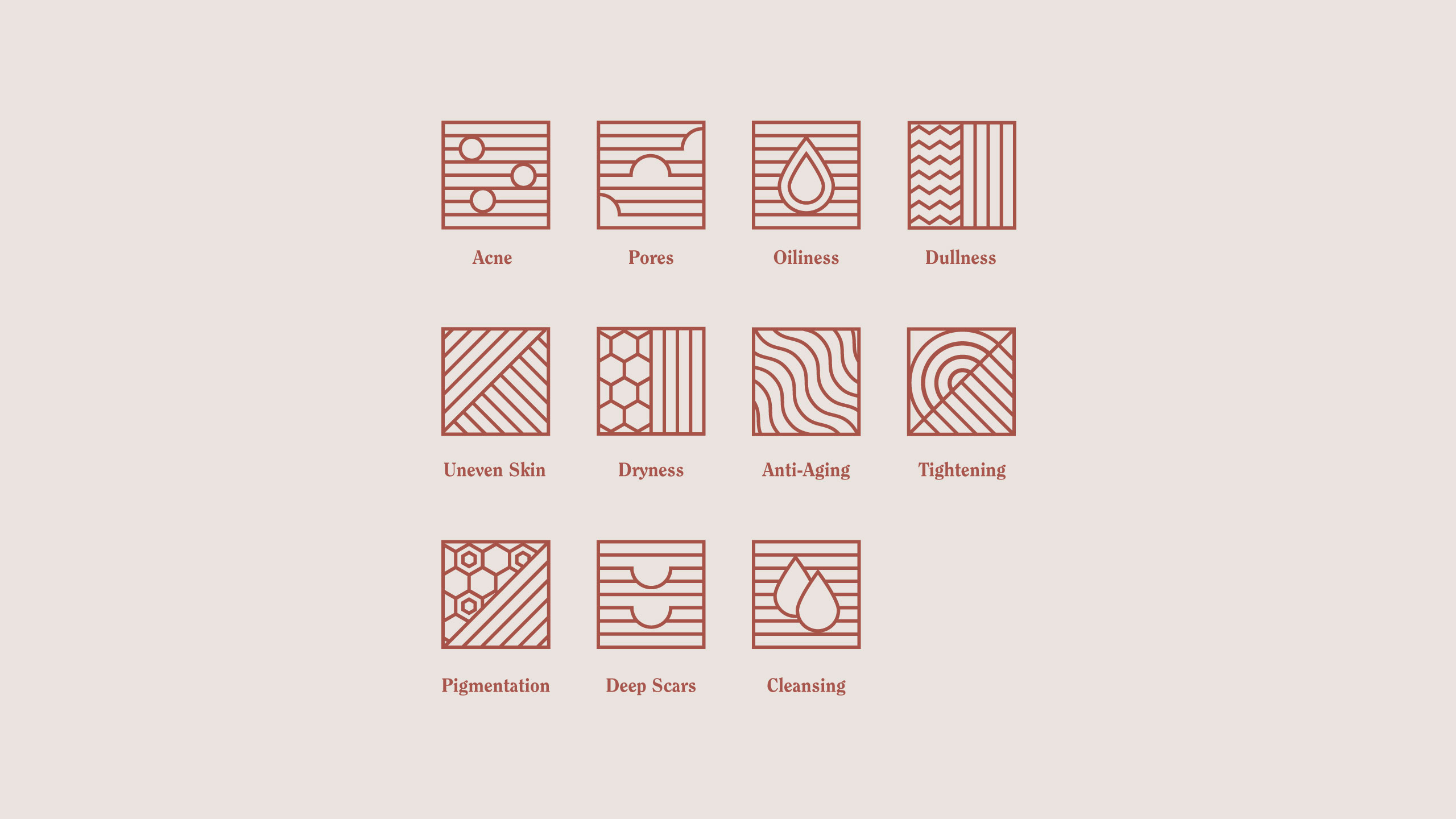
The brand's key elements were all also designed to celebrate progress through the brand's three pillars. First, simple and gentle frames highlight a diversity of faces, celebrating progress one can own. Second, textures mostly found in nature express the tactility not just of skin, but also of moods and experiences. The variety of textures acknowledges all skin types and promotes a kind of progress that can be seen and felt. Lastly, ripples through the textures illustrate the movement of progress that keeps going, that isn't contained in a single moment, but rather a habit one commits to for the better. Icons were also designed as abstract expressions of skin concerns, grounded in progressing lines.
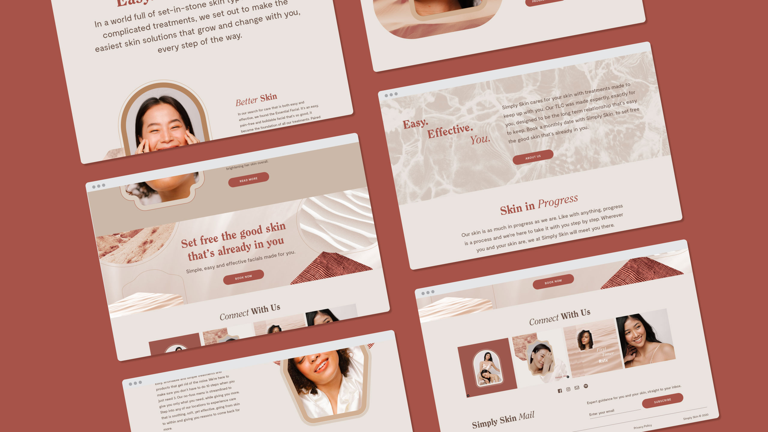
We then applied the brand's strategic and visual foundations into intentionally designed experiences in-store, on social media and on their website.
The Simply Skin team beautifully expanded our brand direction into a deep and engaging brand experience. Check out how you can adopt a mindset of progress through their Instagram or visit their branches or their website.
Make Sense & Look Good®. Made by Serious People. Creating brands that shape tomorrow, today. Boring is the Enemy. Humans deserve nice things™. Seriously. Hi Mom. Success is found in the details. With great budgets come great work. We are known to make brands human. We enjoy creating brands from the ground up. Great brands invest in great design. Ugly brands don’t care about people. Your brand could always be better. Trust us. Branding is like mind control, but cooler. We will tell you if you have food stuck in your teeth. For a relaxing time, make it Suntory time. Make Sense & Look Good®. Made by Serious People. Creating brands that shape tomorrow, today. Boring is the Enemy. Humans deserve nice things™. Seriously. Hi Mom. Success is found in the details. With great budgets come great work. We are known to make brands human. We enjoy creating brands from the ground up. Great brands invest in great design. Ugly brands don’t care about people. Your brand could always be better. Trust us. Branding is like mind control, but cooler. We will tell you if you have food stuck in your teeth. For a relaxing time, make it Suntory time. Make Sense & Look Good®. Made by Serious People. Creating brands that shape tomorrow, today. Boring is the Enemy. Humans deserve nice things™. Seriously. Hi Mom. Success is found in the details. With great budgets come great work. We are known to make brands human. We enjoy creating brands from the ground up. Great brands invest in great design. Ugly brands don’t care about people. Your brand could always be better. Trust us. Branding is like mind control, but cooler. We will tell you if you have food stuck in your teeth. For a relaxing time, make it Suntory time. Make Sense & Look Good®. Made by Serious People. Creating brands that shape tomorrow, today. Boring is the Enemy. Humans deserve nice things™. Seriously. Hi Mom. Success is found in the details. With great budgets come great work. We are known to make brands human. We enjoy creating brands from the ground up. Great brands invest in great design. Ugly brands don’t care about people. Your brand could always be better. Trust us. Branding is like mind control, but cooler. We will tell you if you have food stuck in your teeth. For a relaxing time, make it Suntory time.