TAKE ROOT BRAND IDENTITY
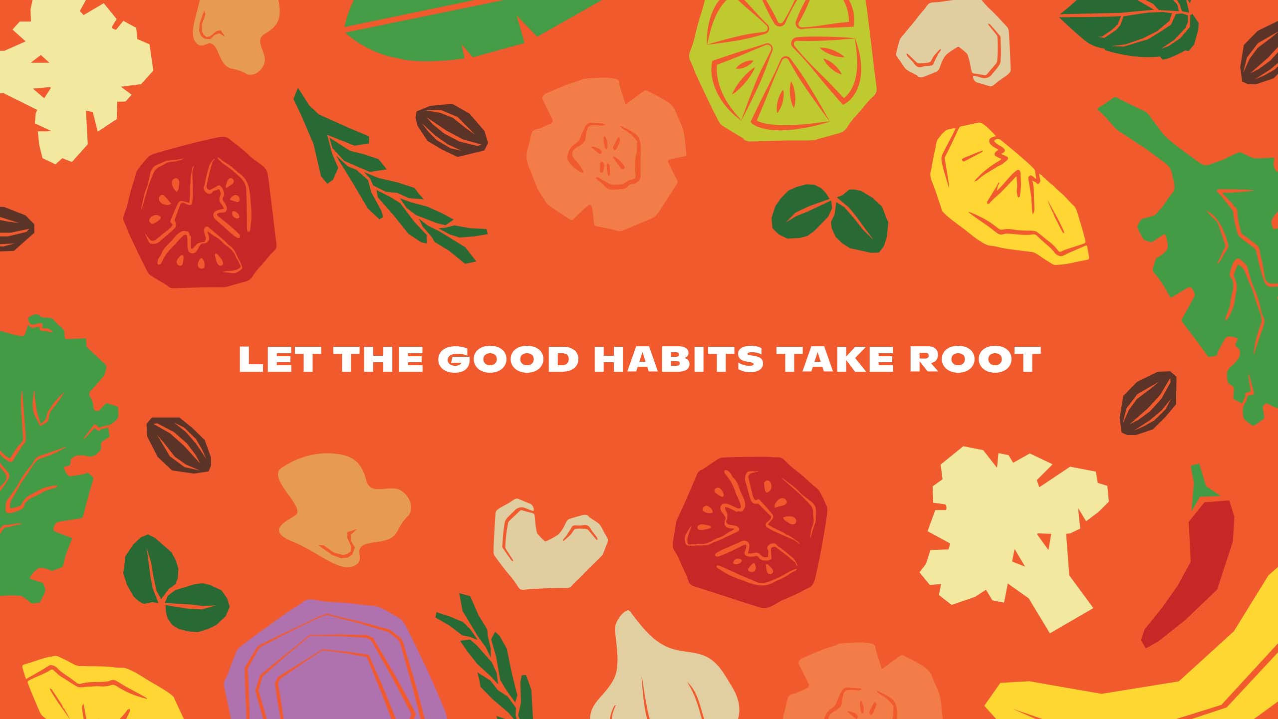
Let the Good
Habits Take Root
BRANDING SCOPE
Brand Identity
Illustrations
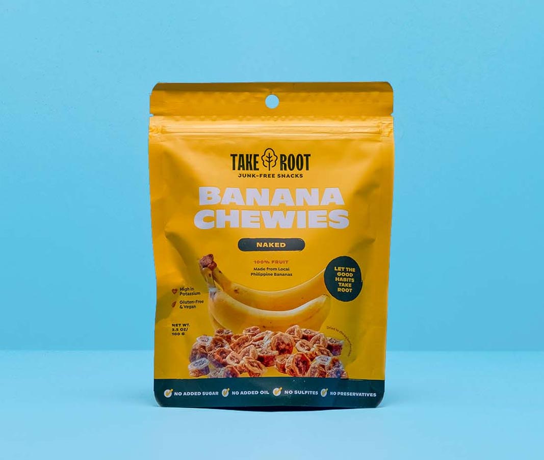
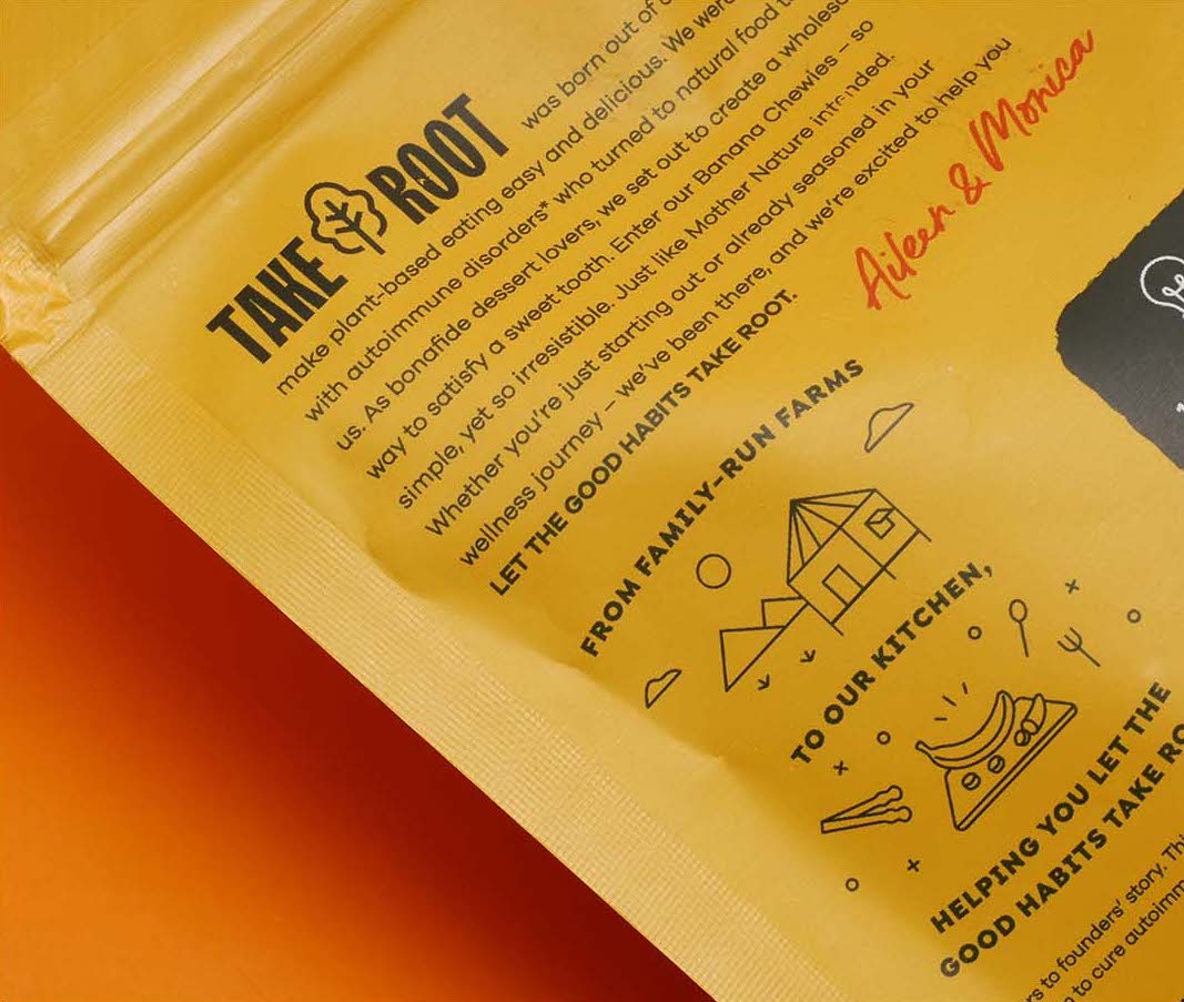
Packaging
Copywriting
OVERVIEW
Take Root was founded on the idea of redefining what we know about healthy snacks. Originally started as a personal endeavour, it eventually became a mission: to create plant-based food that nourishes the body and the soul. The problem was that people were either intimidated or skeptical of anything advertised as "healthy."
MORE INFORMATION
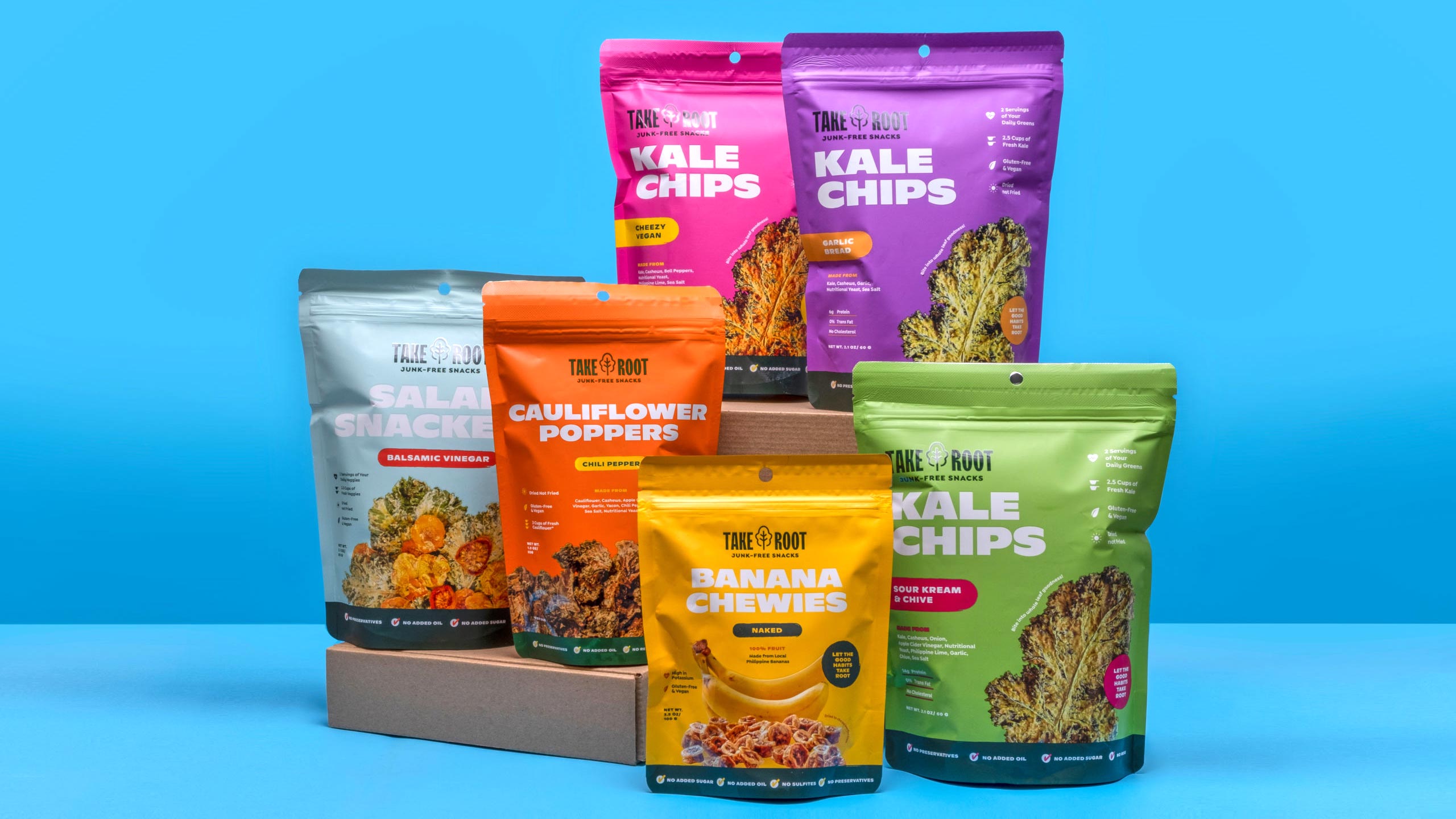
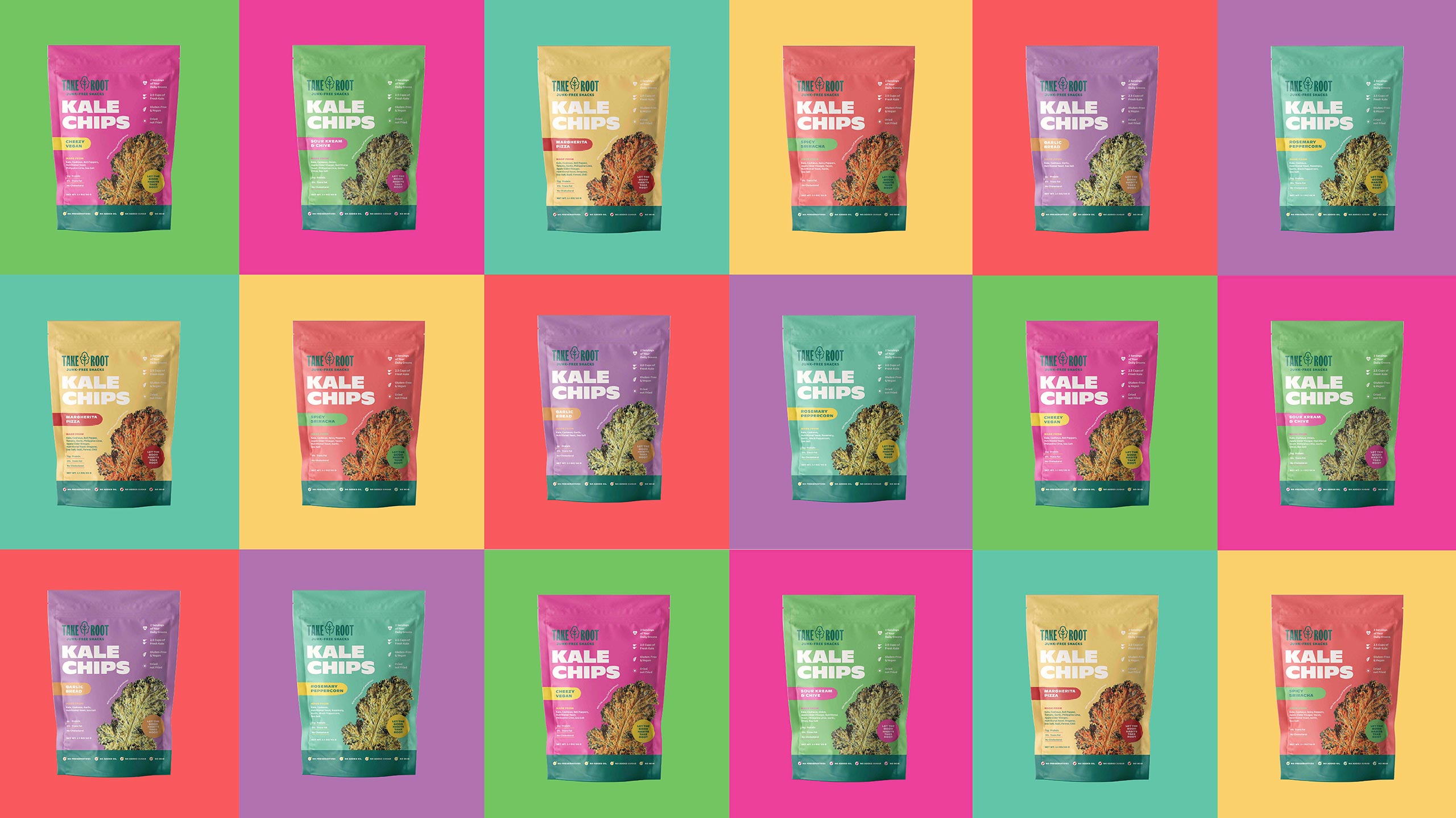
We wanted to update their identity in a way that would help new patrons identify Take Root immediately without alienating their current niche and without compromising what they stand for—healthy without the big commitments. With their snacks, Take Root wanted to be the gateway for those who were interested in living a healthier lifestyle, or to be the go-to for those who have already started in their journey. Take Root was hinged on the idea of being the good habit of everyone.
The logo was updated to be easily used in different formats, be it horizontal or vertical, allowing the logo to take up the space it needs to be on the packaging. The type is tall and condensed, yet it has some little quirks here and there, giving it a sense of playfulness without being distracting. Instead of being restrained within a circle, the logo flows seamlessly along with the other parts of the packaging.
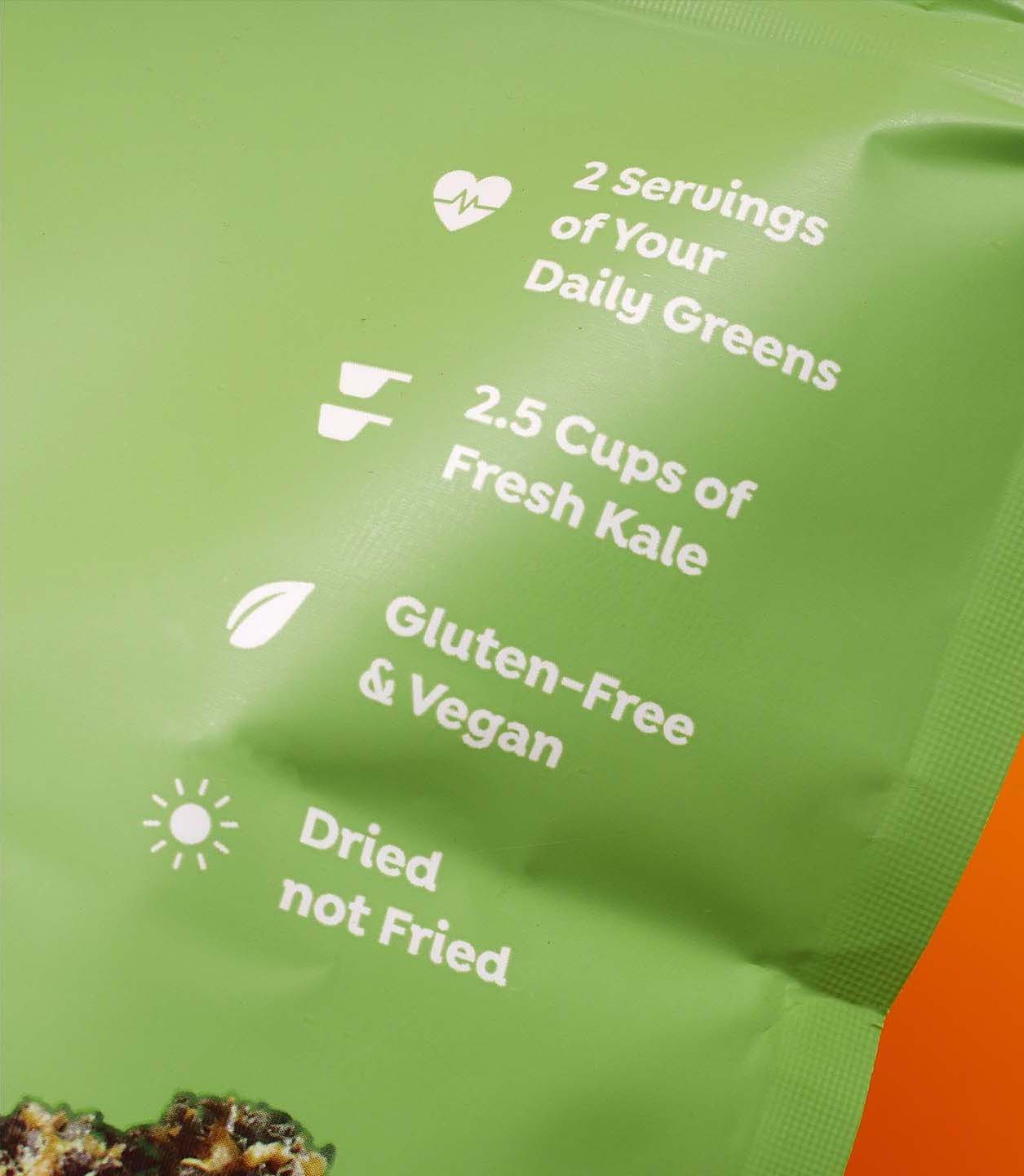
The type hierarchy is based on functionality and personality. To retain Take Root’s personality, the main heading is a loud and punchy sans serif font without being intimidating or looking too tough. Instead of using a handwritten font usually found in healthy snack packaging, we opted to balance it with a smaller heading that’s softer and modern. The whole look was new and fresh, yet it was still similar to what they had.
Make Sense & Look Good®. Made by Serious People. Creating brands that shape tomorrow, today. Boring is the Enemy. Humans deserve nice things™. Seriously. Hi Mom. Success is found in the details. With great budgets come great work. We are known to make brands human. We enjoy creating brands from the ground up. Great brands invest in great design. Ugly brands don’t care about people. Your brand could always be better. Trust us. Branding is like mind control, but cooler. We will tell you if you have food stuck in your teeth. For a relaxing time, make it Suntory time. Make Sense & Look Good®. Made by Serious People. Creating brands that shape tomorrow, today. Boring is the Enemy. Humans deserve nice things™. Seriously. Hi Mom. Success is found in the details. With great budgets come great work. We are known to make brands human. We enjoy creating brands from the ground up. Great brands invest in great design. Ugly brands don’t care about people. Your brand could always be better. Trust us. Branding is like mind control, but cooler. We will tell you if you have food stuck in your teeth. For a relaxing time, make it Suntory time. Make Sense & Look Good®. Made by Serious People. Creating brands that shape tomorrow, today. Boring is the Enemy. Humans deserve nice things™. Seriously. Hi Mom. Success is found in the details. With great budgets come great work. We are known to make brands human. We enjoy creating brands from the ground up. Great brands invest in great design. Ugly brands don’t care about people. Your brand could always be better. Trust us. Branding is like mind control, but cooler. We will tell you if you have food stuck in your teeth. For a relaxing time, make it Suntory time. Make Sense & Look Good®. Made by Serious People. Creating brands that shape tomorrow, today. Boring is the Enemy. Humans deserve nice things™. Seriously. Hi Mom. Success is found in the details. With great budgets come great work. We are known to make brands human. We enjoy creating brands from the ground up. Great brands invest in great design. Ugly brands don’t care about people. Your brand could always be better. Trust us. Branding is like mind control, but cooler. We will tell you if you have food stuck in your teeth. For a relaxing time, make it Suntory time.