WONDERHOME NATURALS BRAND IDENTITY
Cleaner
by Nature
BRANDING SCOPE
Brand Identity
Brand Strategy
Copywriting
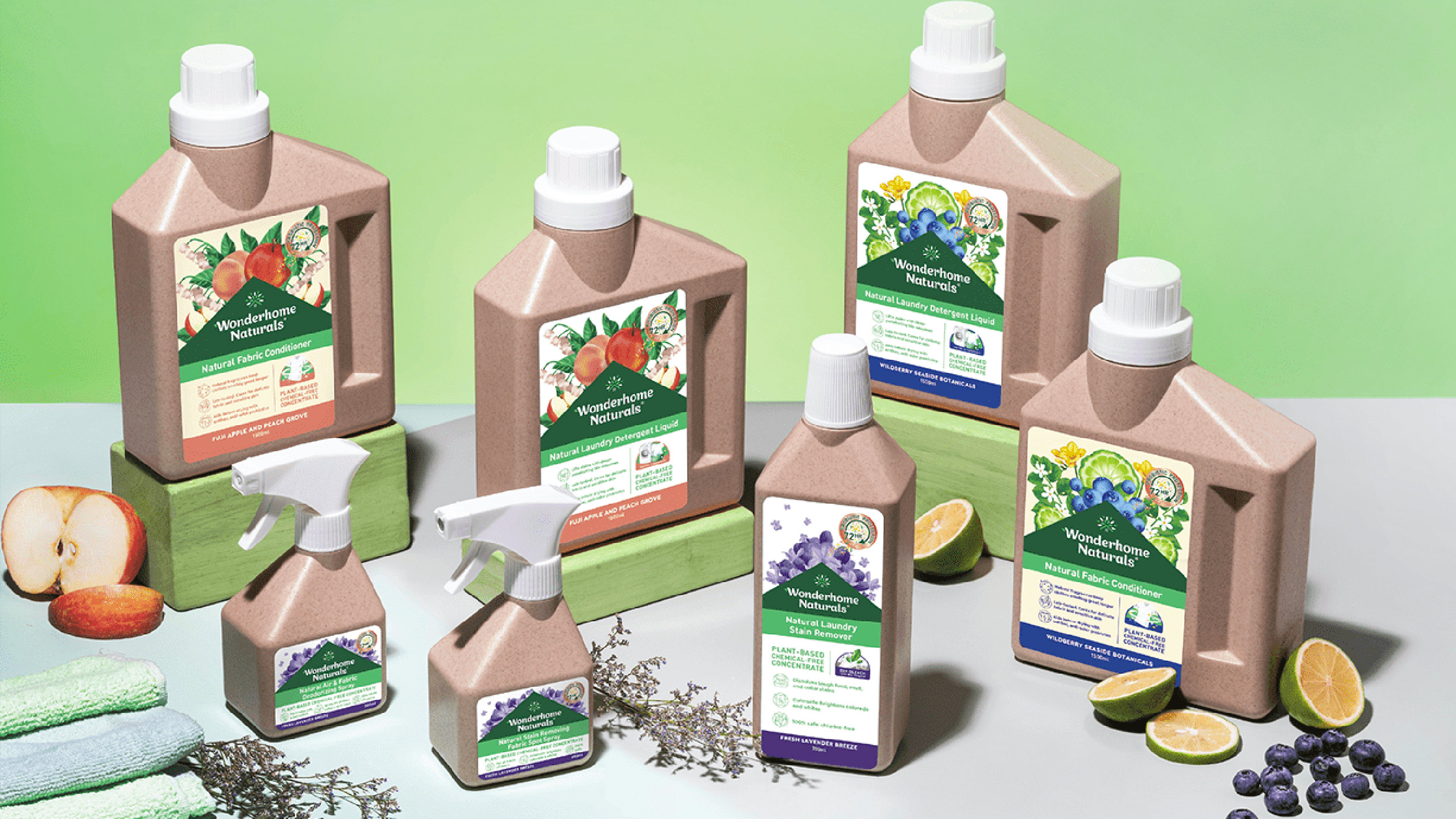
Packaging Design
OVERVIEW
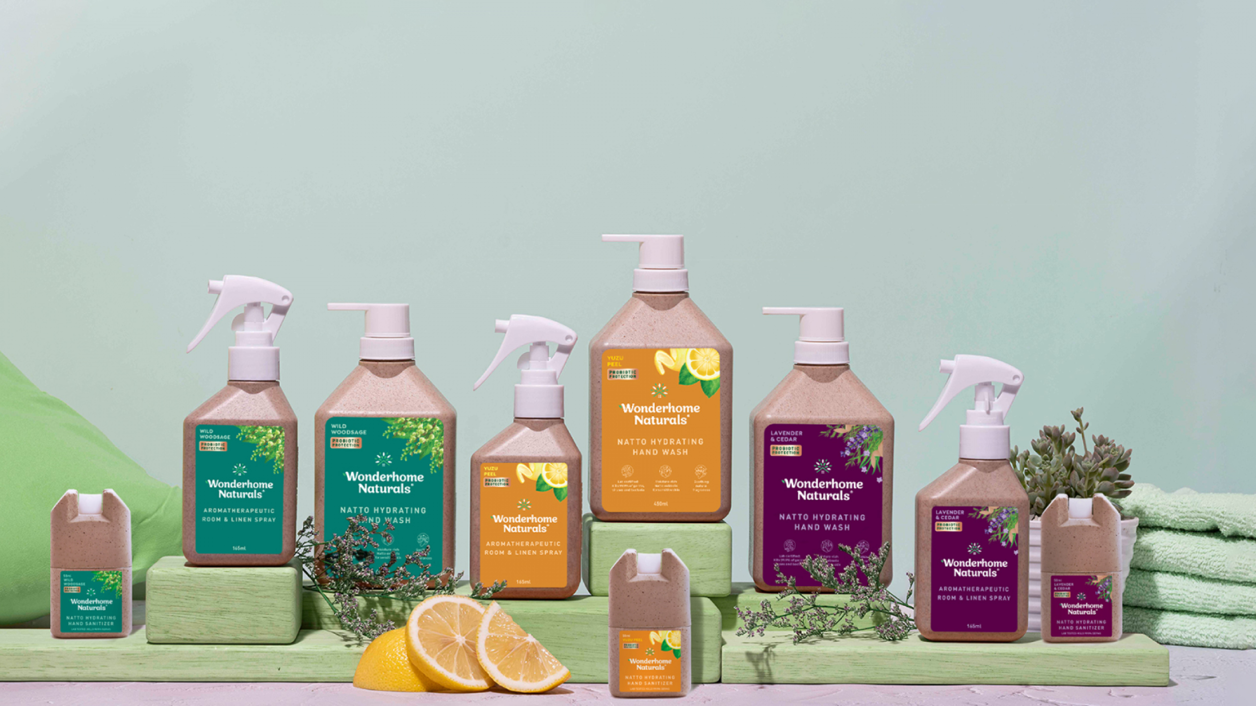
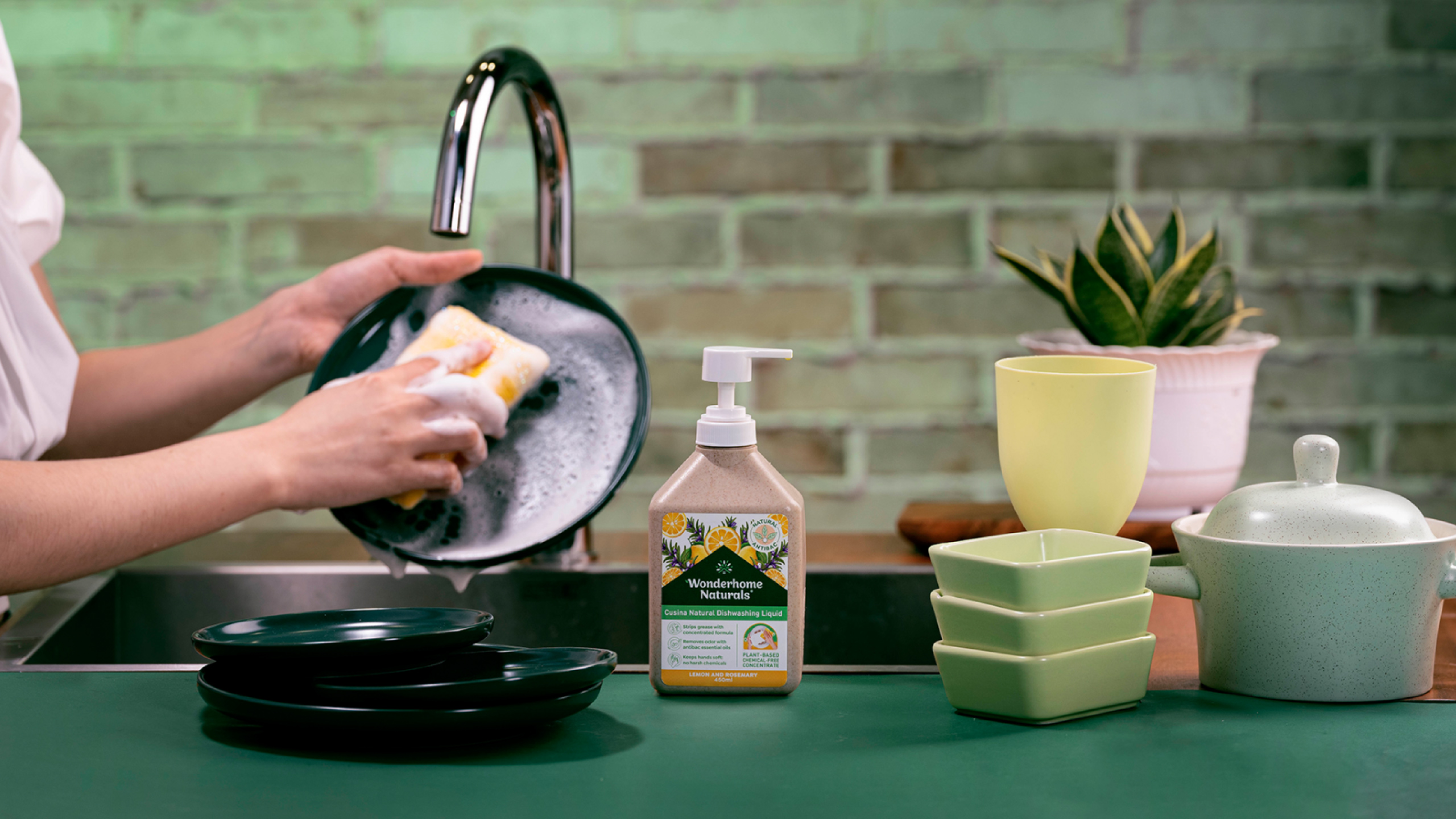
Wonderhome represents a revolutionary brand of cleaning products that harnesses the power of nature to ensure homes are safe and immaculate. These eco-friendly products are beneficial not only for individual households but also for the broader community and our planet as a whole.
MORE INFORMATION
A simple stroll through a supermarket aisle or, in modern terms, a quick Google search reveals a limited variety in home cleaning products. The prevailing trend in this space has been brightly colored plastic packaging, imagery related to science, depictions of fragrant fruits, and promises of value. However, with the rising emphasis on sustainability and the heightened standards of cleanliness due to the Covid-19 pandemic, there's a pressing need for products that are eco-friendly, safe, yet just as potent. While several brands have tried to address this gap, none have successfully resonated with the Filipino mainstream audience.
Engaging with the Wonderhome team, we discovered a pivotal insight from their extensive research: nature's efficacy rivals that of contemporary science. Nature has indeed been the planet's custodian far longer and more effectively than humans. Our mission was to craft a genuine natural alternative that mirrored the potency of familiar cleaning products. We aspired for Wonderhome to be the definitive choice, merging both functionality and eco-consciousness.
We embarked on this journey by synthesizing the best of both mainstream and specialized cleaning products. The result? A brand that truly stands out — scientifically robust, inherently safe, and profoundly compassionate.
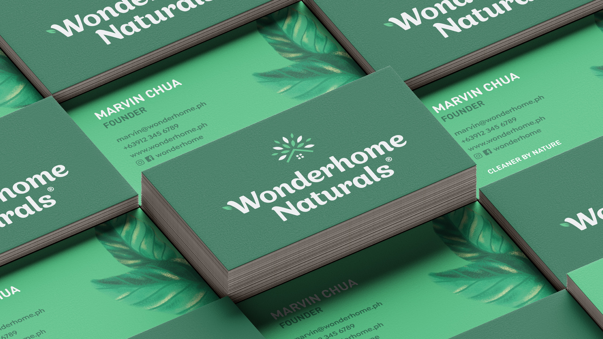
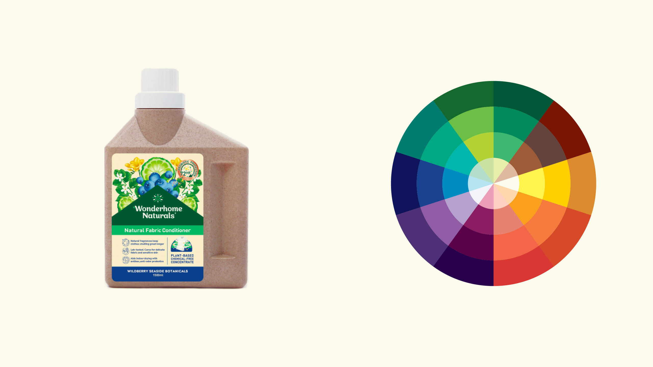
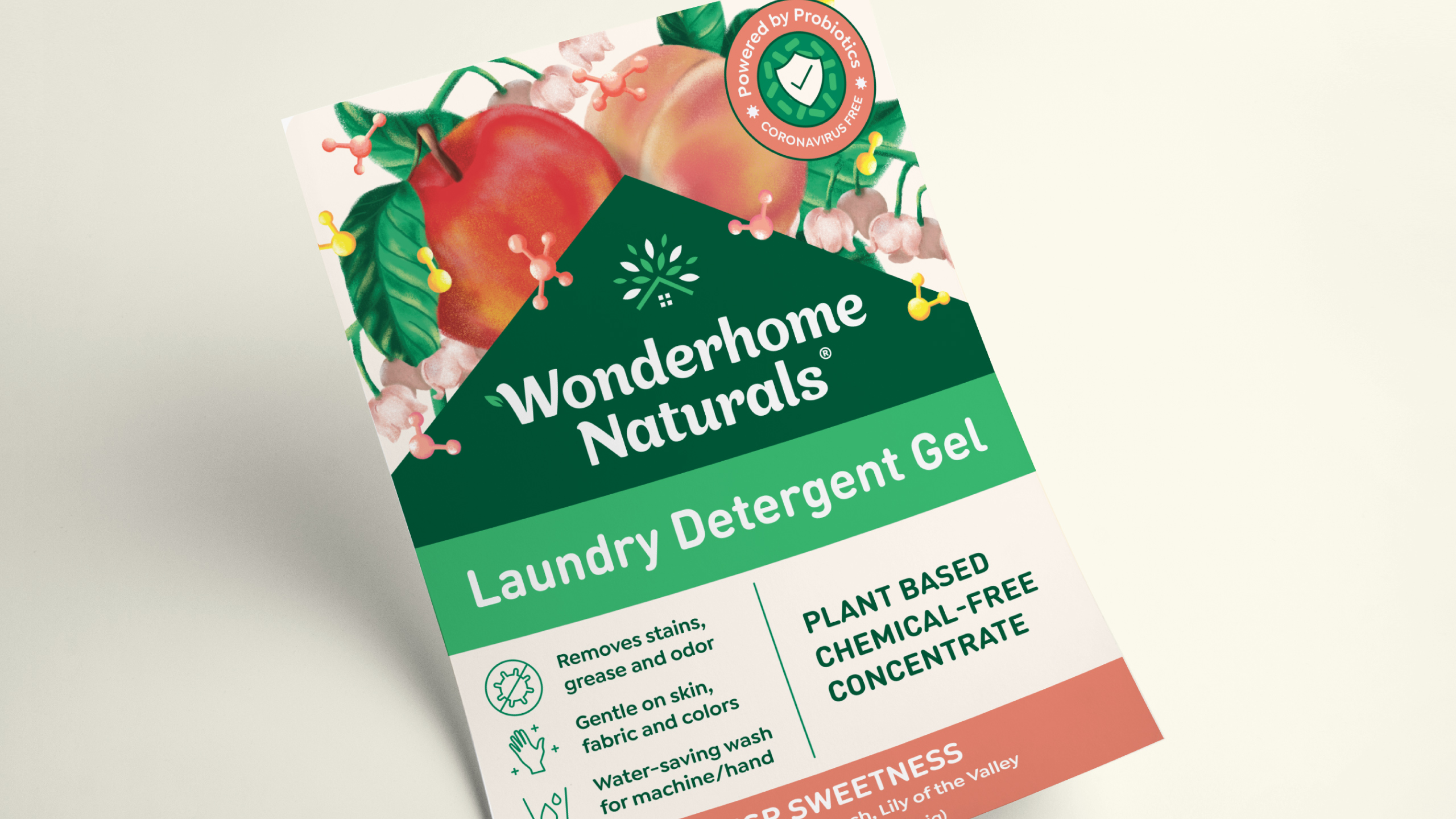
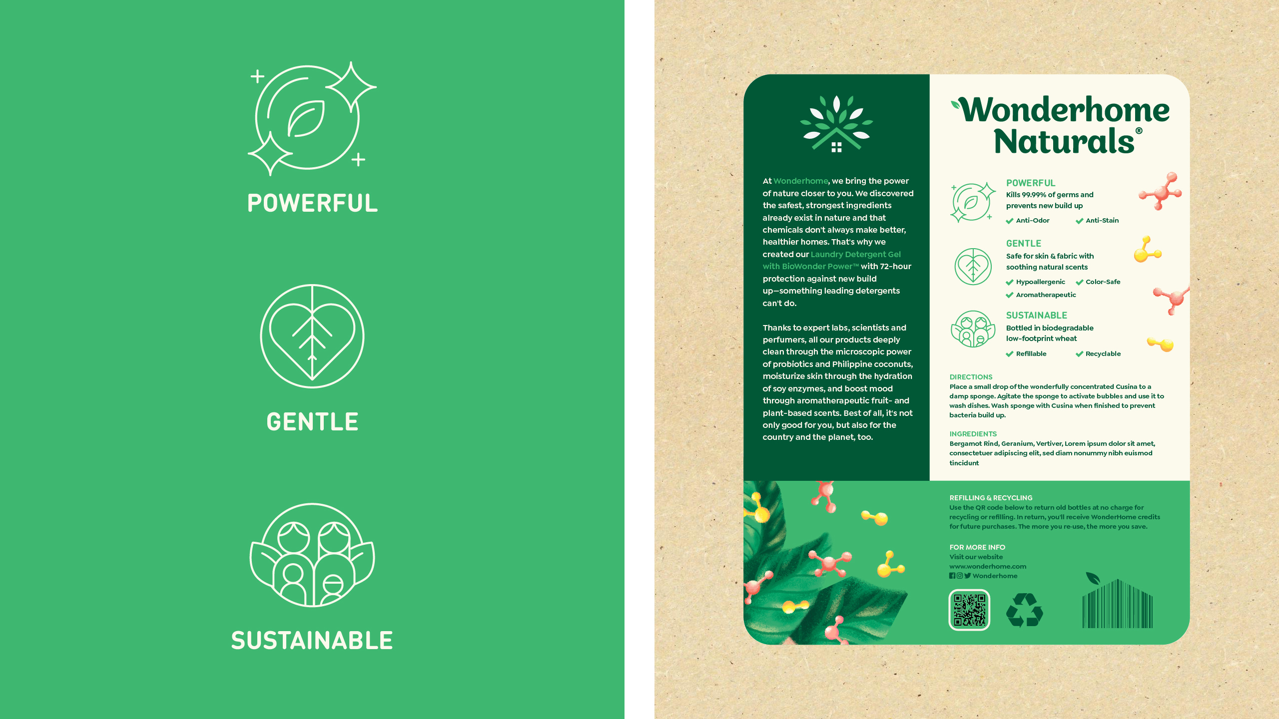
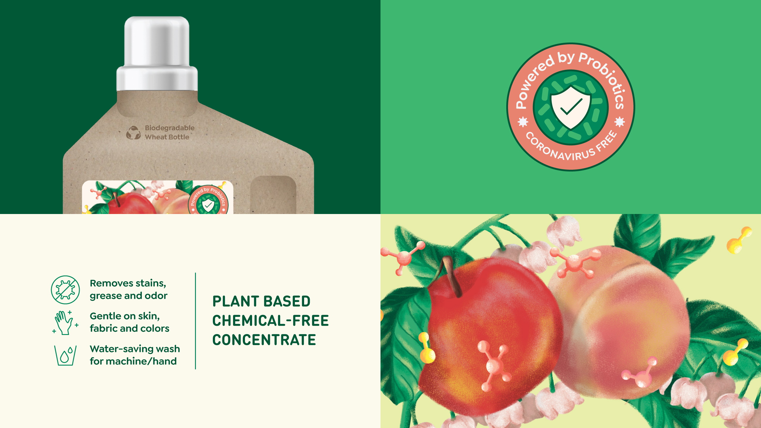
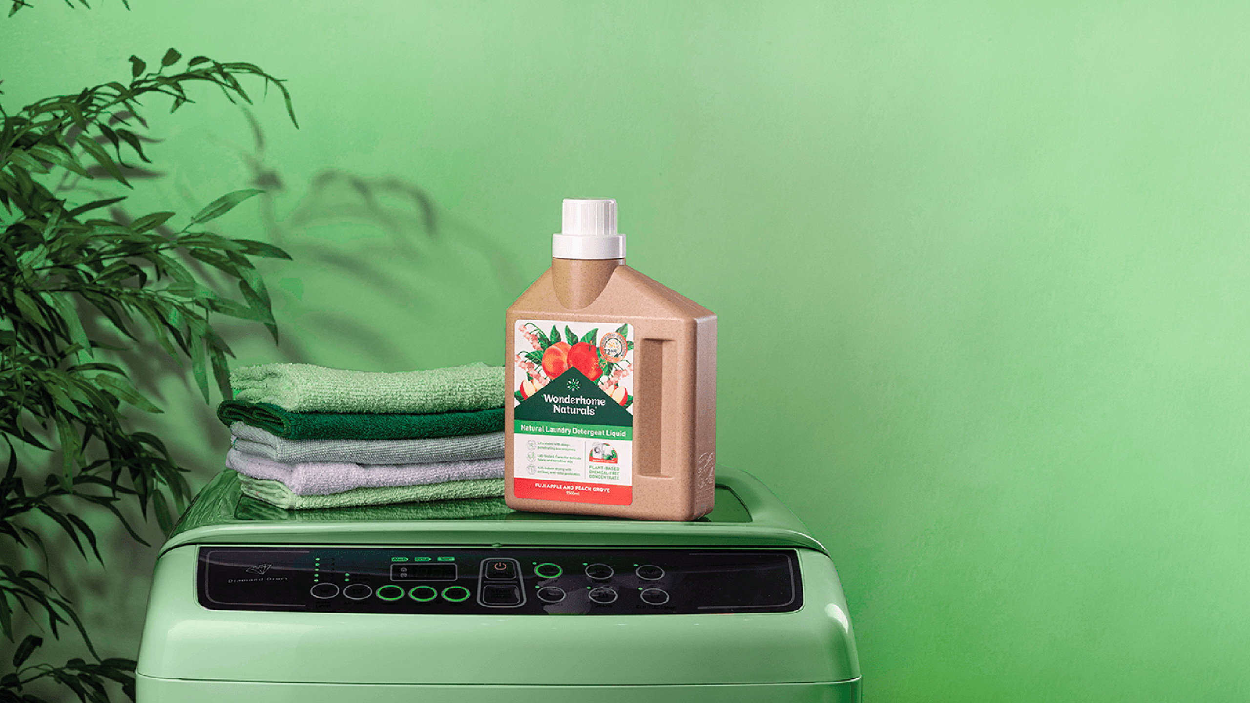
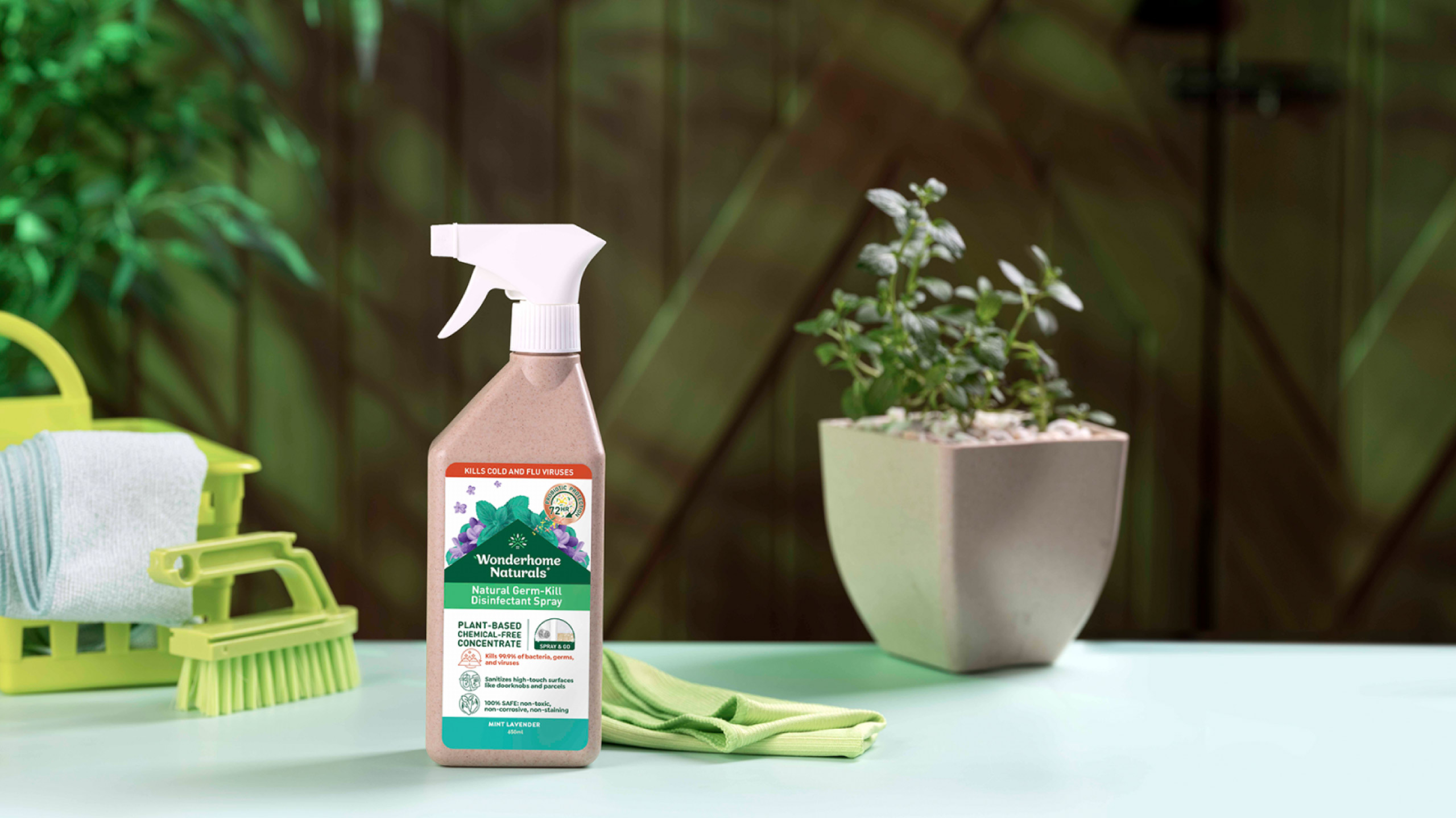
The Wonderhome logo boasts a rounded sans-serif typography, exuding trustworthiness while encapsulating the brand's refreshing appeal. Subtle inclusions like leaves and a home emblem emphasize its gentle yet effective stance on cleaning. Recognizing the significance of color in making products pop both online and on physical shelves, our color scheme melded varying shades of green with pristine off-white and vibrant highlights, creating a palette that feels organic yet distinctly assertive.
Make Sense & Look Good®. Made by Serious People. Creating brands that shape tomorrow, today. Boring is the Enemy. Humans deserve nice things™. Seriously. Hi Mom. Success is found in the details. With great budgets come great work. We are known to make brands human. We enjoy creating brands from the ground up. Great brands invest in great design. Ugly brands don’t care about people. Your brand could always be better. Trust us. Branding is like mind control, but cooler. We will tell you if you have food stuck in your teeth. For a relaxing time, make it Suntory time. Make Sense & Look Good®. Made by Serious People. Creating brands that shape tomorrow, today. Boring is the Enemy. Humans deserve nice things™. Seriously. Hi Mom. Success is found in the details. With great budgets come great work. We are known to make brands human. We enjoy creating brands from the ground up. Great brands invest in great design. Ugly brands don’t care about people. Your brand could always be better. Trust us. Branding is like mind control, but cooler. We will tell you if you have food stuck in your teeth. For a relaxing time, make it Suntory time. Make Sense & Look Good®. Made by Serious People. Creating brands that shape tomorrow, today. Boring is the Enemy. Humans deserve nice things™. Seriously. Hi Mom. Success is found in the details. With great budgets come great work. We are known to make brands human. We enjoy creating brands from the ground up. Great brands invest in great design. Ugly brands don’t care about people. Your brand could always be better. Trust us. Branding is like mind control, but cooler. We will tell you if you have food stuck in your teeth. For a relaxing time, make it Suntory time. Make Sense & Look Good®. Made by Serious People. Creating brands that shape tomorrow, today. Boring is the Enemy. Humans deserve nice things™. Seriously. Hi Mom. Success is found in the details. With great budgets come great work. We are known to make brands human. We enjoy creating brands from the ground up. Great brands invest in great design. Ugly brands don’t care about people. Your brand could always be better. Trust us. Branding is like mind control, but cooler. We will tell you if you have food stuck in your teeth. For a relaxing time, make it Suntory time.