YORI PHILIPPINES FURNITURE BRANDING
Built for Real Life
BRANDING SCOPE
Brand Identity
Brand Strategy
Product Naming
Packaging Design
OVERVIEW
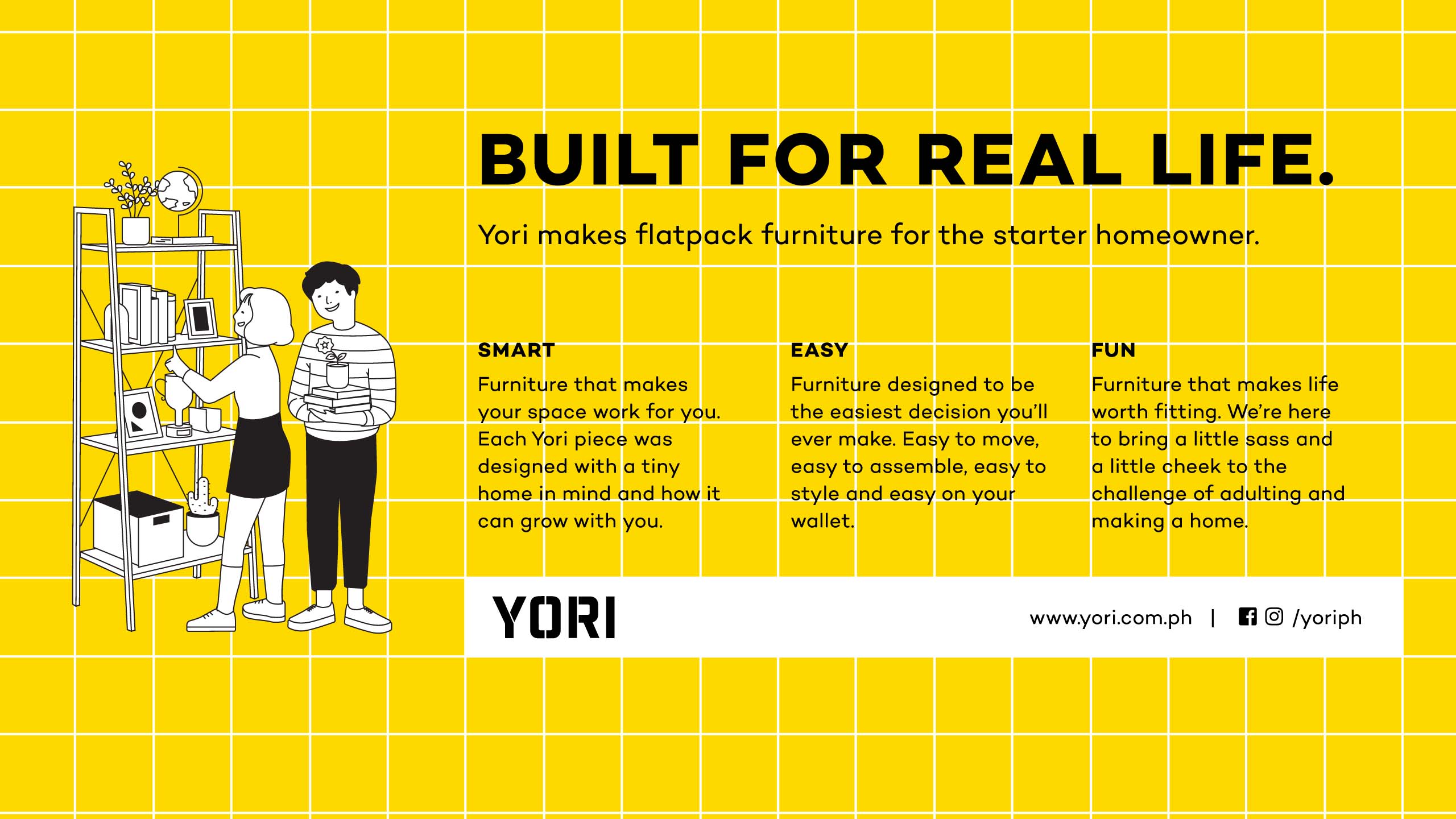
Yori makes DIY flatpack furniture for the starter home and the weekday condo. Designed to be smart, built to be easy and made with a lot of fun, Yori helps you adult into a home and a life that feel like they're yours. With clever furniture that won’t break the bank, Yori helps make decorating, homemaking and life a bit easier—the baby steps to adulting you didn't know you were already ready to take.
MORE INFORMATION
Homes have been getting smaller and smaller and Yori understood that furniture will have to follow suit. Today, people don’t just need furniture that looks and feels like them; they need them to adapt to real life and solve the same problems in more clever, innovative ways and in much less space. So, Yori decided to make genuinely affordable, easy-to-build, multi-purpose flatpack furniture, for the generation with a DIY approach to adulting.
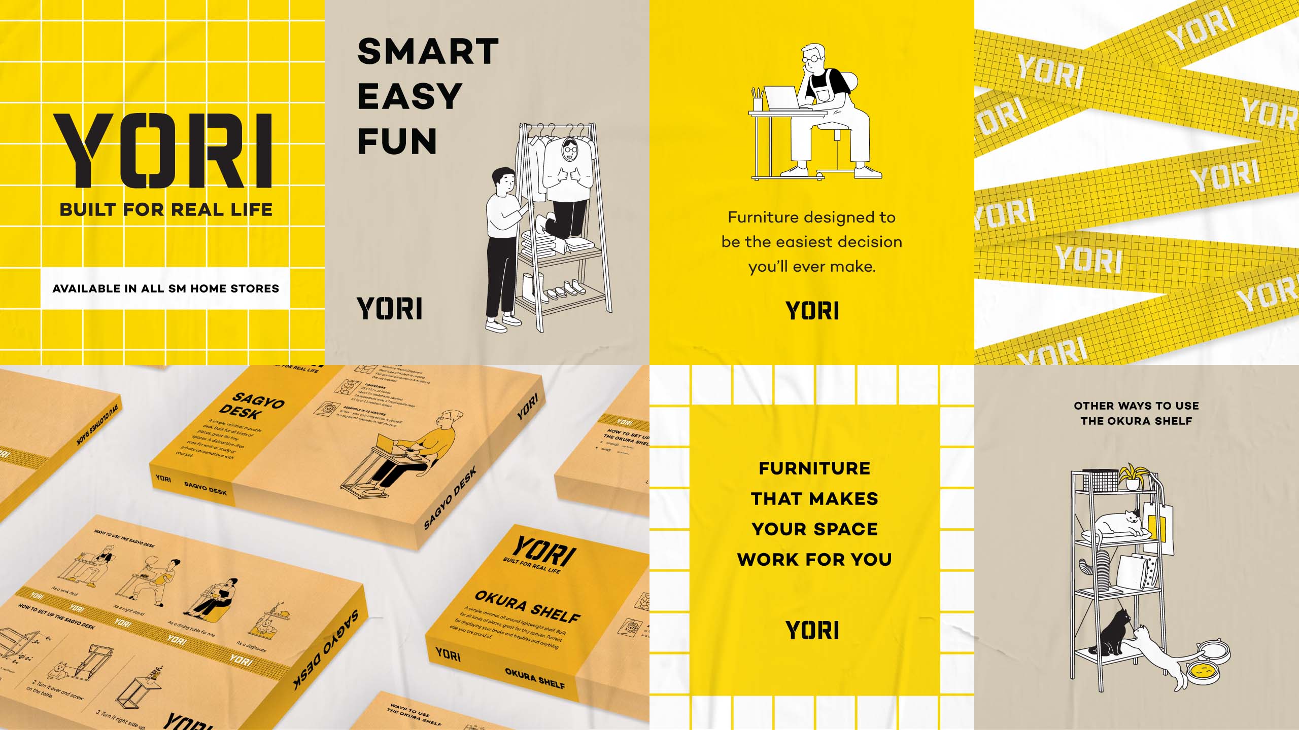
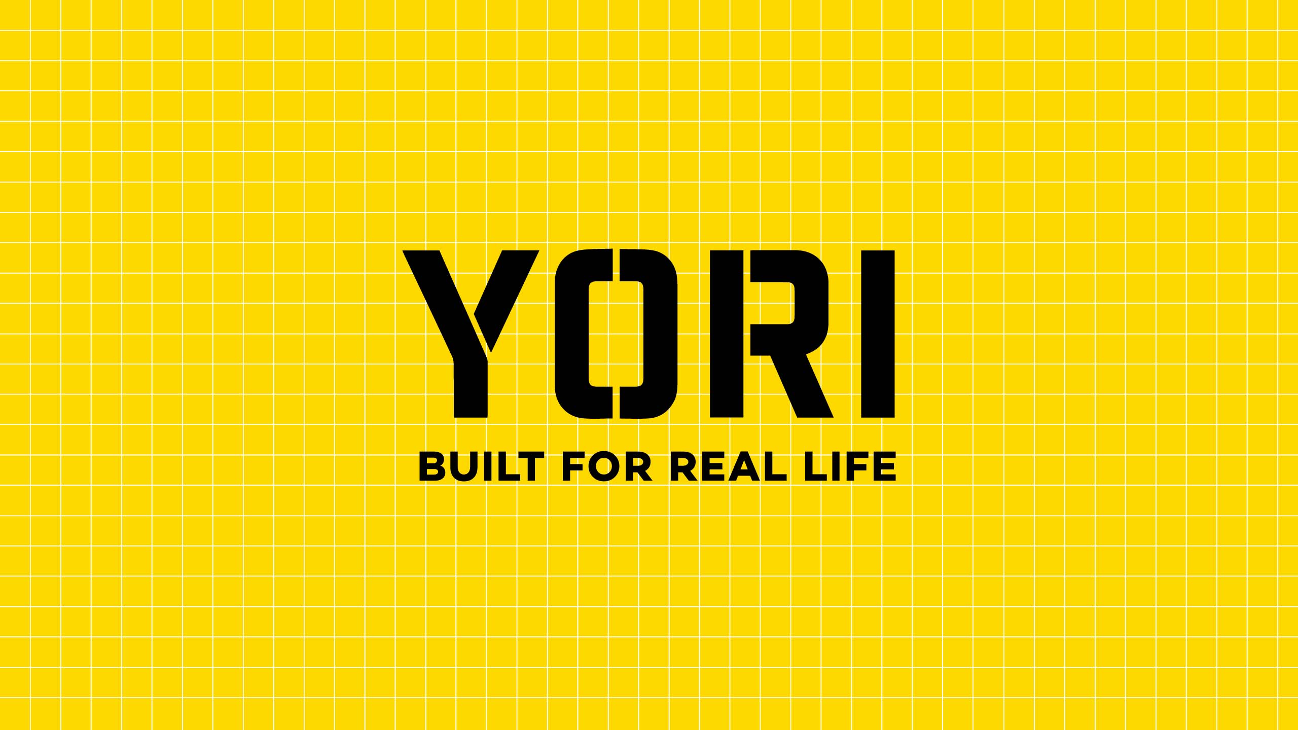
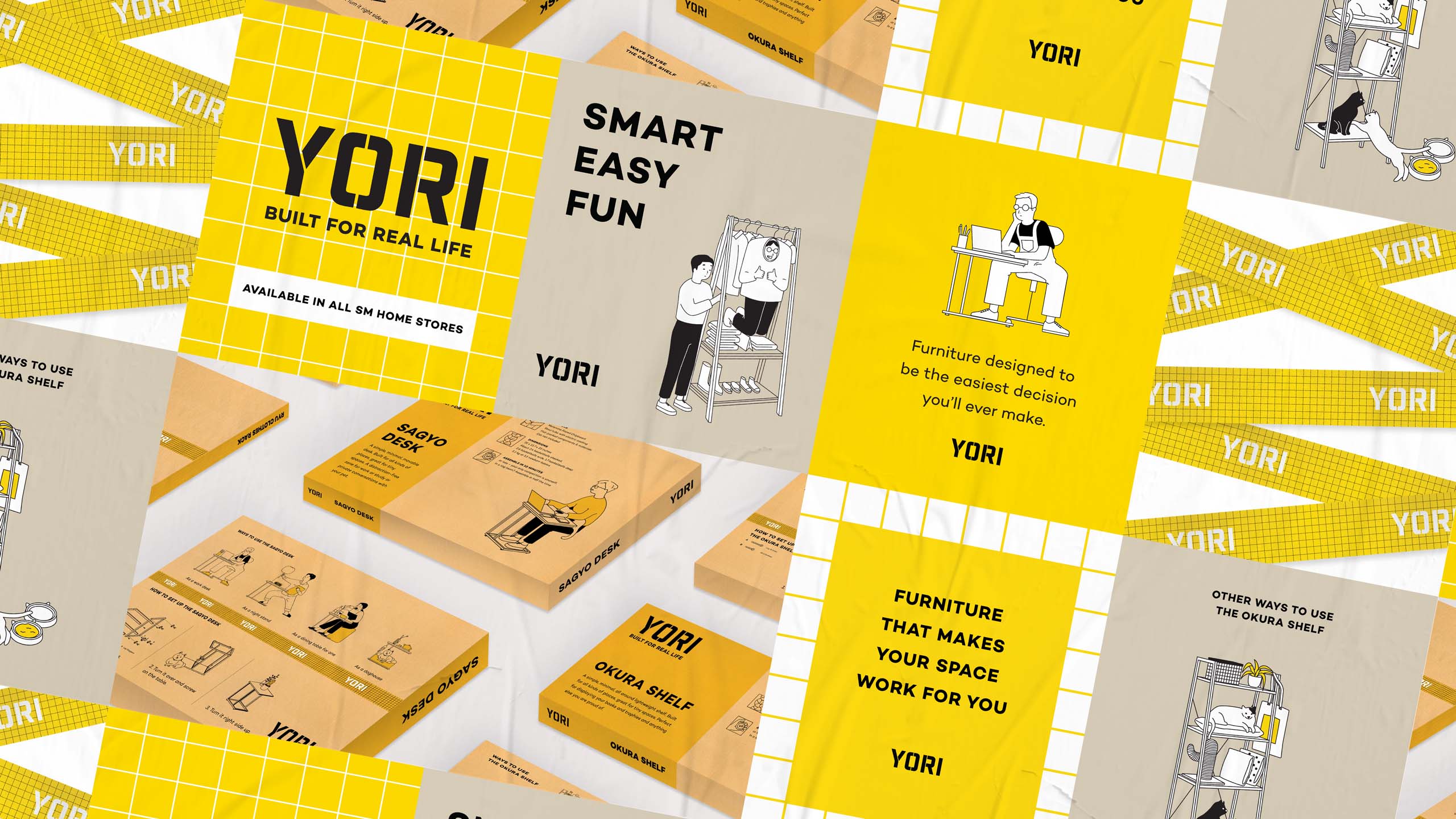
Yori's overall look was inspired by the reliability of an industrial aesthetic. With cheeky copy & illustrations and a bright, striking yellow to bring it to life, much of Yori's tone visually and verbally took cues from Japanese culture in a balance of both its utilitarian and kawaii sides. Also, because Yori was always intended to be priced accessibly and distributed widely, heavy consideration was made towards practicality, feasibility and relatability in the building of the brand.
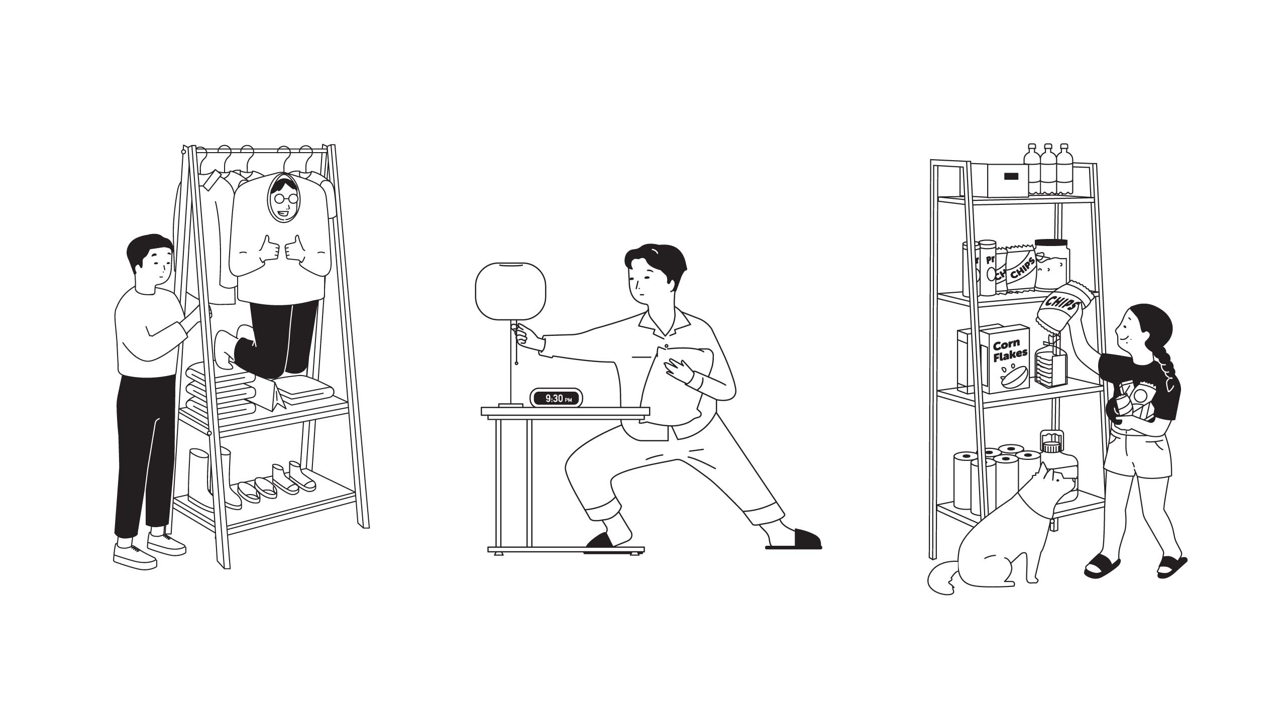
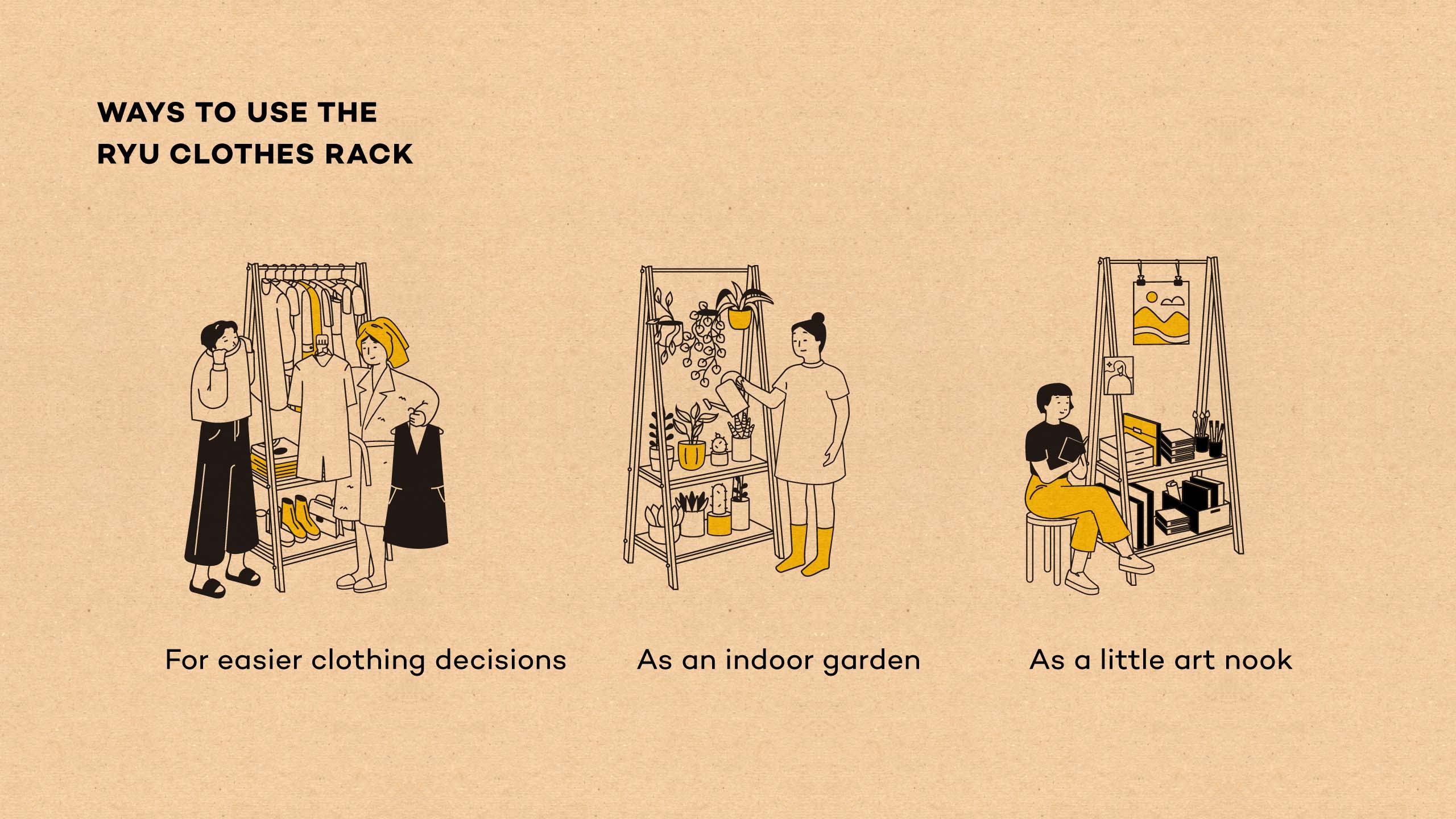
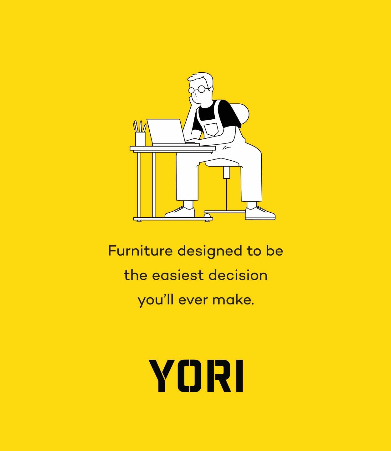
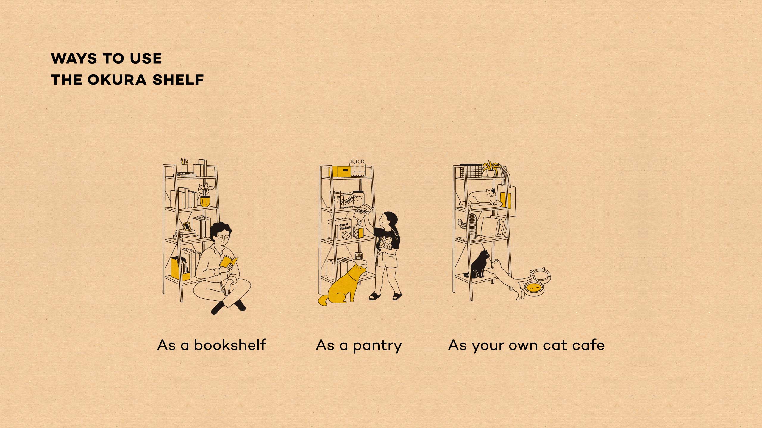
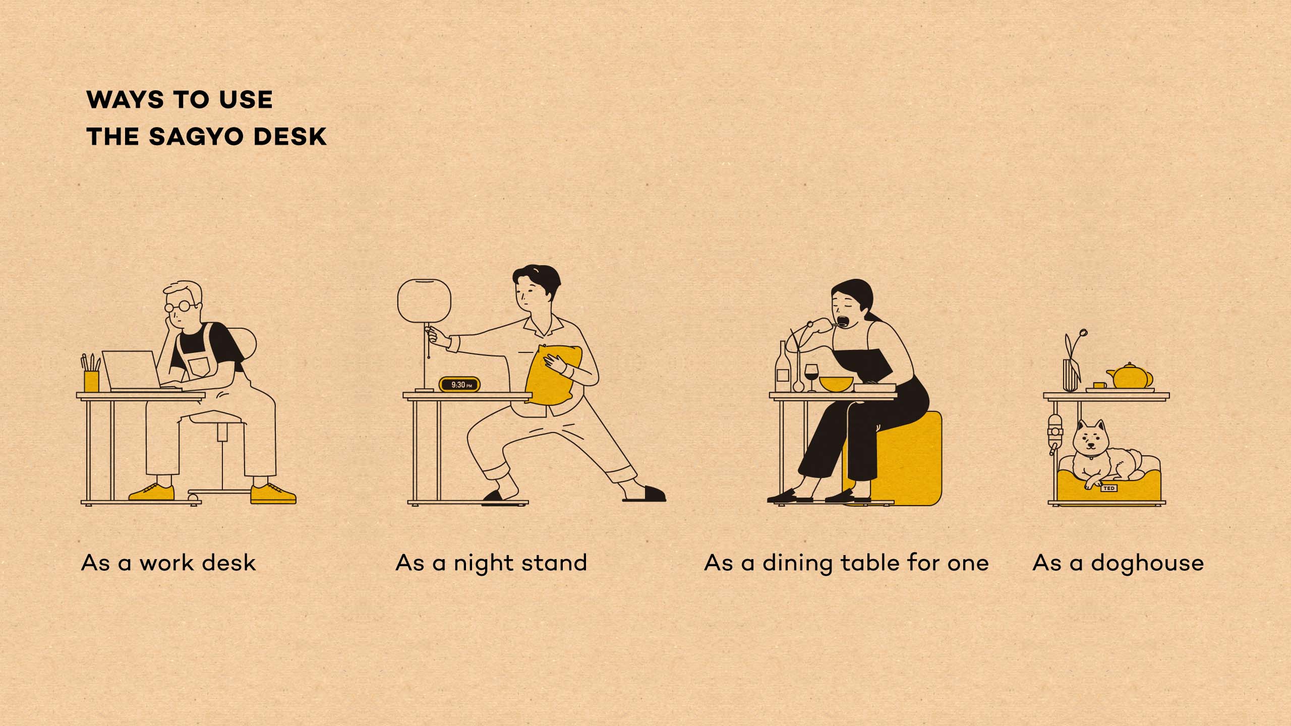
To make the brand assets adaptable, the illustrations were broken down into their many individual elements so the Yori team can mix and match them to create completely new illustrations and to simulate new real-life uses in the future. Quirky, Japanese-inspired illustrations with clean, organic lines add to the brand's visual identity to contextualize the furniture in real life and show the many possibilities for each Yori piece.
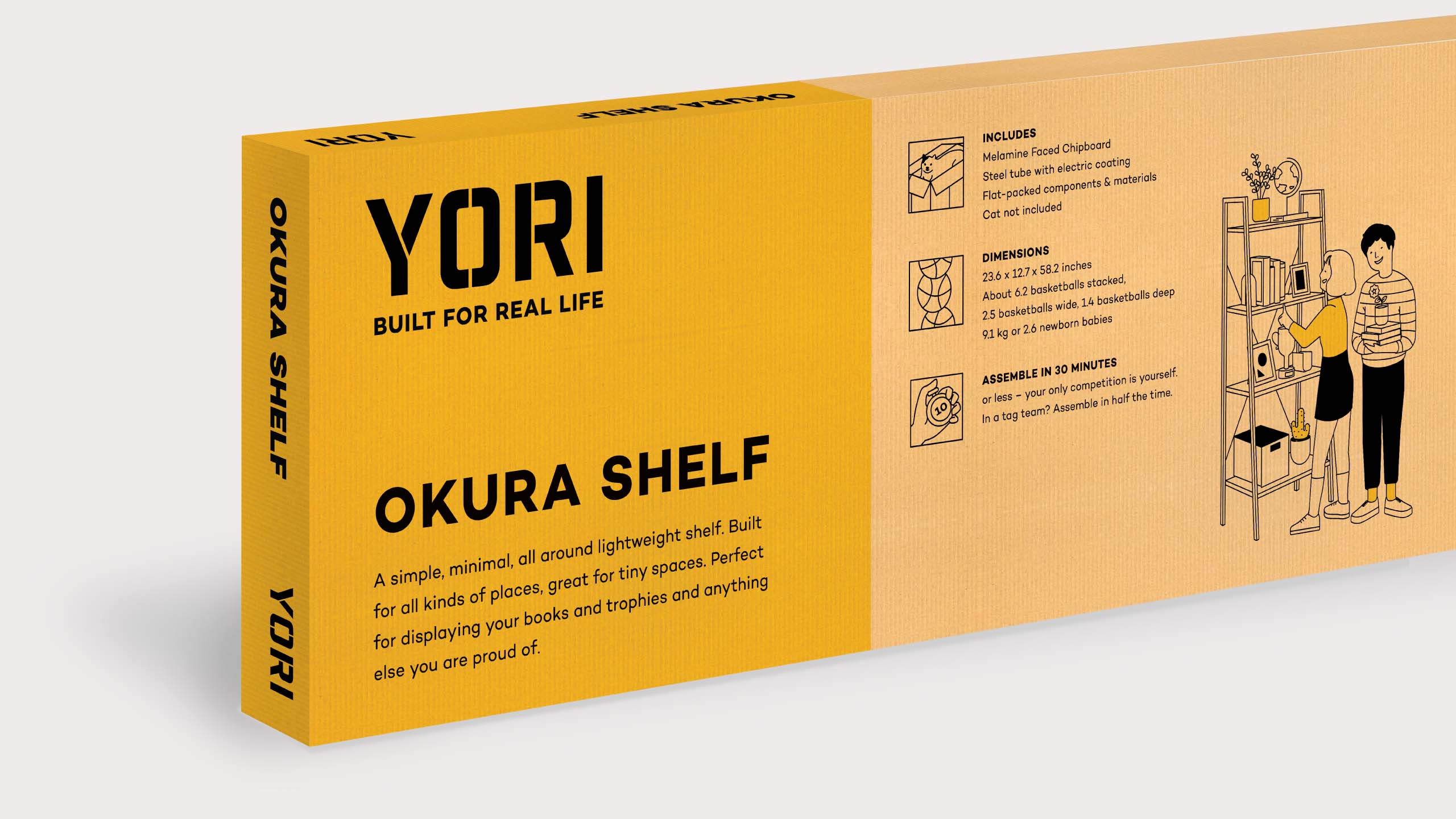
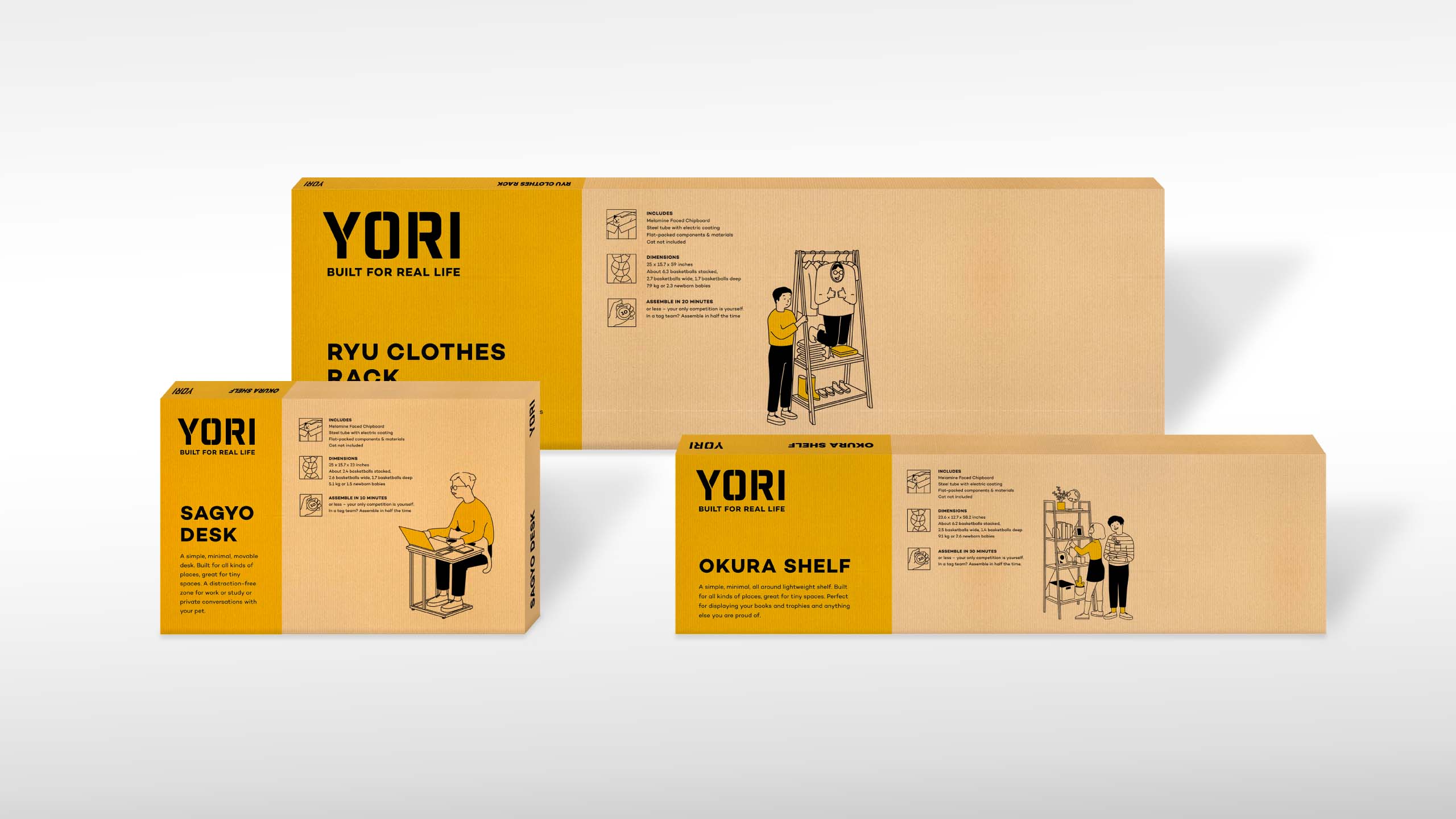
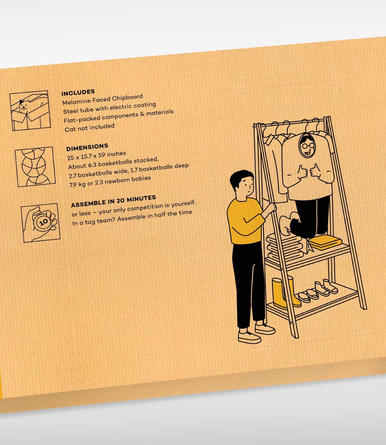
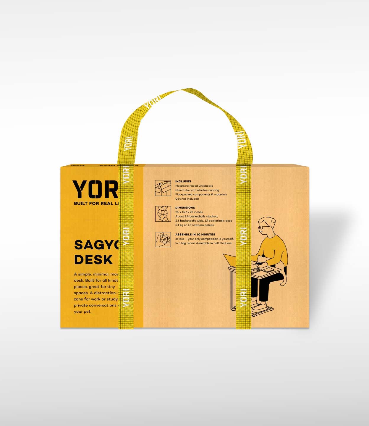
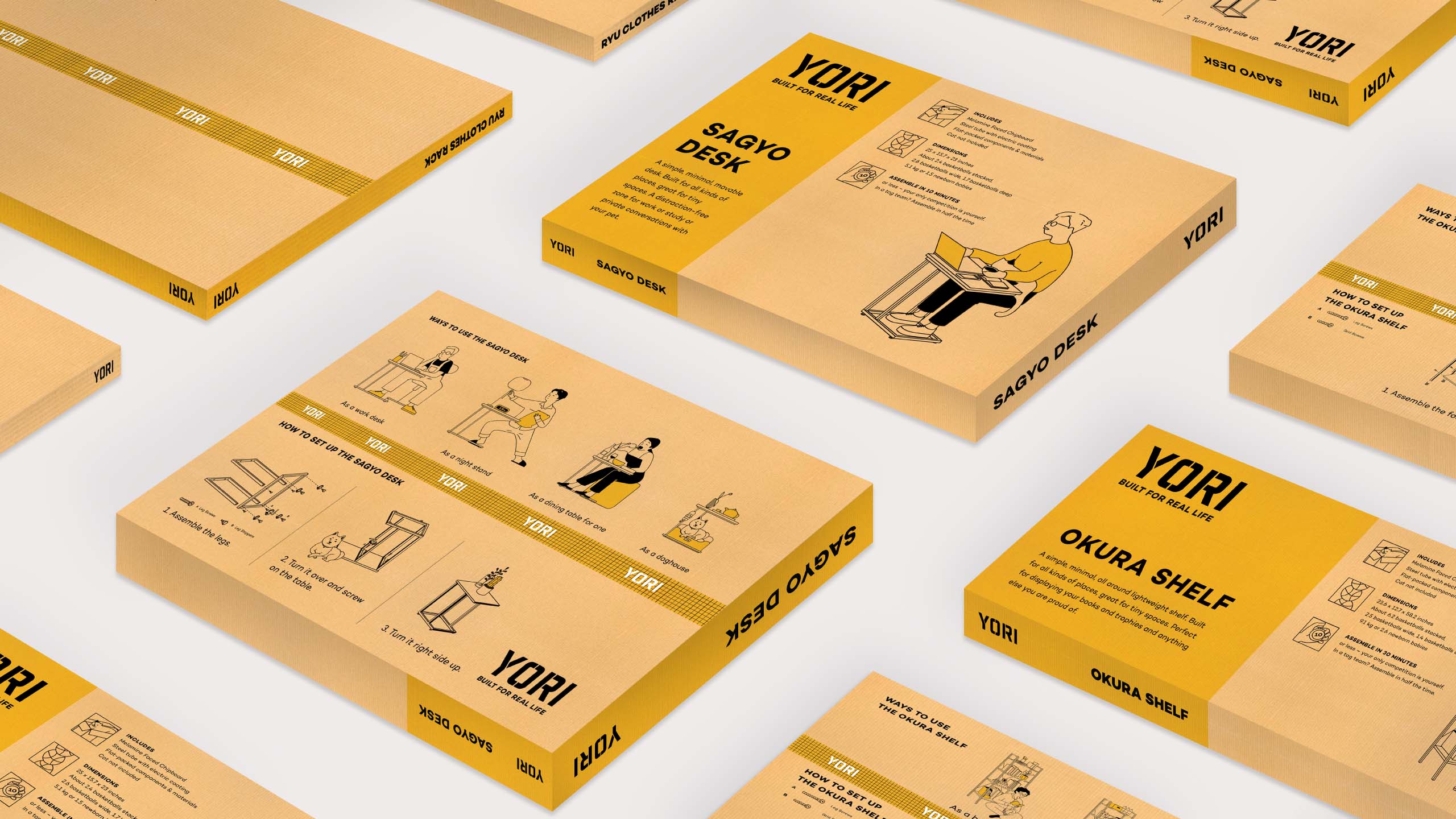
Whether bought in department stores or online, the experience of bringing home a Yori product is its most impactful touchpoint. As such, a lot of time and effort was spent building this, to simultaneously communicate the personality of the brand, while providing important and useful information in an easy-to-understand way. A bold block of yellow was designed to help the Yori box stand out in a crowded department store. This striking color is the first our eyes register and works well even with a limited and pragmatic 2-color palette. Each piece was given a simple Japanese name (e.g. "Okura" is warehouse or storehouse in Japanese) as a nod to the brand's utilitarian side.
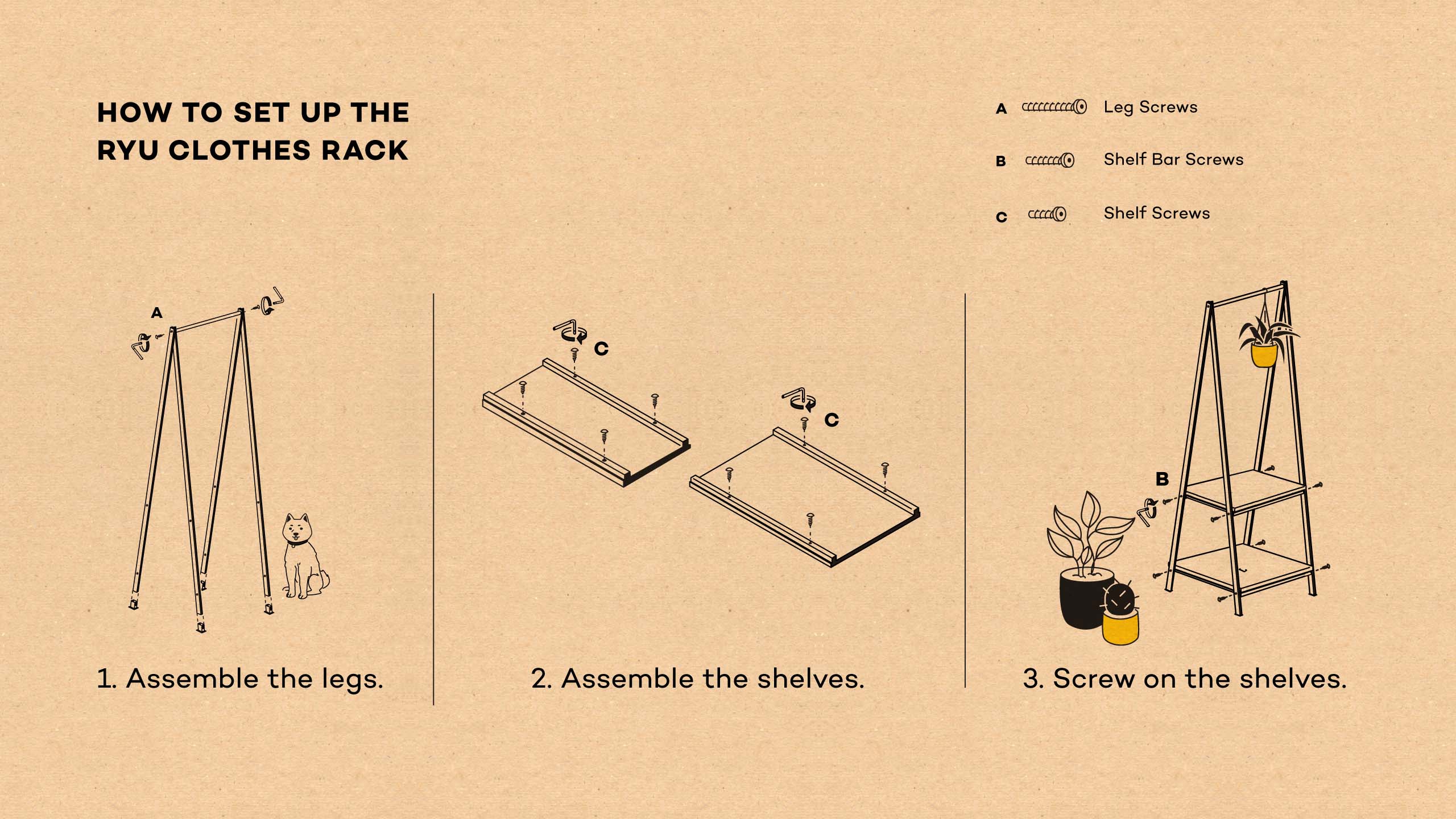
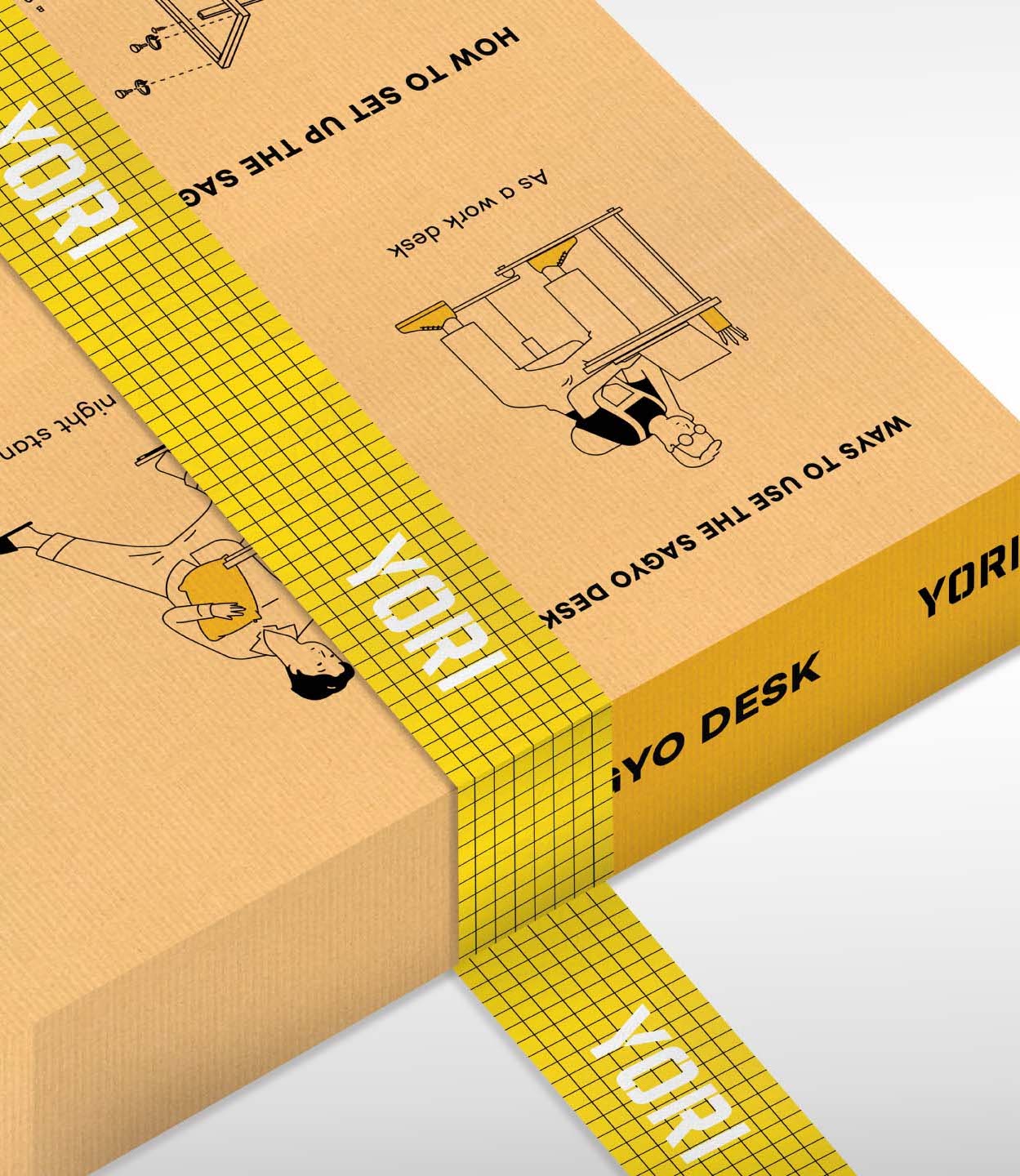
Each section of the box was carefully designed to not only attract a potential buyer, but more importantly, to help them understand how smart, easy, and fun Yori is. Aside from a manual, assembly instructions were also included right on the box with simple illustrations that are easy to understand.
We had a lot of fun storyboarding and illustrating different practical and not-so-practical uses for each piece. This shows how truly versatile Yori is, while keeping the brand's light and fun tone present and consistent throughout different touchpoints.
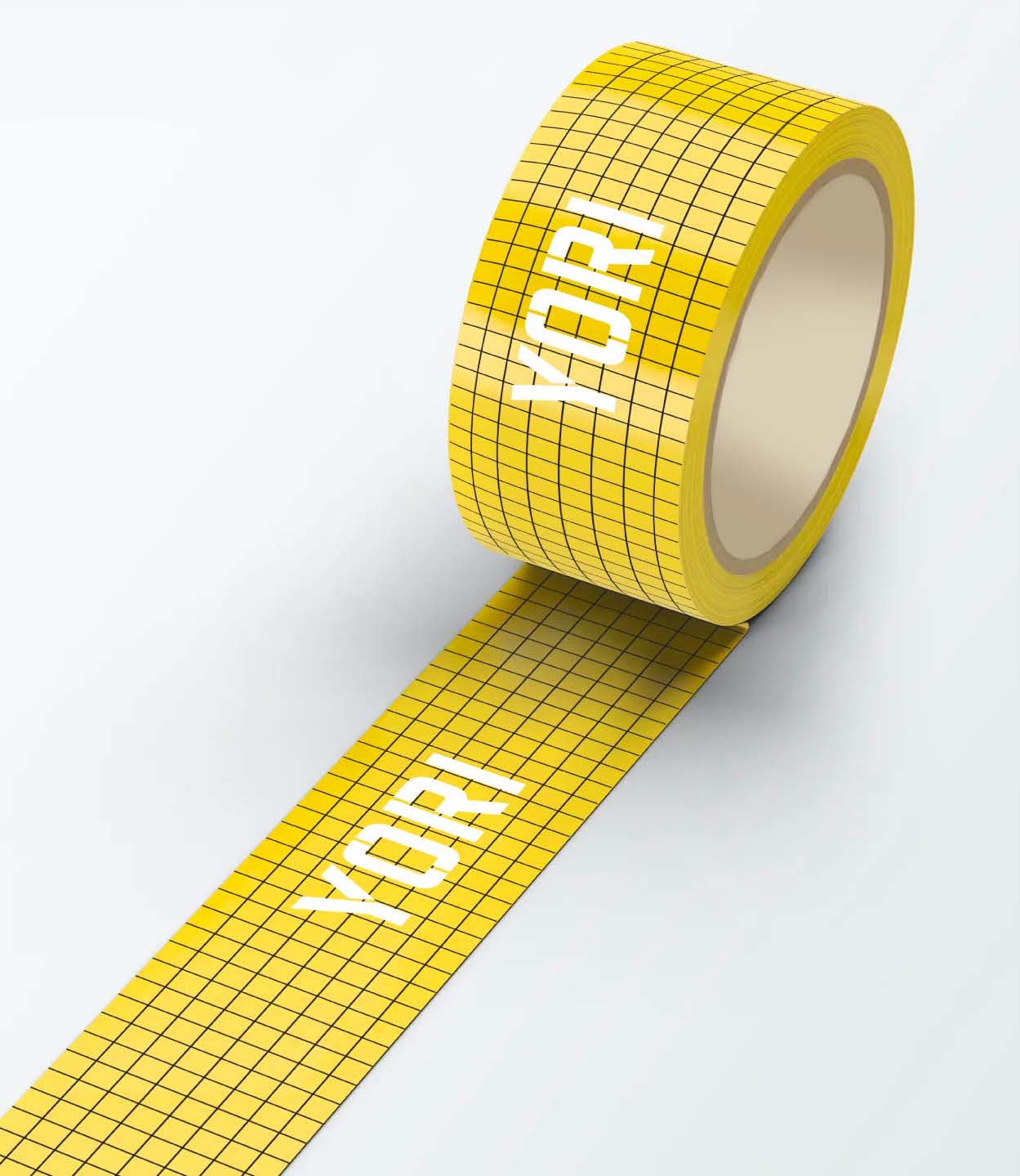
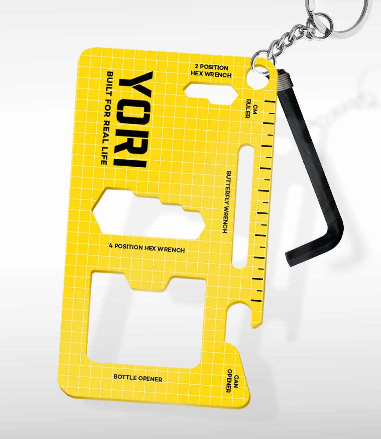
Even the smallest details were intentionally designed. As an additional means to make the packaging stand out, the brand pattern was also used for packaging tape to seal the box edges. We also designed a keychain "toolbox" you can carry wherever you go. It contains a ruler, bottle opener, can opener, and different kinds of wrenches including an Allen wrench that may be used to build a Yori flatpack.
Make Sense & Look Good®. Made by Serious People. Creating brands that shape tomorrow, today. Boring is the Enemy. Humans deserve nice things™. Seriously. Hi Mom. Success is found in the details. With great budgets come great work. We are known to make brands human. We enjoy creating brands from the ground up. Great brands invest in great design. Ugly brands don’t care about people. Your brand could always be better. Trust us. Branding is like mind control, but cooler. We will tell you if you have food stuck in your teeth. For a relaxing time, make it Suntory time. Make Sense & Look Good®. Made by Serious People. Creating brands that shape tomorrow, today. Boring is the Enemy. Humans deserve nice things™. Seriously. Hi Mom. Success is found in the details. With great budgets come great work. We are known to make brands human. We enjoy creating brands from the ground up. Great brands invest in great design. Ugly brands don’t care about people. Your brand could always be better. Trust us. Branding is like mind control, but cooler. We will tell you if you have food stuck in your teeth. For a relaxing time, make it Suntory time. Make Sense & Look Good®. Made by Serious People. Creating brands that shape tomorrow, today. Boring is the Enemy. Humans deserve nice things™. Seriously. Hi Mom. Success is found in the details. With great budgets come great work. We are known to make brands human. We enjoy creating brands from the ground up. Great brands invest in great design. Ugly brands don’t care about people. Your brand could always be better. Trust us. Branding is like mind control, but cooler. We will tell you if you have food stuck in your teeth. For a relaxing time, make it Suntory time. Make Sense & Look Good®. Made by Serious People. Creating brands that shape tomorrow, today. Boring is the Enemy. Humans deserve nice things™. Seriously. Hi Mom. Success is found in the details. With great budgets come great work. We are known to make brands human. We enjoy creating brands from the ground up. Great brands invest in great design. Ugly brands don’t care about people. Your brand could always be better. Trust us. Branding is like mind control, but cooler. We will tell you if you have food stuck in your teeth. For a relaxing time, make it Suntory time.