Serious Studio’s Brand Aid is a brand-building mentorship program that aims to help COVID-19 affected SMEs troubleshoot today, in order to future-proof tomorrow. The program aims to uncover core issues, figure out a feasible plan forward, and design a better future together — all for free to grantees.
Brand Strategy
Brand Identity
Creative Direction: Deane Miguel
Lead Strategy: Paolo Aljibe & Selina De Guzman
Lead Design: Lazir Caluya
BACKGROUND: UNCOVERING CORE ISSUES
As part of the first batch of the Brand Aid initiative, Ami Farms (formerly known as Malipayon Farms) approached us to reimagine their brand. The change to “Ami Farms” was a culmination of their new attitude and approach to farming while keeping their foundations intact. Ami means “second harvest” in Hiligaynon, fitting as the whole exercise resulted in a brighter and optimistic take on local farming.
With the pandemic affecting businesses that directly cater to consumers, suppliers (or the B2B market) were also affected because of the erratic influx in demand. Originally a provider to restaurants only, Ami Farms had to pivot to a wider market as cooking moves inwards to the home instead. The cooking revolution throughout the lockdown deemed to be a great opportunity, but with this change came a big challenge: How do we educate the market about our specialty produce without intimidating them?
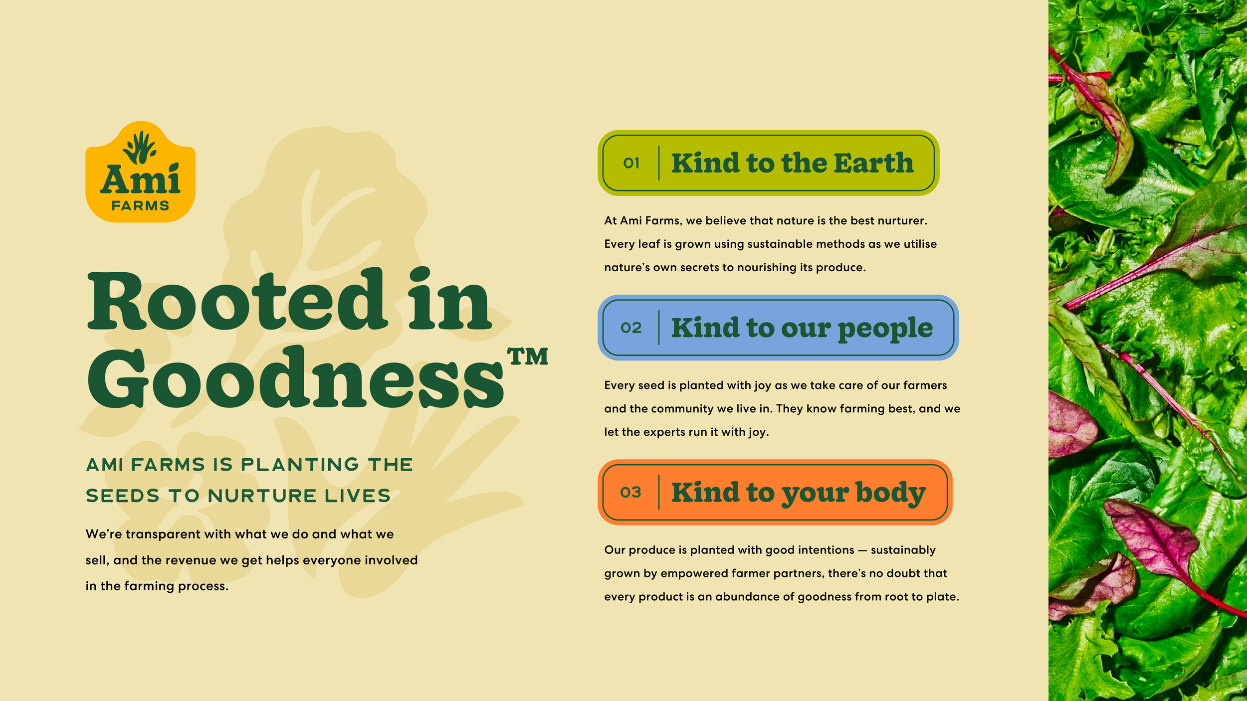
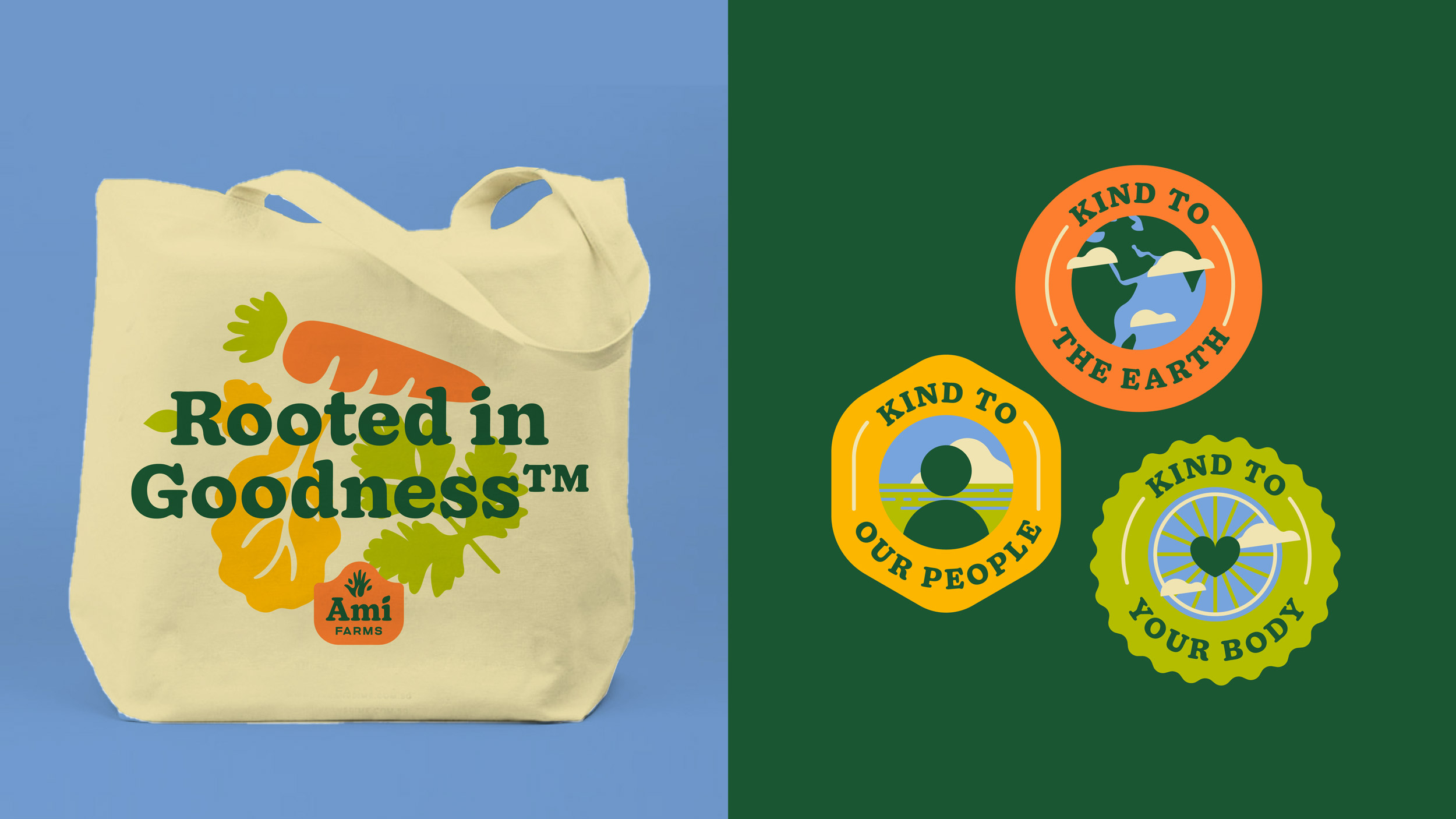
Ami Farms is a biodynamic farm in Silang, Cavite. The farm puts an emphasis on kindness: being kind to the Earth through sustainable farming methods (that is, nurturing produce through the secrets of Mother Nature), being kind to its community by working together with their farmers and treating them as partners, and sharing produce that is kind to our bodies.
With that, it was almost second nature to hinge the brand on goodness. Knowing that the produce is good from the root to the plate — that is, from good farming practices that enrich the soul to advocates of good and healthy food that enrich the body, Ami Farms is undeniably rooted in goodness.
IDENTITY: DESIGNING A BETTER FUTURE TOGETHER
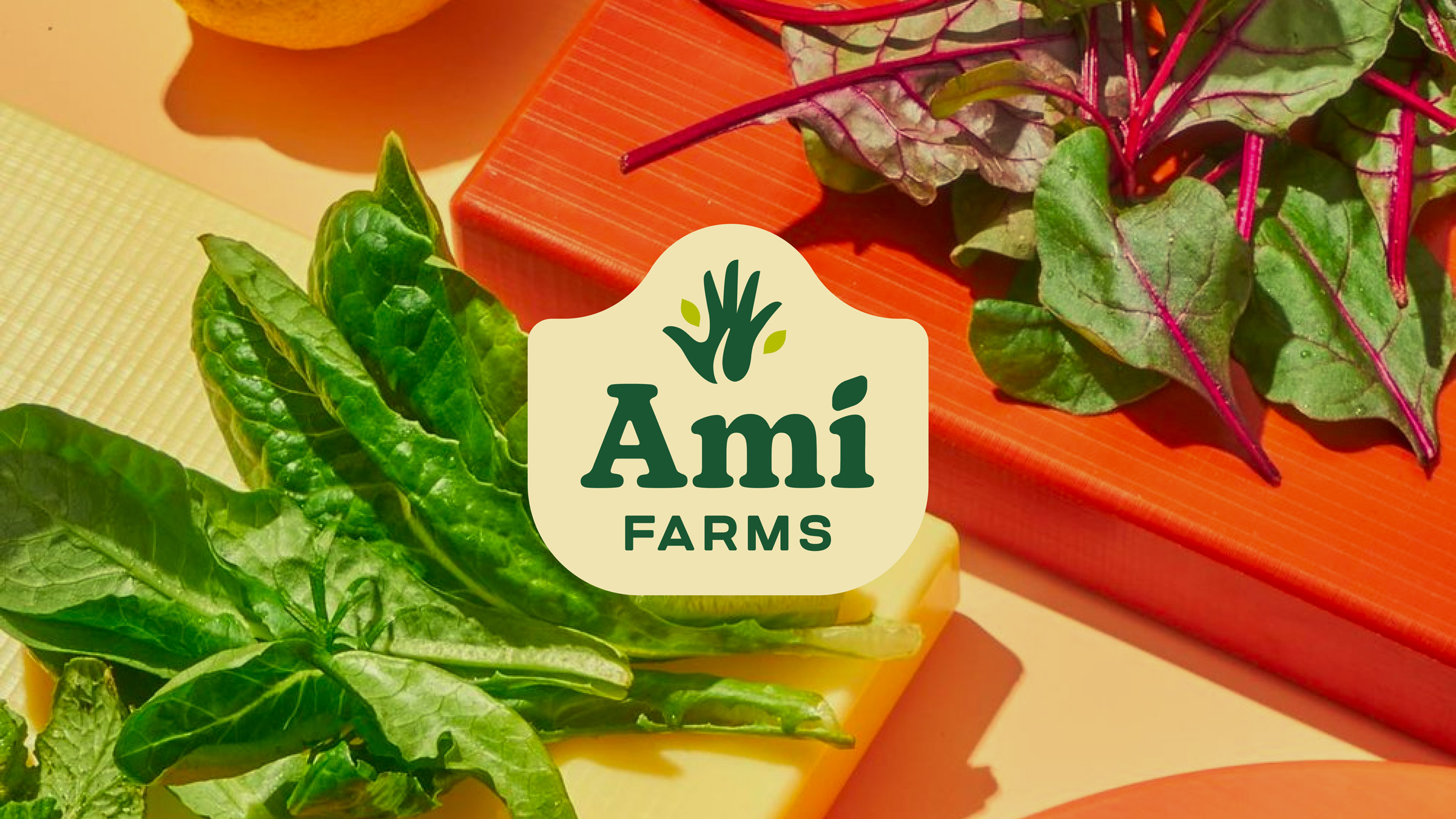
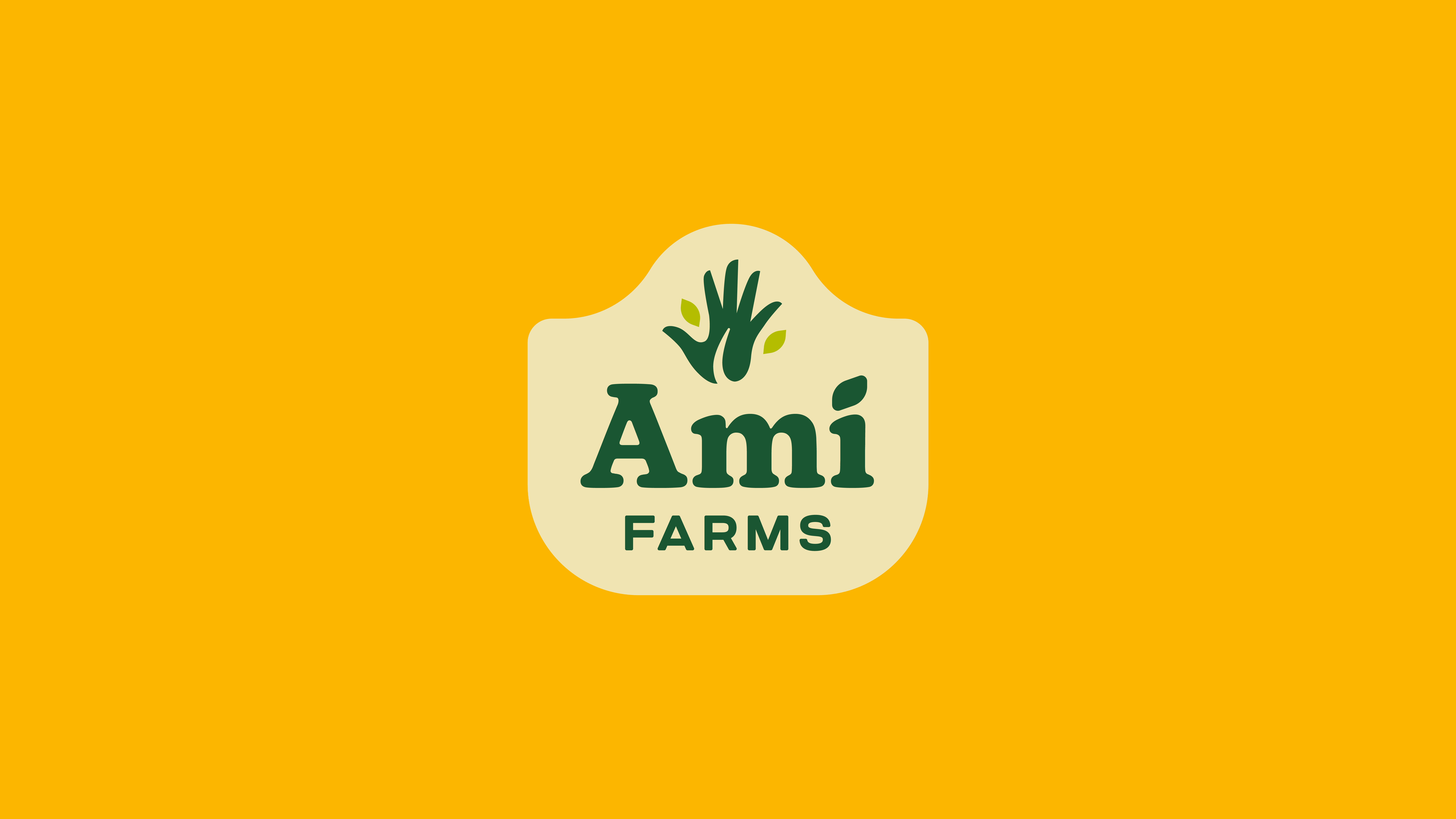
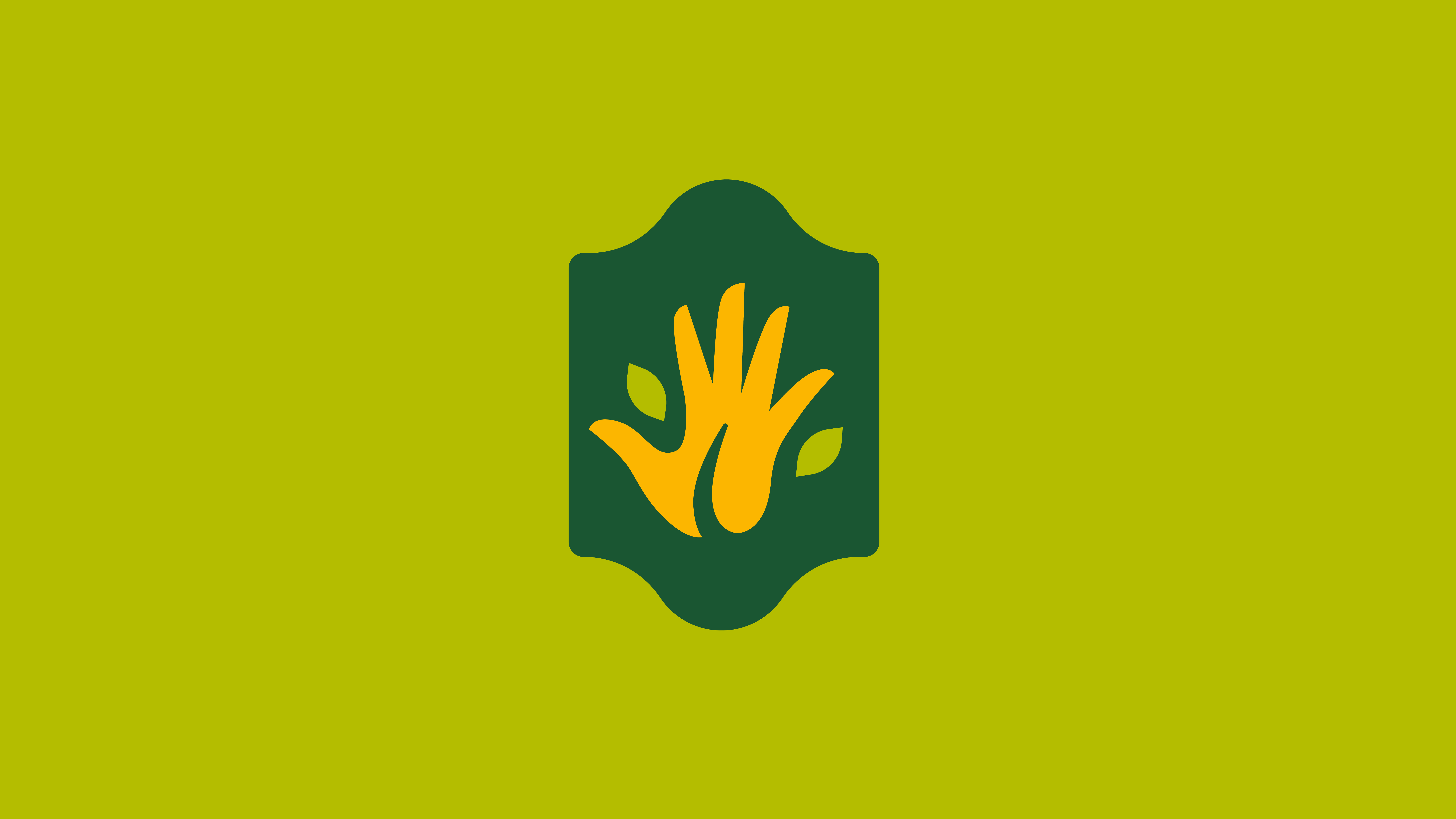
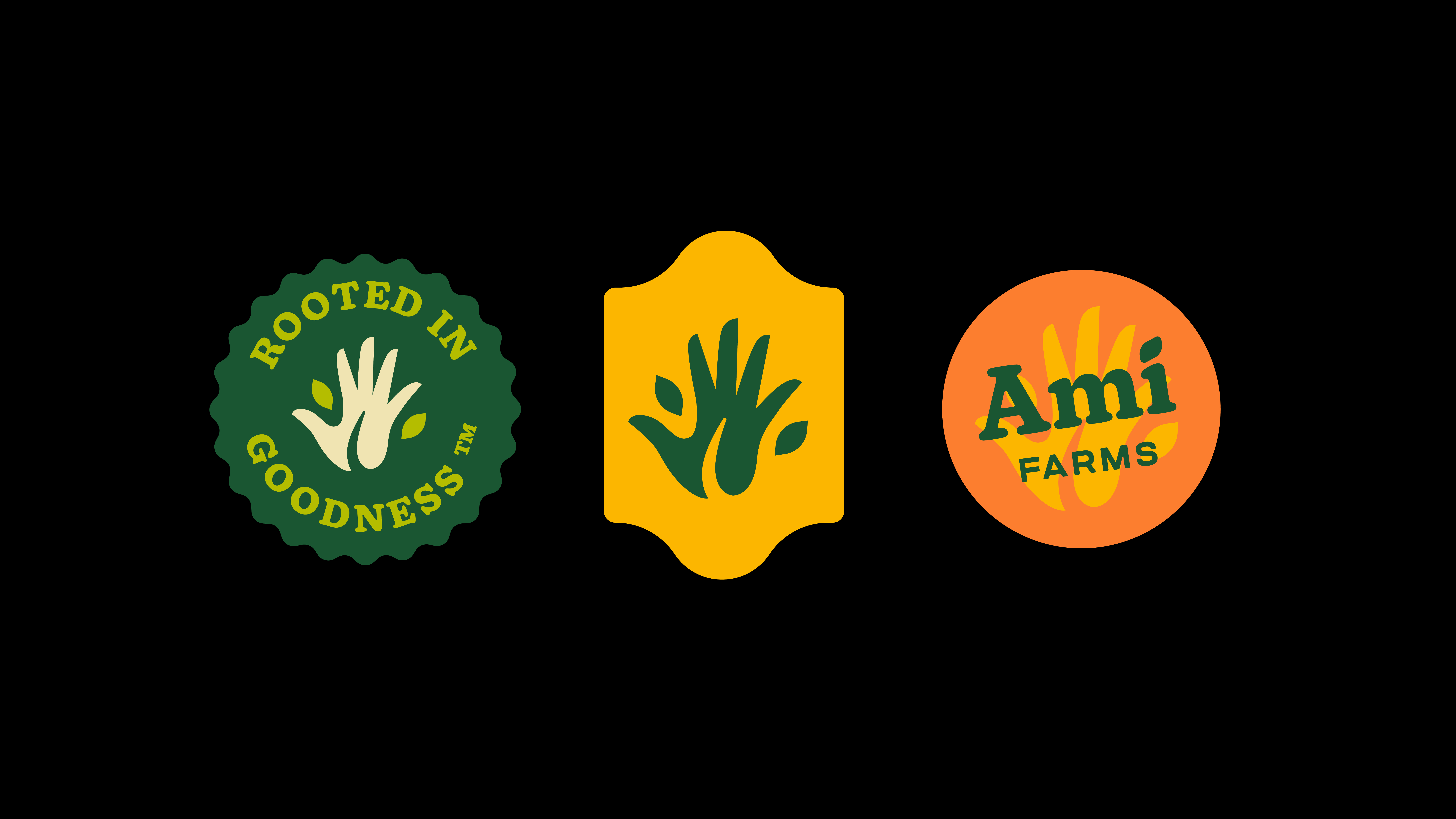
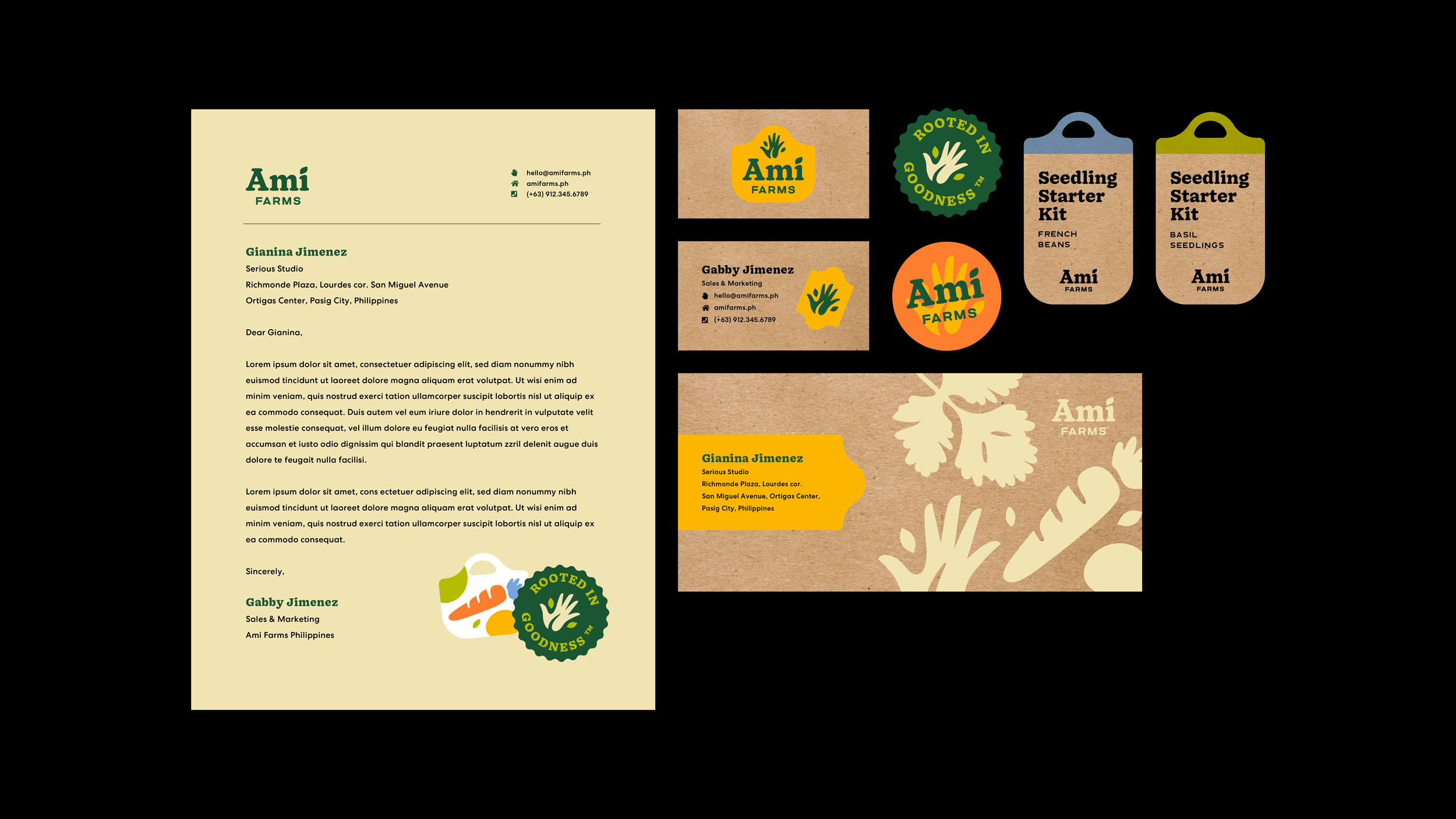
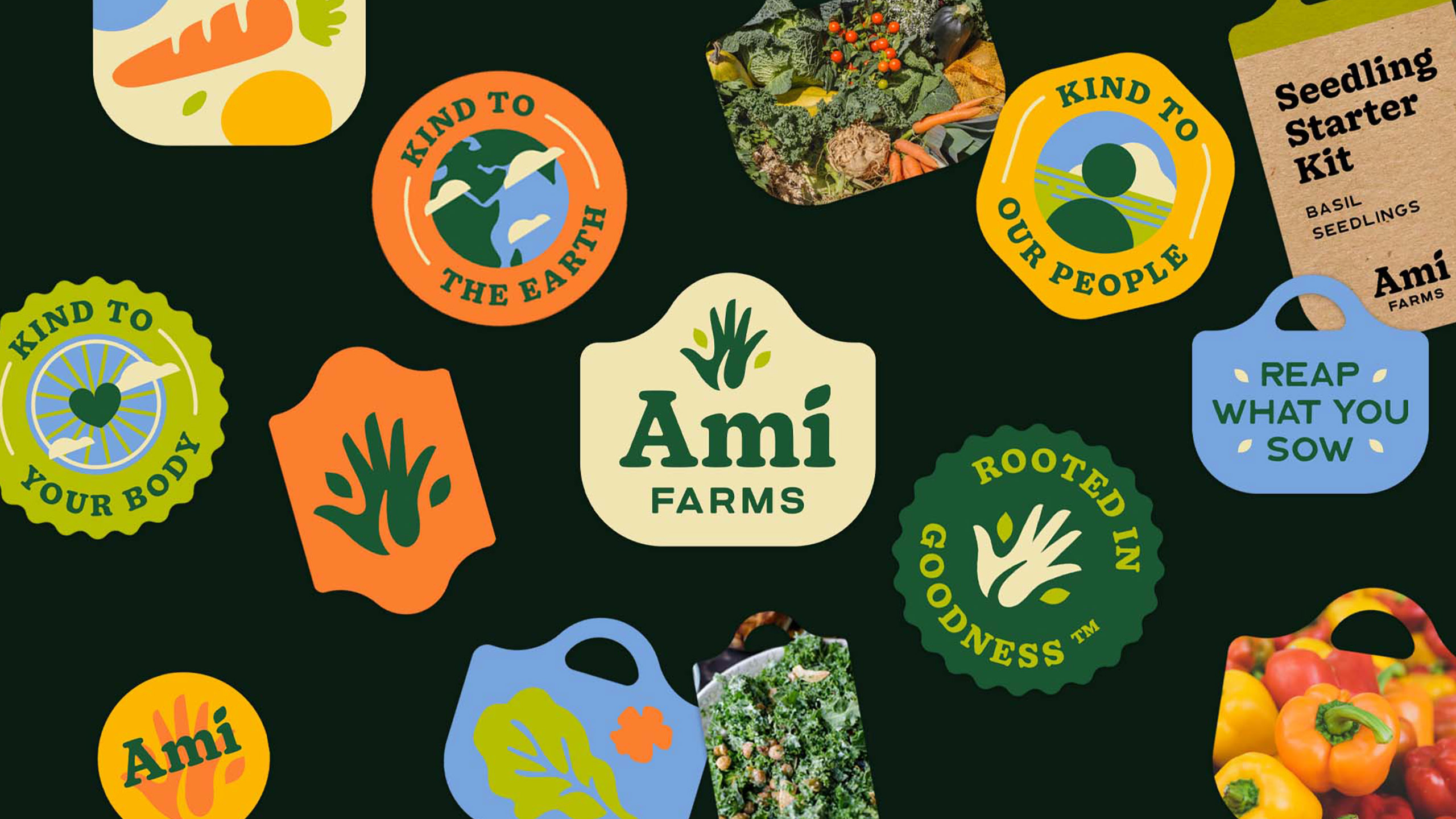
The logo features a hand accompanied with leaves, symbolising the green thumb as part of nature. The accompanying type is set in an old-school slab serif font which is a nod to vintage cookbooks. While the type was a conscious decision in order to craft familiarity, we wanted to introduce a carefree feel to the whole brand by using a more modern accent font to entice a new generation of cooks.
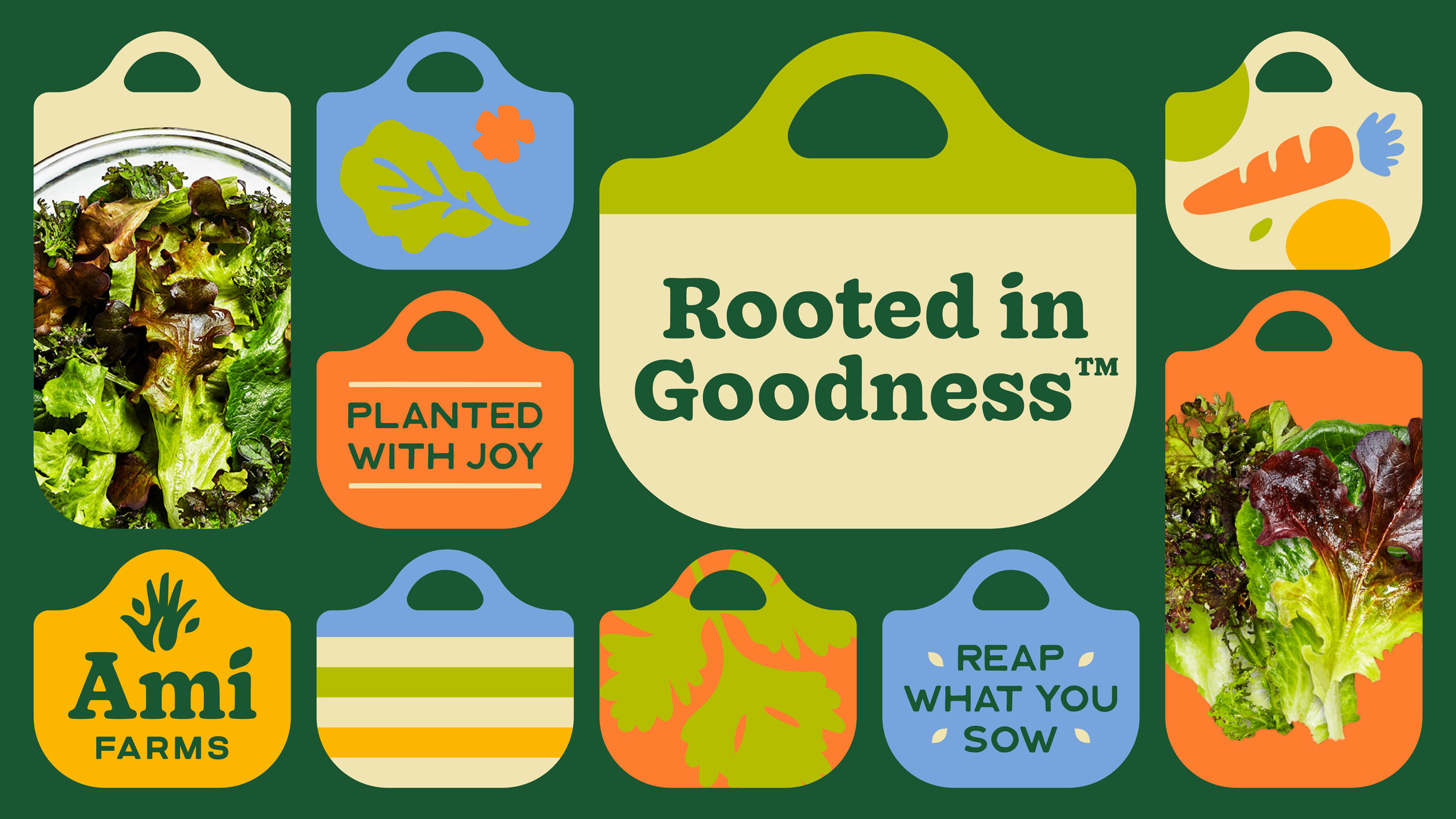
The logo is then presented in different ways through a seal that takes on a rather unconventional shape inspired by bayongs (bags made from rattan). In the Philippines, this type of bag is used in myriad of ways, but is often the choice for trips to the wet market.
The bayong is an important image for the brand as it is the culmination of Filipino market practices of preparing for abundance while being sustainable as ever. Thus it was imperative that we integrated such imagery in the identity.
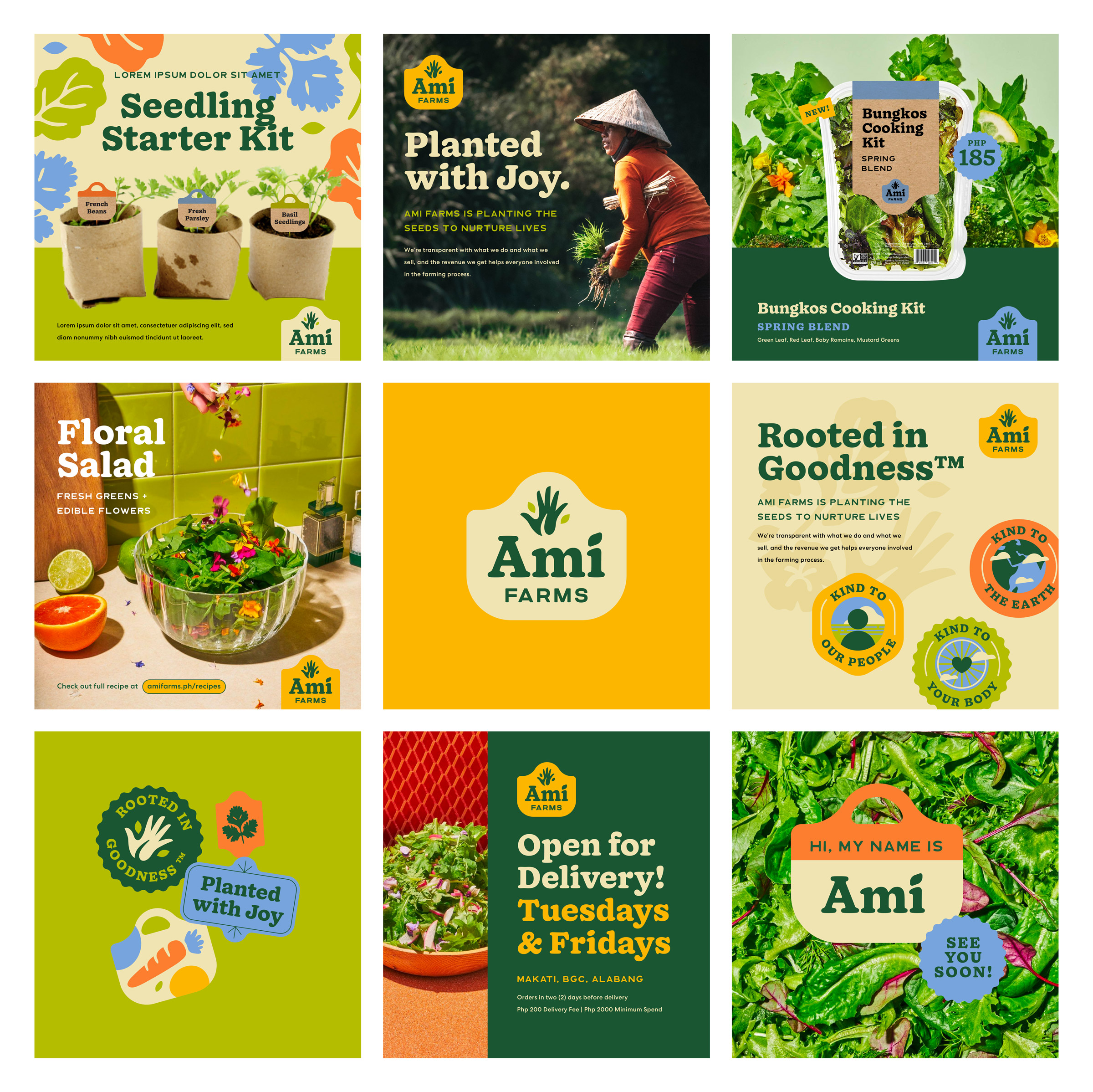
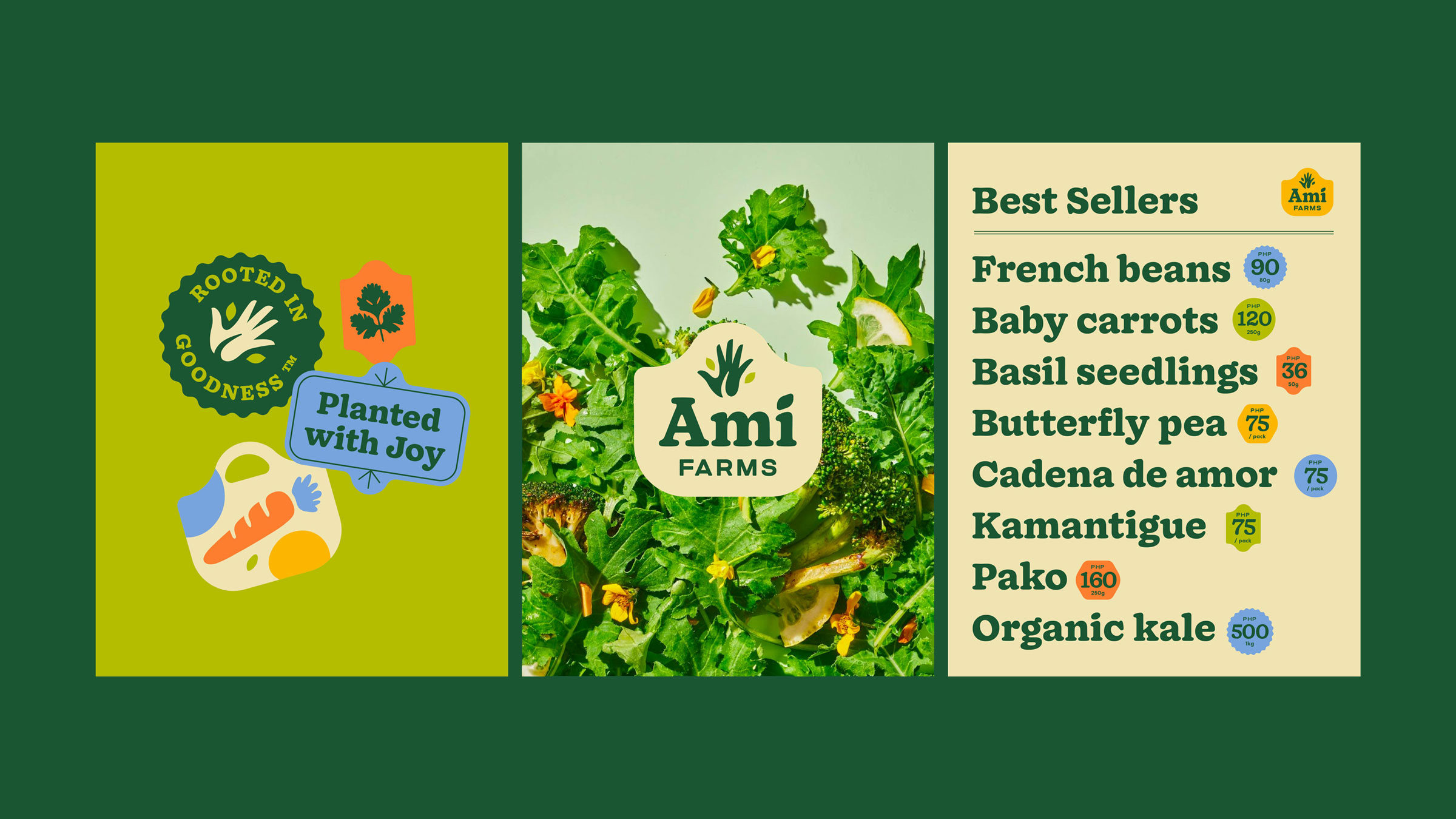
The collaterals were designed for e-commerce being its main focus due to restrictions brought upon by the pandemic. But we didn’t just want to confine them to hard sells, so instead we explored other ways in which their products could be shared among different people.
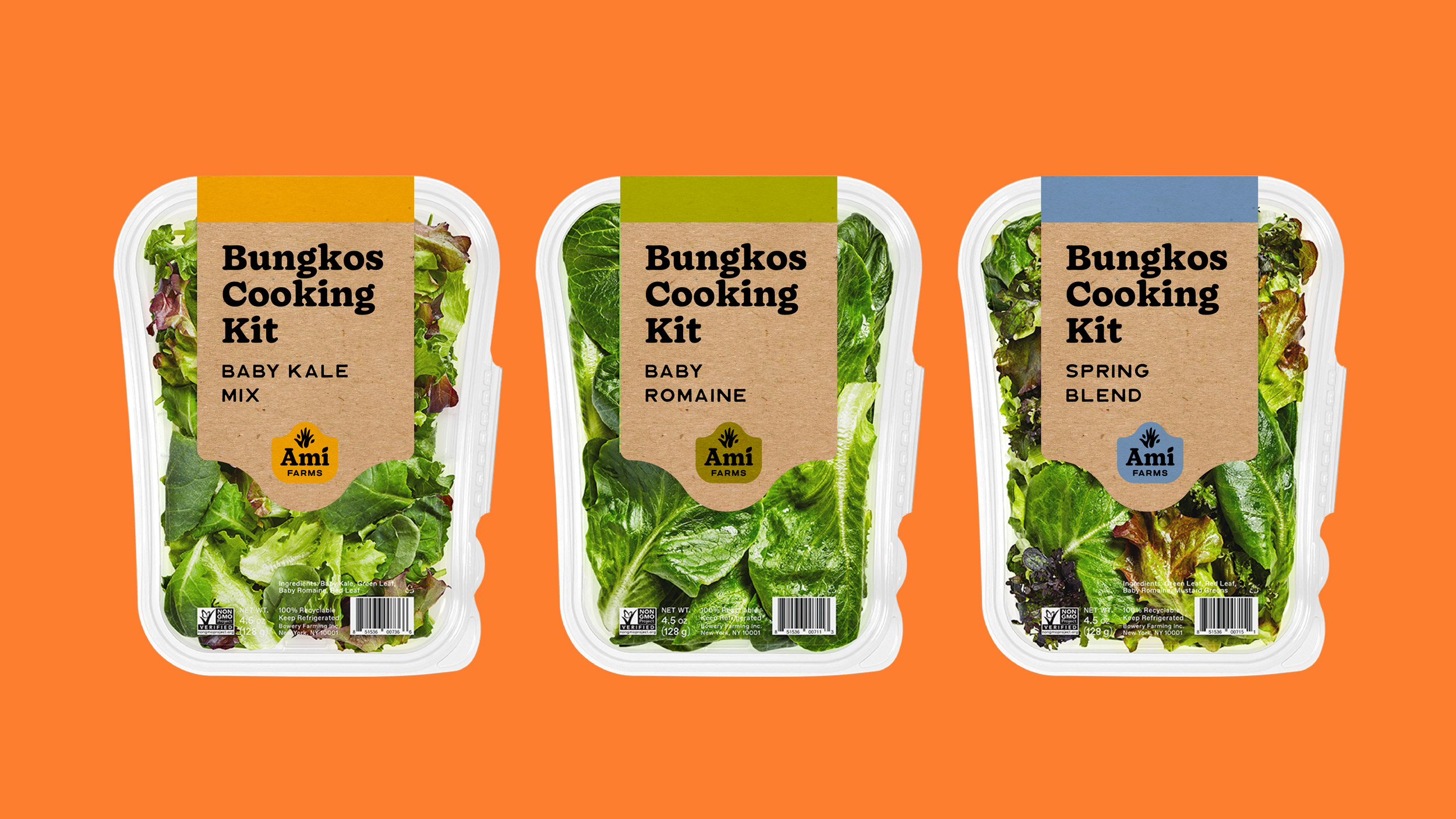
The brand, inspired by market imagery, utilises shapes that resemble fruit stickers used in various ways. Brightly lit photos are paired with stamp-like illustrations, giving the brand another visual dimension. To streamline communications and in hopes of educating the market about their products (and what’s a better way to understand produce than cooking?) the collaterals were systematized to showcase their roster in different forms, be it cooked and uncooked.
This resulted in a visual narrative strongly inspired by the local market scene without utilising cliches and stereotypes. With a familiar look that is also modern in itself, the identity is accessible throughout different age groups in hopes that local produce be easily appreciated by anyone.