GCASH FINTECH BRAND IDENTITY
Designing the
Future of Money
BRANDING SCOPE
Brand Identity / System
Brand Strategy
Brand Video Storyboarding
Brand Video Animation
Sonic Branding
OVERVIEW
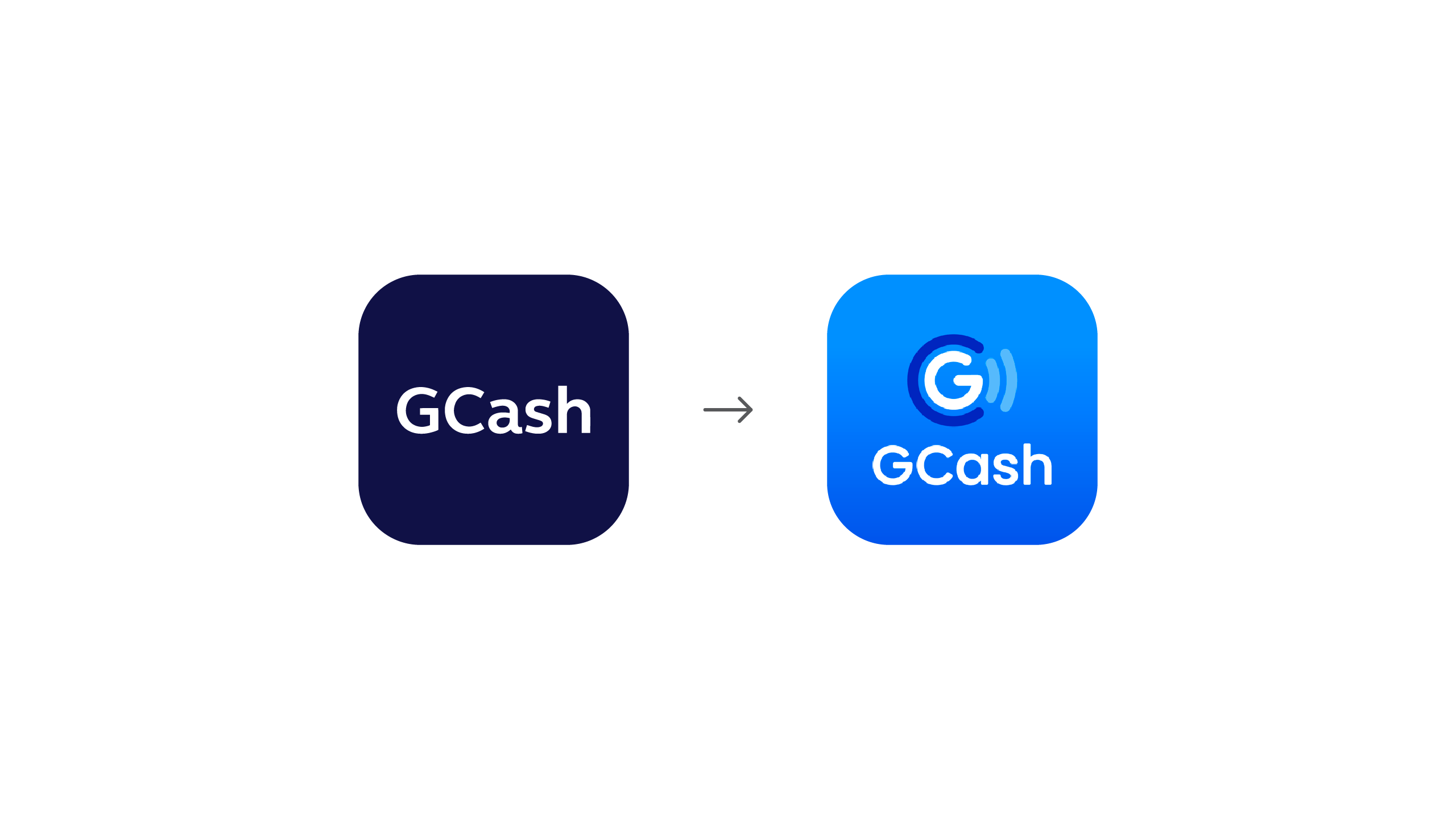
Since its inception, GCash has focused on its singular goal of providing purpose-driven financial technology to empower the underserved. Yet, despite being one of the country's first movers in mobile payments, they faced some challenges in communicating the level of innovation they continue to achieve and pursue. This is when they asked for our help. They needed to refresh the entire GCash brand through an adaptable, robust design system, that connects their audience to their mission and their message, in a culture that is still apprehensive towards modern fintech.
MORE INFORMATION
THE CHALLENGE.
From the onset, we knew that a rebrand was not a cure-all and we never set out to design a mere facelift. GCash acknowledged that, before we could begin, they had to rethink and reevaluate who they were and how their customers see them. So they took the time to understand their customers, themselves and their primary medium, their app, and closely collaborated with us to see its visual identity come to life. After about 2 years and countless hours of interviews and data, they realized that mobile payments could have the potential not just to go deep with the underserved, but also beyond to the national lifestyle market. Mobile payments could encompass the needs of everyday life. As such, they sought to create a new GCash that provided easier and more accessible financial services for everyone, so that people can focus on the things that matter to them. Ultimately, GCash was built to make it easy for its customers to love the way they lived. On top of all this, the challenge lay in communicating this vision to a market that is largely skeptical, or unfamiliar at best, with tech that catered to their financial needs.
THE SOLUTION.
Because of this, it was important to design GCash not only as a tech company but also as a lifestyle product. It needed to look professional and reliable, while still allowing for elements of play and life. As such, we created and standardized the overall branding system of GCash, including assets from the logo, the typesetting, and color the palette, to their more identifying elements, such as the robust system of patterns and illustrations we've created to correspond to the usage of the brand. Working very closely with the GCash team, we designed the brand system with universal accessibility for differently-abled people, for all types of screens and eventually, for turnover and expansion by GCash's own team of designers now and in the future.
The GCash logo icon consists of 3 elements — the clear and central G; the round integrated C symbolizing coins and money; and finally the pay waves, symbolizing the mobile nature of the brand, expanding and growing to symbolize all that you can do with GCash.
Designing the system required that we strike the balance between being practical and being creative. It needed to be a flexible branding system that can keep up with an ever-growing product.
TYPOGRAPHY.
Its typesetting was built using modern, professional type, that is readily available on Google Fonts and easily compatible with many browsers.
ELEMENTS.
Each foundational element wasn't designed for mere ornamentation, but instead, thoughtfully considered so that it could expand and trickle down into the rest of the applications.
COLOR.
The GCash color palette consists of a range of colors that moved away from the original deep blue into a vibrant array to reflect a fresh and dynamic look. The palette's expanded range allows for maximum brand adaptability as well.
ILLUSTRATIONS.
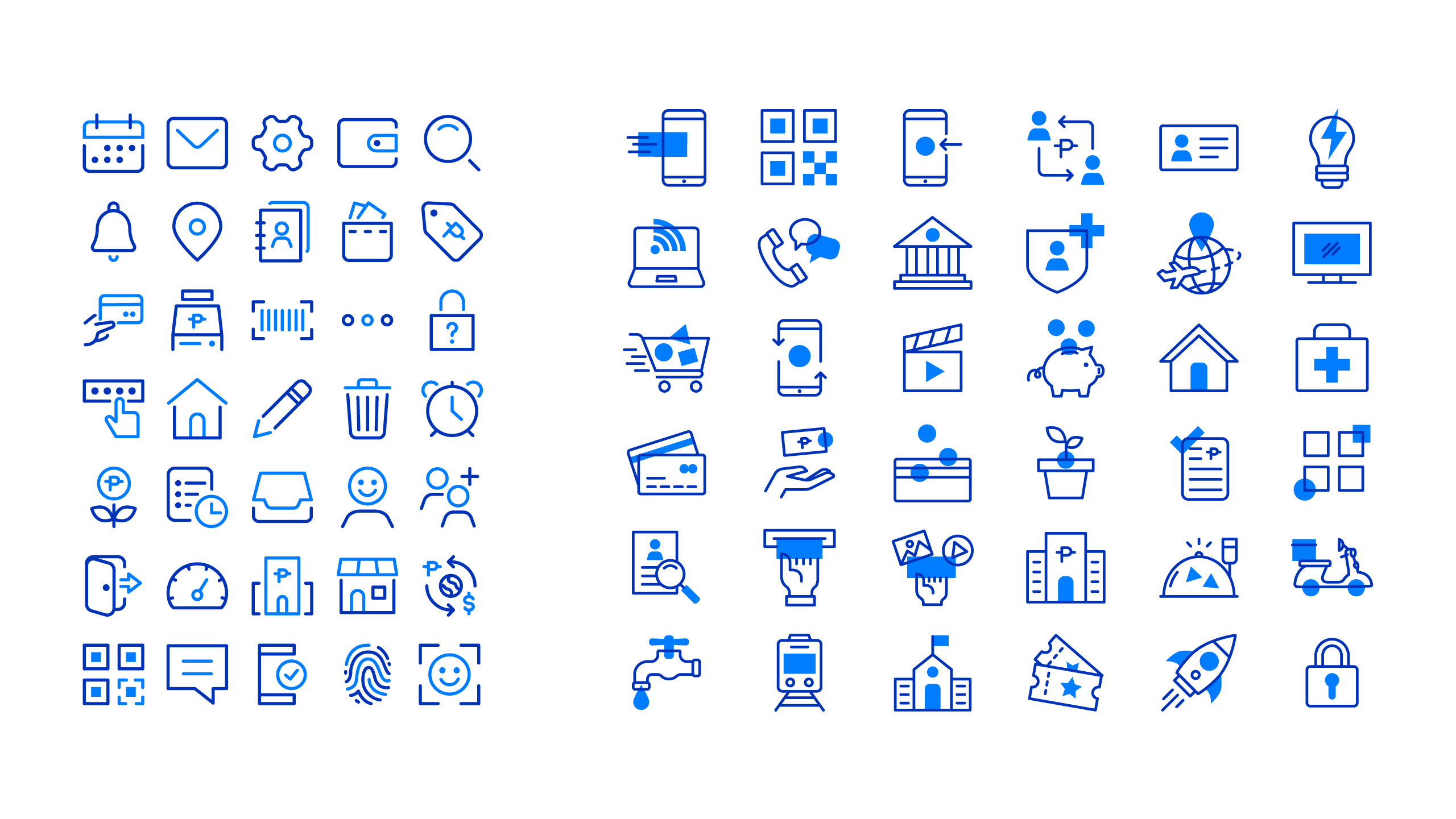
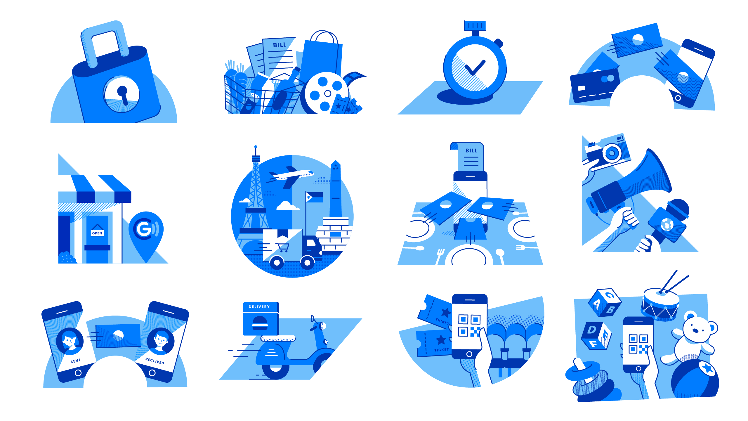
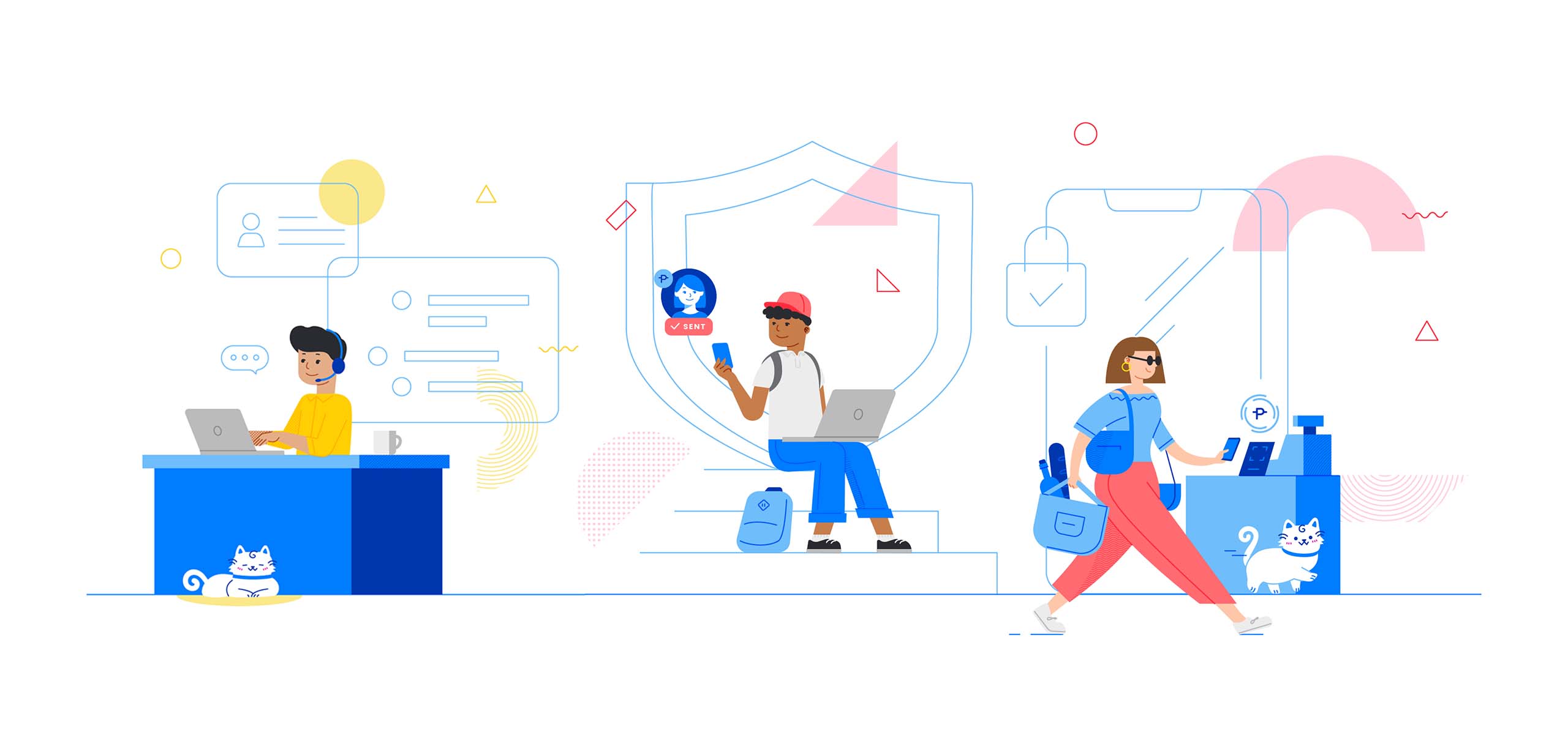
The system is made up of 4 levels of illustrations, from the most basic system icons to those that are more detailed and more functional. The levels then move up to lifestyle-specific illustrations to those that are scenic and persona-centric. Apart from the foundational elements, the most complex illustration level utilizes characters developed to reflect the different lifestyles of a mobile life, set in an environment of larger than life illustrations that show what GCash can do for you.
GCAT.
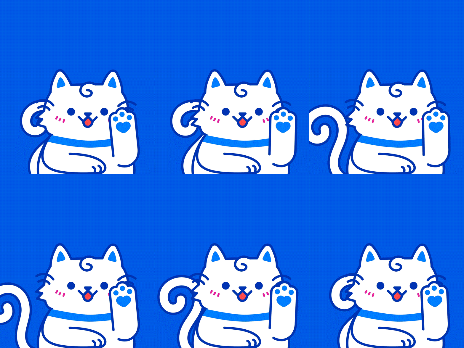
GCash's much loved GCat also got a refresh. With more intentional — and more adorable — features, GCat has developed to become even more memorable and more iconic than his previous iteration.
1. GCat’s paw now contains a heart to reflect his warmth;
2. His hair and tail subtly curl into a G;
3. His whiskers are derived from the pay waves of the logo icon;
4. And his collar, ears, & paws use the brand's primary blue.Coming from the previous upright GCat, the new GCat was designed to feel like your loyal pet, more often seen on all fours to be able to express real-cat mannerisms. Also, objects and outfits in line with his personality (he likes round things that resemble coins; he loves fitting himself in small spaces; he owns a suit to show his professional side) were incorporated to show that he is a cat that will happily fit into anyone's lifestyle, just like what GCash strives to do.
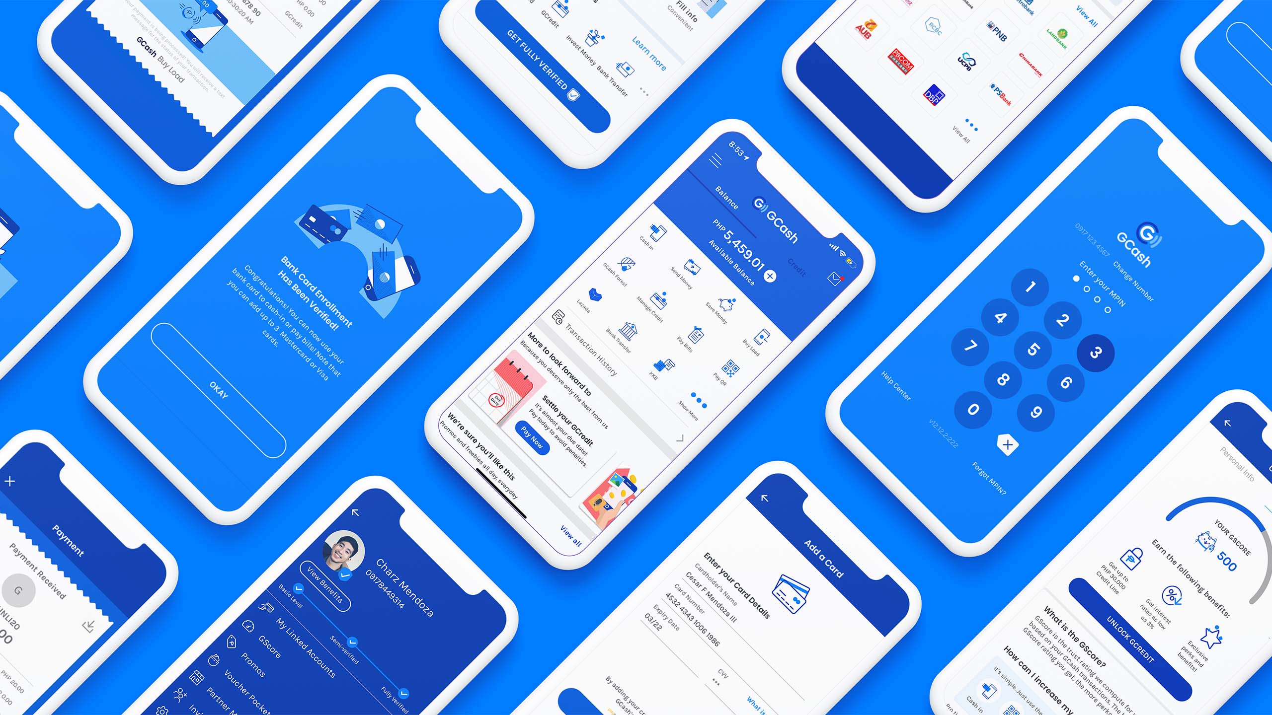
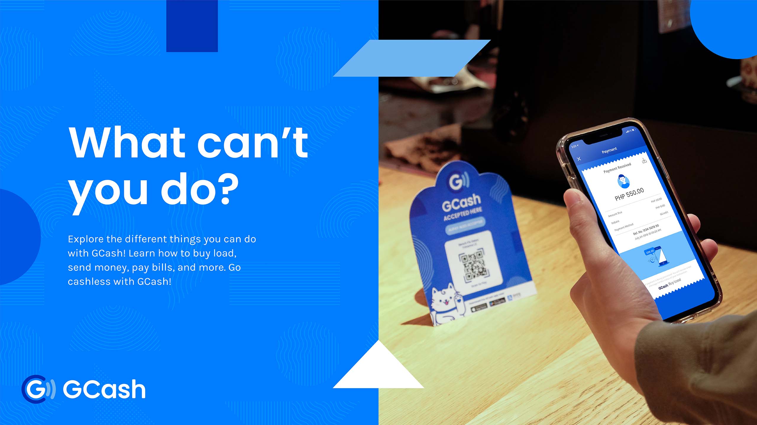
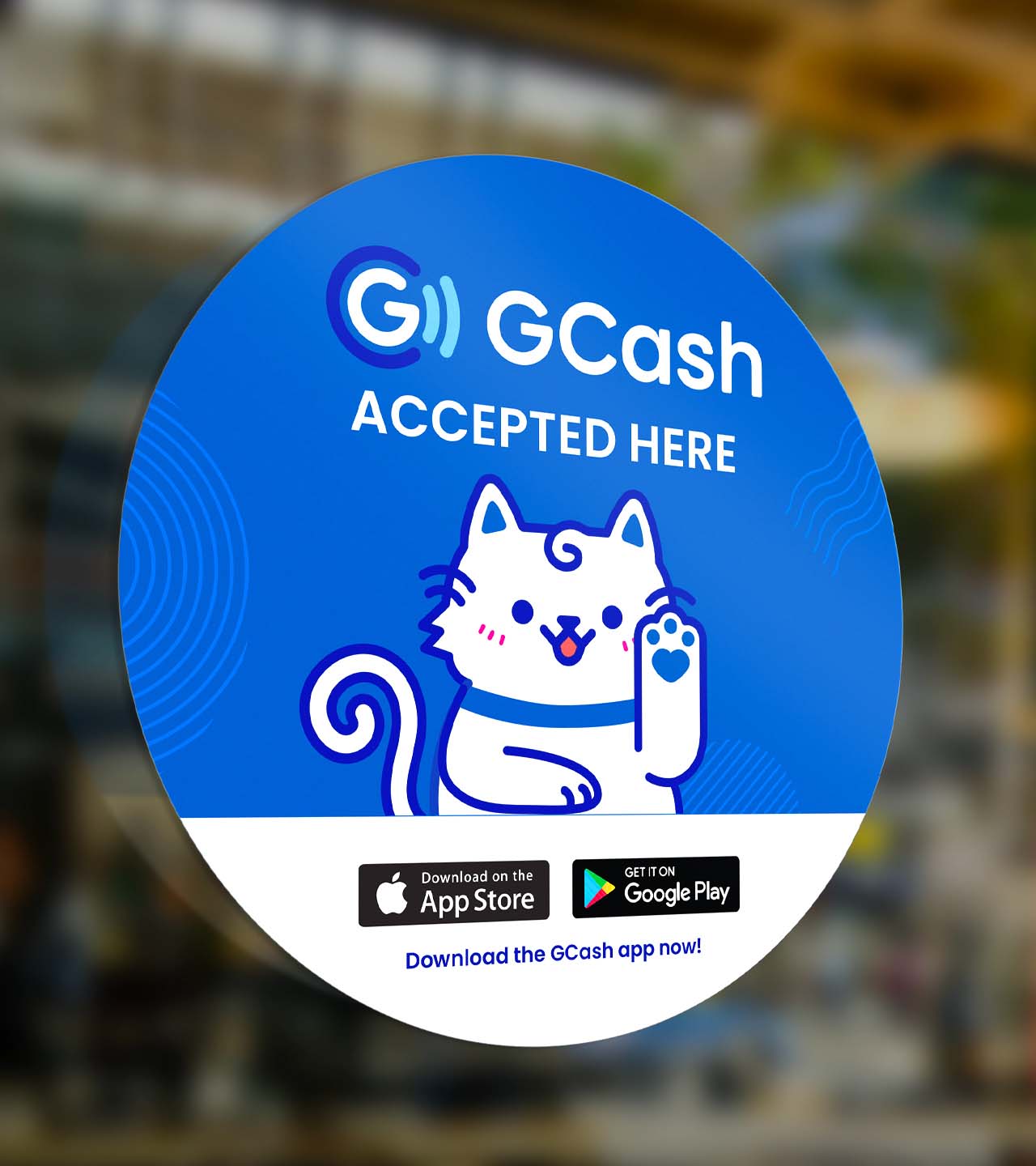
Today, GCash's new identity has been applied throughout its different touchpoints, from its digital presence (social media, product app, video ads) to its in-store and outdoor displays. Guided by the brand system we've designed for them, the brand is able to exude a spirit of approachability, credibility and trust. Their team was also able to apply the branding to their app's UX and UI design. This usability of the brand guidelines was a very important component for the project to be successful in the long run.
Furthermore, it required some level of boldness to challenge how corporate brands are typically perceived and expected to look like. We thought that it was a pivotal time in GCash's growth to rediscover the potential of their branding system, and to take on the challenge of pushing the visual direction of a trusted, corporate brand, while maintaining visual cues that make it still familiar and reliable.
All in all, the GCash rebrand was a long journey of getting to know the brand, what it really stands for, and what it wants to be for people. To design a good brand experience, we set out to reframe the question of “How do I as a brand stand out?” to “How will my users and stakeholders interact with us in an easier, comfortable and understandable way?”
From there, we were able to make better aesthetic decisions that help make GCash an easy brand to recognize, trust and understand. Through this, design becomes a deeper and long-lasting way of communicating the core of the brand, rather than an arbitrary change of visuals to look trendy and new. Ultimately, as a design-team led by purpose, working with likeminded GCash also helped us design with depth and intention to make a meaningful, human experience out of the future of money.
From there, we were able to make better aesthetic decisions that help make GCash an easy brand to recognize, trust and understand. Through this, design becomes a deeper and long-lasting way of communicating the core of the brand, rather than an arbitrary change of visuals to look trendy and new. Ultimately, as a design-team led by purpose, working with likeminded GCash also helped us design with depth and intention to make a meaningful, human experience out of the future of money.


Make Sense & Look Good®. Made by Serious People. Creating brands that shape tomorrow, today. Boring is the Enemy. Humans deserve nice things™. Seriously. Hi Mom. Success is found in the details. With great budgets come great work. We are known to make brands human. We enjoy creating brands from the ground up. Great brands invest in great design. Ugly brands don’t care about people. Your brand could always be better. Trust us. Branding is like mind control, but cooler. We will tell you if you have food stuck in your teeth. For a relaxing time, make it Suntory time. Make Sense & Look Good®. Made by Serious People. Creating brands that shape tomorrow, today. Boring is the Enemy. Humans deserve nice things™. Seriously. Hi Mom. Success is found in the details. With great budgets come great work. We are known to make brands human. We enjoy creating brands from the ground up. Great brands invest in great design. Ugly brands don’t care about people. Your brand could always be better. Trust us. Branding is like mind control, but cooler. We will tell you if you have food stuck in your teeth. For a relaxing time, make it Suntory time. Make Sense & Look Good®. Made by Serious People. Creating brands that shape tomorrow, today. Boring is the Enemy. Humans deserve nice things™. Seriously. Hi Mom. Success is found in the details. With great budgets come great work. We are known to make brands human. We enjoy creating brands from the ground up. Great brands invest in great design. Ugly brands don’t care about people. Your brand could always be better. Trust us. Branding is like mind control, but cooler. We will tell you if you have food stuck in your teeth. For a relaxing time, make it Suntory time. Make Sense & Look Good®. Made by Serious People. Creating brands that shape tomorrow, today. Boring is the Enemy. Humans deserve nice things™. Seriously. Hi Mom. Success is found in the details. With great budgets come great work. We are known to make brands human. We enjoy creating brands from the ground up. Great brands invest in great design. Ugly brands don’t care about people. Your brand could always be better. Trust us. Branding is like mind control, but cooler. We will tell you if you have food stuck in your teeth. For a relaxing time, make it Suntory time.