REMEDY SKIN SOLUTIONS PHILIPPINES BRAND IDENTITY
A Solution Beyond the Cure
BRANDING SCOPE
Brand Identity
Brand Strategy
Graphic Design
Environment Graphics
OVERVIEW
Remedy is a professional dermatological clinic specializing in acne treatments. With an insight built on its founders' personal experiences with various skin concerns, Remedy seeks to provide patients with skin solutions that go beyond the surface.
What we set out to create was a brand that provided solutions for more than what's on the surface. Remedy, with its pioneering philosophies and beliefs, is everything our skin and souls deserve—the expertise of experienced dermatological brands, the accessibility sought and expected by the market of today, and the overall care that proper acne solutions represent.
MORE INFORMATION
Skin concerns aren't the easiest to talk about—not just because they can easily become technical and scientific, but also because of the underlying effects they have on one's self-esteem and, in turn, their perception of themselves. This is the story Remedy's founders shared with us, a personal story that resonates with people—especially teenagers and young adults—affected by various skin concerns.
We discovered that despite the many brands and clinics in the market tackling acne, the conversation that needed to be had was often ignored if not pushed to the sidelines. It was not enough to just lessen the visible scars caused by acne. Instead, brands also had to be part of the bigger journey of healing, inside and out, by shedding light on the improved self-esteem and well-being provided by acne treatment. Remedy sought to be a brand that was not only effective against acne but to be a solution that was more than skin deep in ways easily understood by its young market.
We discovered that despite the many brands and clinics in the market tackling acne, the conversation that needed to be had was often ignored if not pushed to the sidelines. It was not enough to just lessen the visible scars caused by acne. Instead, brands also had to be part of the bigger journey of healing, inside and out, by shedding light on the improved self-esteem and well-being provided by acne treatment. Remedy sought to be a brand that was not only effective against acne but to be a solution that was more than skin deep in ways easily understood by its young market.
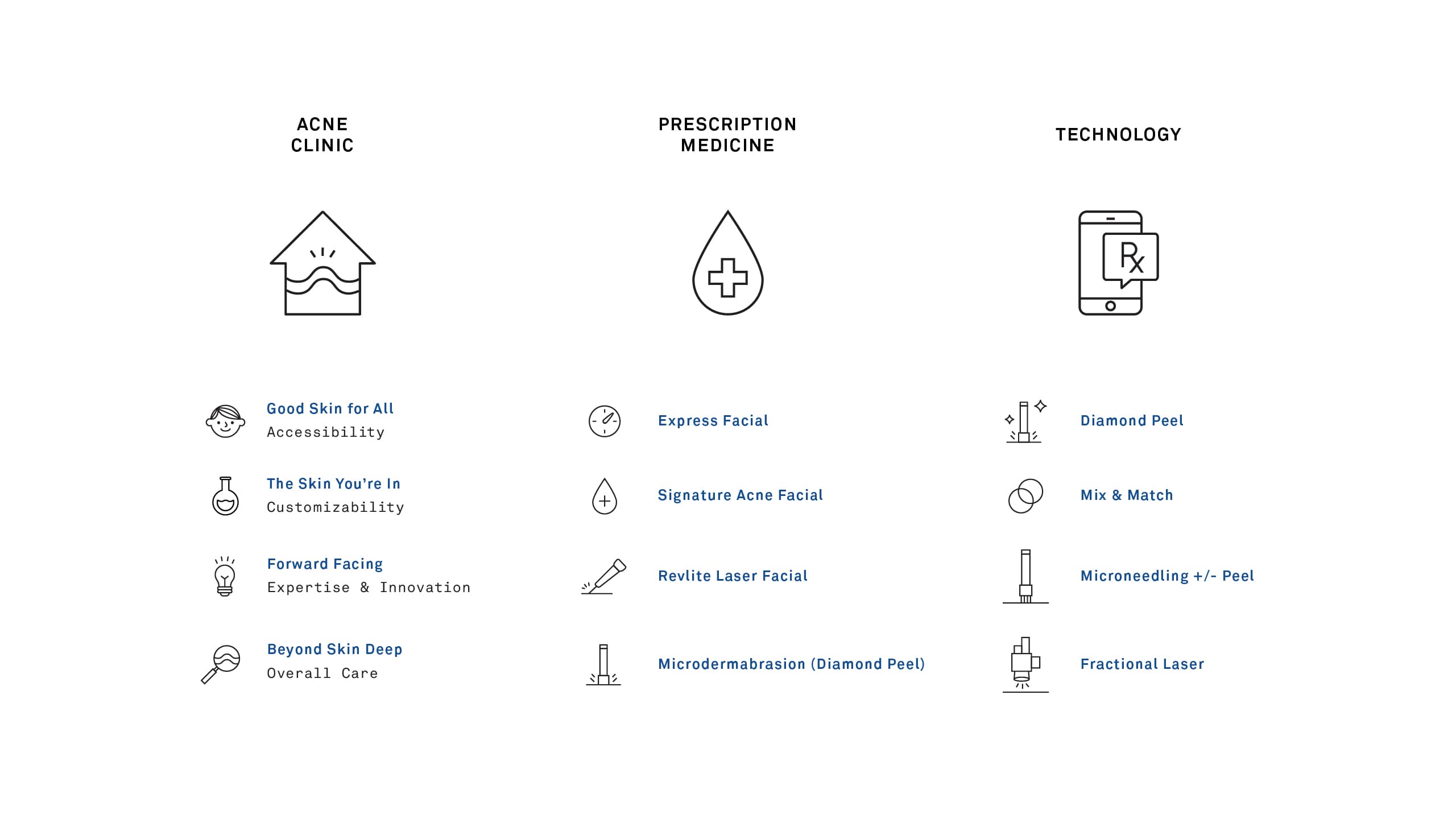
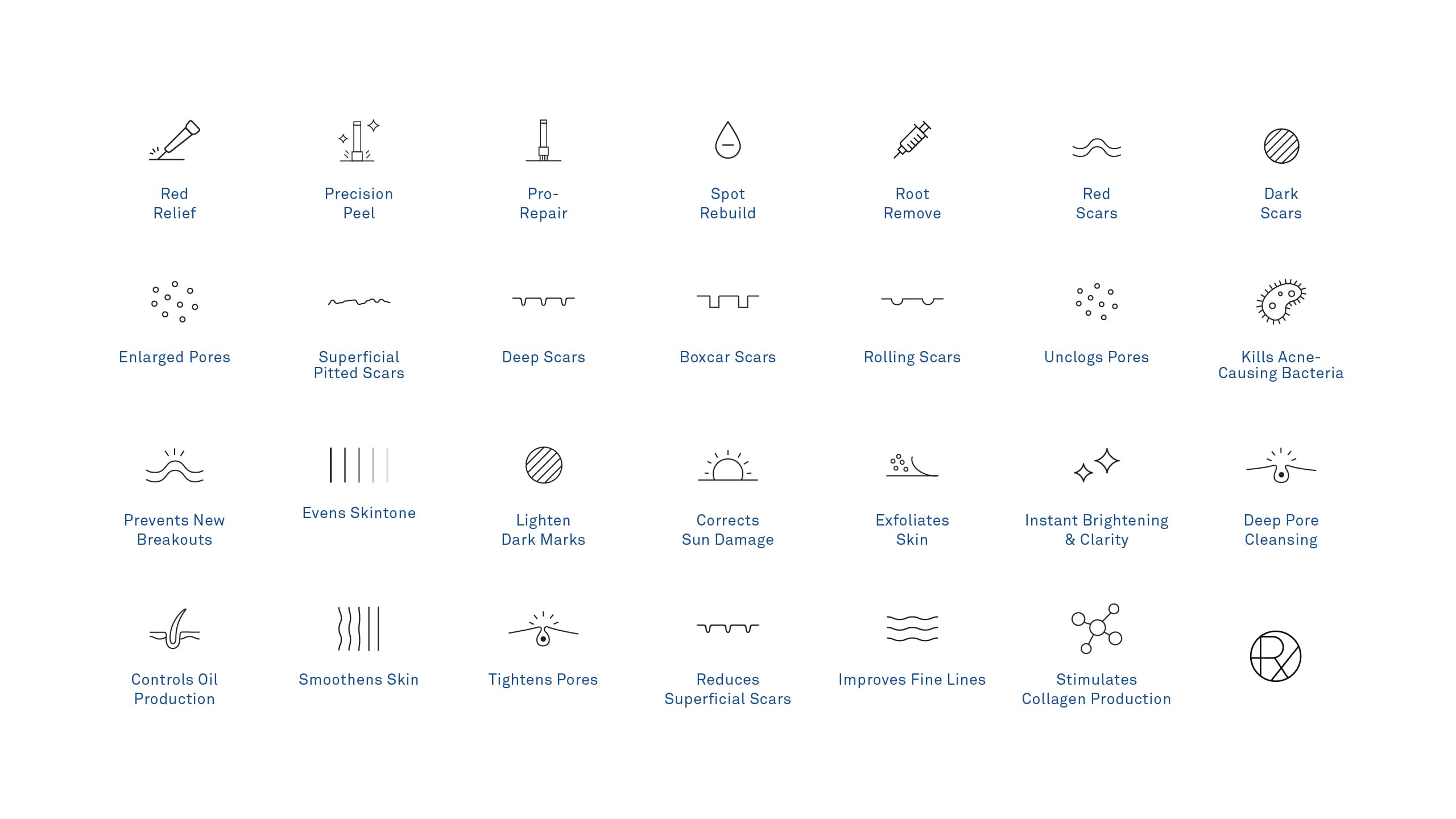
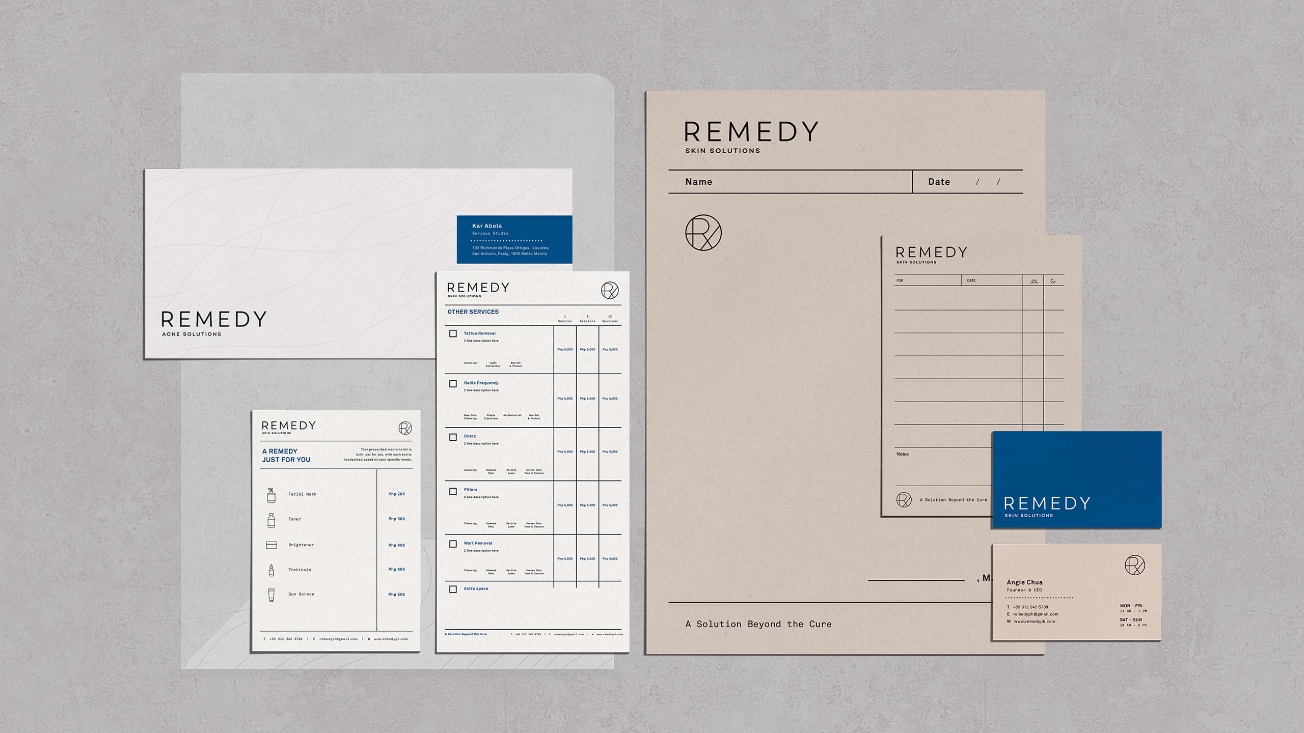
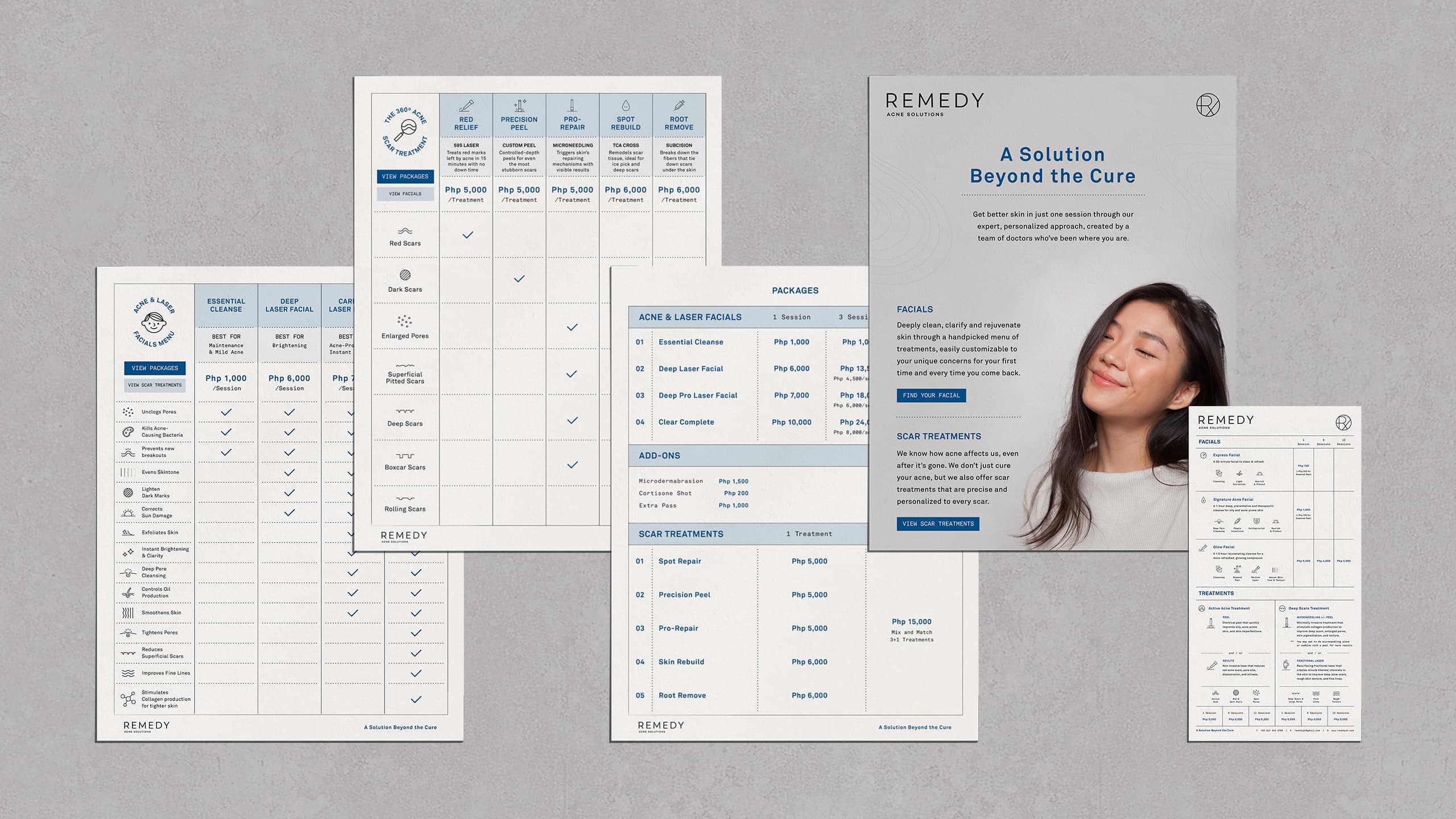
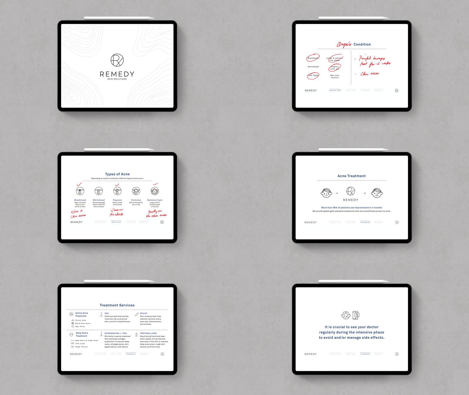
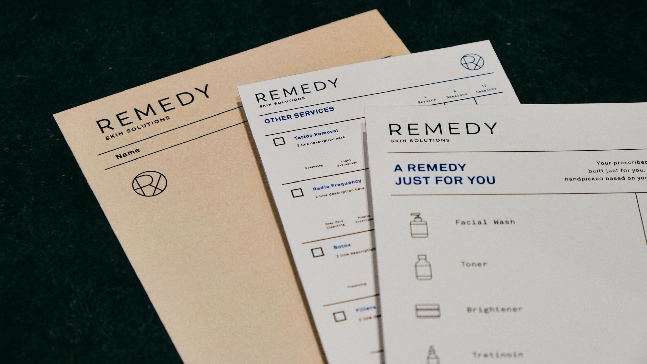
The brand's professionalism is immediately visible in the logo, an icon reminiscent of medical prescriptions. Pairing it with a clean sans serif created a clean and calming mark of expertise. We found out that one of the biggest apprehensions when it comes to skin services is understanding the many different options available. To make the brand as patient-friendly as possible, we redesigned their service menu to be comprehensible in a single glance, using the brand's iconography system and even renaming some of their offerings. We also designed an interactive PDF that guides doctors in providing the best consultation experience—informative, personal, and pleasant. Used on a tablet, doctors can also write on the PDF as patients consult.
This overall approach makes it ideal for creating easy-to-understand personal prescriptions. Far from cold and clinical, we wanted these prescriptions to be simple enough to follow yet informative enough to provide the best results.
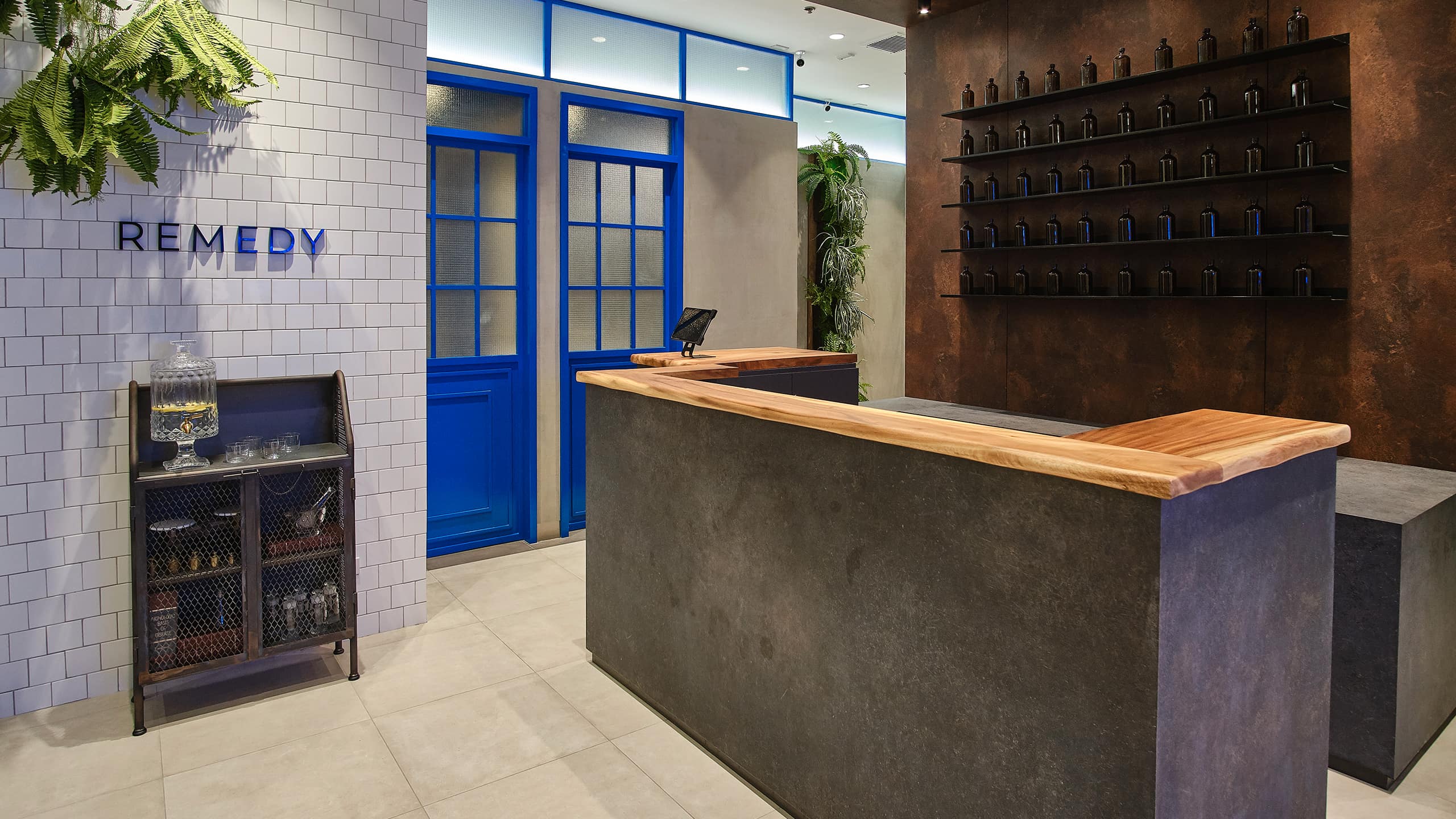
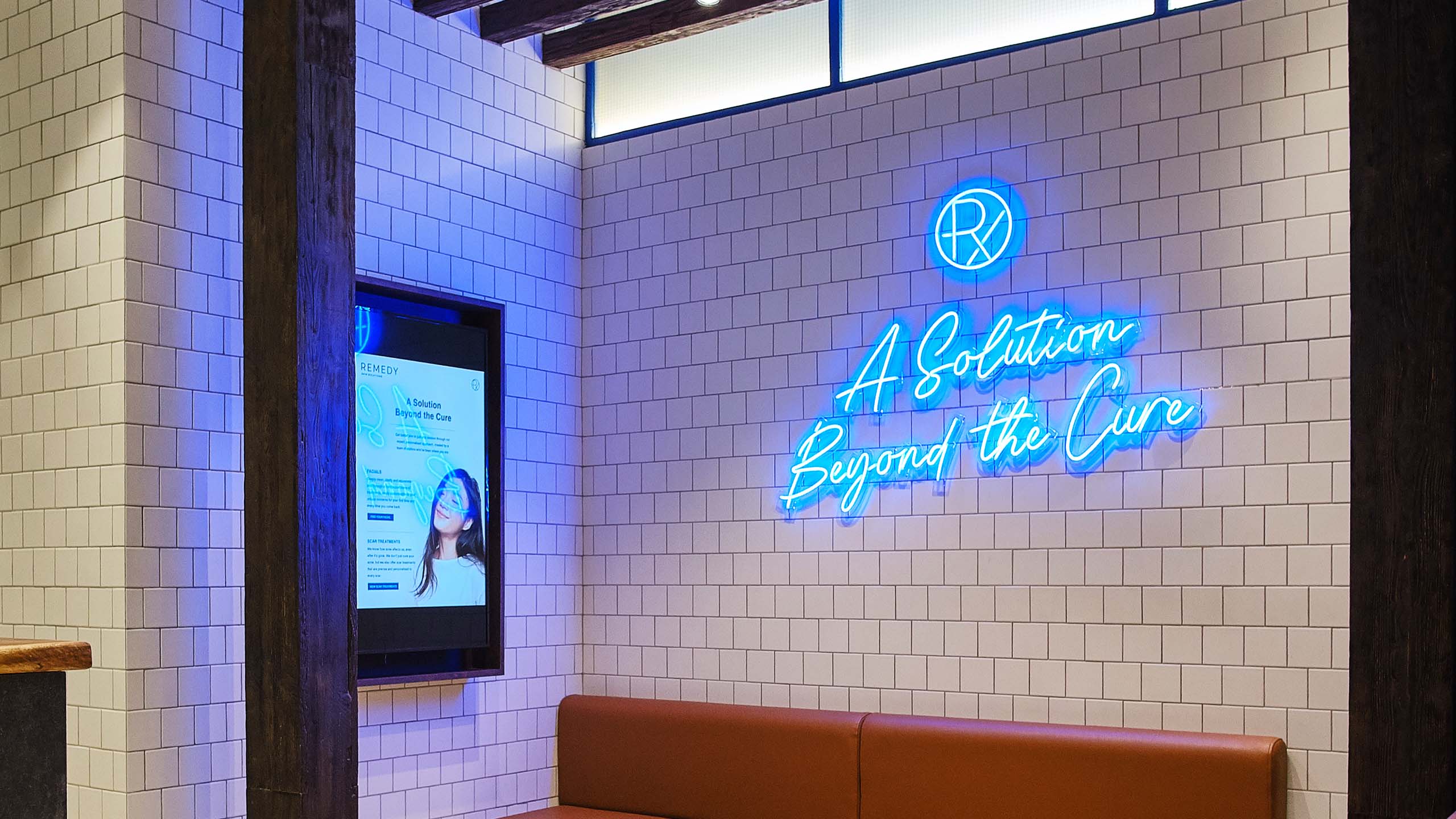
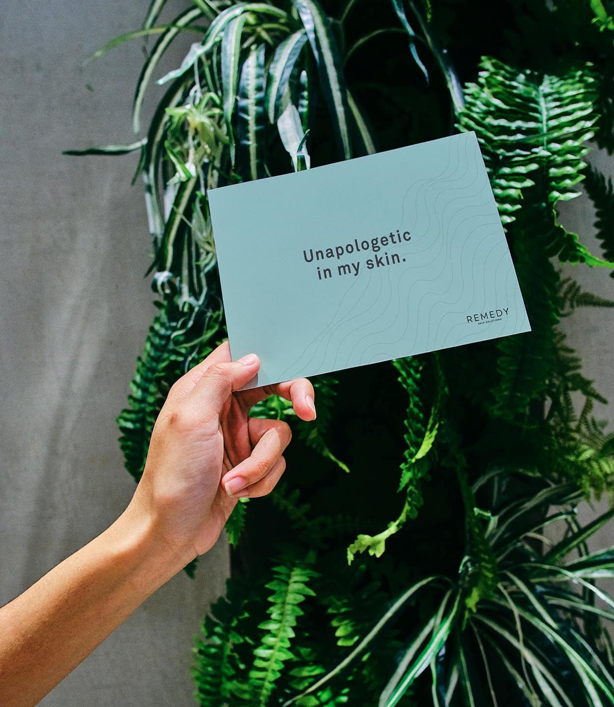
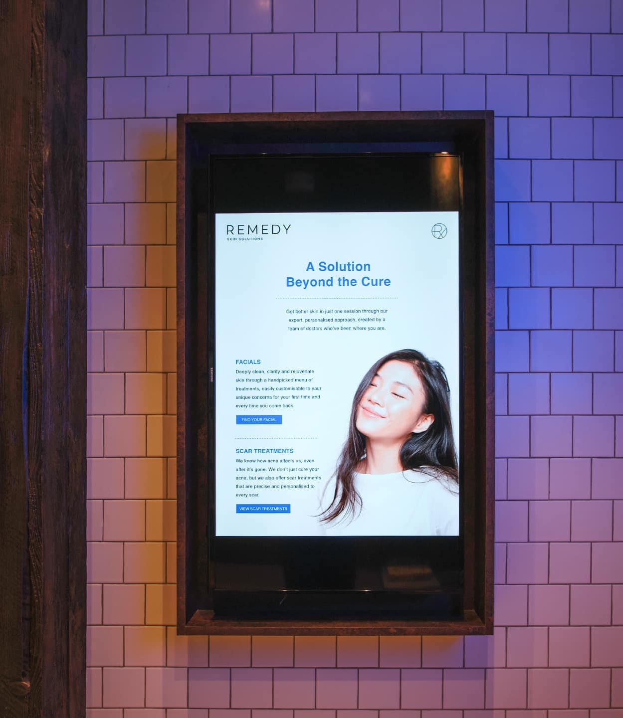
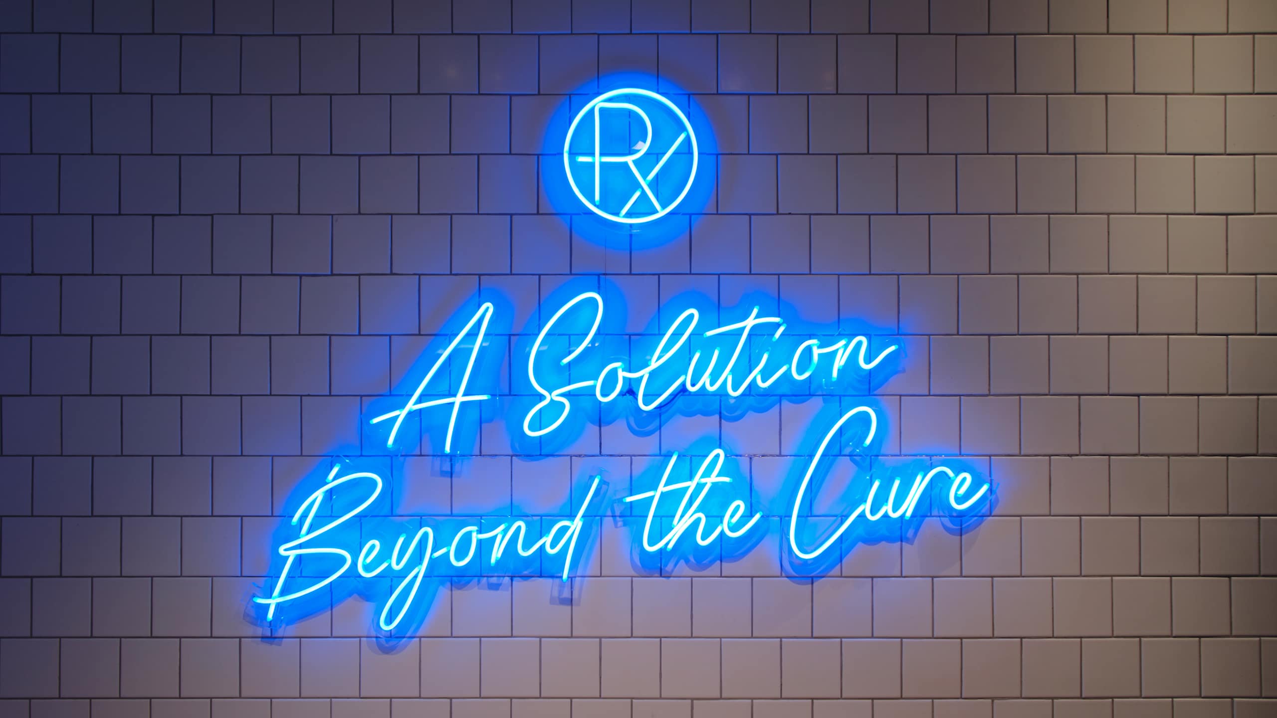
This warmth also extends to the space, where instead of greeting clients with walls of white, we injected life through the use of plants and the energy that the color blue provides. We also included a play of textures using natural cues such as wood and stone, and modern elements like tiles and neon lights. Through all its touchpoints, Remedy looks at not only the clinical aspect of acne treatments but also the small things that can make skin solutions better and deeper for the market of today—truly a solution beyond the cure.
This warmth also extends to the space, where instead of greeting clients with walls of white, we injected life through the use of plants and the energy that the color blue provides. We also included a play of textures using natural cues such as wood and stone, and modern elements like tiles and neon lights. Through all its touchpoints, Remedy looks at not only the clinical aspect of acne treatments but also the small things that can make skin solutions better and deeper for the market of today—truly a solution beyond the cure.

Make Sense & Look Good®. Made by Serious People. Creating brands that shape tomorrow, today. Boring is the Enemy. Humans deserve nice things™. Seriously. Hi Mom. Success is found in the details. With great budgets come great work. We are known to make brands human. We enjoy creating brands from the ground up. Great brands invest in great design. Ugly brands don’t care about people. Your brand could always be better. Trust us. Branding is like mind control, but cooler. We will tell you if you have food stuck in your teeth. For a relaxing time, make it Suntory time. Make Sense & Look Good®. Made by Serious People. Creating brands that shape tomorrow, today. Boring is the Enemy. Humans deserve nice things™. Seriously. Hi Mom. Success is found in the details. With great budgets come great work. We are known to make brands human. We enjoy creating brands from the ground up. Great brands invest in great design. Ugly brands don’t care about people. Your brand could always be better. Trust us. Branding is like mind control, but cooler. We will tell you if you have food stuck in your teeth. For a relaxing time, make it Suntory time. Make Sense & Look Good®. Made by Serious People. Creating brands that shape tomorrow, today. Boring is the Enemy. Humans deserve nice things™. Seriously. Hi Mom. Success is found in the details. With great budgets come great work. We are known to make brands human. We enjoy creating brands from the ground up. Great brands invest in great design. Ugly brands don’t care about people. Your brand could always be better. Trust us. Branding is like mind control, but cooler. We will tell you if you have food stuck in your teeth. For a relaxing time, make it Suntory time. Make Sense & Look Good®. Made by Serious People. Creating brands that shape tomorrow, today. Boring is the Enemy. Humans deserve nice things™. Seriously. Hi Mom. Success is found in the details. With great budgets come great work. We are known to make brands human. We enjoy creating brands from the ground up. Great brands invest in great design. Ugly brands don’t care about people. Your brand could always be better. Trust us. Branding is like mind control, but cooler. We will tell you if you have food stuck in your teeth. For a relaxing time, make it Suntory time.