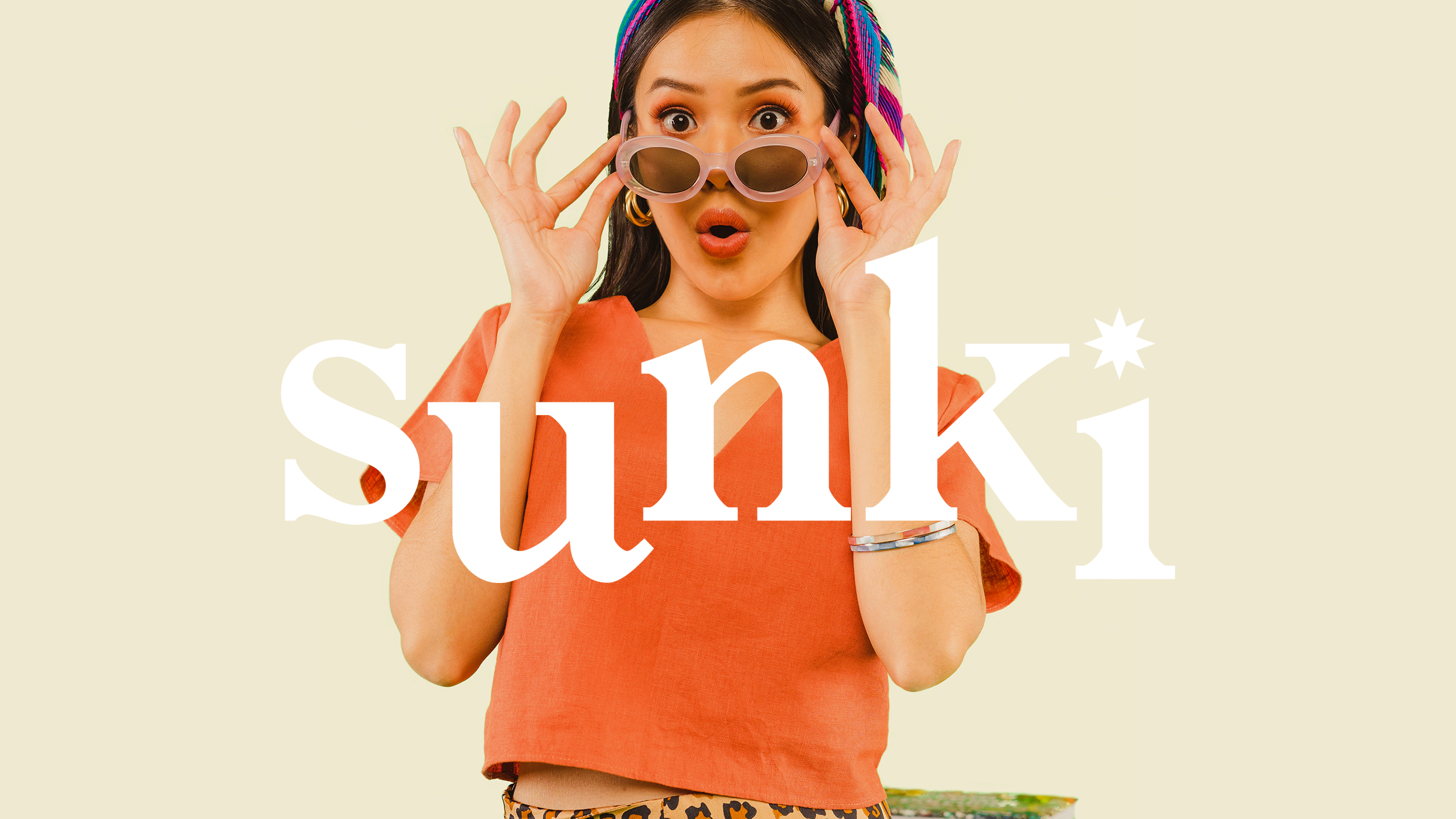
SUNKI BRAND IDENTITY
Dressed for Impact
BRANDING SCOPE
Brand Strategy
Brand Identity
Packaging Design
Website Design and UX
Copywriting
OVERVIEW
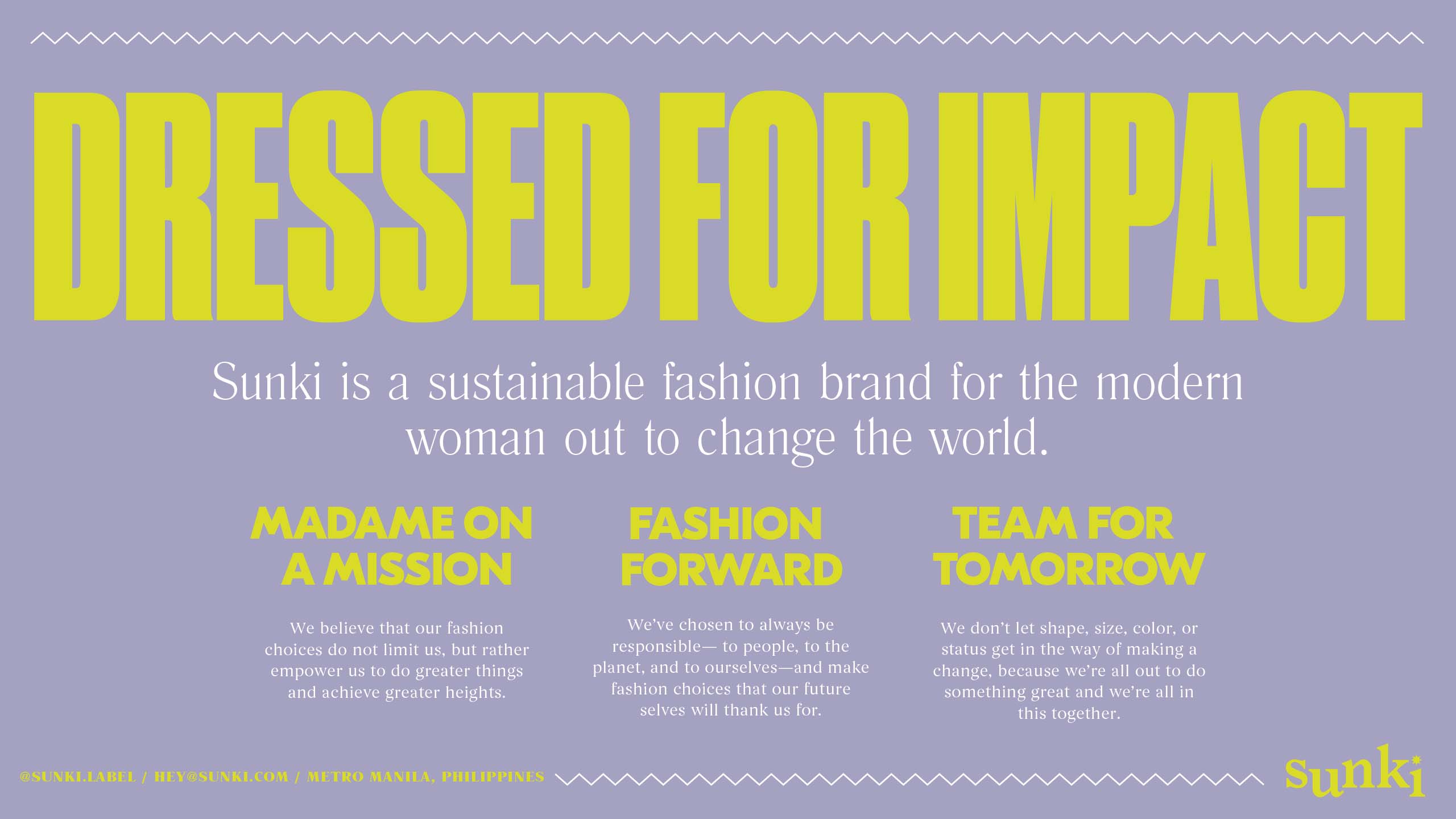
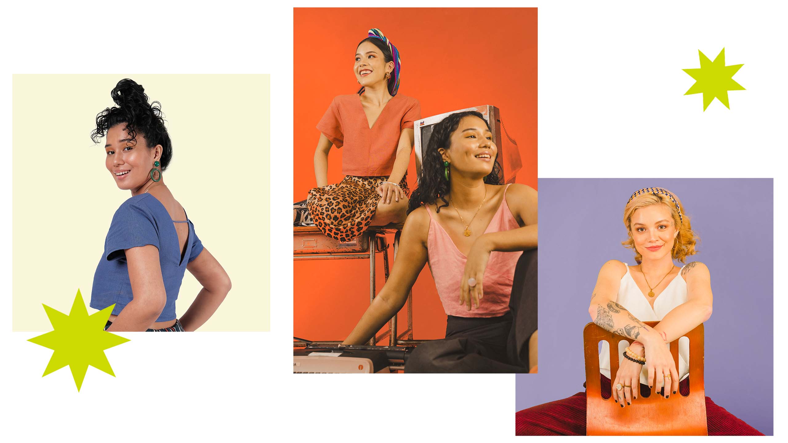
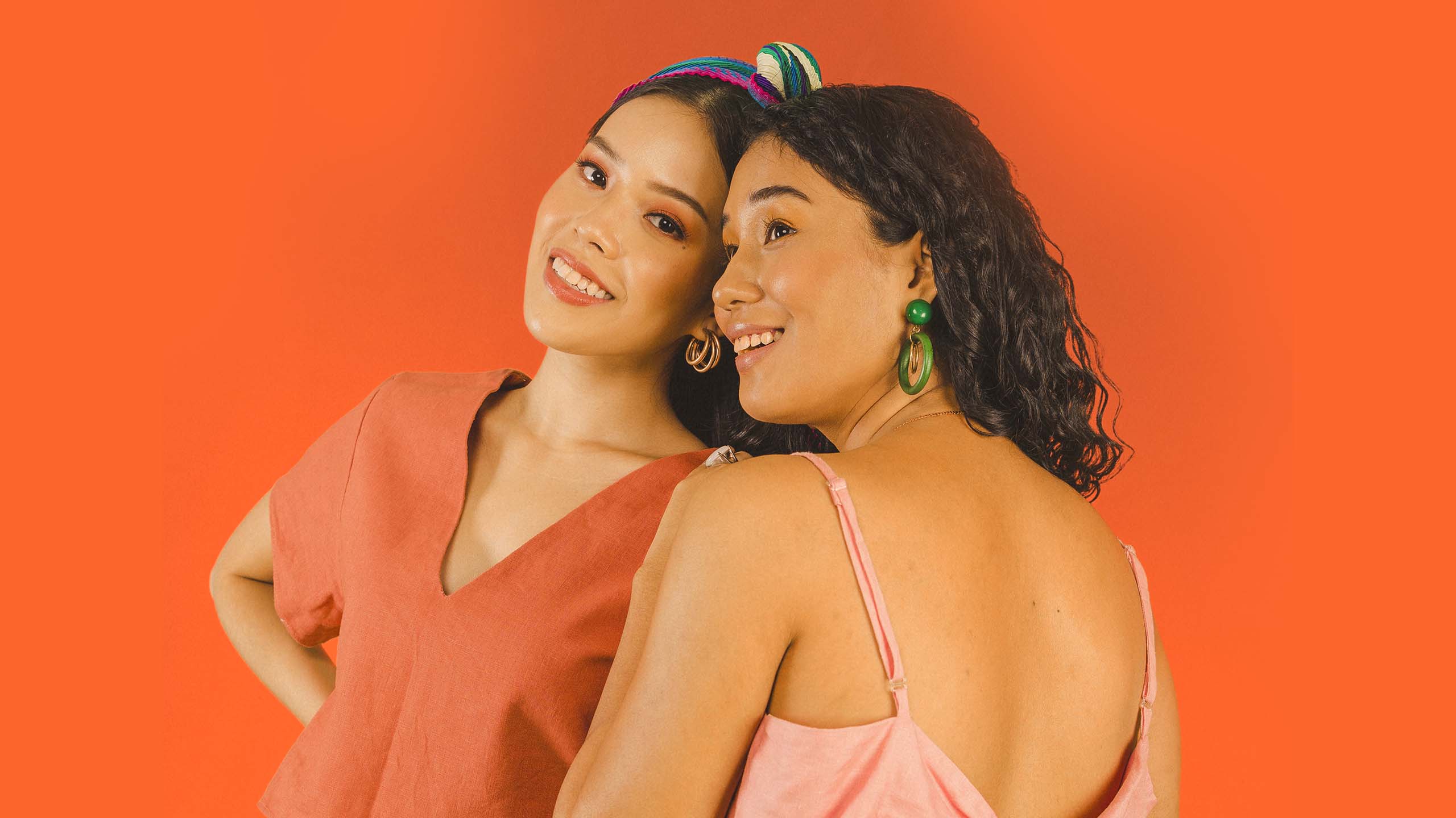
Sunki is a serious sustainable fashion brand for the modern woman out to change the world. It highlights the idea of dressing with impact, and pushes itself to be in line with choosing sustainable and ethical processes as well as inviting everyone—in all shapes and sizes, color and character—be part of the movement.
MORE INFORMATION
SHE'S GOT SOME TEETH
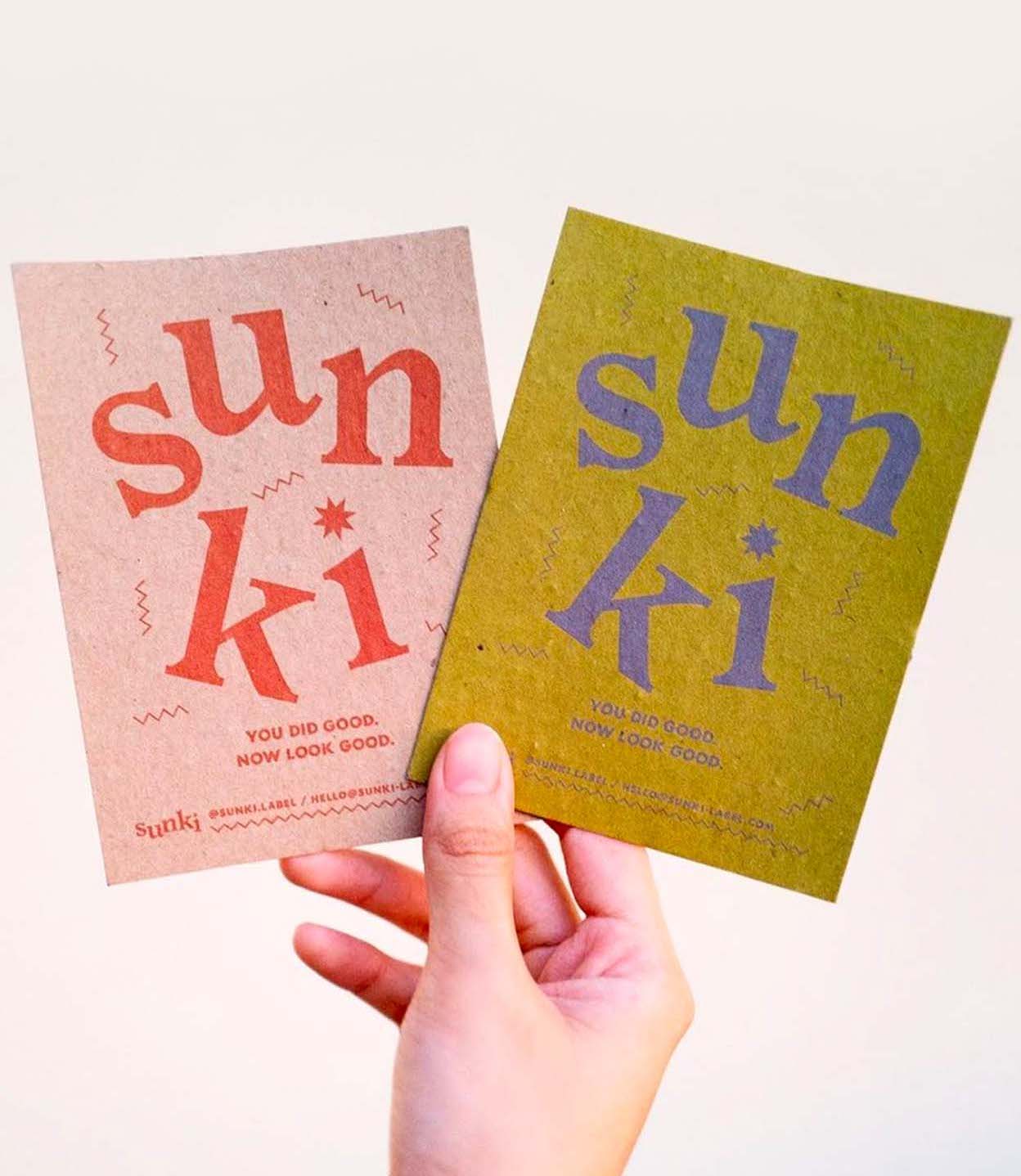
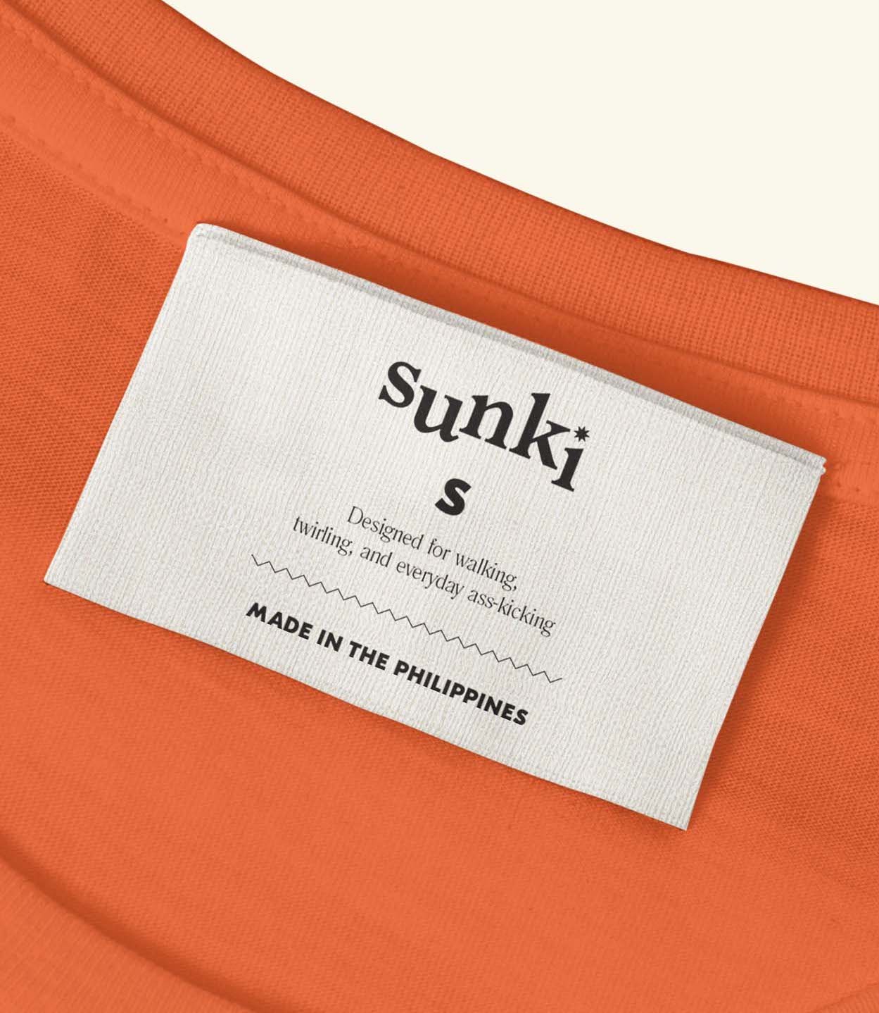
Developed in collaboration with the client, we crafted a narrative out of the name Sunki (pronounced as soong-key), derived from the Filipino word "Sungki," meaning crooked. Sunki is an extraordinary perspective and representation of the woman that we cater to and aim to be: a woman with bite, who is bold in her pursuits especially when it's for a good cause. She owns something that makes her unique, like a bite that's crooked. And despite so, she still smiles the biggest and embraces everything that makes her different—including how she dresses. The logo uses a strong serif type to represent a strong call to action, and laid out in a slightly crooked manner to signify where the name came from: uneven teeth. To add a dynamic and feminine spin, the dot of the "i" is an eight-pointed star.
THE SOLUTION.
We helped the brand express its distinctive approach by defining its proposition, name, identity under 3 brand pillars:
1. Empowerment: A new kind of power-dressing that empowers us to do greater things and achieve greater heights.
2. Sustainability: With that power comes great responsibility in choosing fashion that our future selves will thank us for.
3. Inclusivity: The idea that we're all out to do something great and we're all in this together
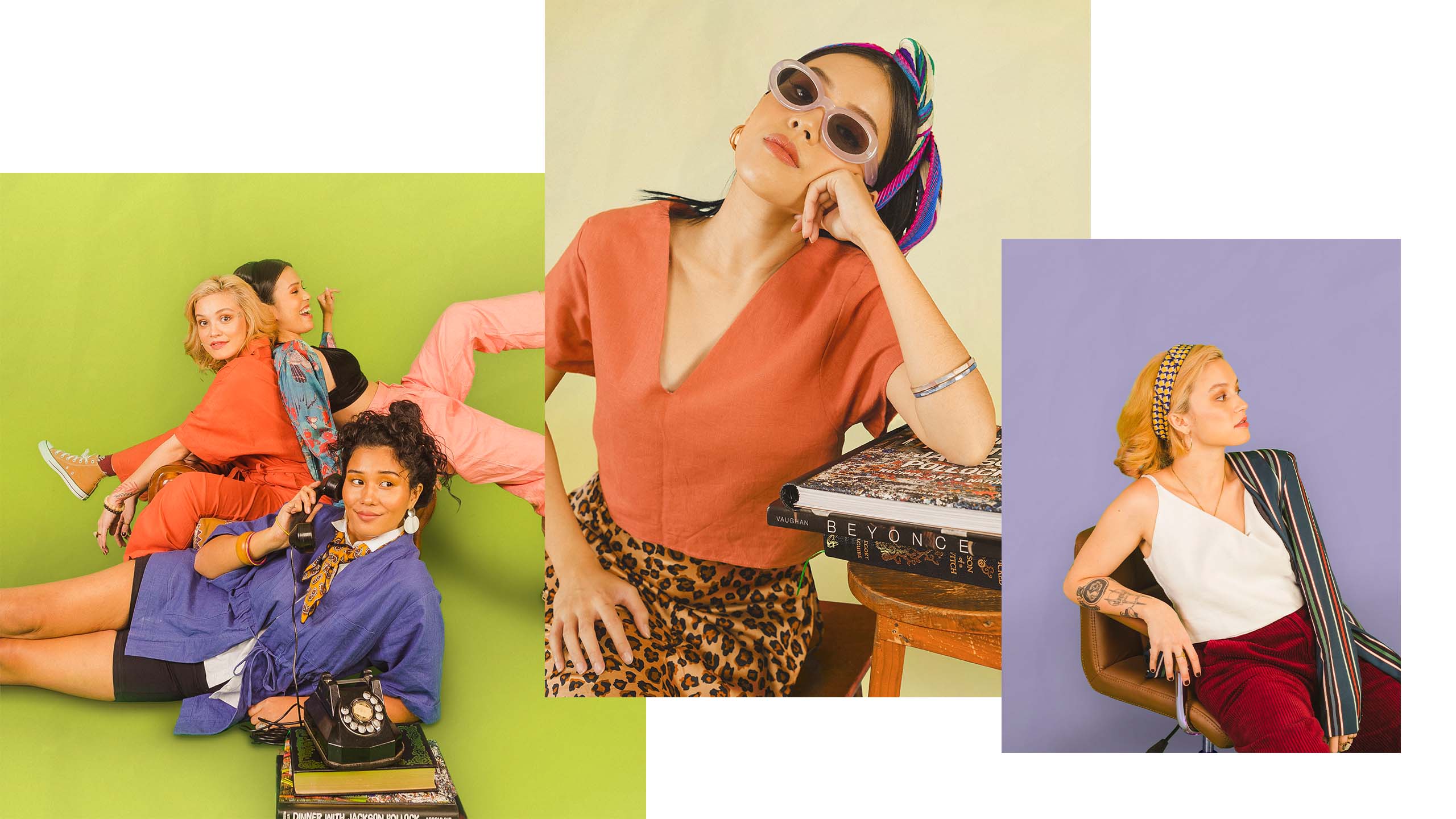
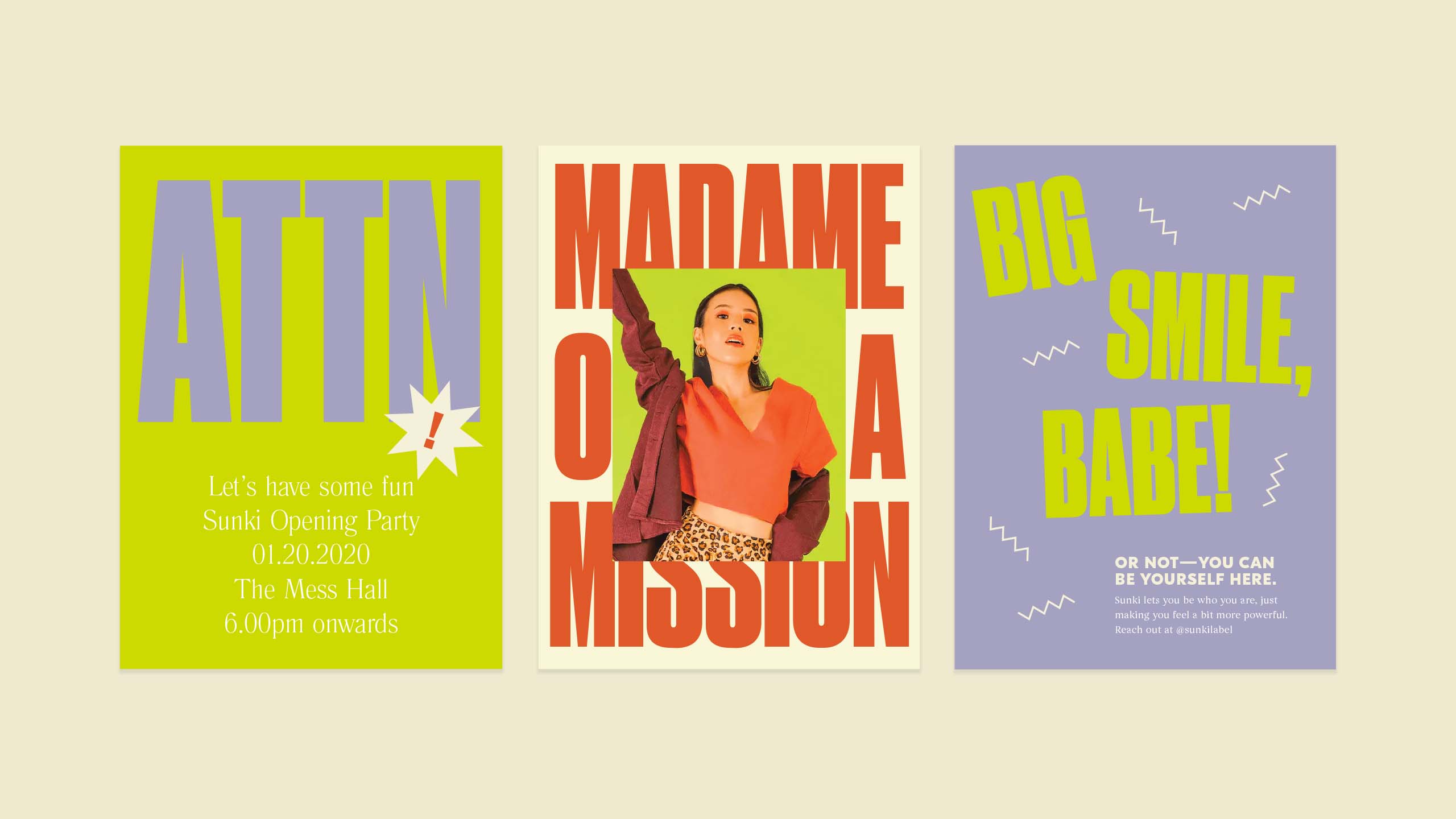
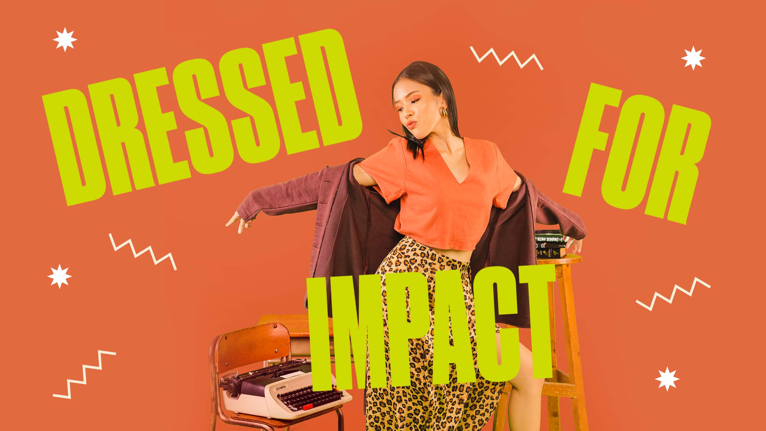
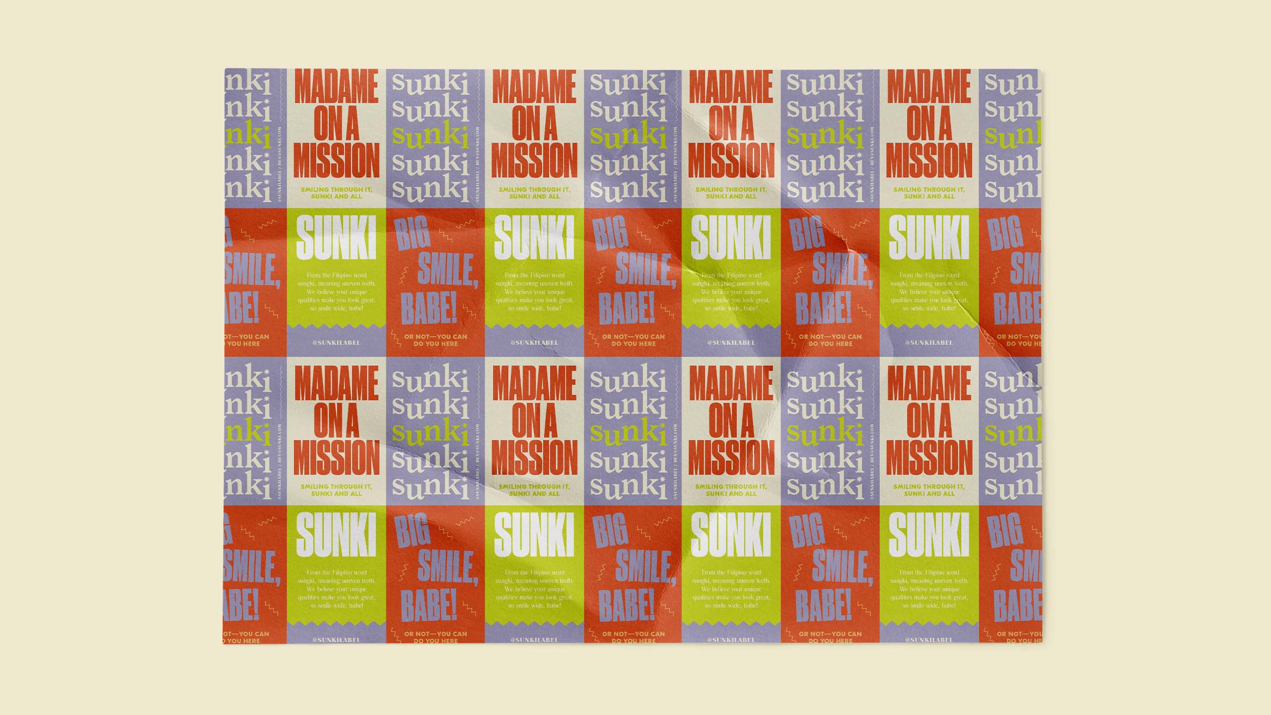
The main color is a bright chartreuse to signify the company's unique approach to sustainability. To balance it with a fun and quirky feel, it's paired with other bright, unique colors. These colors challenge the sustainable industry conventions of a more natural and organic palette, fitting to how Sunki wants to break the mold and encourages every woman to do so as well.
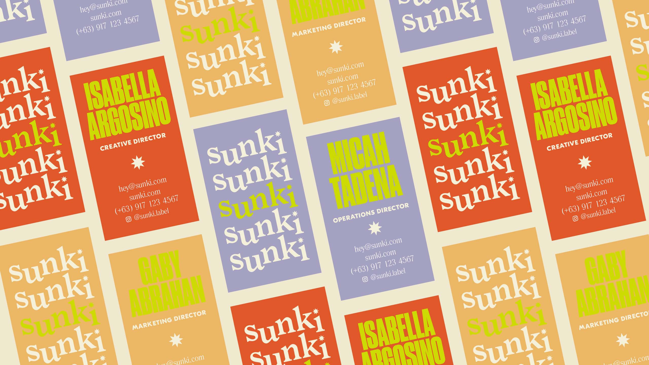
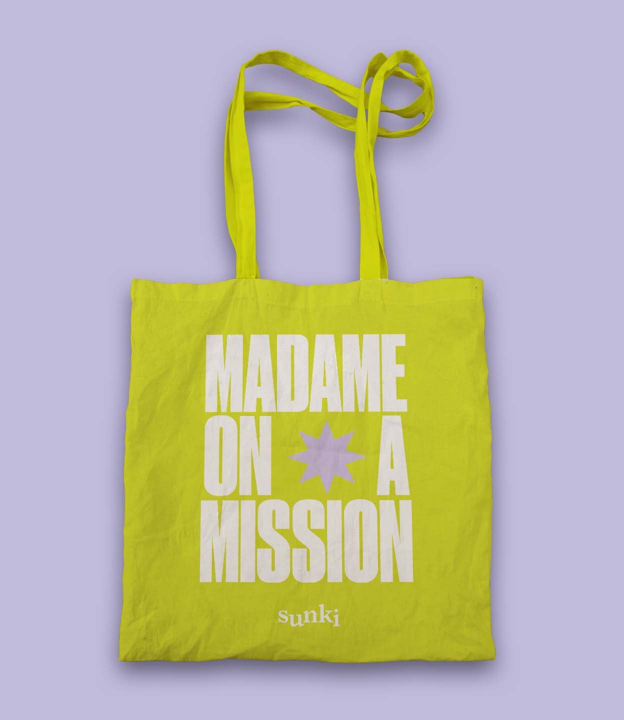
At the heart of the visual is a spunk highly inspired by early suffragettes and propaganda movements. It consists of bold and edgy text with jagged lines for a subtle recall to the brand name.
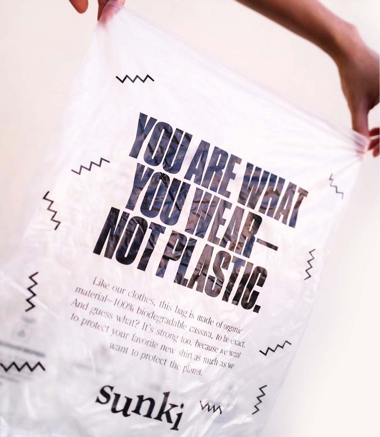
Designing the packaging was a pure collaborative effort between the client and ourselves. Using cassava bags and seed paper for their tags, it's definitely one that stands out from other packaging in its category especially when employed with the brand's visual language.
As Sunki joins the new wave of brands that set new standards, we made sure that the vibrant and sustainable culture and message are also spread out in its website. It was designed to illuminate the brand's desire to be inclusive while still capturing its energetic spirit. These come alive even in the tiniest ways—from the ease of the UX and the balance of visuals and copy, down to the language used (You won't see any greenwashing and fancy buzzwords)!


Make Sense & Look Good®. Made by Serious People. Creating brands that shape tomorrow, today. Boring is the Enemy. Humans deserve nice things™. Seriously. Hi Mom. Success is found in the details. With great budgets come great work. We are known to make brands human. We enjoy creating brands from the ground up. Great brands invest in great design. Ugly brands don’t care about people. Your brand could always be better. Trust us. Branding is like mind control, but cooler. We will tell you if you have food stuck in your teeth. For a relaxing time, make it Suntory time. Make Sense & Look Good®. Made by Serious People. Creating brands that shape tomorrow, today. Boring is the Enemy. Humans deserve nice things™. Seriously. Hi Mom. Success is found in the details. With great budgets come great work. We are known to make brands human. We enjoy creating brands from the ground up. Great brands invest in great design. Ugly brands don’t care about people. Your brand could always be better. Trust us. Branding is like mind control, but cooler. We will tell you if you have food stuck in your teeth. For a relaxing time, make it Suntory time. Make Sense & Look Good®. Made by Serious People. Creating brands that shape tomorrow, today. Boring is the Enemy. Humans deserve nice things™. Seriously. Hi Mom. Success is found in the details. With great budgets come great work. We are known to make brands human. We enjoy creating brands from the ground up. Great brands invest in great design. Ugly brands don’t care about people. Your brand could always be better. Trust us. Branding is like mind control, but cooler. We will tell you if you have food stuck in your teeth. For a relaxing time, make it Suntory time. Make Sense & Look Good®. Made by Serious People. Creating brands that shape tomorrow, today. Boring is the Enemy. Humans deserve nice things™. Seriously. Hi Mom. Success is found in the details. With great budgets come great work. We are known to make brands human. We enjoy creating brands from the ground up. Great brands invest in great design. Ugly brands don’t care about people. Your brand could always be better. Trust us. Branding is like mind control, but cooler. We will tell you if you have food stuck in your teeth. For a relaxing time, make it Suntory time.